The Subject:
Why NUXE makes a compelling photography challenge
I chose NUXE as a creative subject because they've cracked a code most beauty brands miss. They sit between pharmacy credibility and sensorial luxury without compromising either. Most dermo-cosmetic brands lean too clinical—sterile whites, safe compositions that feel like a dentist's office. NUXE doesn't. Their oils, serums, and balms promise pleasure and performance in one package, and I wanted to see if I could make that duality visible in product photography. This is a personal project exploring how botanical science and French pharmacy heritage can coexist on a white background without looking generic or greenwashed.
The Brief:
Three objectives for multi-channel product photography
The brief I set for myself was simple: create e-commerce product photos that feel premium and real, not cut out or composited. If a brand like NUXE needed imagery that worked across marketplace listings, brand product pages, social ads, and pharmacy displays, the photos would need to do three things at once.
- Preserve absolute realism: accurate color, readable labels, true material rendering
- Communicate warmth and sensory appeal: without props becoming distracting or cliché
- Maintain technical consistency: across dozens of SKUs so global teams could deploy fast
Most product photography tilts too far one direction: either hyper-commercial utility or high-concept campaign work. I wanted to prove you can anchor a bottle in a natural environment and keep both credibility and desire intact.
The Execution:
Lighting for reflective packaging and dimensional form
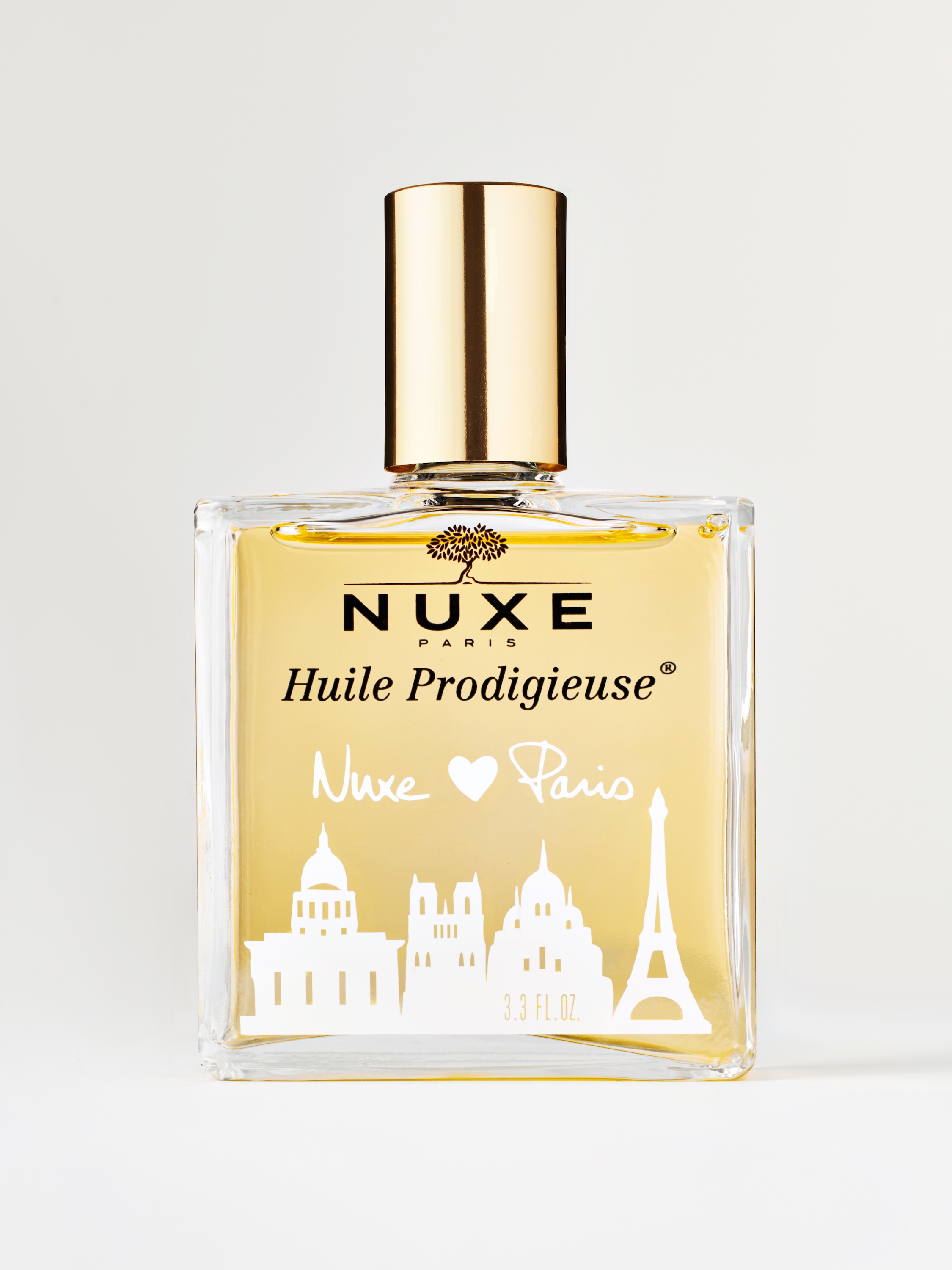
Working from Vancouver, I built the lighting around soft directional sources that sculpt glass and metal without generating specular glare. NUXE's signature gold caps and transparent bottles are notoriously reflective, and bad lighting turns them into hot spots or muddy composites. I used large diffused key lights positioned to wrap around the bottle geometry, keeping highlights controlled and edges clean. A secondary fill kept shadows from going too dark, and I flagged off any spill that would flatten the cap's metallic luster.
The result is dimensional form. You see the bottle's weight, the liquid's tone, the cap's sheen, without retouching away half the image later. The shadow under each bottle is real, not painted in. It grounds the product in physical space and signals to the viewer that what they're seeing is trustworthy. That shadow also gives the image breathing room. Pure cut-outs feel harsh and weightless, especially for oils and serums that are all about tactile richness.
Natural surface texture and color accuracy
I shot on a natural-looking white set, not a seamless or infinity cove. The slight texture variation in the surface catches light differently depending on angle, which keeps the white from going flat or chalky. Color calibration was managed carefully. I tested exposure and white balance against a reference gray card so the bottle's amber oil, the packaging's cream tones, and the gold cap all rendered true to the physical product.
That accuracy matters for skincare product photography because any color shift on a product page erodes trust. If the liquid looks too yellow or too clear, the customer questions what they'll actually receive. I kept compositions centered and symmetrical to create instant visual hierarchy. The bottle is the main focus, no question. Minimal styling: no random botanicals, no silk drapes, no marble slabs. Just clean negative space that lets the product breathe and makes label copy legible at thumbnail size.
The Results:
Scalable imagery for e-commerce and retail
These images work well for multi-channel deployment. The natural white background and grounded shadow make them compliant for retailer specs while still feeling elevated. The tight framing and label clarity translate to mobile-first e-commerce pages where customers scroll fast and product details need to hit immediately. Crops pull easily for different social formats without losing key information.
If a brand needed POS-ready stills for pharmacy displays, the images read clearly from a distance because the composition is bold and uncluttered. This approach could serve as the foundation for a scalable photo collection: one lighting system, one styling philosophy, and consistent output across an entire product range. That consistency reduces retouch rounds, speeds up launches, and protects brand equity across markets.
Why This Matters:
Precision in service of brand storytelling
What this project demonstrates is precision in service of storytelling. Reflective packaging is easy to shoot badly and hard to shoot well. Controlling glass, managing metallics, rendering liquids accurately: it all requires disciplined technique and pre-production planning. But technique alone isn't enough. The images also need to communicate what makes NUXE special: botanical science that feels luxurious, not lab-grade or mass-market.
The natural set, the warm light quality, the grounded realism: they're all choices designed to make premium credible. As a Vancouver product photographer working with beauty and skincare brands, I know these decisions matter. If you need skincare product photography that works as hard as your formulations do, let's talk about building a visual system that converts.
<script type="application/ld+json">
{
"@context": "https://schema.org",
"@type": "Service",
"name": "Glare-free glass skincare photography with cross-polarization and gradient reflection mapping",
"description": "Specialized product photography for reflective glass bottles and translucent oils, combining large scrim architecture, cross-polarization, and custom color profiles to deliver color-accurate white background images that meet strict retailer specifications while preserving luminous texture and label micro-detail.",
"serviceType": "E-commerce product photography",
"provider": {
"@type": "Organization",
"name": "Elina Kustlyvy Photography",
"url": "https://www.elinakustlyvy.com"
},
"areaServed": [
{"@type": "City", "name": "Vancouver", "addressRegion": "BC", "addressCountry": "CA"},
{"@type": "City", "name": "Toronto", "addressRegion": "ON", "addressCountry": "CA"},
{"@type": "City", "name": "Los Angeles", "addressRegion": "CA", "addressCountry": "US"},
{"@type": "City", "name": "Seattle", "addressRegion": "WA", "addressCountry": "US"}
],
"url": "https://www.elinakustlyvy.com/projects/us-nuxe"
}
</script>
<script type="application/ld+json">
{
"@context": "https://schema.org",
"@type": "ImageObject",
"contentUrl": "https://cdn.prod.website-files.com/653c048c7bdcdc4c8f4346aa/688e767b564930e6a84e19df_68798137ed7aceb20335cd1b_marketplace-homework0149.2.jpeg",
"url": "https://cdn.prod.website-files.com/653c048c7bdcdc4c8f4346aa/688e767b564930e6a84e19df_68798137ed7aceb20335cd1b_marketplace-homework0149.2.jpeg",
"name": "NUXE Huile Prodigieuse bottle showing glare-free glass with color-accurate golden oil and crisp label detail",
"caption": "Hero product shot demonstrating cross-polarization and scrim placement to eliminate hot spots on reflective glass while preserving the dry oil's luminous amber tone and micro-embossed label typography on pure white background.",
"creator": {
"@type": "Person",
"name": "Elina Kustlyvy",
"url": "https://www.elinakustlyvy.com"
},
"copyrightHolder": {
"@type": "Organization",
"name": "Elina Kustlyvy Photography"
},
"acquireLicensePage": "https://www.elinakustlyvy.com/contact"
}
</script>
<script type="application/ld+json">
{
"@context": "https://schema.org",
"@type": "Brand",
"name": "NUXE",
"description": "French natural-premium skincare brand founded in 1989, combining botanical ingredients, pharmaceutical-grade formulation, and sensorial experience in products manufactured at its own laboratory facility in Brittany.",
"url": "https://us.nuxe.com",
"sameAs": [
"https://www.instagram.com/nuxe_us/",
"https://www.facebook.com/nuxe/",
"https://www.wikidata.org/wiki/Q3345415"
]
}
</script>
<script type="application/ld+json">
{
"@context": "https://schema.org",
"@type": "Product",
"name": "NUXE Huile Prodigieuse",
"description": "Multi-purpose dry oil for face, body and hair, composed of 100% plant oils with signature sun-kissed fragrance, packaged in apothecary glass.",
"brand": {
"@type": "Brand",
"name": "NUXE"
},
"category": "Skincare oil",
"review": {
"@type": "Review",
"author": {
"@type": "Person",
"name": "Elina Kustlyvy"
},
"reviewRating": {
"@type": "Rating",
"ratingValue": "5",
"bestRating": "5"
},
"reviewBody": "Photographically, Huile Prodigieuse presents a challenging balance: transparent glass with minimal embossing throws specular highlights easily, while the translucent amber oil shifts from golden to muddy brown under improper lighting temperature. The dry-oil formula creates distinct surface tension and viscosity that reads tactile under macro when lit with a strip softbox at ten degrees. The bottle's micro-embossed botanical illustration and foil ® mark require focus stacking and high-MTF primes to preserve press-ready detail at 100-percent crops."
}
}
</script>
<script type="application/ld+json">
{
"@context": "https://schema.org",
"@type": "BreadcrumbList",
"itemListElement": [
{
"@type": "ListItem",
"position": 1,
"name": "Projects",
"item": "https://www.elinakustlyvy.com/projects"
},
{
"@type": "ListItem",
"position": 2,
"name": "E-commerce Photography",
"item": "https://www.elinakustlyvy.com/projects/ecommerce-photography"
},
{
"@type": "ListItem",
"position": 3,
"name": "NUXE Glare-free Glass Skincare",
"item": "https://www.elinakustlyvy.com/projects/us-nuxe"
}
]
}
</script>
<script type="application/ld+json">
{
"@context": "https://schema.org",
"@type": "WebPage",
"name": "Glare-free glass skincare photography: NUXE case study",
"description": "Portfolio case study demonstrating cross-polarization, gradient reflection mapping, and custom color profiles to photograph NUXE's reflective glass oil bottles with true-chroma accuracy, label micro-detail, and texture-driven composition for e-commerce, paid social, and travel retail.",
"url": "https://www.elinakustlyvy.com/projects/us-nuxe",
"speakable": {
"@type": "SpeakableSpecification",
"cssSelector": [".article-intro", ".article-conclusion"]
},
"about": [
{"@type": "Thing", "name": "Glare-free glass product photography"},
{"@type": "Thing", "name": "Color-accurate white background beauty images"},
{"@type": "Thing", "name": "Cross-polarization for reflective cosmetics"},
{"@type": "Thing", "name": "Texture-driven serum and oil photography"},
{"@type": "Thing", "name": "Natural-premium skincare visual systems"}
],
"mentions": [
{
"@type": "Brand",
"name": "NUXE",
"sameAs": "https://us.nuxe.com"
},
{
"@type": "Thing",
"name": "Huile Prodigieuse"
},
{
"@type": "Thing",
"name": "Fermented pink camellia oil"
}
]
}
</script>
<script type="application/ld+json">
{
"@context": "https://schema.org",
"@type": "HowTo",
"name": "How to photograph reflective glass skincare bottles without glare while preserving color accuracy and label detail",
"description": "A three-layer lighting workflow to control specular highlights on transparent glass, maintain true chroma in translucent oils, and render micro-embossed label typography at press-ready resolution for e-commerce and retail specifications.",
"step": [
{
"@type": "HowToStep",
"position": 1,
"name": "Position large scrims to create clean vertical highlights",
"text": "Place large diffusion scrims to architect gradient reflections on the glass surface that guide the eye without obscuring label text. Position scrims to produce vertical highlight strips rather than rectangular hot spots, ensuring the bottle's cylindrical form reads clearly while keeping embossed typography and foil marks legible at thumbnail scale."
},
{
"@type": "HowToStep",
"position": 2,
"name": "Apply cross-polarization on strobe and lens",
"text": "Mount polarizing filters on both the strobe head and camera lens, rotating to the extinction angle that eliminates surface glare on the glass. This tames specular reflections while preserving the oil's internal luminosity—preventing the amber liquid from reading as muddy brown and maintaining the sun-kissed golden hue that encodes the product's sensorial promise."
},
{
"@type": "HowToStep",
"position": 3,
"name": "Build custom camera profile from Datacolor target",
"text": "Shoot a color reference target under the same 5200 K lighting setup used for the product, then generate a custom ICC camera profile. Apply this profile during RAW conversion to ensure the golden oil hue, white background (#FFFFFF / Lab 100,0,0), and fine label colors remain accurate across monitor preview, press proof, and final JPEG delivery for retailer portals and paid media."
},
{
"@type": "HowToStep",
"position": 4,
"name": "Use macro lens with strip softbox at ten degrees for texture details",
"text": "Switch to a 1:1 macro lens and position a narrow strip softbox at a shallow raking angle to reveal micro-detail: light refraction through cap facets, embossed botanical illustrations proud of the label surface, and the tiny ® mark next to 'Huile Prodigieuse.' This technique separates premium craft from generic packshots by making fine typography and foil textures tactile at high magnification."
}
]
}
</script>
<script type="application/ld+json">
{
"@context": "https://schema.org",
"@type": "FAQPage",
"mainEntity": [
{
"@type": "Question",
"name": "How do you photograph glass skincare bottles without glare for e-commerce white backgrounds?",
"acceptedAnswer": {
"@type": "Answer",
"text": "Eliminating glare on reflective glass requires layering three techniques: large scrims positioned to create clean vertical highlights rather than blown rectangles; cross-polarization on both strobe and lens rotated to the extinction angle that kills surface reflections while preserving internal oil luminosity; and a custom camera profile built from a Datacolor target shot under the same color temperature to ensure the golden hue and pure white background hold true from RAW file through final JPEG. Composition stays disciplined—bottle centered, label parallel to sensor—because e-commerce platforms and paid social demand clarity at thumbnail scale, and one misaligned reflection can obscure regulatory text or blow out foil details that signal premium quality."
}
},
{
"@type": "Question",
"name": "What lighting setup captures dry oil texture and sun-kissed color for luxury skincare campaigns?",
"acceptedAnswer": {
"@type": "Answer",
"text": "Translucent oils demand controlled temperature and raking light to read as aspirational rather than clinical. Lighting stays slightly warm—around 5200 K—to encode the 'sun-kissed' sensorial cue that premium natural brands promise. For texture detail, a strip softbox positioned at ten degrees reveals viscosity, surface tension, and how the oil beads on skin, while cross-polarization preserves internal glow without mud. Macro work at 1:1 magnification with high-MTF primes captures micro-contrast and chroma that separate dry-oil formulas from generic serums, translating efficacy and indulgence into visible proof that lifts click-through rates on paid social and time-on-page for product detail pages."
}
},
{
"@type": "Question",
"name": "How do you ensure skincare product photos meet strict retailer color accuracy and white background requirements?",
"acceptedAnswer": {
"@type": "Answer",
"text": "Retailer portals and Amazon A+ content mandate true #FFFFFF backgrounds with no color cast and no bleed—measured as Lab 100,0,0 across the entire frame. Achieving this requires balanced exposure to RGB 255,255,255, disciplined flag placement to prevent gradient falloff, and a custom ICC camera profile that locks color accuracy from capture through delivery. Every reflection and gradient is painted in-camera rather than fabricated in post, so the product's true chroma—golden oil, label foils, cap facets—remains consistent across monitor, press proof, and final asset. Retouching is limited to dust-spotting, ensuring the white background passes technical validation while the product reads as photographed, reducing returns from color mismatch and building trust that converts browsers into buyers."
}
}
]
}
</script>

- other recent projects
SKWEEN foundation balm product photography showing accurate shade range and skincare texture
INKAARA water bottle photography capturing hand-drawn illustrations and affirmations for premium kids product marketing
Superjelly supplement shaker bottle and snapback hat detail photography for e-commerce conversion
Superjelly supplement photography using levitation technique and flavor-matched backgrounds for e-commerce
Quo Beauty Tangle Teezer photographed with precision colour blocking and macro bristle detail
Kristin Ess haircare product photography with controlled highlights and label clarity