The Client:
Skween foundation balm photography for online store launch
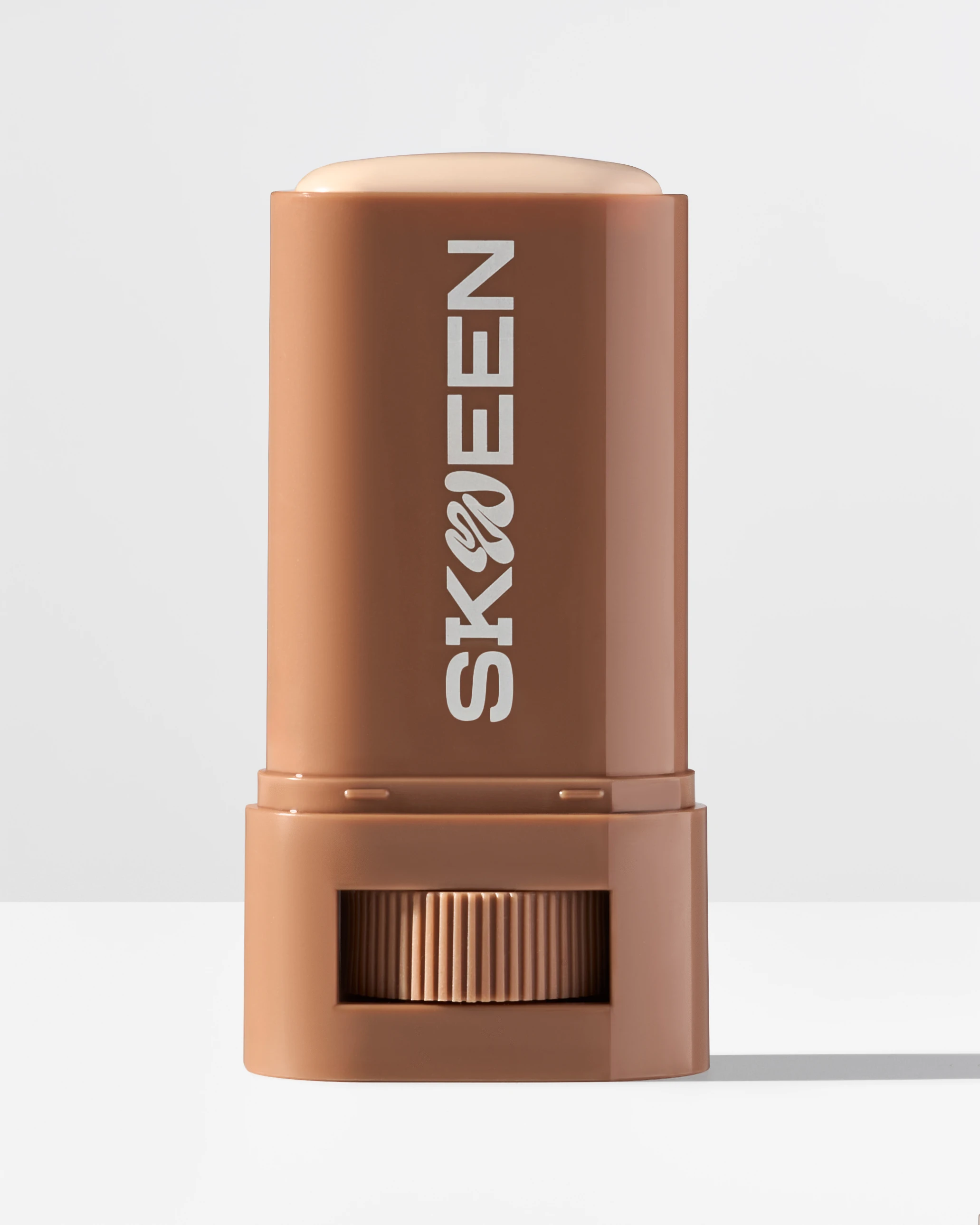
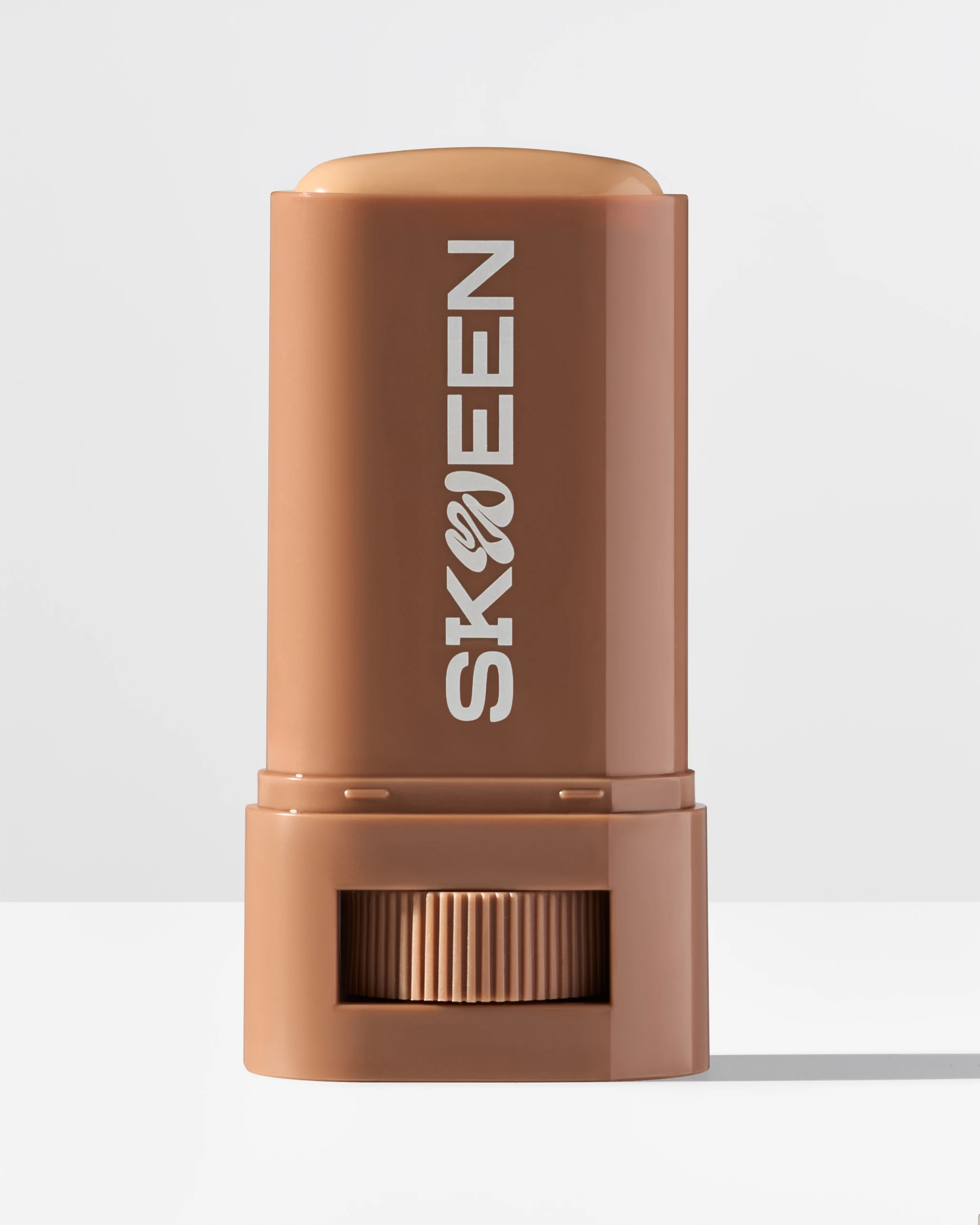
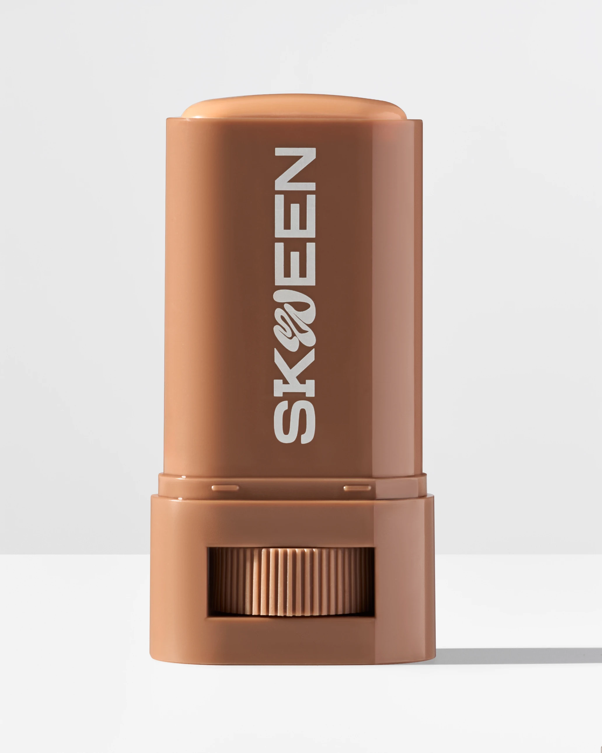
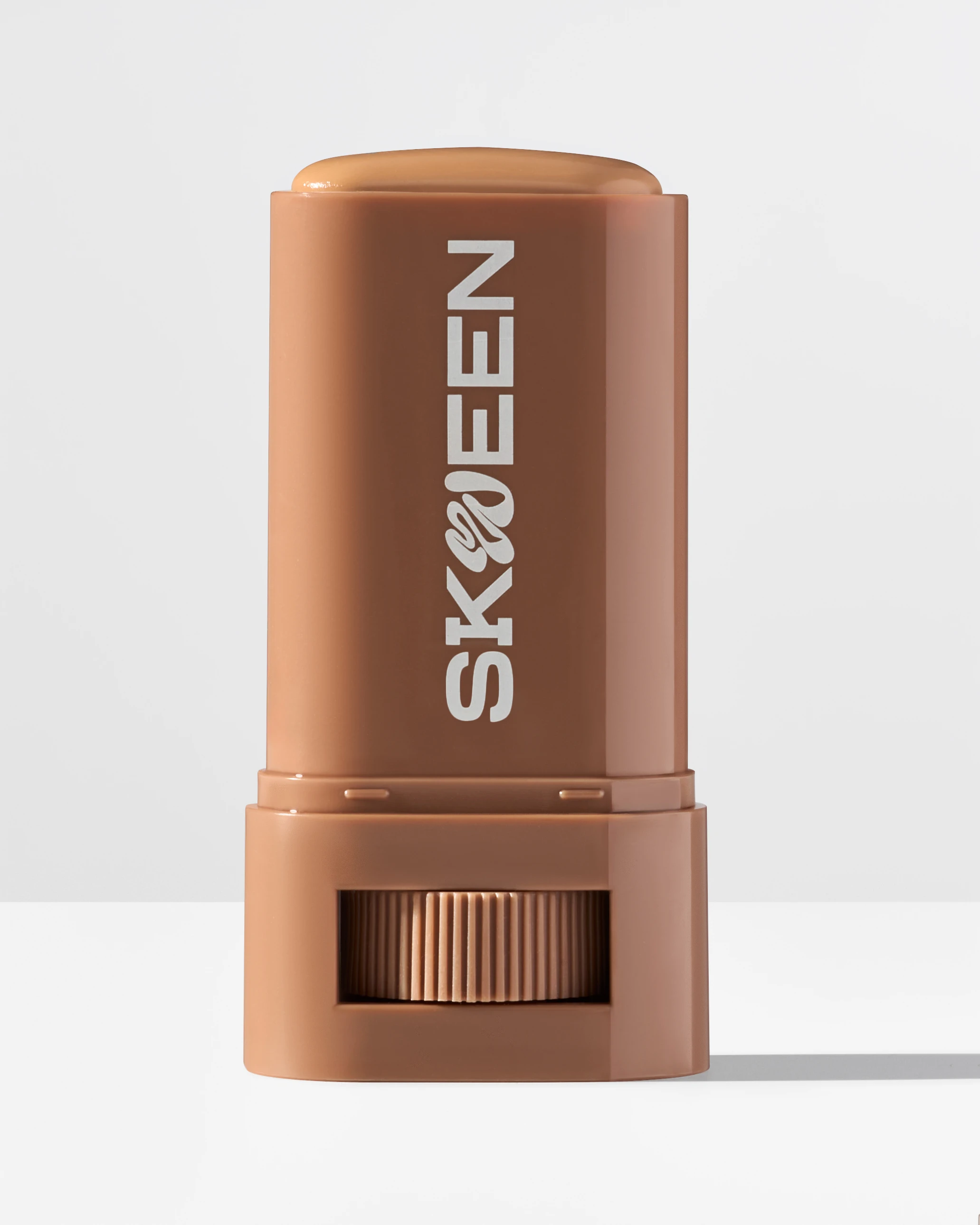
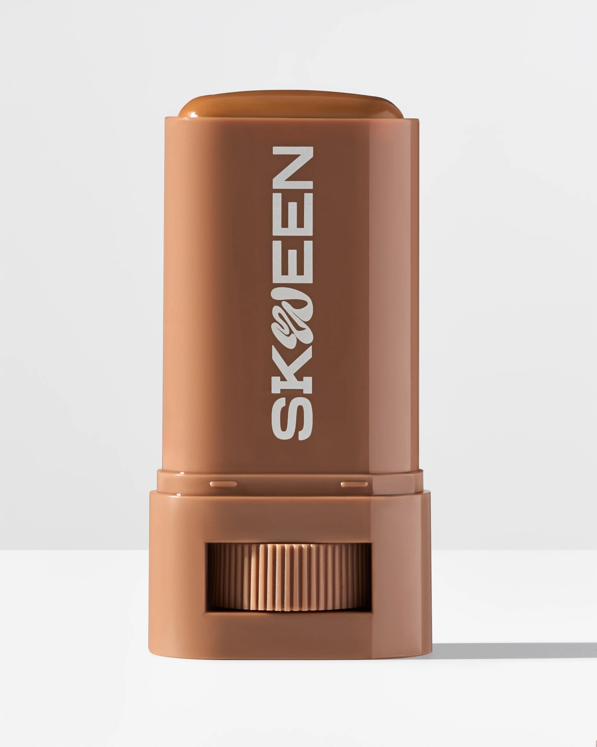
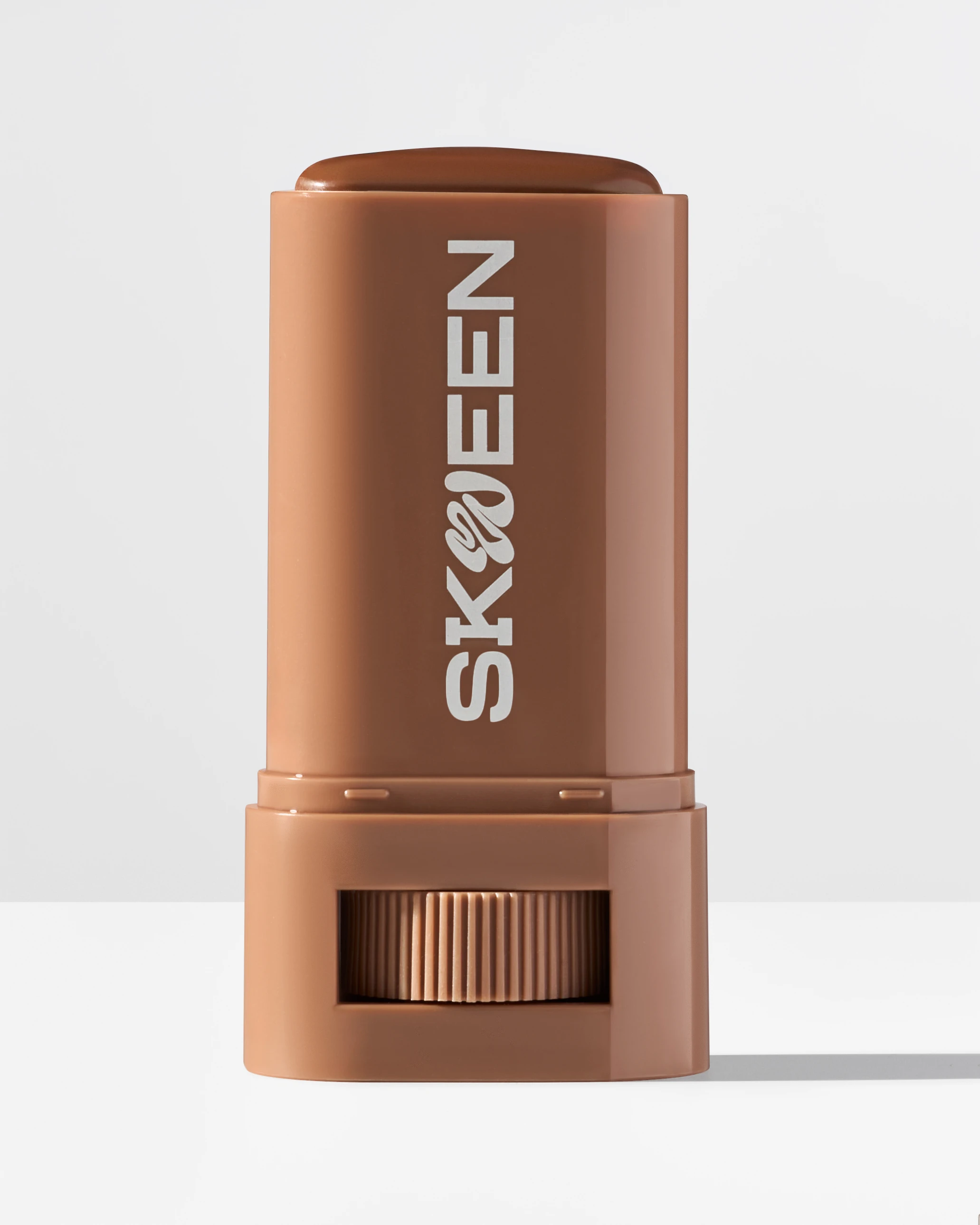
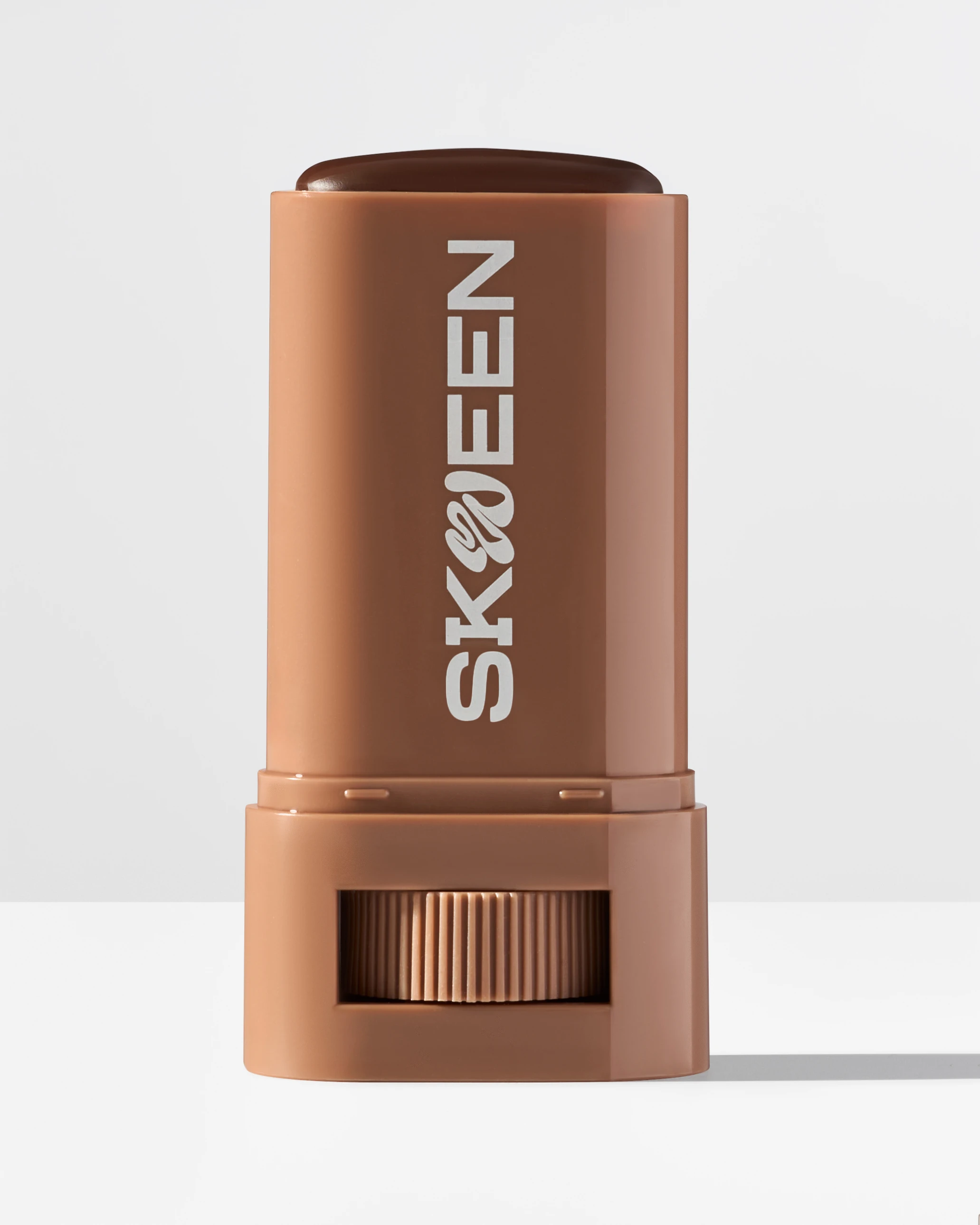
I photographed Skween's foundation balm line for their online store launch. Skween creates a serum-boosted skin tint balm formulated specifically for melanin-rich complexions, merging makeup coverage with skincare benefits. The project centered on delivering product photography that showed accurate shade representation and texture detail for their website.
The Challenge:
Maintaining true-to-life color without gray cast or undertone distortion
The challenge with photographing foundation products for deeper skin tones is maintaining true-to-life color without introducing gray cast or undertone distortion. Standard beauty photography often misses the mark on shade accuracy, creating confusion for customers trying to match their skin. I needed to create images where a shopper could look at the product and confidently judge whether the shade would work for their complexion.
The Execution:
Melanin shade-accurate product photography built around controlled color fidelity
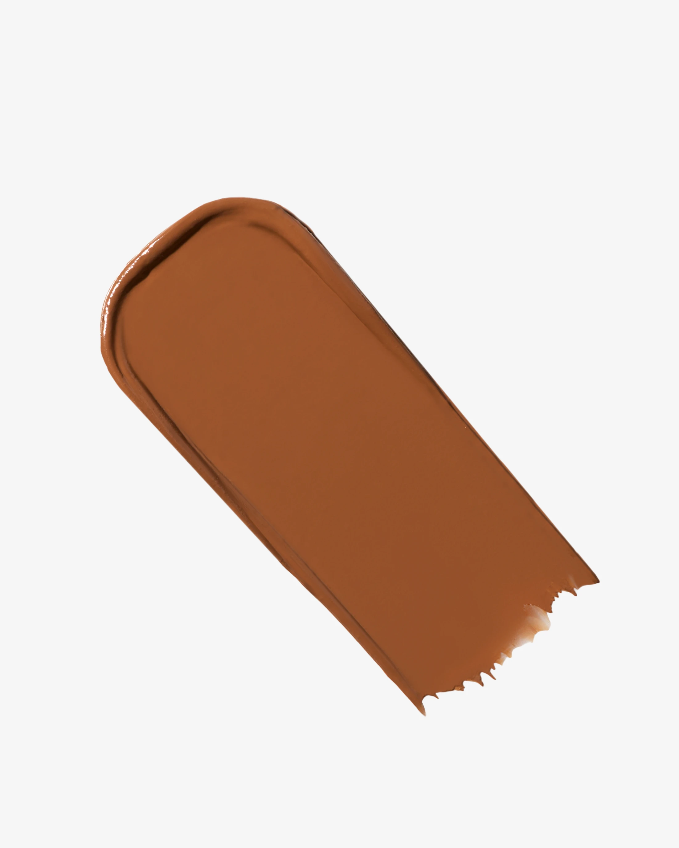
I approached this as a melanin shade-accurate product photography project built around controlled color fidelity. The deliverables included straightforward product photos showing the balm stick from clean angles, swatch photography demonstrating texture and tone, and five creative images designed for both e-commerce and social use. Every shot required precision in lighting and exposure to preserve undertone accuracy and show the product's creamy, hydrating finish without making it look heavy or opaque.
Lighting setup and diffusion control
Working from Vancouver, I built the lighting setup around soft, evenly diffused light sources that eliminated harsh reflections and shadow bias. Foundation products are particularly susceptible to glare that obscures label details and texture, so I used diffusion techniques to control specular highlights while maintaining enough contrast to show the balm's sheen and structure. The goal was clinical clarity without sacrificing the premium aesthetic Skween needed to compete in the skincare-makeup hybrid category.
Calibrated exposure and white balance consistency
I used calibrated exposure and white balance settings to ensure consistent color across every frame. For complexion products, even small shifts in color temperature can make shades look mismatched between images, creating doubt for customers. I photographed each shade under locked lighting ratios and used neutral backgrounds that eliminated color cast. This consistency meant the same shade would look identical whether a customer viewed it in a product grid, zoomed detail, or social post.
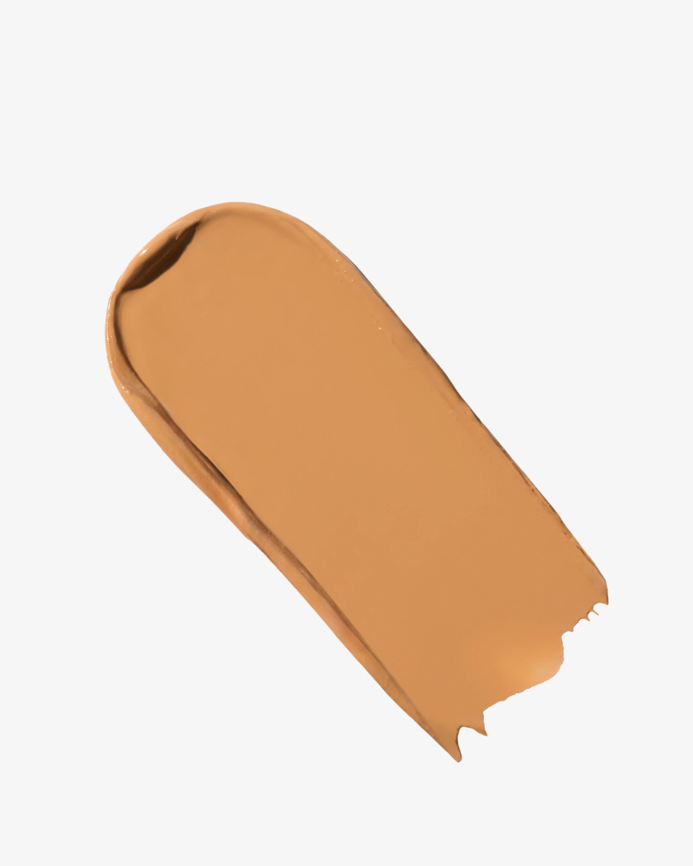
Swatch photography showing finish and slip behavior
The swatch photography required particular attention to finish and slip. I captured close-up studies showing how the balm diffuses on application, the creamy texture at the swatch edge, and the skin-like result without harsh lines or cakey buildup. These were not stylized beauty shots but foundation swatch close-ups designed to give shoppers visual proof of coverage level and undertone behavior. I framed each swatch with enough detail to show micro-texture and highlight behavior while keeping the composition clean and distraction-free.
Product photos revealing branding and mechanism
For the product photos, I used front-facing angles that revealed both the branding and the stick mechanism. Customers needed to understand the twist-up format and see the label clearly to distinguish between shades. I maintained crisp focus across the frame and used high-resolution capture to preserve detail even when images were cropped for different placements. Retouching stayed minimal, prioritizing realism over gloss to match Skween's positioning around authentic, breathable coverage.
Creative images for e-commerce and social flexibility
The creative images extended the same color-controlled approach into more compositional setups. I photographed the balm sticks in arrangements that showed the shade range and communicated the skincare-makeup hybrid positioning through minimal styling and clean surfaces. These images needed to perform on both the website and social channels, so I framed them with flexibility for different formats while keeping the product legible and the color accurate in every crop.
The Result:
Photo library designed for immediate e-commerce use with accurate shade representation
The final collection gave Skween a photo library designed for immediate e-commerce use. The straightforward product shots anchored their product pages with clarity and consistency. The swatch photography provided zoomable detail for customers evaluating finish and undertone. The creative images offered flexibility for homepage banners, email campaigns, and social content without losing the color fidelity that is essential for complexion products serving melanin-rich skin tones.
As a Vancouver product photographer, this project reinforced how important technical precision is when photographing foundation and complexion products. Accurate shade representation is not just an aesthetic preference, it is functional product photography that reduces returns and builds confidence at the point of purchase. The combination of controlled lighting, calibrated color workflow, and restrained retouching created images that work across platforms while maintaining the undertone accuracy Skween's customers need to make informed shade choices.
If you are launching a beauty or skincare line and need product photography that performs across e-commerce and social channels, reach out to discuss how we can build a visual system around color accuracy and detail clarity.
<script type="application/ld+json">
{
"@context": "https://schema.org",
"@type": "Service",
"name": "Inclusive Color-Accurate Beauty Photography for Melanin-Safe Shade Ranges",
"description": "Color-faithful photography system for hybrid skincare�makeup products, using consistent white balance, warm-neutral backgrounds, and shade grid arrays that render true-to-life undertones on deeper skin tones without ashy cast.",
"serviceType": "Beauty Product Photography",
"provider": {
"@type": "Organization",
"name": "Elina Kustlyvy Photography",
"url": "https://www.elinakustlyvy.com"
},
"areaServed": [
{"@type": "City", "name": "Vancouver", "addressRegion": "BC", "addressCountry": "CA"},
{"@type": "City", "name": "Toronto", "addressRegion": "ON", "addressCountry": "CA"},
{"@type": "City", "name": "Los Angeles", "addressRegion": "CA", "addressCountry": "US"},
{"@type": "City", "name": "Seattle", "addressRegion": "WA", "addressCountry": "US"}
],
"url": "https://www.elinakustlyvy.com/projects/skween"
}
</script>
<script type="application/ld+json">
{
"@context": "https://schema.org",
"@type": "ImageObject",
"contentUrl": "https://cdn.prod.website-files.com/653c048c7bdcdc4c8f4346aa/6941e79e672d6370ed4af0f8_%231.webp",
"url": "https://cdn.prod.website-files.com/653c048c7bdcdc4c8f4346aa/6941e79e672d6370ed4af0f8_%231.webp",
"name": "SKWEEN Serum Boosted Skin Tint Beauty Balm shade range arranged in clinical top-down grid showing six melanin-safe shades",
"caption": "Top-down shade grid array demonstrating color-accurate photography for SKWEEN's six-shade range of serum-boosted skin tint balms, captured with consistent white balance and warm-neutral backgrounds to ensure true-to-life undertone rendering for deeper skin tones.",
"creator": {
"@type": "Person",
"name": "Elina Kustlyvy",
"url": "https://www.elinakustlyvy.com"
},
"copyrightHolder": {
"@type": "Organization",
"name": "Elina Kustlyvy Photography"
},
"acquireLicensePage": "https://www.elinakustlyvy.com/contact"
}
</script>
<script type="application/ld+json">
{
"@context": "https://schema.org",
"@type": "Brand",
"name": "SKWEEN",
"description": "Hybrid beauty brand delivering serum-boosted skin tint balms with skincare actives and inclusive, melanin-safe shade ranges for deeper skin tones.",
"url": "https://skween.com"
}
</script>
<script type="application/ld+json">
{
"@context": "https://schema.org",
"@type": "Product",
"name": "SKWEEN Serum Boosted Skin Tint Beauty Balm",
"description": "Stick balm offering sheer-to-light coverage with skincare actives including peptides, niacinamide, hyaluronic acid, vitamin C, and vitamin E, formulated for melanin-rich skin tones across six shades.",
"brand": {
"@type": "Brand",
"name": "SKWEEN"
},
"category": "Hybrid Skincare-Makeup",
"review": {
"@type": "Review",
"author": {
"@type": "Person",
"name": "Elina Kustlyvy"
},
"reviewRating": {
"@type": "Rating",
"ratingValue": "5",
"bestRating": "5"
},
"reviewBody": "The balm displays a creamy, serum-like texture that melts on contact, producing a subtle sheen finish. Close-up photography reveals smooth, even consistency without separation. The stick mechanism glides cleanly, and the formulation photographs with dimensional glow that signals ingredient activity. Packaging is compact and premium, photographing well against neutral backgrounds without glare."
}
}
</script>
<script type="application/ld+json">
{
"@context": "https://schema.org",
"@type": "BreadcrumbList",
"itemListElement": [
{
"@type": "ListItem",
"position": 1,
"name": "Projects",
"item": "https://www.elinakustlyvy.com/projects"
},
{
"@type": "ListItem",
"position": 2,
"name": "Paid",
"item": "https://www.elinakustlyvy.com/projects/categories/paid"
},
{
"@type": "ListItem",
"position": 3,
"name": "SKWEEN Beauty Product Photography",
"item": "https://www.elinakustlyvy.com/projects/skween"
}
]
}
</script>
<script type="application/ld+json">
{
"@context": "https://schema.org",
"@type": "WebPage",
"name": "SKWEEN Case Study: Inclusive Color-Accurate Beauty Photography for Melanin-Safe Shade Ranges",
"description": "Photography case study documenting color-faithful imagery system for SKWEEN's serum-boosted skin tint balm launch, using shade grid arrays, texture detail, and skin-tone comparisons to reduce shade mismatch returns and support hybrid skincare�makeup positioning.",
"url": "https://www.elinakustlyvy.com/projects/skween",
"speakable": {
"@type": "SpeakableSpecification",
"cssSelector": [".article-intro", ".article-conclusion"]
},
"about": [
{"@type": "Thing", "name": "Inclusive color-accurate beauty photography"},
{"@type": "Thing", "name": "Melanin-safe shade range photography"},
{"@type": "Thing", "name": "Shade grid comparison photography"},
{"@type": "Thing", "name": "Cosmetic texture swatch photography"}
],
"mentions": [
{
"@type": "Brand",
"name": "SKWEEN",
"sameAs": "https://skween.com"
},
{
"@type": "Thing",
"name": "SKWEEN Serum Boosted Skin Tint Beauty Balm"
}
]
}
</script>
<script type="application/ld+json">
{
"@context": "https://schema.org",
"@type": "HowTo",
"name": "How to Photograph Inclusive Shade Ranges for Deeper Skin Tones Without Ashy Cast",
"description": "Technical method for capturing color-accurate beauty product photography that renders melanin-safe undertones faithfully across full shade ranges, eliminating ashy cast and supporting shade match guarantees.",
"step": [
{
"@type": "HowToStep",
"position": 1,
"name": "Establish color fidelity foundation with controlled lighting",
"text": "Use soft, even illumination from large diffused light sources positioned to eliminate hot spots. Pair with consistent white balance across every shot, avoiding cool grays that pull undertones ashy on screen. Shoot tethered with monitor calibration and real-time color checks against physical product samples to ensure on-screen color matches in-hand product."
},
{
"@type": "HowToStep",
"position": 2,
"name": "Create shade grid comparison arrays with neutral-to-warm backgrounds",
"text": "Photograph each shade under identical conditions using top-down, centered compositions. Choose backgrounds in neutral to warm-neutral tones to maintain undertone integrity. Deliver shade grids that allow side-by-side comparison without color shifts between frames, creating visual maps that help shoppers self-identify their shade without guesswork."
},
{
"@type": "HowToStep",
"position": 3,
"name": "Capture texture details to communicate hybrid skincare�makeup benefits",
"text": "Use close-up macro shots to reveal balm creaminess, melt-on-contact texture, and subtle sheen that signals active ingredients. Introduce dimensional shadows subtly to lift product off background while maintaining clinical clarity. Frame texture images as proof points that show�rather than tell�how the formula behaves differently from traditional makeup."
},
{
"@type": "HowToStep",
"position": 4,
"name": "Build modular asset library with platform-specific crops",
"text": "Deliver single-product hero shots, full-range lineup images, individual swatches with and without background, packaging-and-product pairings, and texture details. Export in multiple aspect ratios: 1:1 for Instagram feed, 4:5 for Stories, 16:9 for YouTube thumbnails, horizontal crops for desktop banners. Plan negative space into every frame for copy overlays and benefit callouts."
}
]
}
</script>
<script type="application/ld+json">
{
"@context": "https://schema.org",
"@type": "FAQPage",
"mainEntity": [
{
"@type": "Question",
"name": "How does color-accurate cosmetics photography reduce shade mismatch returns for beauty brands?",
"acceptedAnswer": {
"@type": "Answer",
"text": "Color-accurate photography uses consistent white balance, calibrated lighting, and warm-neutral backgrounds to ensure what shoppers see on screen matches what arrives in the mail. By rendering undertones faithfully�especially on deeper skin tones�and providing shade grid comparison arrays and skin-tone reference images, the photography eliminates shade selection guesswork. This directly reduces shade-related returns, lowers customer service tickets, and makes guarantees like SKWEEN's Perfect Shade Promise credible and actionable."
}
},
{
"@type": "Question",
"name": "What photography techniques show natural glow and texture for hybrid skincare�makeup products like skin tint balms?",
"acceptedAnswer": {
"@type": "Answer",
"text": "Macro texture detail shots capture balm creaminess, melt-on-contact behavior, and the subtle sheen that signals active ingredients at work. Using soft, even lighting with dimensional shadows introduces premium lift without adding visual noise. Close-ups reveal smooth, serum-like finish that visually reinforces peptides-and-niacinamide narratives. These texture images serve as proof points on product detail pages, showing�not telling�that the formula behaves differently from traditional matte foundations, which supports conversion and communicates the one-step skincare�makeup benefit."
}
},
{
"@type": "Question",
"name": "How do you photograph inclusive shade ranges for deeper skin tones without ashy cast?",
"acceptedAnswer": {
"@type": "Answer",
"text": "Photographing melanin-safe shade ranges requires soft, even illumination from large diffused sources to eliminate hot spots, paired with strict white balance discipline. Use neutral-to-warm-neutral backgrounds instead of cool grays that pull undertones ashy. Shoot tethered with calibrated monitors and real-time color checks against physical samples. Create top-down shade grids under identical conditions so the full range can be compared side by side without color drift. Include skin-tone comparison images that map each shade to real undertones, allowing shoppers to self-identify their match confidently."
}
}
]
}
</script>

- other recent projects
INKAARA water bottle photography capturing hand-drawn illustrations and affirmations for premium kids product marketing
Superjelly supplement shaker bottle and snapback hat detail photography for e-commerce conversion
Superjelly supplement photography using levitation technique and flavor-matched backgrounds for e-commerce
Quo Beauty Tangle Teezer photographed with precision colour blocking and macro bristle detail
Kristin Ess haircare product photography with controlled highlights and label clarity
Photographing Truly Beauty serum texture with macro dropper sequences for clean beauty e-commerce
