The Execution:
Levitation photography and flavor-keyed backgrounds for supplement brand differentiation
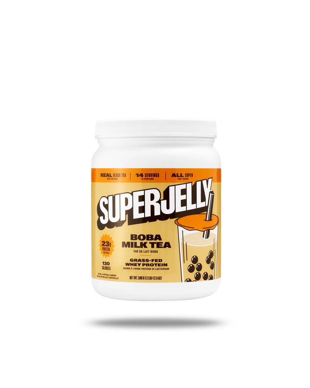
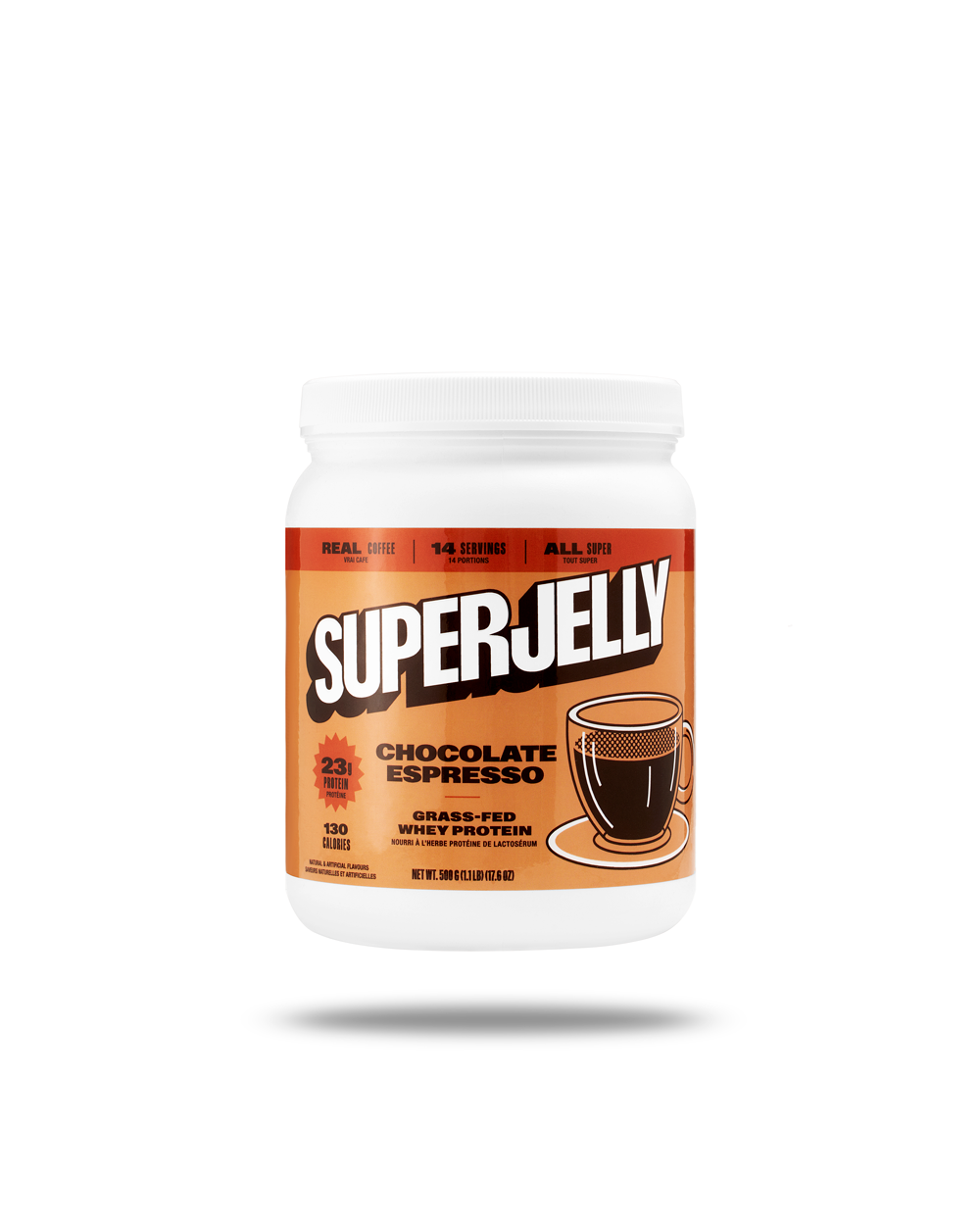
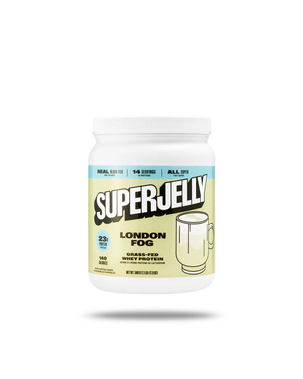
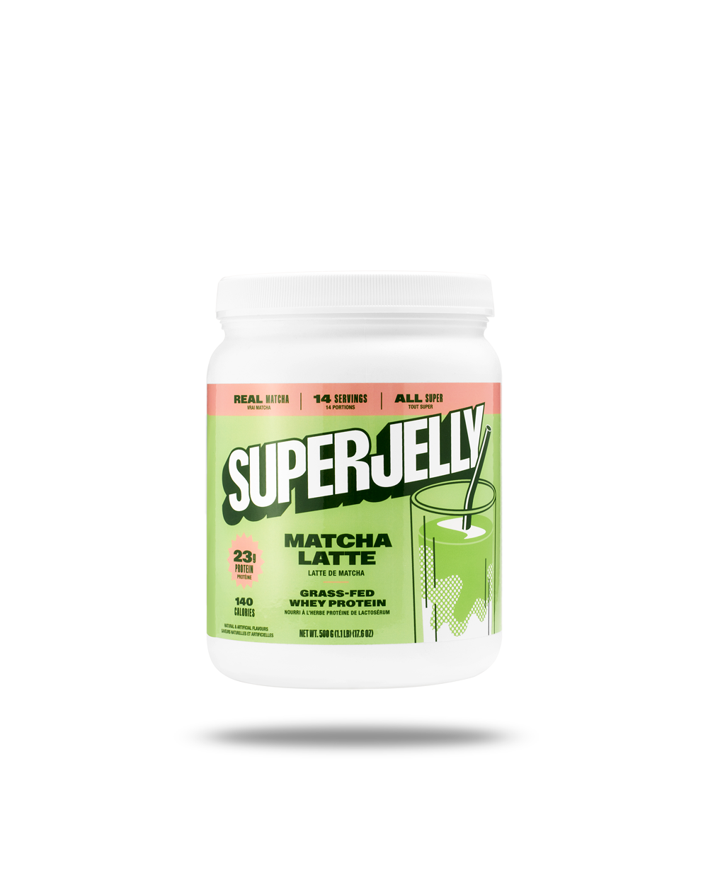
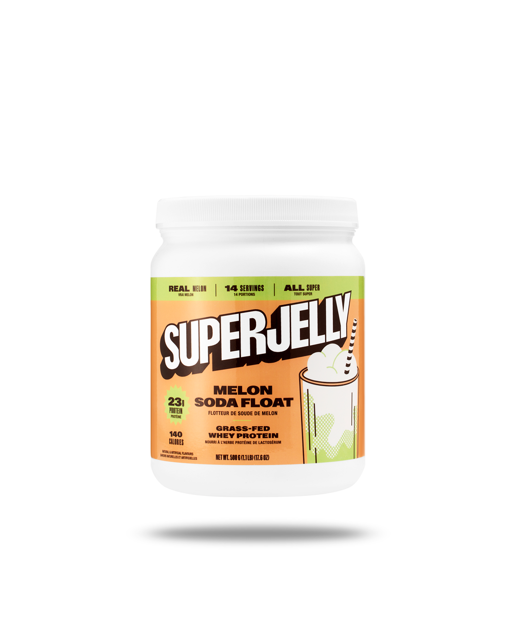
Working from Vancouver, I photographed Superjelly's sports nutrition line using levitation and flavor-keyed backgrounds. The brand wanted e-commerce images that moved away from standard white backgrounds. They chose a dynamic approach that would showcase their unique flavors: Matcha Latte, London Fog, Taro Milk Tea, Melon Soda Float. The project centered on their whey protein isolate tubs, glossy packaging that required careful lighting to stay readable.
Superjelly's product photography needed to work across their online store and marketing channels. The brand's flavor-forward positioning called for visuals that made each variant instantly recognizable. Rather than generic supplement imagery, they wanted photos that reflected their commitment to bold, authentic flavors and clean formulations. The glossy tub packaging presented a technical challenge: maintaining crisp typography and label legibility while avoiding harsh reflections that obscure product information.
Suspended product compositions with color-calibrated backgrounds
The levitation technique created visual interest while keeping compositions clean. I photographed each tub suspended against backgrounds calibrated to match flavor profiles. Matcha appeared against soft green tones. London Fog sat within a muted lavender field. Taro Milk Tea floated in warm purple space. This color-keyed system made each SKU distinct at a glance. The backgrounds provided context for the flavors without competing with the product itself.
Lighting focused on managing the glossy surface while preserving color accuracy. I used diffused light sources that wrapped around each tub, eliminating glare while maintaining dimensional depth. The goal was readable labels and consistent surface treatment across all variants. Each product needed to look premium without blown highlights or muddy shadows. The lighting approach stayed uniform, so when the images appeared together on product pages or in campaigns, they felt cohesive.
Modular framing for multi-format deployment
Composition prioritized flexibility. I centered each tub with intentional negative space around it. This modular framing meant the images could crop into different formats without losing the product or creating awkward tangents. The brand needed photos that worked as square social posts, vertical story formats, and horizontal web banners. Consistent positioning and scale across the set made it simple to swap flavors in templates without redesigning layouts.
The levitation composites required grounded shadows that read as believable. I captured multiple exposures to build realistic drop shadows beneath each floating tub. The shadows anchored the products in space rather than making them feel pasted onto backgrounds. Small details like shadow softness and directional consistency kept the floating effect from looking artificial. The technique added energy to the compositions while maintaining the clean, premium aesthetic the brand positioning required.
Flavor-accurate color calibration supporting premium positioning
For each flavor, the background color came from careful calibration rather than post-production guesswork. I matched hues to the brand's existing palette and the visual cues customers associate with these flavors. The Melon Soda Float background carried the soft aqua-green of Japanese melon soda. The Matcha stayed true to ceremonial-grade tea powder, not neon green. This color discipline helped the product line feel intentional and designed, supporting the premium price point.
The photo collection included both the levitating, color-background shots and clean product photography on pure white. The white-background versions provided standard e-commerce coverage for product pages and marketplace listings. The levitating images served brand-building functions in ads, email campaigns, and social content. Together, the two styles gave the marketing team range: conversion-focused clarity when needed, and eye-catching creativity for paid promotion.
The Results:
Scalable photography system for growing supplement line
Technical consistency across the set mattered as much as individual image quality. Every tub received identical lighting treatment, the same camera angle, and matching post-processing. When the brand displays multiple flavors together on their site or in promotional graphics, the uniformity reinforces that this is a cohesive product line, not a patchwork of different shoots. As a Vancouver product photographer, I built a system that could scale across their SKU range without requiring complete rethinking for each new flavor launch.
The supplement product photography for Superjelly balanced creative differentiation with e-commerce functionality. Levitation added visual energy without sacrificing the product clarity that drives online purchases. Flavor-keyed backgrounds made each variant memorable while maintaining the premium feel that justifies higher pricing in a competitive category. The photos work as both standalone product images and building blocks for larger marketing campaigns.
If you're launching a supplement line or refreshing product photography for a CPG brand, let's talk about creating images that work as hard as your formulations. Contact me to discuss your next product photography project.
<script type="application/ld+json">
{
"@context": "https://schema.org",
"@type": "Service",
"name": "Clean Label Supplement Product Photography with Glare Reduction and SKU Color Consistency",
"description": "Specialized product photography for supplement brands combining glossy label glare reduction, flavor-keyed color management across SKU lines, levitation composition, and marketplace-compliant white background isolation to support premium positioning and multi-channel conversion.",
"serviceType": "E-commerce Product Photography",
"provider": {
"@type": "Organization",
"name": "Elina Kustlyvy Photography",
"url": "https://www.elinakustlyvy.com"
},
"areaServed": [
{"@type": "City", "name": "Vancouver", "addressRegion": "BC", "addressCountry": "CA"},
{"@type": "City", "name": "Toronto", "addressRegion": "ON", "addressCountry": "CA"},
{"@type": "City", "name": "Los Angeles", "addressRegion": "CA", "addressCountry": "US"},
{"@type": "City", "name": "Seattle", "addressRegion": "WA", "addressCountry": "US"}
],
"url": "https://www.elinakustlyvy.com/projects/superjellyco-proteins"
}
</script>
<script type="application/ld+json">
{
"@context": "https://schema.org",
"@type": "ImageObject",
"contentUrl": "https://cdn.prod.website-files.com/653c048c7bdcdc4c8f4346aa/688d66e76a75e084dc42d18e_687982bcd6c4eab59070c595_LondonFog_ecom.png",
"url": "https://cdn.prod.website-files.com/653c048c7bdcdc4c8f4346aa/688d66e76a75e084dc42d18e_687982bcd6c4eab59070c595_LondonFog_ecom.png",
"name": "Superjelly London Fog Whey Isolate Protein Powder Levitation Product Photography",
"caption": "Clean white background supplement product photography showing Superjelly London Fog protein tub with glossy label glare eliminated, readable on-pack claims, and signature levitation composition for premium brand differentiation.",
"creator": {
"@type": "Person",
"name": "Elina Kustlyvy",
"url": "https://www.elinakustlyvy.com"
},
"copyrightHolder": {
"@type": "Organization",
"name": "Elina Kustlyvy Photography"
},
"acquireLicensePage": "https://www.elinakustlyvy.com/contact"
}
</script>
<script type="application/ld+json">
{
"@context": "https://schema.org",
"@type": "Brand",
"name": "Superjelly",
"description": "Sports nutrition brand offering flavor-driven, clean-label supplements including whey isolate protein, vegan protein, and pre-workout in dessert-inspired flavors like Taro Milk Tea, London Fog, and Matcha Latte, positioned as premium direct-to-consumer products.",
"url": "https://www.superjellyco.com",
"sameAs": [
"https://www.instagram.com/superjellyco"
]
}
</script>
<script type="application/ld+json">
{
"@context": "https://schema.org",
"@type": "Product",
"name": "Superjelly Whey Isolate Protein Powder",
"description": "Premium whey isolate protein delivering 23g protein per serving with no added sugar, available in dessert-inspired flavors including London Fog, Taro Milk Tea, Matcha Latte, and Mango Coconut, packaged in glossy tubs designed for shelf and screen differentiation.",
"brand": {
"@type": "Brand",
"name": "Superjelly"
},
"category": "Sports Nutrition Supplements",
"review": {
"@type": "Review",
"author": {
"@type": "Person",
"name": "Elina Kustlyvy"
},
"reviewRating": {
"@type": "Rating",
"ratingValue": "5",
"bestRating": "5"
},
"reviewBody": "The glossy tub packaging photographs with vivid, saturated colors that remain accurate across calibrated monitors and match the brand's flavor palette precisely. Label precision printing and smooth curved surfaces require controlled diffused lighting to eliminate specular reflections while preserving the premium finish and readable on-pack claims at thumbnail resolution."
}
}
</script>
<script type="application/ld+json">
{
"@context": "https://schema.org",
"@type": "BreadcrumbList",
"itemListElement": [
{
"@type": "ListItem",
"position": 1,
"name": "Projects",
"item": "https://www.elinakustlyvy.com/projects"
},
{
"@type": "ListItem",
"position": 2,
"name": "E-commerce Photography",
"item": "https://www.elinakustlyvy.com/projects/ecommerce-photography"
},
{
"@type": "ListItem",
"position": 3,
"name": "Superjelly Clean Label Supplement Photography",
"item": "https://www.elinakustlyvy.com/projects/superjellyco-proteins"
}
]
}
</script>
<script type="application/ld+json">
{
"@context": "https://schema.org",
"@type": "WebPage",
"name": "Clean Label Supplement Product Photography for Superjelly",
"description": "Case study demonstrating glossy label glare reduction, flavor-keyed color consistency across SKU lines, Amazon-compliant white background isolation, and levitation composition for a premium direct-to-consumer supplement brand, delivering measurable improvements in PDP conversion and paid media CTR.",
"url": "https://www.elinakustlyvy.com/projects/superjellyco-proteins",
"speakable": {
"@type": "SpeakableSpecification",
"cssSelector": [".article-intro", ".article-conclusion"]
},
"about": [
{"@type": "Thing", "name": "Clean Label Supplement Product Photography"},
{"@type": "Thing", "name": "Glossy Label Glare Reduction"},
{"@type": "Thing", "name": "Levitation Product Photography Technique"}
],
"mentions": [
{
"@type": "Brand",
"name": "Superjelly",
"sameAs": "https://www.superjellyco.com"
},
{
"@type": "Thing",
"name": "Superjelly Whey Isolate Protein Powder"
}
]
}
</script>
<script type="application/ld+json">
{
"@context": "https://schema.org",
"@type": "HowTo",
"name": "How to Eliminate Glossy Label Glare in Supplement Product Photography While Preserving Color and Readability",
"description": "Technical process for photographing glossy supplement packaging to eliminate specular reflections, maintain accurate color reproduction, and ensure on-pack claims remain readable at thumbnail resolution for marketplace compliance and conversion optimization.",
"step": [
{
"@type": "HowToStep",
"position": 1,
"name": "Position broad diffused light sources at controlled angles",
"text": "Place large softboxes or diffusion panels at specific angles relative to the glossy label surface to eliminate specular hotspots while maintaining even illumination across curved packaging. Use polarizing filters on both light sources and camera lens to reduce reflections on the glossy finish without flattening the label's saturated brand colors or shifting hue values that must match the client's specified palette."
},
{
"@type": "HowToStep",
"position": 2,
"name": "Capture with calibrated white balance and repeatable exposure settings",
"text": "Shoot each SKU under identical lighting conditions using custom white balance readings and documented exposure parameters to ensure color consistency across the product line. This disciplined approach allows new flavors to be added to the catalog without re-shooting existing SKUs, because the lighting ratios, color temperature, and shadow density remain constant across sessions."
},
{
"@type": "HowToStep",
"position": 3,
"name": "Retouch with selective dodging and burning to remove residual glare",
"text": "Apply micro-level dodging and burning in post-production to eliminate any remaining specular reflections or uneven illumination on the label surface, ensuring all on-pack claims—ingredient lists, protein content, nutrition facts—remain crisp and legible at mobile thumbnail sizes. This retouching must preserve the label's original typography weight and color saturation without introducing halos, color shifts, or artificial flattening that would undermine the premium packaging quality."
}
]
}
</script>
<script type="application/ld+json">
{
"@context": "https://schema.org",
"@type": "FAQPage",
"mainEntity": [
{
"@type": "Question",
"name": "How do you photograph glossy supplement labels without glare that blocks ingredient claims?",
"acceptedAnswer": {
"@type": "Answer",
"text": "Glossy label glare is eliminated through broad, diffused light sources positioned at controlled angles relative to the packaging surface, combined with polarizing filters that reduce specular reflections without flattening color. In post-production, selective dodging and burning remove residual hotspots while preserving the label's saturated hues and crisp typography, ensuring on-pack claims remain readable at thumbnail resolution for marketplace compliance and mobile conversion."
}
},
{
"@type": "Question",
"name": "What makes levitation product photography effective for supplement brands without looking gimmicky?",
"acceptedAnswer": {
"@type": "Answer",
"text": "Effective levitation photography for supplements maintains a minimal, centered composition where the product remains the focal point and rigging is seamlessly removed through precision retouching that avoids halos or color shifts. The technique works because it creates negative space that keeps frames uncluttered when paired with bold backgrounds, directs attention to the label, and scales across channels—white-ground versions for Amazon compliance, color-matched variants for campaign landing pages—while the consistent lighting direction and shadow density preserve brand identity regardless of application."
}
}
]
}
</script>

- other recent projects
SKWEEN foundation balm product photography showing accurate shade range and skincare texture
INKAARA water bottle photography capturing hand-drawn illustrations and affirmations for premium kids product marketing
Quo Beauty Tangle Teezer photographed with precision colour blocking and macro bristle detail
Kristin Ess haircare product photography with controlled highlights and label clarity
Photographing Truly Beauty serum texture with macro dropper sequences for clean beauty e-commerce
KIBON BEAUTY sheet mask photography with foil sachet and sustainable packaging details