The Project:
Making drugstore beauty tools photograph like premium products
I chose Quo Beauty's Tangle Teezer as a creative subject because they've solved a problem most drugstore beauty brands ignore—making accessible pricing feel like a smart choice instead of a compromise. As a Vancouver cosmetics product photographer, I set myself the brief: could I make a $12 hair tool photograph like a $40 premium product while staying true to what it actually is? That tension—elevating without misleading—is what interested me. This is a personal project, not client work, but it let me explore a visual challenge I see constantly: how do you shoot small, reflective tools for e-commerce without the plastic looking cheap or the color going muddy?
The Brief:
Consistency at scale for high-volume beauty brands
If a brand like Quo needed imagery that works across drugstore product pages, paid social, and retail media without tripling production cost, here's how I'd approach it. The strategic challenge is consistency at scale. When you have 1,000+ SKUs, they need to look cohesive while each collection (Unbreakable hair accessories, lip oils, tools) keeps its own identity. The photography system has to deliver product page clarity and campaign-level energy from a single shoot.
For the Tangle Teezer specifically, the brief I set was: communicate grip, tooth architecture, and material quality in a way that competes with premium brands, all while keeping the vibrant yellow true to life. Drugstore beauty shoppers are savvy—they'll abandon cart if the shade looks off or the finish seems misleading.
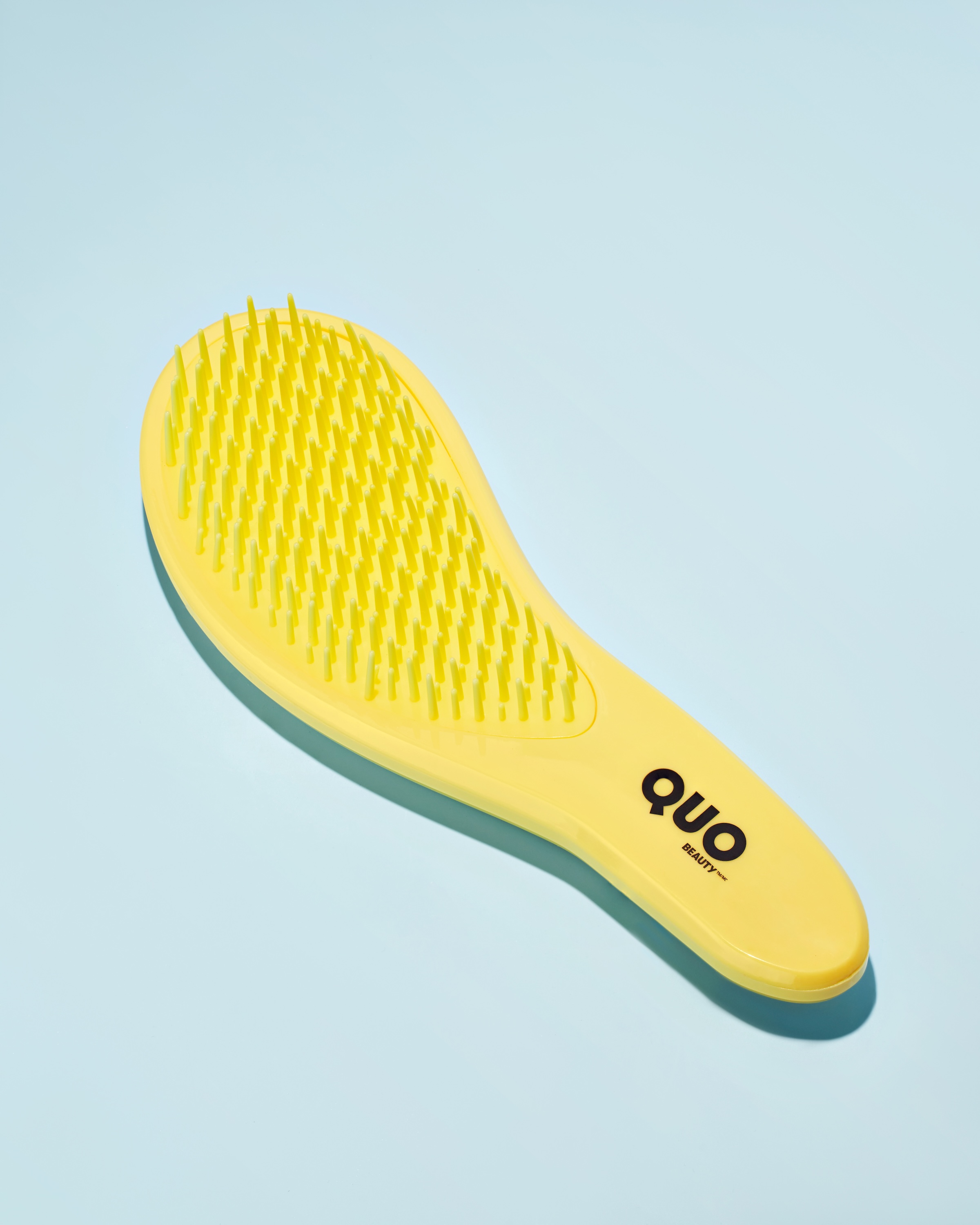
The Execution:
Controlled reflections and color accuracy on recyclable plastic
I built the lighting around controlled reflections. Recyclable plastic can read as flimsy if you let highlights blow out or shadows go too hard, so I flagged the key light to sculpt the ergonomic curves without creating glare streaks. The yellow had to stay saturated but accurate—beauty customers will complain if the online color doesn't match what they pull off the shelf.
I placed a diffused fill opposite the key to keep the tooth detail visible in shadow areas, then added a rim accent to separate the product from the background and give the plastic a premium finish. The angle was deliberate: slightly elevated to show the grip contour and teeth pattern in one frame, so someone scrolling on mobile instantly understands what it does and how it fits in their hand.
Background strategy for multi-channel flexibility
The background choice came from thinking about where these images live. Quo's brand energy is optimistic and trend-forward—not clinical white-lab, not luxury-minimalist. I used a vibrant, saturated backdrop with dramatic shadows to inject editorial attitude while keeping the product sharply described. That balance lets one image flex across placements: crop tight for an Instagram carousel, pull wide for a banner, zoom to teeth detail for a swatch-style social post.
The shadows are graphic but controlled—they add dimension without obscuring function. I shot multiple angles and detail macros to build out what would be a launch-ready photo collection: visuals for campaign use, clean product photos for product pages, and macro crops that prove material quality when shoppers zoom in.
The Application:
One production system serving multiple stakeholders
These images work well for different channels. The shot with colorful background and sculpted shadows could function as paid social creative or email headers—it has the premium feel that catches attention without looking like a luxury brand Quo isn't trying to be. The clean product photos on white would serve as e-commerce foundation images, giving online stores the true-to-life clarity that reduces returns and supports conversion.
The detail macros showing teeth and finish could work as proof-of-quality content for product pages or carousel sequences. Working from Vancouver, I wanted to demonstrate how one production can deliver a cohesive system: photos that scale across SKUs, maintain brand consistency, and answer multiple stakeholders (e-commerce, social, retail media) without requiring separate shoots or endless revisions. It's spec work, but it reflects the repeatable process beauty brands need when they're managing high volume on lean budgets.
The Takeaway:
Solving the premium-without-misrepresentation tension
What this project shows is my ability to solve the core tension in accessible beauty photography: making price-conscious products feel premium without misrepresenting them. I understand how to manage reflections on recyclable plastics, how to keep color true across devices, and how to frame small tools so their function and quality read instantly.
If you're a beauty brand marketing manager in Vancouver juggling launch calendars, SKU volume, and cross-platform image needs, let's talk about building a photography system that makes your products compete visually without blowing your budget. Reach out and we'll map your next collection to a shot list that works everywhere.
<script type="application/ld+json">
{
"@context": "https://schema.org",
"@type": "Service",
"name": "Sustainable Beauty Product Photography with Color-Blocked Compositions and Texture-First Macro Capture",
"description": "Photography system for values-driven beauty brands combining precision color blocking, macro texture capture, and hue-accurate lighting to communicate vegan/cruelty-free claims and drive conversion across hero campaigns, e-commerce, and retail touchpoints.",
"serviceType": "E-Commerce Product Photography",
"provider": {
"@type": "Organization",
"name": "Elina Kustlyvy Photography",
"url": "https://www.elinakustlyvy.com"
},
"areaServed": [
{"@type": "City", "name": "Vancouver", "addressRegion": "BC", "addressCountry": "CA"},
{"@type": "City", "name": "Toronto", "addressRegion": "ON", "addressCountry": "CA"},
{"@type": "City", "name": "Los Angeles", "addressRegion": "CA", "addressCountry": "US"},
{"@type": "City", "name": "Seattle", "addressRegion": "WA", "addressCountry": "US"}
],
"url": "https://www.elinakustlyvy.com/projects/quoskincare"
}
</script>
<script type="application/ld+json">
{
"@context": "https://schema.org",
"@type": "ImageObject",
"contentUrl": "https://cdn.prod.website-files.com/653c048c7bdcdc4c8f4346aa/688d66e6f064450ddac0c312_6879821e5af191086f091d2a_1.jpeg",
"url": "https://cdn.prod.website-files.com/653c048c7bdcdc4c8f4346aa/688d66e6f064450ddac0c312_6879821e5af191086f091d2a_1.jpeg",
"name": "Quo Beauty Tangle Teezer Color-Blocked Product Photography on Periwinkle Background",
"caption": "Vibrant yellow Tangle Teezer photographed against softened periwinkle field with controlled dramatic shadow, showcasing precision bristle arrangement and matte-gloss handle interplay for Quo Beauty's sustainable product line.",
"creator": {
"@type": "Person",
"name": "Elina Kustlyvy",
"url": "https://www.elinakustlyvy.com"
},
"copyrightHolder": {
"@type": "Organization",
"name": "Elina Kustlyvy Photography"
},
"acquireLicensePage": "https://www.elinakustlyvy.com/contact"
}
</script>
<script type="application/ld+json">
{
"@context": "https://schema.org",
"@type": "Brand",
"name": "Quo Beauty",
"description": "Canadian private-label beauty brand established in 2000, relaunched in 2020 with 100% PETA-certified vegan and cruelty-free products across twelve categories, emphasizing sustainability, innovation, and inclusivity at accessible price points.",
"url": "https://beauty1.shoppersdrugmart.ca/Luxury/brands/Quo-Beauty",
"sameAs": [
"https://www.instagram.com/quobeauty/",
"https://www.facebook.com/quobeauty/"
]
}
</script>
<script type="application/ld+json">
{
"@context": "https://schema.org",
"@type": "Product",
"name": "Tangle Teezer Hair Brush",
"description": "Detangling hair brush featuring engineered synthetic bristles with precision mold lines, matte-gloss handle finish, and venting details designed for durability and performance.",
"brand": {
"@type": "Brand",
"name": "Quo Beauty"
},
"category": "Hair Care Tools",
"review": {
"@type": "Review",
"author": {
"@type": "Person",
"name": "Elina Kustlyvy"
},
"reviewRating": {
"@type": "Rating",
"ratingValue": "5",
"bestRating": "5"
},
"reviewBody": "The bristle arrangement shows precision mold lines where clusters meet the base, demonstrating quality tooling rather than commodity manufacturing. The matte-gloss interplay on the handle signals advanced material engineering, while tiny venting details reveal thoughtful design. The uniform synthetic bristles photograph with clarity that substantiates the vegan and cruelty-free performance claims without requiring copy support."
}
}
</script>
<script type="application/ld+json">
{
"@context": "https://schema.org",
"@type": "BreadcrumbList",
"itemListElement": [
{
"@type": "ListItem",
"position": 1,
"name": "Projects",
"item": "https://www.elinakustlyvy.com/projects"
},
{
"@type": "ListItem",
"position": 2,
"name": "E-Commerce Photography",
"item": "https://www.elinakustlyvy.com/projects/ecommerce-photography"
},
{
"@type": "ListItem",
"position": 3,
"name": "Quo Beauty Sustainable Product Photography",
"item": "https://www.elinakustlyvy.com/projects/quoskincare"
}
]
}
</script>
<script type="application/ld+json">
{
"@context": "https://schema.org",
"@type": "WebPage",
"name": "Sustainable Beauty Product Photographer Toronto | Quo Beauty Case Study",
"description": "Case study demonstrating color-blocked product photography, precision macro texture capture, and hue-accurate lighting system for Quo Beauty's vegan, cruelty-free cosmetics line across hero campaigns, e-commerce, and 1,300+ retail touchpoints.",
"url": "https://www.elinakustlyvy.com/projects/quoskincare",
"speakable": {
"@type": "SpeakableSpecification",
"cssSelector": [".article-intro", ".article-conclusion"]
},
"about": [
{"@type": "Thing", "name": "Sustainable beauty product photography"},
{"@type": "Thing", "name": "Color-blocked cosmetics photography"},
{"@type": "Thing", "name": "Macro texture capture for vegan beauty products"}
],
"mentions": [
{
"@type": "Brand",
"name": "Quo Beauty",
"sameAs": "https://beauty1.shoppersdrugmart.ca/Luxury/brands/Quo-Beauty"
},
{
"@type": "Thing",
"name": "Tangle Teezer Hair Brush"
}
]
}
</script>
<script type="application/ld+json">
{
"@context": "https://schema.org",
"@type": "HowTo",
"name": "How to Photograph Beauty Products to Communicate Vegan and Cruelty-Free Claims Visually",
"description": "Technical approach to photographing sustainable beauty products using color blocking, macro texture capture, and precision lighting to substantiate ethical claims without copy dependency.",
"step": [
{
"@type": "HowToStep",
"position": 1,
"name": "Build precision color-blocked compositions with strategic palette choices",
"text": "Select vibrant yellow product against softened periwinkle field to create shelf pop and scroll-stopping contrast. The color pairing does conceptual work: yellow reads energetic and innovative, blue conveys trust and calm, together they skew younger and trend-forward without alienating core demographics. Use precision even-key lighting with minimal fall-off and rigorous white balance calibration to preserve hue fidelity under any downstream color space conversion, ensuring color-accurate imagery holds true across iPhone displays in direct sun or desktop monitors in dim offices."
},
{
"@type": "HowToStep",
"position": 2,
"name": "Capture macro texture passes to reveal material engineering and ethical manufacturing",
"text": "Photograph close-up passes showing precision mold lines where bristle clusters meet the base, the matte-gloss interplay on handles that signals quality tooling, and tiny venting details that suggest engineering rather than commodity manufacturing. The hyper-clarity macro capture reveals surface finish and join lines that become material storytelling—every detail is a small argument for value and durability. By rendering synthetic bristles with clarity and showing their engineered uniformity and precision placement, the imagery makes the vegan case visually: this is advanced material science, not a cost-cutting substitute."
},
{
"@type": "HowToStep",
"position": 3,
"name": "Apply controlled dramatic shadow and off-center composition for hero impact and cross-channel flexibility",
"text": "Use off-center placements to guide the eye along product curves and create negative space that retail teams can use for text or callouts without crowding the hero. Add controlled dramatic shadow crisp enough to add depth but soft enough not to distract, modeling volume and implying three-dimensionality to make flat JPEGs feel tactile. That shadow also reinforces unbreakable narratives subtly—there's an implicit solidity when a product casts weight. The clean, uncluttered set design with no props or distracting textures functions as an eco-signal, aligning with sustainability messaging without needing recycling icons in-frame."
}
]
}
</script>
<script type="application/ld+json">
{
"@context": "https://schema.org",
"@type": "FAQPage",
"mainEntity": [
{
"@type": "Question",
"name": "How do you photograph beauty products to show texture and applicator detail that validates performance claims?",
"acceptedAnswer": {
"@type": "Answer",
"text": "Macro texture capture reveals the precision mold lines where bristle clusters meet the base, the matte-gloss interplay on handles signaling quality tooling, and venting details suggesting engineering rather than commodity manufacturing. This hyper-clarity approach transforms product photography into material storytelling where every surface finish and join line becomes a small argument for value and durability. By rendering synthetic bristles with clarity and showing their engineered uniformity and precision placement, the imagery makes performance cases visually before a shopper reads the product page, substantiating claims like pH-adjusting formulations or fifty-pound force resistance through observable construction quality."
}
},
{
"@type": "Question",
"name": "How can cosmetics product photography visually communicate vegan and cruelty-free claims without relying on copy or certification badges?",
"acceptedAnswer": {
"@type": "Answer",
"text": "Photography can carry ethical narratives implicitly by rendering synthetic bristles with clarity that demonstrates their engineered uniformity and precision placement, making the case that this is advanced material science rather than a cost-cutting substitute. Clean, uncluttered set design with no props or distracting textures functions as an eco-signal, aligning with sustainability messaging without needing recycling icons in-frame. The approach turns vegan and cruelty-free stories into quiet proof points rather than loud declarations, letting the product's material quality and photographic craft speak to the brand's values through observable construction details and refined aesthetic choices that code premium ethics."
}
},
{
"@type": "Question",
"name": "What lighting and color workflow ensures consistent colour accuracy across beauty product SKUs for e-commerce?",
"acceptedAnswer": {
"@type": "Answer",
"text": "Build lighting with precision even key and minimal fall-off, rigorous white balance calibration, and a second fill just bright enough to keep shadows from crushing detail. This approach preserves hue fidelity under any downstream color space conversion, delivering color-accurate imagery that holds true whether displayed on an iPhone in direct sun or a desktop monitor in a dim office. Disciplined color workflows reduce cognitive load on product pages and cut return rates driven by shade or finish mismatches, while maintaining a cohesive visual identity across seasonal launches and thirteen hundred retail locations."
}
},
{
"@type": "Question",
"name": "How does color-blocked product photography help beauty brands position value-priced products as premium?",
"acceptedAnswer": {
"@type": "Answer",
"text": "Strategic color blocking—such as vibrant yellow product against softened periwinkle field—creates immediate shelf pop and scroll-stopping contrast while doing conceptual work. Yellow reads energetic and innovative, blue conveys trust and calm, and together they skew younger and trend-forward without alienating core demographics. In a retail environment saturated with black-and-white minimalist beauty packaging, this palette claims visual real estate and codes premium at a glance. The refined color fields, dramatic but controlled lighting, and design-forward framing establish accessible brands as trend-worthy without tipping into luxury inaccessibility, solving the tension between drugstore pricing and aspirational positioning."
}
}
]
}
</script>

- other recent projects
SKWEEN foundation balm product photography showing accurate shade range and skincare texture
INKAARA water bottle photography capturing hand-drawn illustrations and affirmations for premium kids product marketing
Superjelly supplement shaker bottle and snapback hat detail photography for e-commerce conversion
Superjelly supplement photography using levitation technique and flavor-matched backgrounds for e-commerce
Kristin Ess haircare product photography with controlled highlights and label clarity
Photographing Truly Beauty serum texture with macro dropper sequences for clean beauty e-commerce