The Project:
Menu photography for Sushi Mahana's omakase restaurant
I photographed visuals for Sushi Mahana's restaurant menu in collaboration with an art director building her design portfolio. The project centered on creating a cohesive set of images that would work within a designed menu system while capturing the cultural authenticity and refined aesthetic that defines Mahana's omakase experience. Working from Vancouver, I approached the photography as a support system for the art director's layout work, which meant every image needed to function within a larger visual identity.
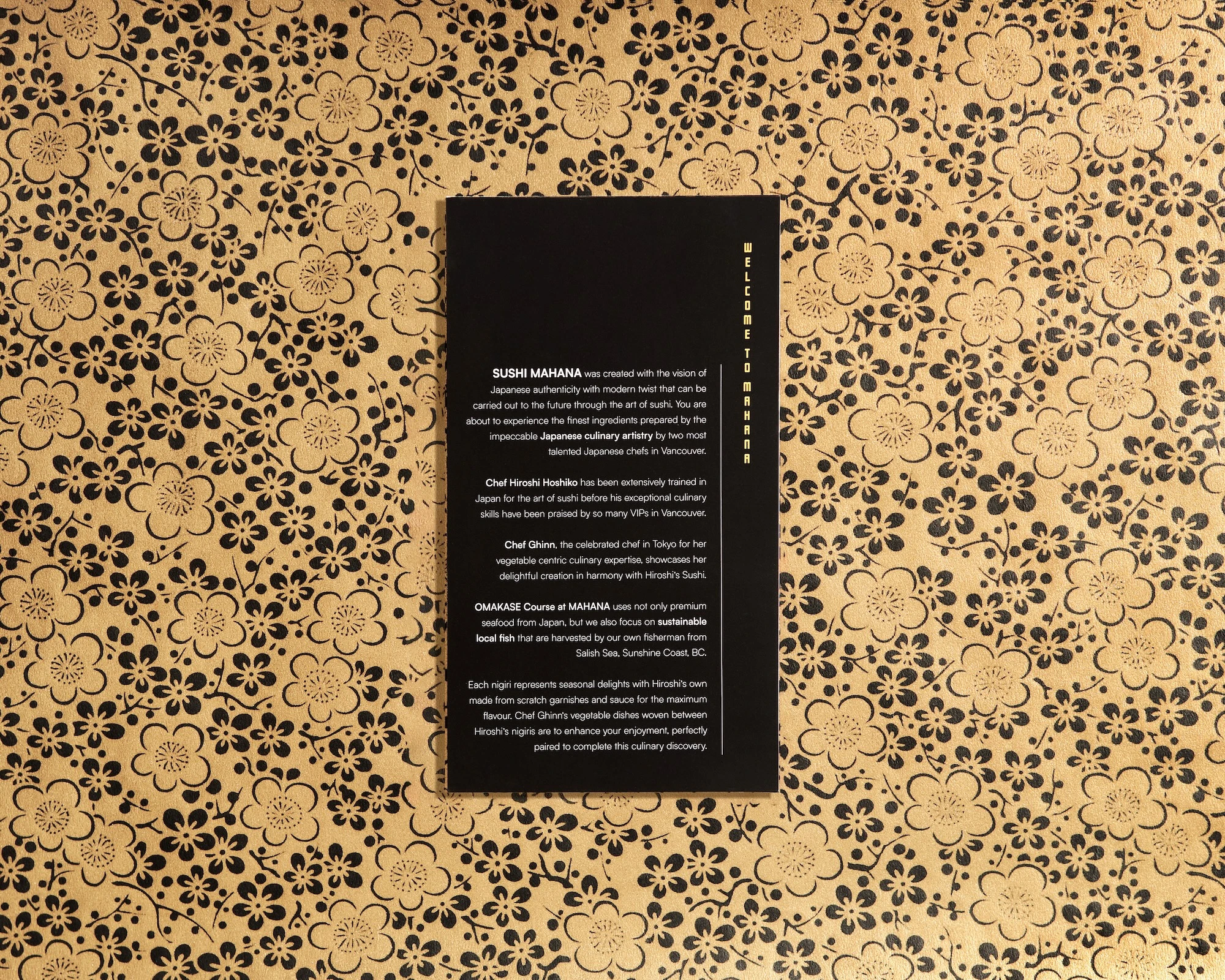
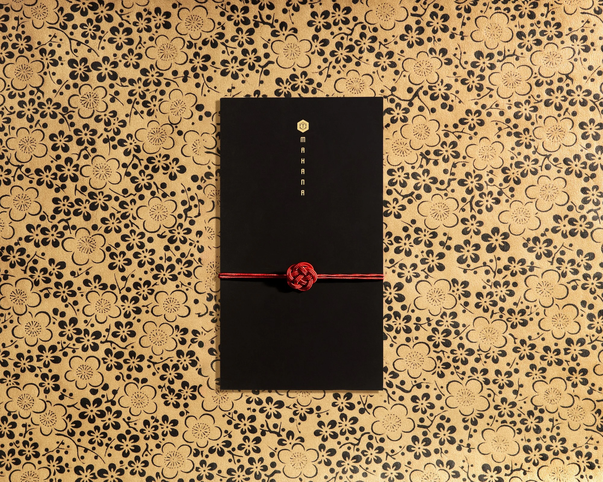
The menu design required images that could integrate seamlessly with typography, accommodate negative space, and maintain visual consistency across multiple pieces. Mahana's brand centers on quiet luxury and Japanese craftsmanship, founded by Yuki Aida, whose fine arts background shapes every detail of the restaurant. The photography needed to reflect that same level of intentionality. I focused on creating images that communicated restraint and precision rather than loud visual statements.
The Approach:
Design-aware photography with layout considerations
My approach started with understanding the art director's layout needs. The images had to leave room for type, maintain legibility against text overlays, and create a consistent rhythm across the menu pages. I built the photography around minimalist compositions with controlled negative space. Every frame considered where headlines, body copy, and graphic elements would sit. The goal was to create images that enhanced the design rather than competing with it.
I used precision flat-lay setups with calibrated lighting to ensure shadow-free results. Lighting consistency matters in menu photography because guests compare images to what arrives at their table. I avoided dramatic shadows or artificial moods that would read as stylized rather than authentic. The lighting setup prioritized accurate color rendering, particularly for fish tones and ceramic surfaces. Mahana uses traditional Japanese ceramics and curated presentation, so the images needed to show those material qualities without glare or blown highlights.
Building a visual system with repetition and restraint
The visual system centered on a singular red accent paired with neutral tones. I composed each frame with symmetrical balance and disciplined spacing. The red cord element appears throughout the collection as a consistent brand thread, tying the menu pages together visually. I shot these details with careful attention to texture in the paper stock, the way the cord catches light, and the tactile quality of traditional Japanese patterned grounds. The repetition creates visual cohesion across the menu without feeling repetitive.
For the food photography, I worked with top-down angles and consistent framing to maintain visual rhythm across courses. Mahana's menu emphasizes Kyushu-style omakase with dry-aged fish, marinades, and seasonal garnishes. The photography had to show those details without making the presentation feel clinical or overly deconstructed. I used macro techniques to capture rice texture, knife work, and the sheen on marinated fish while keeping the overall feel restrained. The images communicate craftsmanship through subtle cues rather than dramatic closeups.
The Execution:
Technical discipline for layout flexibility
Typography legibility drove many of my composition decisions. I left intentional negative space in predictable areas so the art director could place text without crowding the image. The background palette stayed neutral to ensure menu copy remained readable. I maintained separation between the primary subject and the edges of the frame, giving the design flexibility for different crop options if needed. The images function as part of a larger system rather than standalone pieces.
Highlight control was important throughout the shoot. Shiny surfaces like lacquered ceramics, glazed fish, and polished wood can easily blow out or create distracting reflections. I positioned lighting to preserve texture and dimension without creating hot spots. The goal was to show the materiality of each element while maintaining even exposure across the frame. This level of control ensures the images translate well to print, where uncontrolled highlights become solid white areas that flatten the composition.
Photography as modular brand elements
The collection includes both intimate menu details and broader brand storytelling images. Some frames focus on the red cord motif and Japanese graphic elements, establishing visual identity. Others show ingredients and sourcing messages that connect Mahana's Japanese technique with Pacific Northwest locality. I approached these broader frames with the same compositional discipline, using alignment and spacing to create a cohesive visual language across different content types.
Working with an art director meant my photography had to be layout-aware from the start. I delivered images with consistent formats and compositional structure so they could slot into the menu design without forcing awkward crops. The images include built-in margins and breathing room. When the art director places text, headlines, or graphic elements, the composition supports those additions rather than fighting them. This kind of design-forward omakase photography requires thinking beyond individual images to how they function as a system.
The Result:
A scalable visual system for fine dining
The final collection serves multiple purposes beyond the printed menu. The images work as website visuals, press-ready stills, and modular brand elements that Mahana can deploy across different channels. The consistent aesthetic and technical approach mean every image reads as part of the same brand story. A fine dining food photographer has to deliver visuals that justify premium pricing and communicate craft without exaggeration. The photography for Mahana achieves that by mirroring the restaurant's own commitment to restrained excellence and cultural authenticity.
The collaboration resulted in a photo collection that functions both within the designed menu and as standalone brand photography. The visual system scales from small menu details to larger storytelling applications while maintaining the same quiet luxury aesthetic. For restaurants built on precision and cultural integrity, photography has to meet that same standard. If you're looking for a Japanese restaurant photographer in Vancouver who can create cohesive visual systems that support design work and communicate craft authentically, let's talk about your project.
<script type="application/ld+json">
{
"@context": "https://schema.org",
"@type": "Service",
"name": "Omakase Restaurant Brand Collateral Photography with Glare-Free Gold Foil Menu Capture",
"description": "Specialized brand collateral photography for luxury omakase restaurants, delivering glare-free gold foil menu shots, macro packaging details, and cohesive multi-channel asset libraries that communicate Japanese minimalist aesthetics and seasonal authenticity.",
"serviceType": "Fine-Dining Restaurant Brand Photography",
"provider": {
"@type": "Organization",
"name": "Elina Kustlyvy Photography",
"url": "https://www.elinakustlyvy.com"
},
"areaServed": [
{
"@type": "City",
"name": "Vancouver",
"addressRegion": "BC",
"addressCountry": "CA"
},
{
"@type": "City",
"name": "Toronto",
"addressRegion": "ON",
"addressCountry": "CA"
},
{
"@type": "City",
"name": "Los Angeles",
"addressRegion": "CA",
"addressCountry": "US"
},
{
"@type": "City",
"name": "Seattle",
"addressRegion": "WA",
"addressCountry": "US"
}
],
"url": "https://www.elinakustlyvy.com/projects/sushimahana"
}
</script>
<script type="application/ld+json">
{
"@context": "https://schema.org",
"@type": "ImageObject",
"contentUrl": "https://cdn.prod.website-files.com/653c048c7bdcdc4c8f4346aa/688e77e383e2b21625e5ce65_686dd696b7798e3fd70e463c_White-menu-closed(colorshadow2).webp",
"url": "https://cdn.prod.website-files.com/653c048c7bdcdc4c8f4346aa/688e77e383e2b21625e5ce65_686dd696b7798e3fd70e463c_White-menu-closed(colorshadow2).webp",
"name": "Glare-Free Gold Foil Menu Photography for Sushi MAHANA",
"caption": "Closed menu shot using off-axis diffuse lighting to eliminate specular glare on gold foil type while preserving legibility and metallic warmth on matte black stock.",
"creator": {
"@type": "Person",
"name": "Elina Kustlyvy",
"url": "https://www.elinakustlyvy.com"
},
"copyrightHolder": {
"@type": "Organization",
"name": "Elina Kustlyvy Photography"
},
"acquireLicensePage": "https://www.elinakustlyvy.com/contact"
}
</script>
<script type="application/ld+json">
{
"@context": "https://schema.org",
"@type": "Brand",
"name": "Sushi MAHANA",
"description": "A luxury omakase dining experience in North Vancouver founded in January 2023, blending Kyushu-style sushi techniques, design-led ambiance with shou sugi ban finishes and traditional noren, and seasonal ingredients from Japan and the Salish Sea.",
"url": "https://www.nsnews.com/local-news/north-vancouver-sushi-mahana-restaurant-unforgettable-experience-omakase-7712528",
"sameAs": [
"https://nomsmagazine.com/sushi-mahana-opens/",
"https://www.straight.com/food/omakase-meets-art-at-sushi-mahana"
]
}
</script>
<script type="application/ld+json">
{
"@context": "https://schema.org",
"@type": "Product",
"name": "DANRAN by MAHANA At-Home Omakase",
"description": "Premium at-home omakase offering packaged in cedar boxes with 24 pieces of seasonal nigiri and curated sake pairings, featuring red cord closures and gold-stamped branding.",
"brand": {
"@type": "Brand",
"name": "Sushi MAHANA"
},
"category": "Luxury At-Home Dining Experience",
"review": {
"@type": "Review",
"author": {
"@type": "Person",
"name": "Elina Kustlyvy"
},
"reviewRating": {
"@type": "Rating",
"ratingValue": "5",
"bestRating": "5"
},
"reviewBody": "The cedar boxes exhibit fine grain variation with tight joinery, the red cord knot holds tension without fraying, and the gold foil stamp catches light cleanly across the wood surface. The packaging materials photograph with exceptional texture clarity, revealing craft quality that justifies premium positioning in e-commerce thumbnails and gift marketing."
}
}
</script>
<script type="application/ld+json">
{
"@context": "https://schema.org",
"@type": "BreadcrumbList",
"itemListElement": [
{
"@type": "ListItem",
"position": 1,
"name": "Projects",
"item": "https://www.elinakustlyvy.com/projects"
},
{
"@type": "ListItem",
"position": 2,
"name": "Other",
"item": "https://www.elinakustlyvy.com/projects#other"
},
{
"@type": "ListItem",
"position": 3,
"name": "Sushi MAHANA Brand Collateral",
"item": "https://www.elinakustlyvy.com/projects/sushimahana"
}
]
}
</script>
<script type="application/ld+json">
{
"@context": "https://schema.org",
"@type": "WebPage",
"name": "Vancouver Omakase Brand Collateral Photographer — Sushi MAHANA Case Study",
"description": "How glare-free gold foil menu photography, texture-forward macro packaging details, and a cohesive launch asset library helped Sushi MAHANA communicate Kyushu craft and design-led luxury across press, social, and e-commerce channels from day one.",
"url": "https://www.elinakustlyvy.com/projects/sushimahana",
"speakable": {
"@type": "SpeakableSpecification",
"cssSelector": [".article-intro", ".article-conclusion"]
},
"about": [
{
"@type": "Thing",
"name": "Omakase restaurant brand collateral photography"
},
{
"@type": "Thing",
"name": "Glare-free gold foil menu capture"
},
{
"@type": "Thing",
"name": "Japanese minimalist flat lay composition"
}
],
"mentions": [
{
"@type": "Brand",
"name": "Sushi MAHANA",
"sameAs": "https://www.nsnews.com/local-news/north-vancouver-sushi-mahana-restaurant-unforgettable-experience-omakase-7712528"
},
{
"@type": "Thing",
"name": "DANRAN by MAHANA At-Home Omakase"
}
]
}
</script>
<script type="application/ld+json">
{
"@context": "https://schema.org",
"@type": "HowTo",
"name": "How to Photograph Gold Foil Menus Without Glare for Fine-Dining Collateral",
"description": "A disciplined lighting technique to capture gold foil typography on matte black stock with full legibility and metallic warmth, eliminating specular hotspots that compromise reproduction in press and digital channels.",
"step": [
{
"@type": "HowToStep",
"position": 1,
"name": "Position off-axis diffuse light sources",
"text": "Use large softboxes positioned at angles rather than overhead or on-axis to the lens. This prevents direct reflections from the foil surface while maintaining even illumination across the menu. The angle allows the gold to read as warm metallic detail without creating specular flare that obliterates legibility in print or web reproduction."
},
{
"@type": "HowToStep",
"position": 2,
"name": "Add negative fill to eliminate stray reflections",
"text": "Place black cards or flags on the opposite side of the light source to absorb any bounce light that could create secondary hotspots on the foil. This controlled negative fill maintains contrast in the gold type and prevents the matte black stock from picking up unwanted environmental reflections, ensuring the design reads cleanly across all output formats."
},
{
"@type": "HowToStep",
"position": 3,
"name": "Compose on centered vertical axis with negative space",
"text": "Frame each flat lay with the menu centered on a vertical axis and leave generous margins around the edges. This compositional restraint signals luxury through visual breathing room and gives art directors layout flexibility for overlaid type, crop variations, and multi-channel deployment. The controlled black-gold-red palette and grid-based placement ensure consistency across dozens of collateral assets."
}
]
}
</script>
<script type="application/ld+json">
{
"@context": "https://schema.org",
"@type": "FAQPage",
"mainEntity": [
{
"@type": "Question",
"name": "How do you photograph gold foil menus without glare for restaurant press kits?",
"acceptedAnswer": {
"@type": "Answer",
"text": "I use off-axis, diffuse light sources—large softboxes positioned at angles rather than overhead—to illuminate gold foil type without creating specular hotspots. Negative fill on the opposite side eliminates stray reflections, allowing the gold to read as warm metallic detail with full legibility. Each flat lay is shot on a centered vertical axis with generous negative space, ensuring the design reproduces cleanly in print, web banners, and social media without glare that would compromise the brand's premium positioning."
}
},
{
"@type": "Question",
"name": "What does a cohesive launch photo library include for a fine-dining restaurant?",
"acceptedAnswer": {
"@type": "Answer",
"text": "A launch-ready library includes hero images composed with off-center weight for web banners with overlaid type, flat lay collateral shots of menus and signage with controlled lighting, macro texture details of packaging materials like cedar grain and cord knots for e-commerce, vertical and square crops for social media with breathing room for platform UI, and press-ready high-res files with embedded color profiles. Every asset is organized by use case, formatted to channel specifications, and tagged for fast deployment, giving small teams the infrastructure to execute campaigns without sacrificing consistency or quality."
}
},
{
"@type": "Question",
"name": "How do you capture Japanese minimalist aesthetics in restaurant brand photography?",
"acceptedAnswer": {
"@type": "Answer",
"text": "I work with asymmetry balanced by negative space, restrained color palettes (typically black, natural wood tones, and selective accent colors like red), and an emphasis on natural textures such as charred wood finishes, handmade paper, and artisan ceramics with irregular glazes. Ambient shots show how light plays across materials like shou sugi ban walls, while flat lays use compositional grids and generous margins to create visual calm. These choices reflect genuine Japanese minimalist principles rather than surface-level trends, building trust with audiences who can distinguish authentic design fluency from generic styling."
}
}
]
}
</script>

- other recent projects
Lifted Movement complete product line: fitness equipment portfolio photography for brand cohesion
INKAARA kids water bottle photography showing hand-drawn owl and mandala artwork with stainless steel detail
Chanel nail polish photography with macro shimmer detail and marketplace packshots
Bloink board game photography capturing suspended blocks and interactive gameplay moments
Photographing fashion accessories with minimalistic black and white styling for Vancouver brand
Mirror Glaze Dessert Photographer for Premium Online Courses: PastryClass Case Study
.webp)
.webp)
.webp)