Fashion
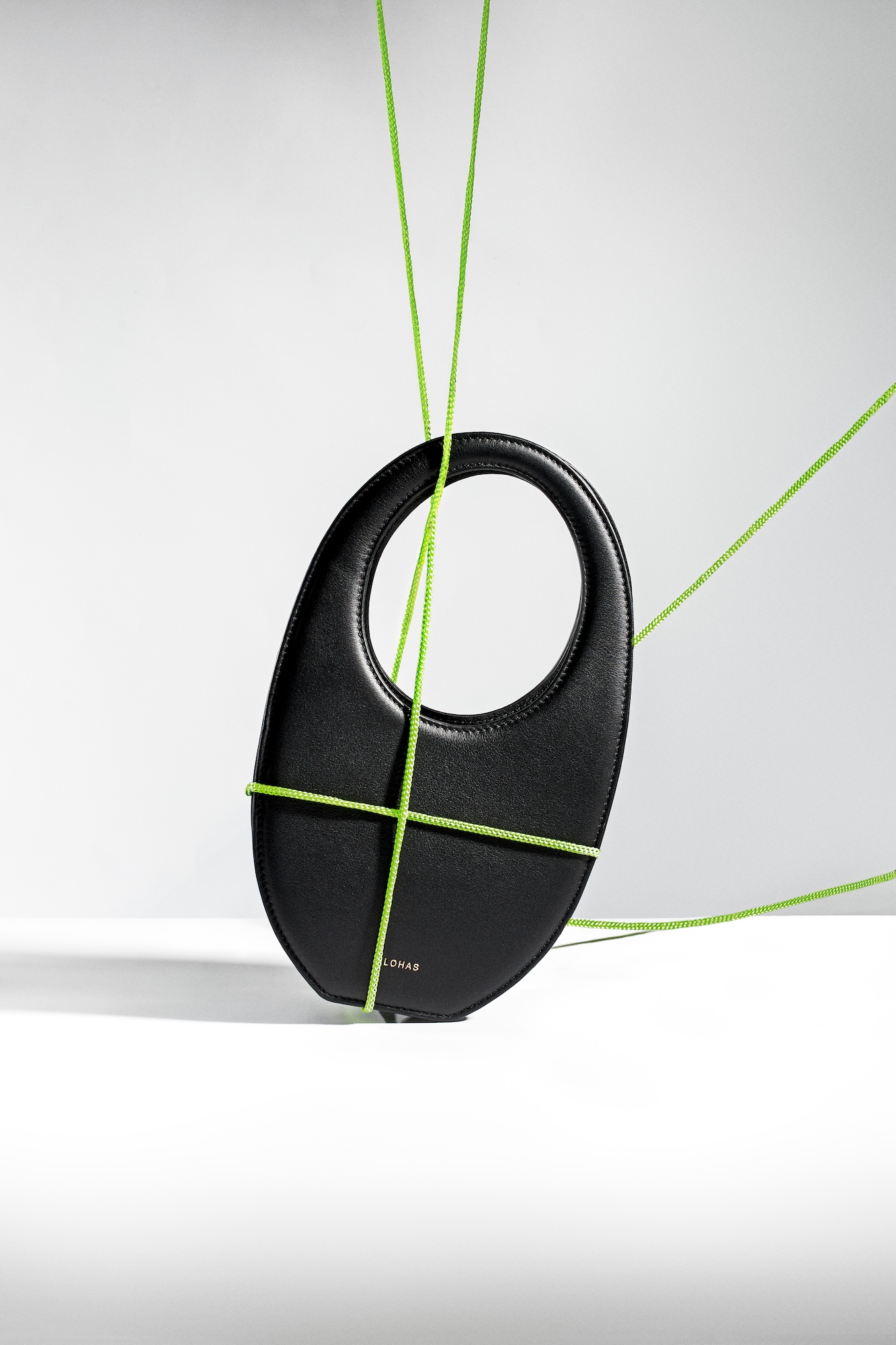
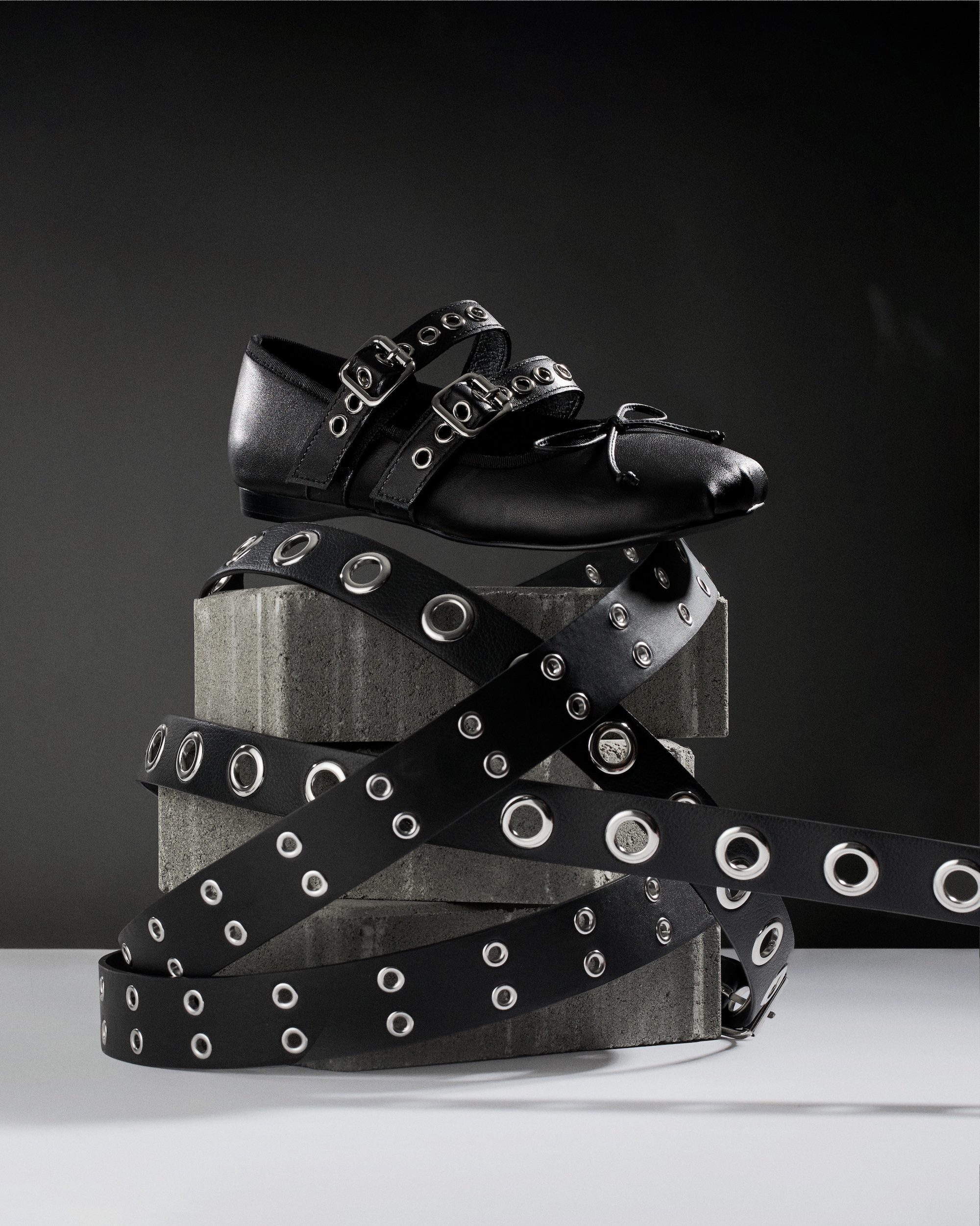
Photographing fashion accessories with minimalistic black and white styling for Vancouver brand
The Assignment:
Why Fashionphile as a creative subject
I chose Fashionphile as a creative subject because they've solved a problem most luxury resale brands ignore: how to look premium while showing exactly what you're selling. As a Vancouver product photographer, I've watched the recommerce space struggle with this tension. Over-retouch the wear and you lose trust, under-light the product and you lose the sale. Fashionphile's model demands images that function as both marketing and evidence. That challenge interests me more than straight beauty work. This is a personal project exploring what that visual balance requires.
The Brief:
Building a photography system that scales without sacrificing honesty
If a brand like Fashionphile needed to build a photography system that scales across thousands of products without sacrificing consistency or honesty, here's how I'd approach it. The business problem isn't just throughput. It's maintaining a premium aesthetic while documenting condition clearly enough to reduce returns and disputes. Resale customers need to assess wear from a screen. That means every listing has to answer the same questions: true color, visible scuffs, readable stamps, in a format that works on product pages, email, and social without reshooting.
The brief I set for myself was: create a photo collection that looks elevated but never hides reality.
The Execution:
High key lighting for clean modern consistency
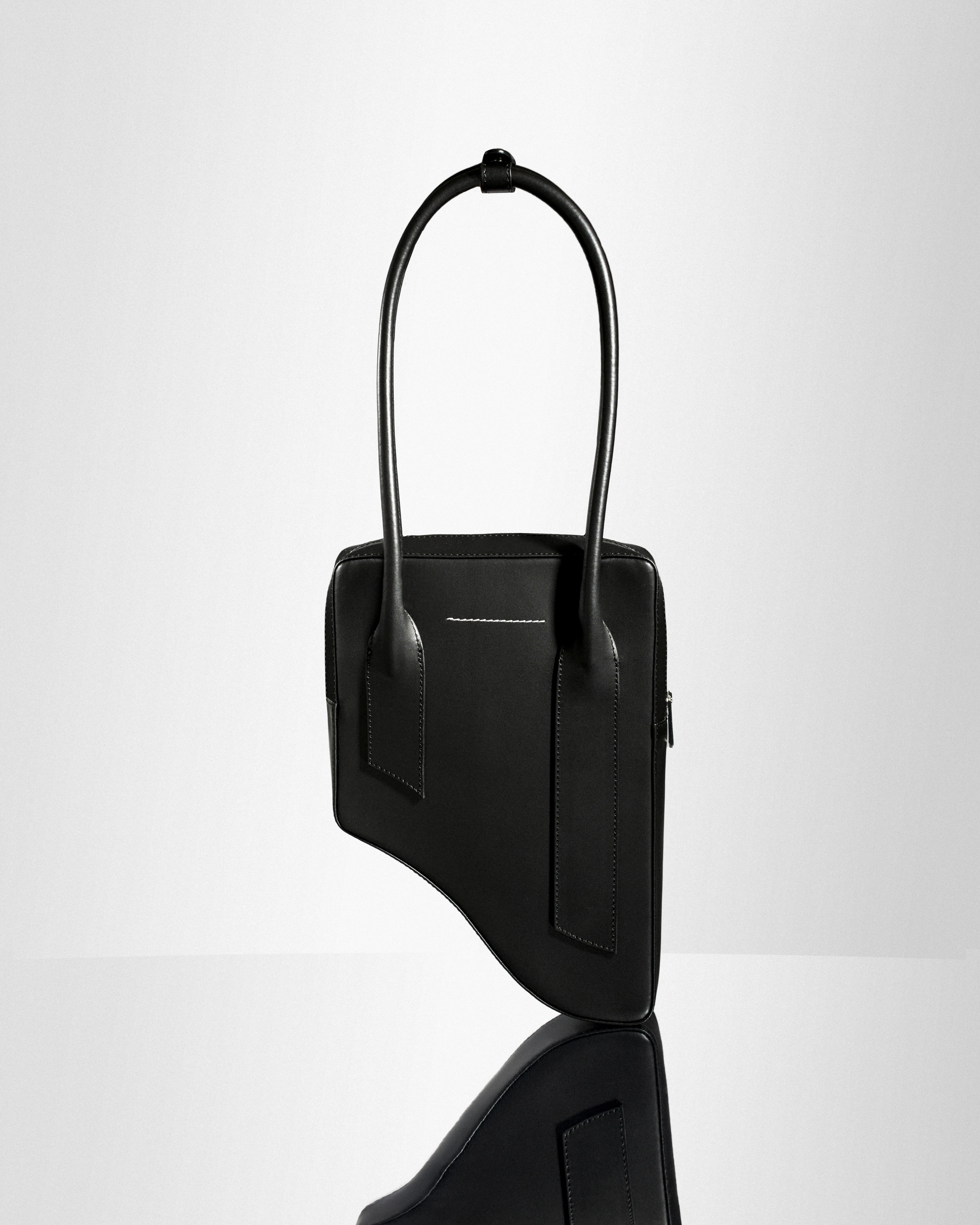
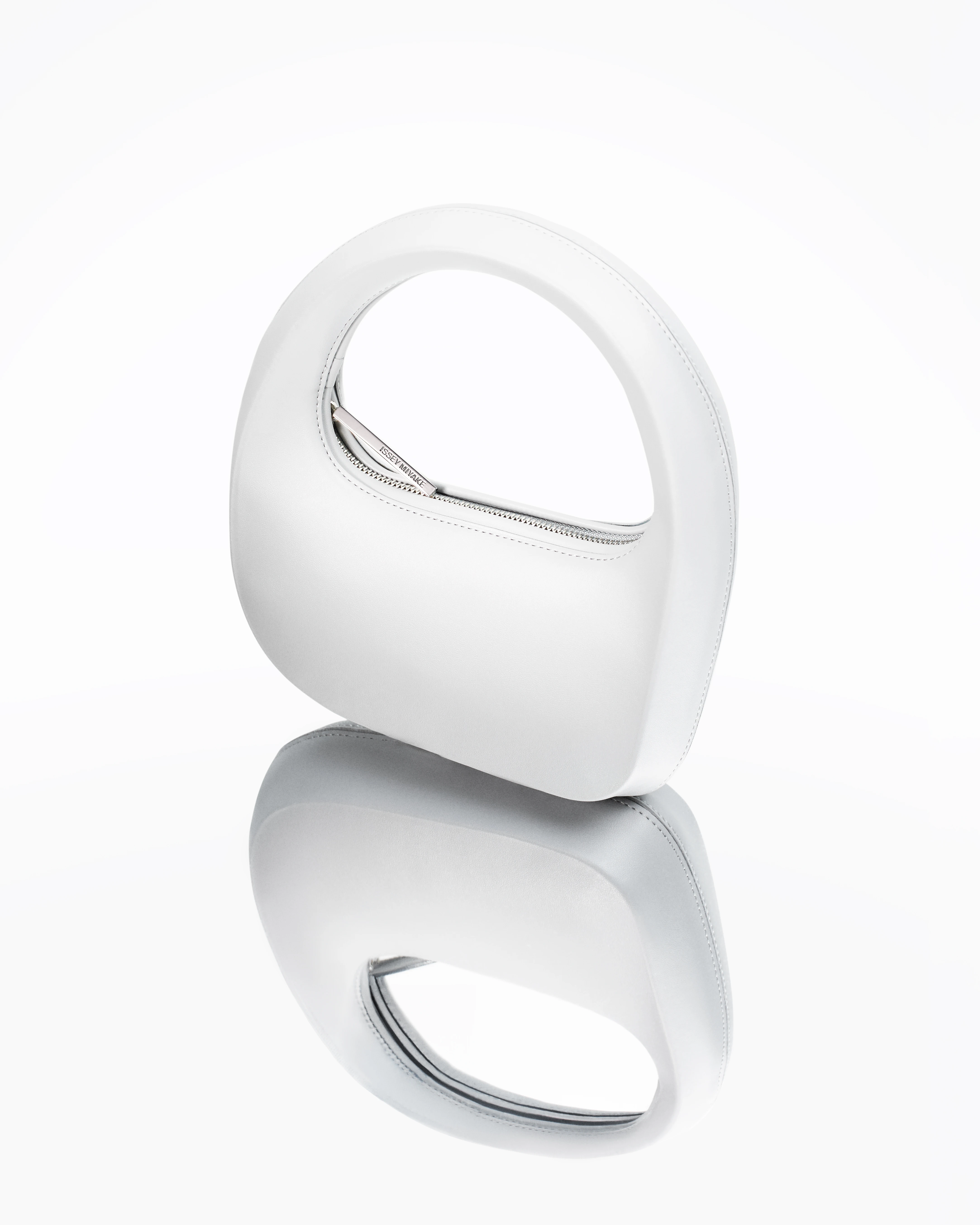
I built the lighting around high-key setups to keep the feel clean and modern. Soft, wrap-around light sources minimized harsh shadows on textured leathers while still defining grain and stitching. For reflective hardware and patent finishes, I flagged highlights to control glare without killing the metallic read entirely. That's important. You need enough specular kick to show the material is glossy, but not so much that buyers can't see scratches or tarnish.
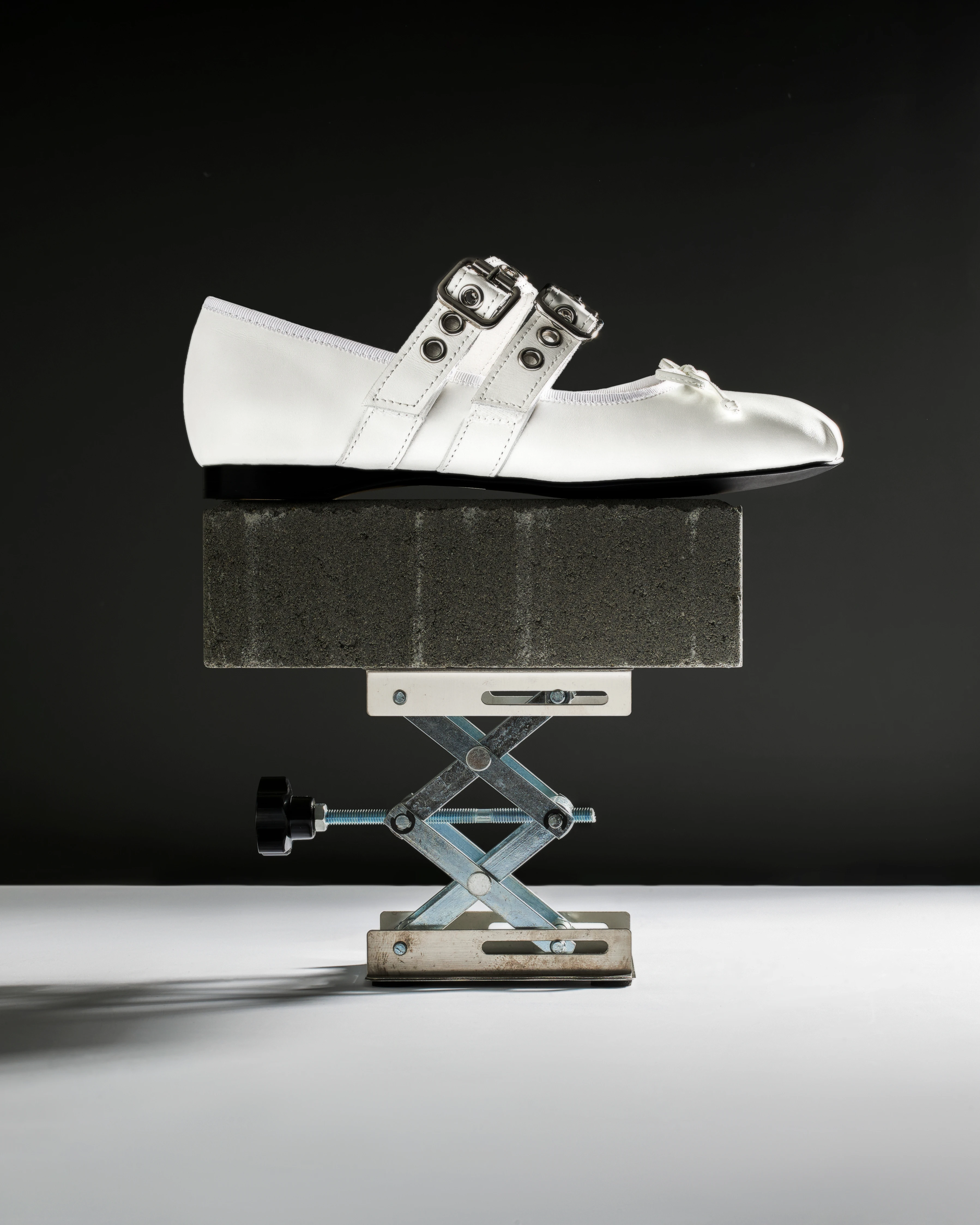
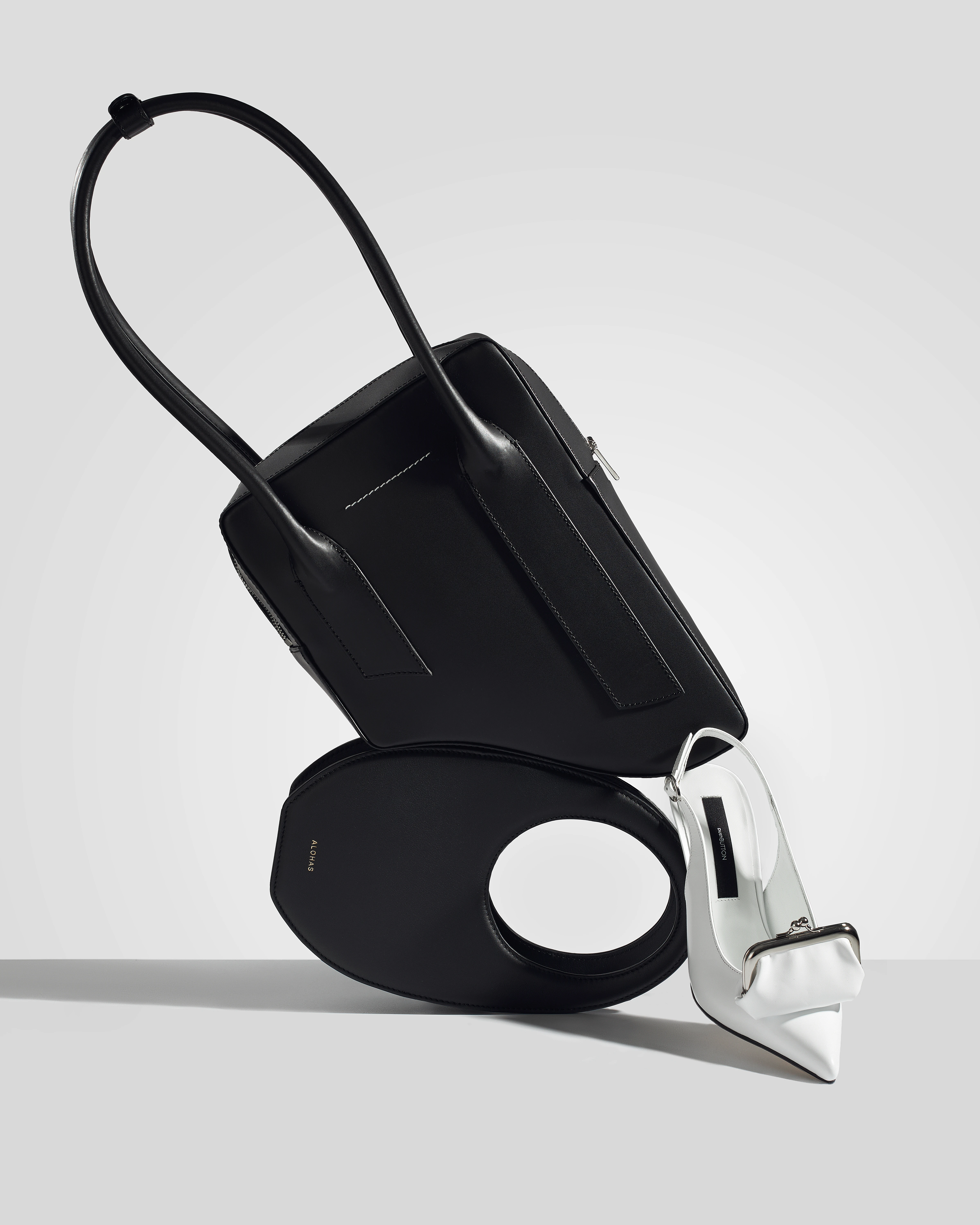
Glass vessels and reflective platforms added depth in a few main frames, creating visual interest without pulling focus from the bag itself. I kept styling minimal: neutral grounds, occasional designed accents like rope or fabric to signal luxury context, but never anything that distracts from condition assessment.
Uniform composition as an operational system
Composition stayed deliberately uniform. I shot centered lateral profiles for silhouette consistency, elevated pedestals to add dimension, and controlled reflections to anchor the frame. The goal was a system: every angle repeatable, every crop predictable. For macro work, I isolated proof points: stitching, edge paint, logo stamps, serial regions, hardware screws. These images function as documentation, not decoration. I shot them at high magnification with enough sharpness that authentication teams could verify details at a glance.
Color management was non-negotiable. I calibrated lighting with gray card targets and locked white balance across the session so neutrals stayed neutral and reds didn't shift orange. In resale, "is this the same color?" drives returns. Precision here matters more than creative flair.
Multi use images designed for different contexts
This collection includes images designed for multiple uses. The elevated shots with reflective treatments and designed accents work well for campaign imagery or email headers, premium enough to compete with full-price luxury marketing. The clean white-background product photos function as product page anchors, giving marketplace listings a consistent, trustworthy look. The macro detail images could serve as proof-of-condition modules or social cutdowns focused on craftsmanship.
I avoided over-retouching. Wear is visible where it exists. Lighting reveals texture honestly. That approach would align with any brand positioning itself on transparency and authentication, especially in a B-Corp or sustainability-focused market where misleading visuals kill credibility. This is spec work, but it demonstrates what a scalable luxury resale photography system requires: technical control that sustains trust without sacrificing aspiration.
The Takeaway:
Balancing competing demands in resale photography
What this project shows is my ability to balance competing demands: speed and precision, volume and consistency, honesty and appeal. I understand that resale photography isn't fashion photography. It's a different discipline. The images have to prove condition while still making someone want to buy. That means controlled lighting for difficult materials, repeatable compositions for operational efficiency, and a retouching philosophy that never crosses into deception.
If you're running a luxury resale brand in Vancouver or anywhere else and your current photography creates friction, returns because color didn't match, bottlenecks because consistency varies, or lost sales because the product looks flat, I'd love to talk about what a better system looks like. Reach out and let's build something that works.
