
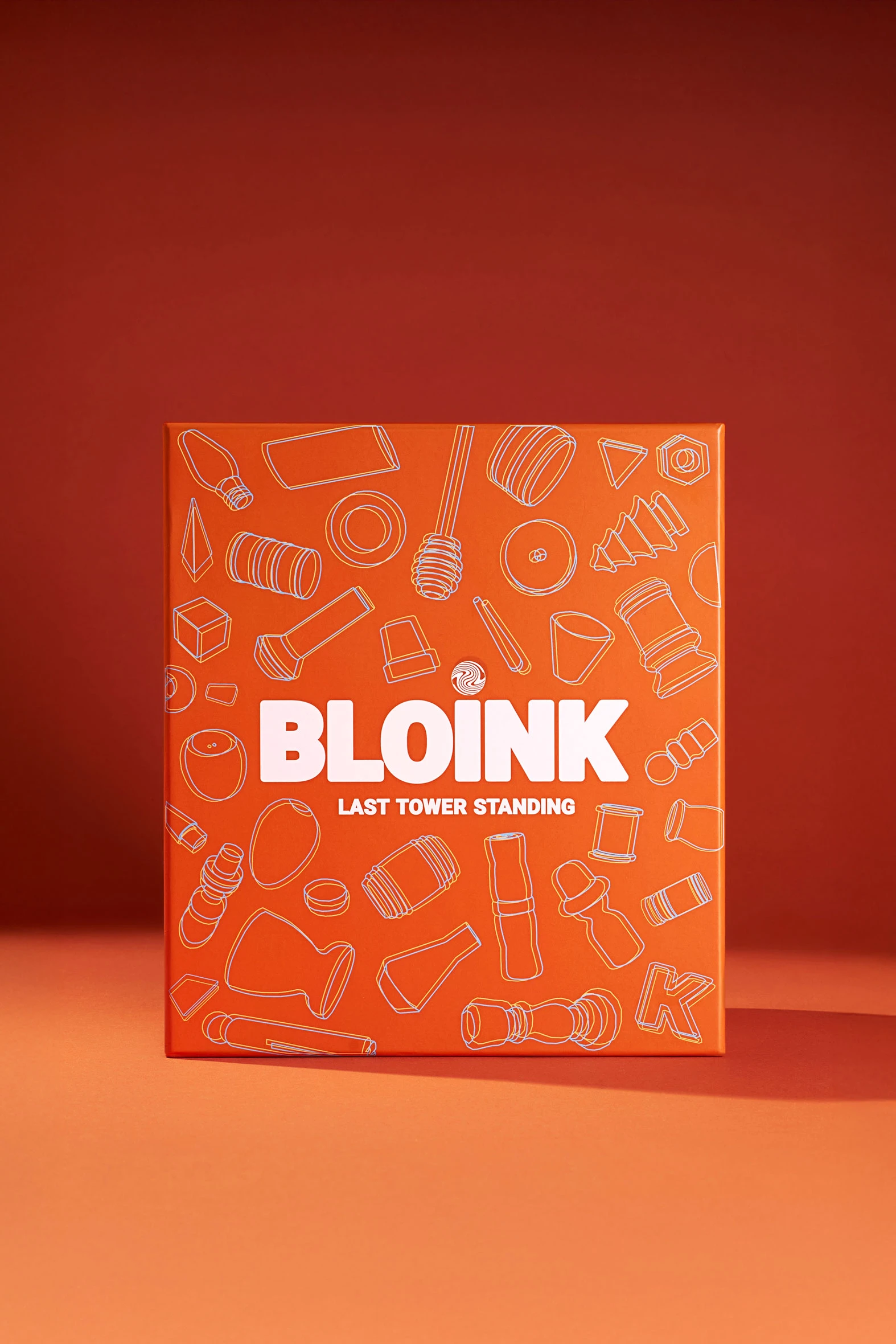

Bloink
Bloink board game photography capturing suspended blocks and interactive gameplay moments

The Project:
Building a visual system for a strategic block-stacking game
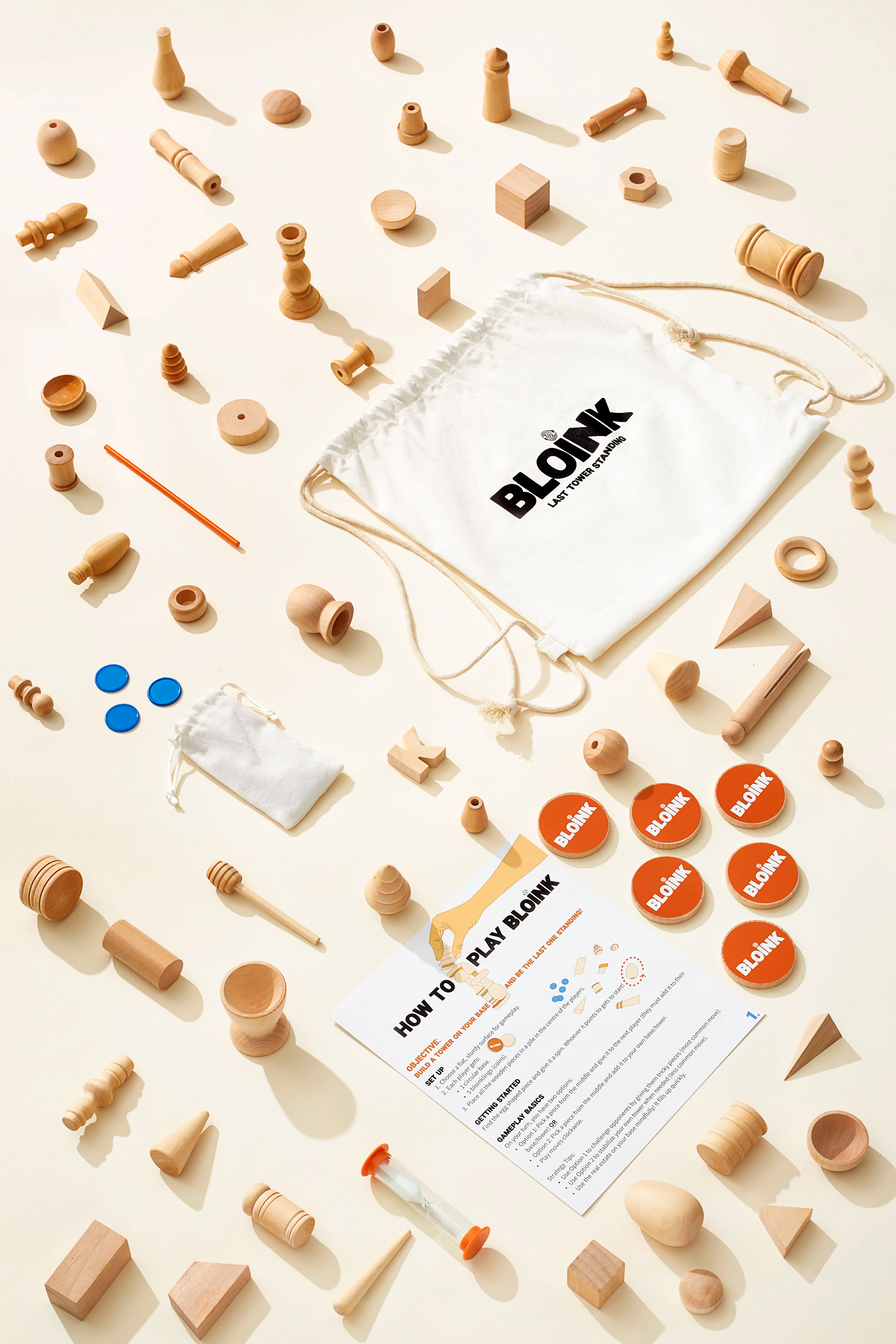
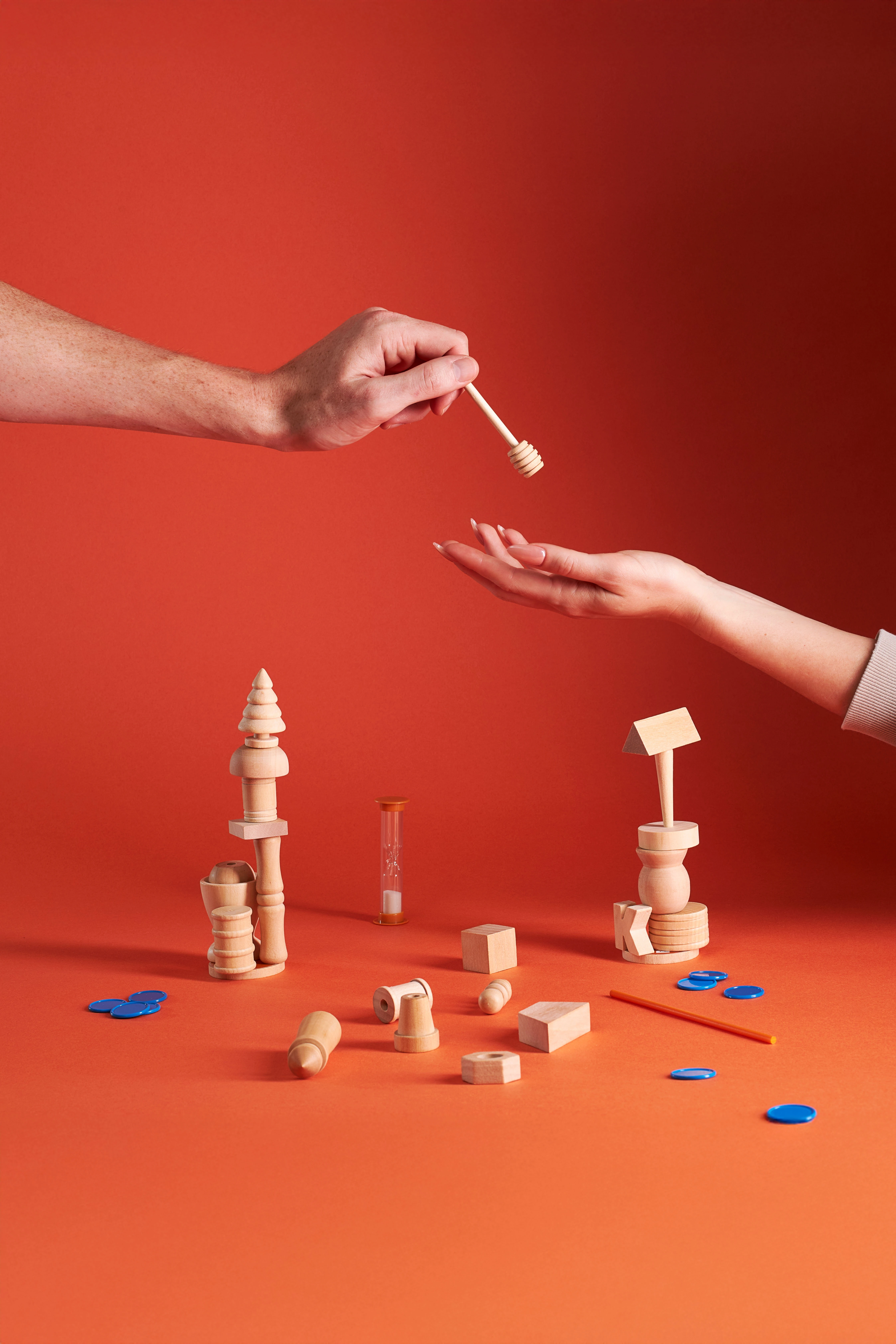
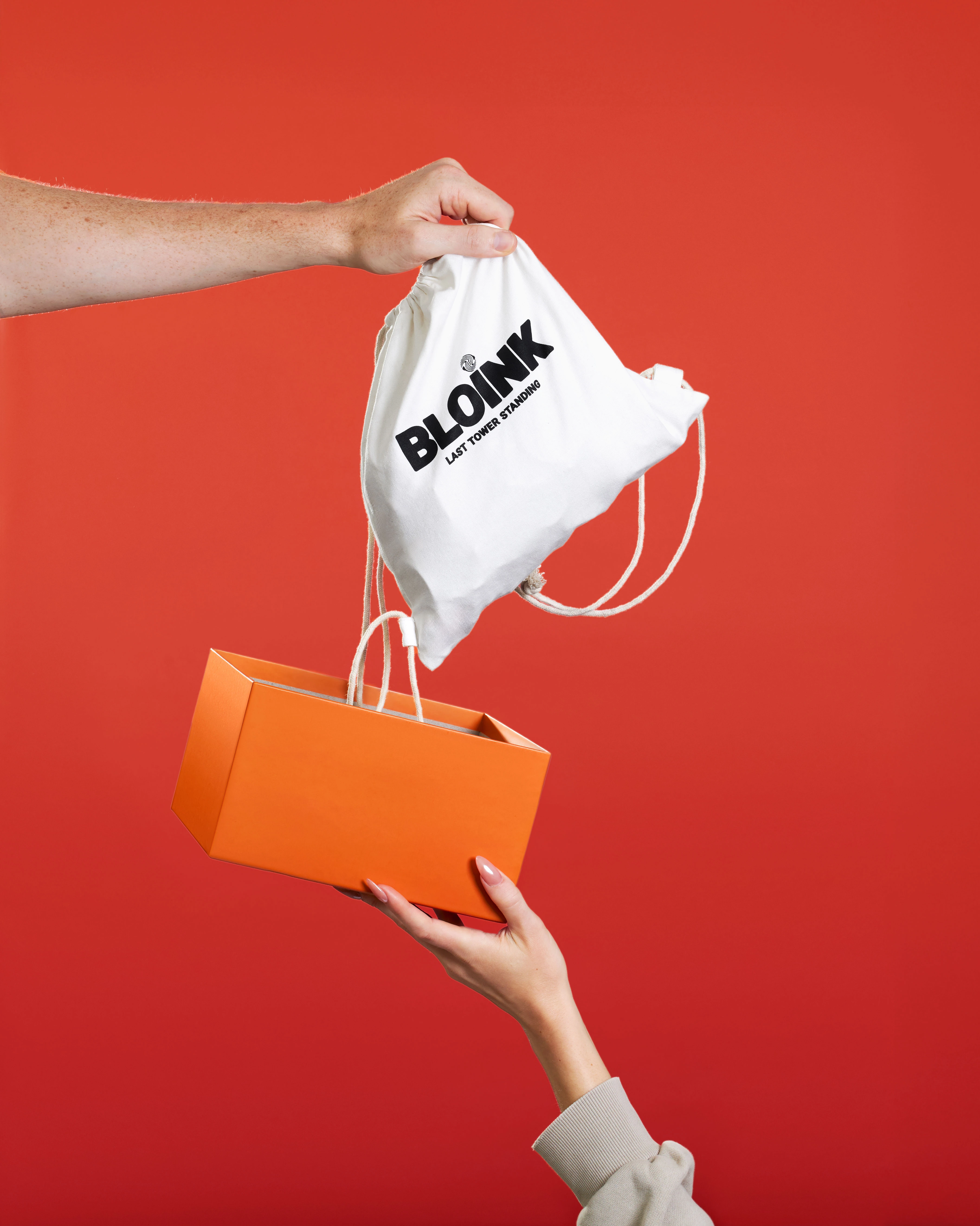
I photographed Bloink, a block-stacking game from Western Canada, creating visuals that capture the emotion and drama of gameplay while serving practical e-commerce needs. The brand combines premium wooden components with strategic mechanics, positioning itself beyond simple dexterity games. My work centered on building a complete visual system: levitation images showing blocks mid-motion, grouped component shots of the rod, hourglass, base, coins, and box contents, plus interaction shots with hands engaging the game. The shoot spanned two days: one focused on hands and models, the other on pure product photography. Images are being used across Bloink's website and broader marketing materials.
The Challenge:
Communicating craftsmanship and competitive tension across platforms
The brand's 56 uniquely shaped wooden pieces and tactical gameplay elements required photography that communicated both craftsmanship and competitive tension. Working from Vancouver, I approached the project by separating human interaction from product precision, ensuring each type of shot maintained clarity while serving different platform needs. The levitation work demanded careful rigging and lighting to visualize instability without looking staged. Component photography needed to show wood grain, machining quality, and the variety of shapes in a way that read premium, not handmade. The hands-in-frame shots balanced showing how the game is played with keeping the product itself the visual anchor.
The Execution:
Three lighting setups for drama, clarity, and impact
I built the lighting around three distinct setups. Sculpted shadows created drama for the levitation sequences, making suspended rods and falling coins feel urgent. Soft, even illumination revealed texture in the macro component work, letting wood grain and precise edges speak to quality. High-key setups with bold orange and red backgrounds made the blue game tokens and natural wood pop, creating immediate visual separation from nostalgic competitors. Each lighting choice supported a specific job: drama for campaign images, clarity for store pages, and impact for social feeds.
Composition strategies for multiple use cases
Composition shifted between completeness and theater depending on the image's purpose. Flat lays showed every component cleanly, answering the "what's included" question for online shoppers. Gravity-defying moments featuring an hourglass suspended mid-air and coins scattering visualized gameplay tension in a single frame. Reveal gestures featuring the branded drawstring bag and box gave the unboxing moment weight. Throughout, I maintained negative space for flexible cropping and kept brand elements visible without cluttering the frame. Color contrast between warm wood and saturated backdrops ensured the product stayed legible across different uses.
Two-day structure for consistency and control
The two-day structure let me control consistency while addressing very different visual goals. Day one captured human interaction: hands poised to place a block, moments of concentration, the social dynamic of gameplay. These lifestyle shots needed natural hand placement and clean backgrounds, showing the experience without losing product clarity. Day two focused entirely on components: the precision needed for store images, the drama needed for campaign work, the detail needed to justify mid-premium pricing. As a Vancouver product photographer, separating these sessions meant each could be lit and styled appropriately without compromise.
The Results:
A cohesive visual language across e-commerce, campaigns, and social
I delivered a complete photo collection spanning e-commerce product photography, campaign imagery, and social content. The grouped component shots give online stores the clarity needed for purchase decisions. The levitation and motion work provides marketing teams with imagery that communicates stakes and strategy. The hands-in-frame sequences humanize the experience, showing the game as something people actually play and enjoy. Together, the collection gives Bloink a cohesive visual language across platforms: from website product pages to paid ads to campaign modules.
The Takeaway:
Different platforms demand different visual approaches within one brand system
This type of tabletop game photography requires understanding that different platforms demand different visual approaches, but all images must feel like one brand. Store pages need accuracy and completeness. Social feeds need immediate impact. Campaign work needs emotion without sacrificing product legibility. The technical challenge is making wood look rich under controlled lighting, capturing motion without blur, and keeping compositions clean enough for flexible use. The strategic challenge is communicating "premium" and "strategic" in a category dominated by casual dexterity games.
If you're launching a board game and need product photography that works across your website, ads, and campaign materials, reach out to discuss your project.


