Mandu
Photographing Mandu skincare products with models showing natural skin radiance

The Challenge:
Why frozen dumplings need a visual system, not just pretty pictures
I chose mandu as a creative subject because frozen dumplings face a visual problem most brands ignore: they can look heavy, generic, or flat on crowded digital shelves. Korean mandu sits at an awkward intersection. It's traditional enough to trigger authenticity concerns, modern enough to need mass-market appeal, and differentiated by details (thin wrappers, diced filling) that vanish under bad lighting. I wanted to explore whether disciplined composition and high-contrast lighting could make frozen product photography feel as premium and intentional as the product itself.
The brief I set for myself centered on a single question: if a CPG frozen dumpling brand needed images that performed across e-commerce and paid social without looking interchangeable, what would that system look like? As a Toronto product photographer, I see brands spending budget on mismatched shoots that don't scale. The challenge wasn't just to make mandu look appetizing. It was to build a visual language that could differentiate Korean dumplings from the potsticker wall, read cleanly at thumbnail size, and give marketing teams a repeatable framework for SKU families and seasonal launches.
The Execution:
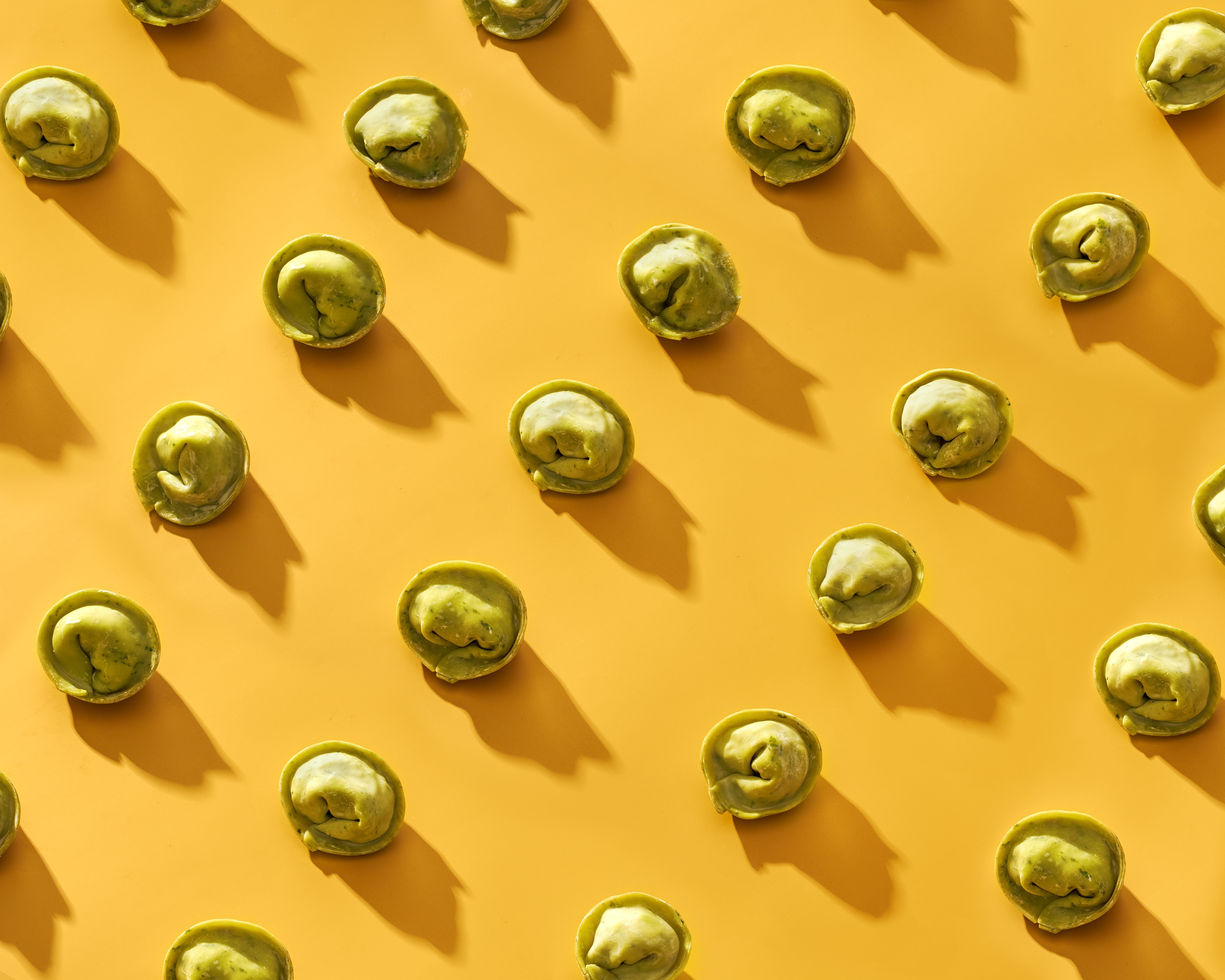
High contrast lighting and geometric precision as strategic tools
I built the lighting around high-contrast setups that carved dimensional shadows and emphasized wrapper translucency. Bright, directional light from above created a clean, appetizing sheen without crossing into grease. The goal was to show surface crispness and material clarity, two things that signal quality in frozen foods but disappear under soft, diffused lighting. I used overhead, symmetrical compositions because they eliminate visual noise and force the product to carry the frame. When you're designing for digital shelf performance, simplicity isn't aesthetic. It's strategy.
Color blocking became the structural foundation. A saturated yellow field set high contrast against green mandu, making the product pop instantly and giving the composition a modern, graphic feel. This approach would work well for brands that need to cut through the visual clutter of retailer sites and social feeds. I controlled repetition and spacing to suggest order and precision, reinforcing the brand story of craftsmanship without relying on messy cross-sections or over-styled garnishes. The diced filling texture stayed implied through restraint: clean surfaces and controlled geometry instead of exposed interiors.
Building a modular content system for SKU complexity
This approach could function as a scalable content system. The images work well for campaign visuals, product pages, and social formats because they share consistent lighting, spacing, and color logic. A brand could shoot a base set using this method and then swap minimal elements (garnish cues, sauce pairings, subtle prop accents) to signal plant-based, halal, or gluten-free variants without redoing the entire production. That modularity matters when you're managing SKU families under tight timelines and need photos that stay compliant across different e-commerce platforms.
The Results:
Photography that performs across channels and brand touchpoints
The collection includes images designed for multiple uses. Overhead symmetry delivers sharp thumbnail readability, which supports the click-through rates that CPG marketers track. High-contrast lighting and dimensional shadows give the product enough depth to feel premium in paid ads while staying clean enough for white-background product page requirements. Controlled color planes and geometric layouts position the brand as globally fluent and design-forward, sidestepping dated cultural clichés while keeping Korean identity legible. These are the visual moves that help frozen food brands compete on quality perception, not just price.
This project demonstrates what happens when you treat food photography as a system, not a one-off shoot. Frozen dumpling brands need images that prove quality, differentiate from competitors, and scale across different channels without constant reshoots. If your brand is managing SKU complexity, launching in new markets, or trying to lift e-commerce performance with better creative, let's build a visual toolkit that works as hard as your product. Contact me to discuss your next CPG frozen dumpling photography project.


