Pierre Hermé's Paris - Macarons
Pierre Herme macaron photography using gradient backgrounds and product stacking

The Brief:
Building a visual system for luxury patisserie under seasonal pressure
I chose Pierre Hermé Paris as a creative subject because they've solved a problem most luxury food brands still struggle with: translating flavor innovation into visual language that justifies premium pricing without looking gimmicky or trend-driven. Their macarons are built around what founder Pierre Hermé calls "flavor architecture," unexpected pairings like rose, raspberry, and lychee in the Ispahan, or miso with chocolate, and that layered sensory complexity deserves imagery as precise as the pastry itself. As a Paris-based luxury food photographer, I wanted to explore how photography could make those invisible qualities (craftsmanship, balance, innovation) tangible across campaign and e-commerce touchpoints. This is a personal project, not commissioned work, but it reflects the strategic challenge brands like Pierre Hermé face every season.
If a brand at this level needed to launch a macaron collection, the brief would start with a core tension: macarons are small, delicate, and unforgiving on camera. Minor color shifts make them look artificial. Overstyling drifts into messy social media tropes that undermine luxury codes. And the brand has to work globally (Paris, Tokyo, Dubai) across print, web, and social formats, often under tight seasonal deadlines. The brief I set for myself was to build a single visual system that could generate main campaign images, editorial still lifes, texture macros, and e-commerce photos from one controlled production approach. The work needed to communicate "haute pâtisserie" without relying on heavy copy or over-the-top styling, and it had to preserve the minimalist, architectural elegance Pierre Hermé is known for.
The Execution:
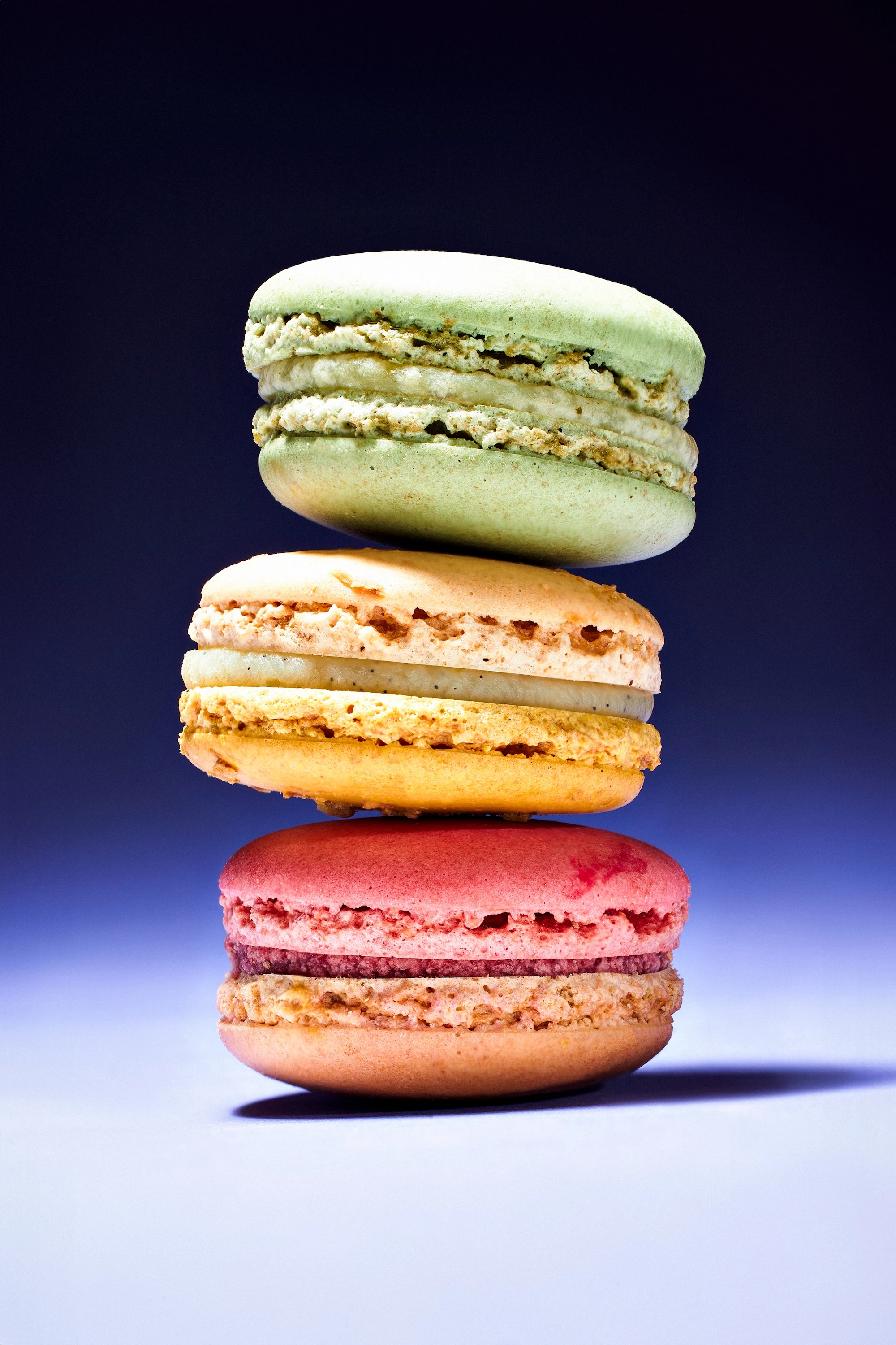
Soft side lighting and gradient backdrops as structural foundation
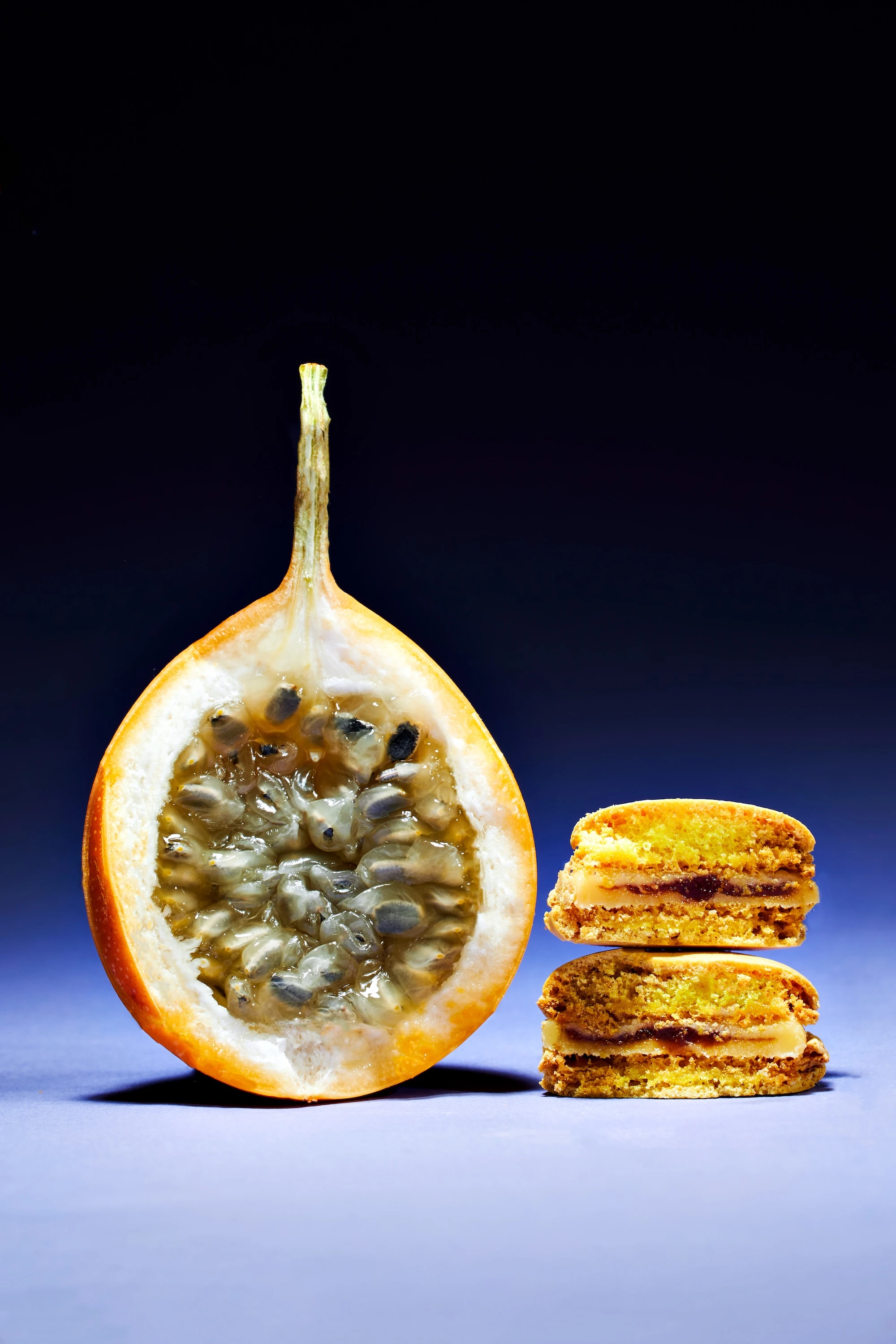
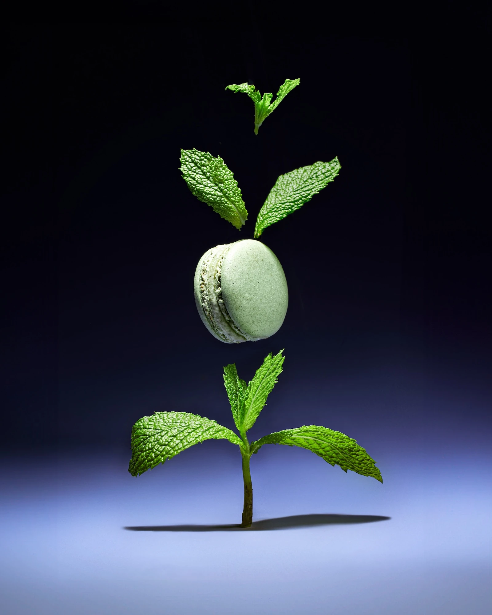
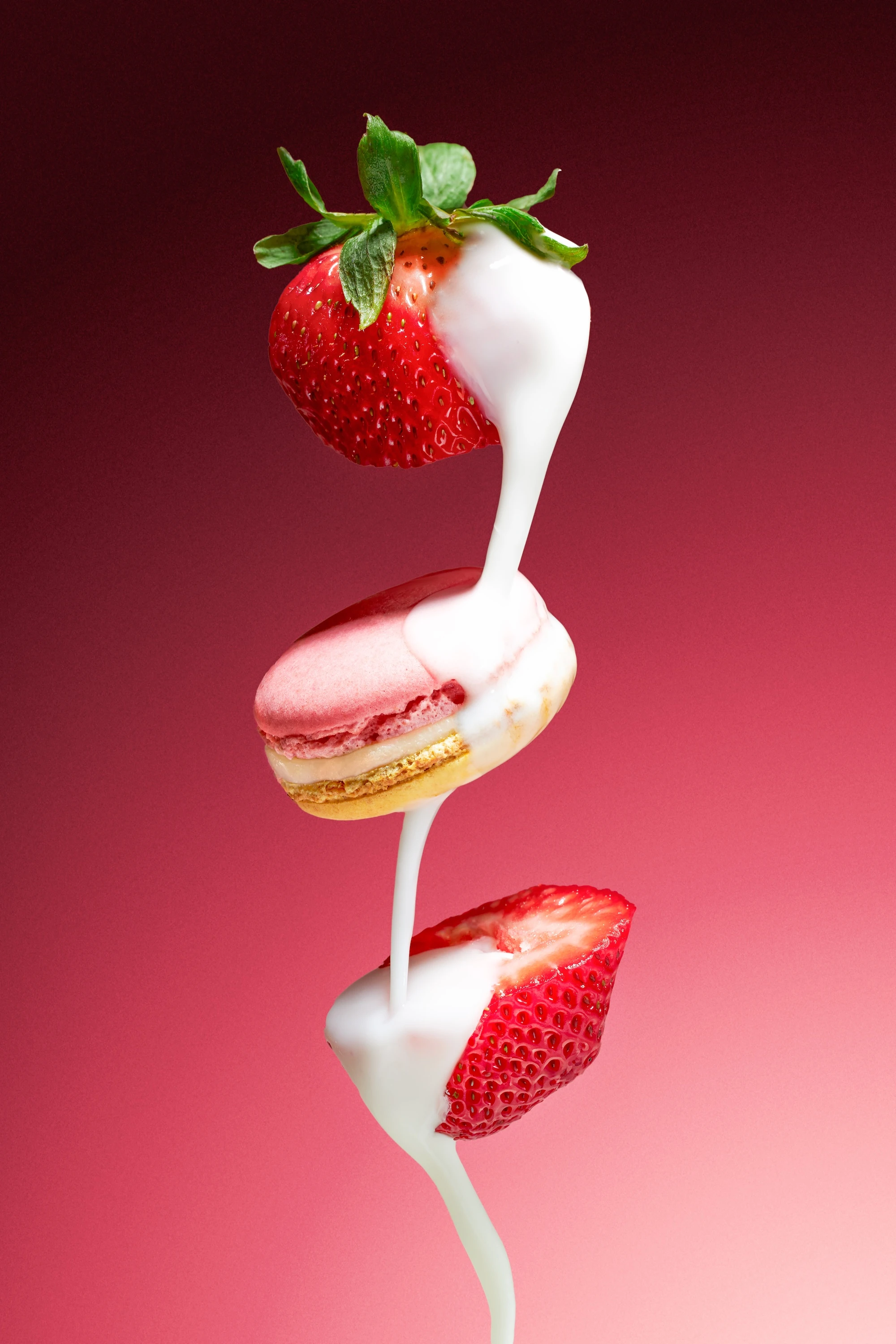
I built the lighting around soft side-lighting to sculpt the macaron shells, fillings, and fresh ingredients without harsh speculars or muddy whites. Directional light from camera left carved out the shell ridges and ganache shine while keeping the highlights clean. I used a graduated dark backdrop (charcoal fading to black) to create depth and negative space that frames the product as a luxury object, not just dessert. That gradient also gives creative directors copy-safe fields for headlines and lockups without crowding the composition. For the ingredient pairings, I worked with pristine passion fruit, mint, strawberries, and cream to signal the brand's flavor-led approach. Translucent fruit seeds, glossy cream flow, and selective focus amplified color fidelity and micro-texture in a way that feels premium, not generic.
Composition followed fashion-level discipline. I shot stacked macarons vertically to add movement and architectural polish while maintaining order. Levitation setups (macarons suspended mid-air, cream flowing between layers) introduce dynamism without losing minimalist restraint. Controlled contrast and disciplined negative space keep the gaze locked on the subject, and every frame was art-directed to work in different crops: square for social formats, horizontal for web banners, and vertical for stories and print. I avoided the "messy crumbs and drips" aesthetic that feels trendy but conflicts with a luxury positioning, instead leaning into precision and balance.
Community input as curatorial filter, not creative compromise
Before shooting, I crowdsourced one-word prop suggestions from social media followers (fabric, flowers, textures) without revealing the product. That method let me test community engagement in a way that still gave me curatorial control. I could incorporate ideas that aligned with Pierre Hermé's codes (rose petals for Ispahan, cocoa for Mogador) and discard anything that felt off-brand. It's a useful tactic for brands balancing social participation with the need to protect their visual authority. For this series, I kept the approach minimal: fresh ingredients over decorative props, and every element had to justify itself as a flavor cue or textural contrast.
The Output:
Campaign architecture built for speed and multi-format deployment
The images work as a launch-ready collection. The main stack on dark gradient could function as a campaign key visual for outdoor advertising or digital banners. Ingredient still lifes pair product with flavor signals (passion fruit for Mogador, mint for chocolate-herb combinations) and could serve editorial features, email campaigns, or brand storytelling online. Levitation and flow shots add conceptual polish for high-impact social posts or brand manifesto content. Texture macros zoom in on shell feet, ganache sheen, and delicate inclusions to prove craftsmanship in a format that performs well on feeds and carousels. E-commerce photos deliver clean product angles with consistent lighting and spacing for product pages and thumbnails. Copy-safe banners in multiple formats mean the photos can deploy across web, print, and paid social without reshoots. This approach would work well for a brand managing frequent seasonal drops (Valentine's, Ramadan, Christmas) where speed and consistency matter as much as creative impact.
Why It Works:
Precision meets storytelling in a scalable production model
What this series demonstrates is my ability to translate luxury codes into a repeatable visual system. I can handle the technical precision macaron product photography demands (color accuracy, texture fidelity, controlled highlights) while still building in conceptual storytelling that elevates the brand beyond simple product photos. The work balances restraint and sensory intrigue, which is what high-end patisserie photography requires. If you're launching products that justify premium pricing through craft and innovation, and you need imagery that works globally across campaign and commerce, let's talk about your next collection.


