The Project:
Holiday beverage photography for Swan Dive sparkling hard tea
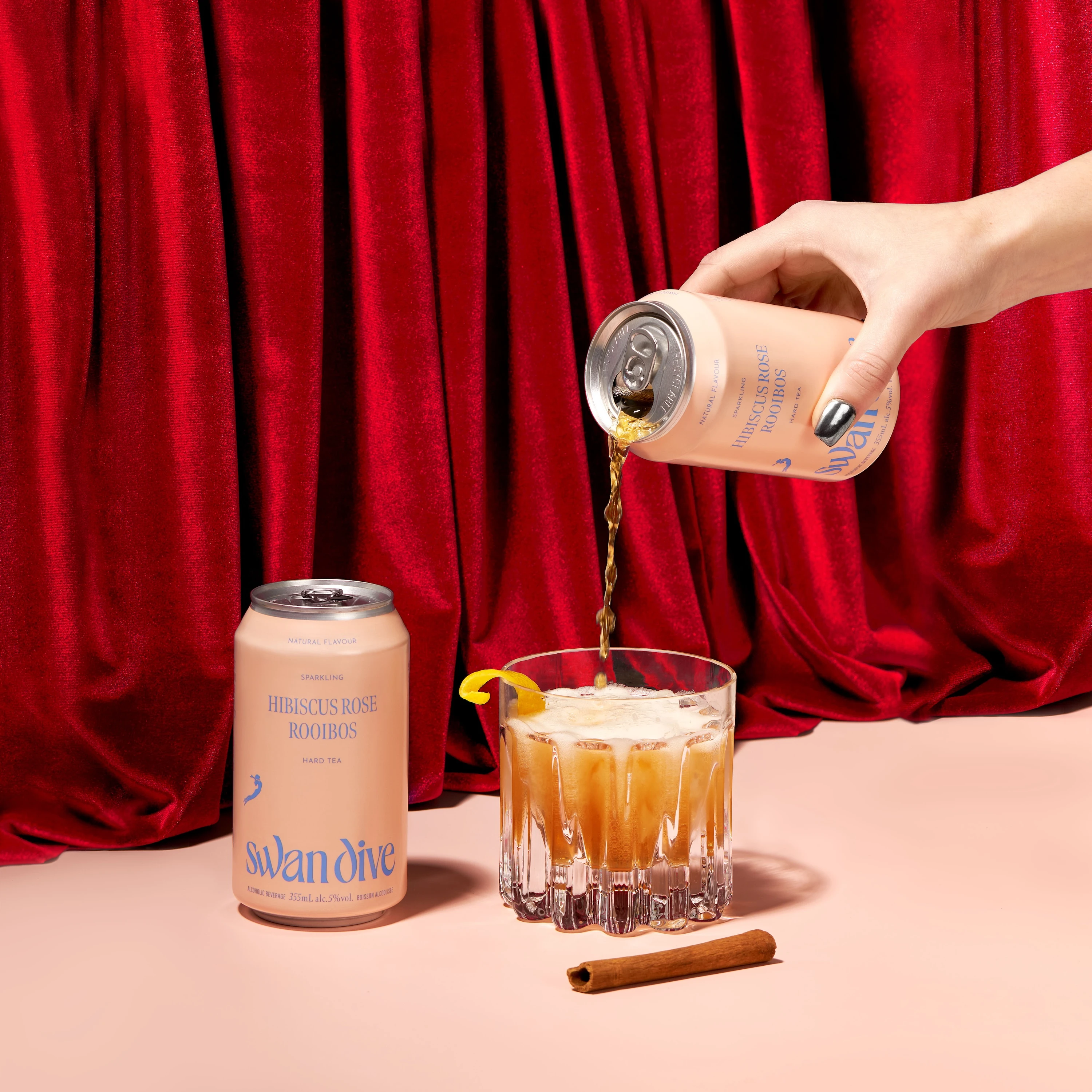
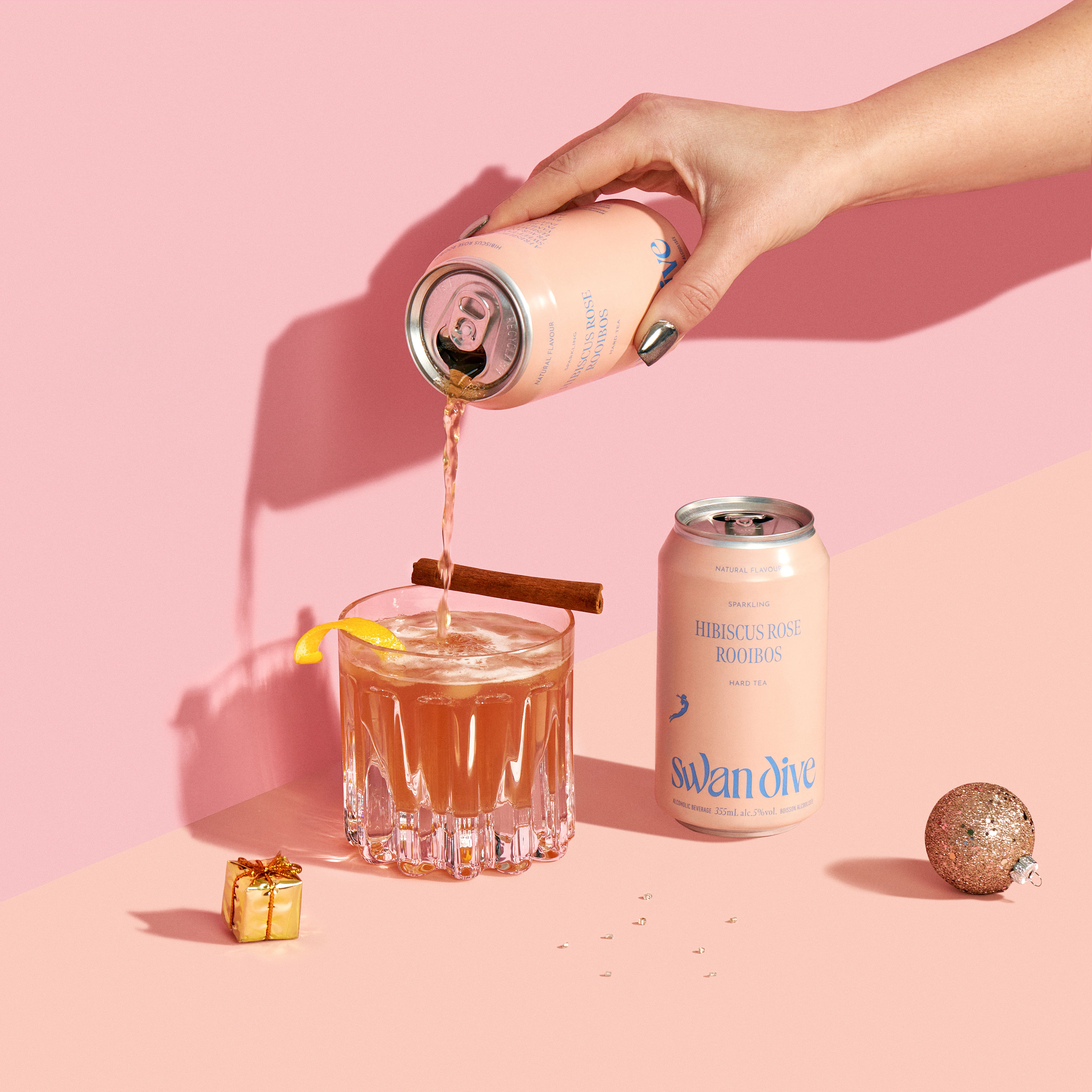
I photographed Swan Dive's Hibiscus Rose Rooibos sparkling hard tea for their holiday campaign. The brand approached me to create two images for their website and publications to advertise the drink during Christmas. They also needed photos to support a cocktail recipe they were publishing. The sparkling hard tea combines hibiscus, rose, and rooibos in an alcoholic format. Working from Vancouver, I focused on creating beverage product photography that showed both the can and the serve moment in a seasonal context.
The Strategy:
Subtle seasonal cues without overwhelming craft positioning
The brief called for restraint. Swan Dive needed holiday imagery without overwhelming their craft positioning. I built the shoot around subtle seasonal cues: a red curtain backdrop, a small wrapped gift, and minimal ornaments. The drink remained the focus. The floral ingredients in the tea meant the pink-rose palette could feel genuine rather than forced. I kept props minimal to avoid cliché and maintained a sophisticated tone that matched the brand's premium craft positioning.
The Execution:
Precision lighting on metallic packaging and controlled glassware
I photographed the can with precision lighting to keep the label readable and true to color. Metallic surfaces require controlled gradients to avoid distracting reflections. The label needed to look straight and crisp for publication use. I lit the aluminum to show texture and premium production quality without muddying the Swan Dive branding. Each frame maintained condensation cues that signal cold refreshment. The effervescence needed to read clearly in the glass pour while keeping the liquid looking clean and appealing.
Compositional flow linking can to cocktail serve
The composition linked can to cocktail through a pour sequence. I used directional framing with a hand guiding the eye from can to glass. The cinnamon stick reinforced the recipe angle without cluttering the scene. I managed specular highlights on the glassware to preserve sparkle and show the drink's clarity. The curtain provided rich texture in the background while keeping the product in sharp focus. Tight prop discipline meant each element earned its place in the frame.
The Outcome:
Multi-use images balancing festive context with craft credibility
I delivered the two images designed for multiple uses. The brand needed photos that worked for web banners, social posts, and print publications. I composed with negative space to accommodate headlines and calls to action. The holiday drink photography balanced festive context with the product's craft credibility. The pink-rose tones from the hibiscus came through naturally, connecting the visual to the flavor profile. Each image communicated the sparkling hard tea format and the cocktail versatility the brand wanted to emphasize.
The photos showed Swan Dive's Hibiscus Rose Rooibos as a premium seasonal option that works beyond the can. Lighting choices kept the metallic packaging looking refined. The pour linked product to usage in a way that felt celebratory without losing the craft beverage positioning. Seasonal cues integrated subtly enough to support holiday marketing while keeping the drink as the primary focus. As a Vancouver product photographer, I found the images balanced editorial restraint with clear product communication.
Photographing seasonal craft beverages requires showing the product clearly while building context that supports the marketing moment. If you need beverage product photography in Vancouver that balances brand positioning with seasonal campaigns, reach out to discuss your next project.
<script type="application/ld+json">
{
"@context": "https://schema.org",
"@type": "Service",
"name": "Premium Hard Tea Holiday Photography with Natural Light Pour Control",
"description": "Multi-shot beverage photography framework combining natural light pour moments, seasonal staging, and texture-rich hero images to communicate botanical complexity and wellness positioning for craft hard tea brands.",
"serviceType": "Premium Beverage Photography",
"provider": {
"@type": "Organization",
"name": "Elina Kustlyvy Photography",
"url": "https://www.elinakustlyvy.com"
},
"areaServed": [
{"@type": "City", "name": "Vancouver", "addressRegion": "BC", "addressCountry": "CA"},
{"@type": "City", "name": "Toronto", "addressRegion": "ON", "addressCountry": "CA"},
{"@type": "City", "name": "Los Angeles", "addressRegion": "CA", "addressCountry": "US"},
{"@type": "City", "name": "Seattle", "addressRegion": "WA", "addressCountry": "US"}
],
"url": "https://www.elinakustlyvy.com/projects/moodyales"
}
</script>
<script type="application/ld+json">
{
"@context": "https://schema.org",
"@type": "ImageObject",
"contentUrl": "https://cdn.prod.website-files.com/653c048c7bdcdc4c8f4346aa/688d653e06ae8d7b6b4faac6_68798c3c7ee536bc4cd75c1a_3.2.webp",
"url": "https://cdn.prod.website-files.com/653c048c7bdcdc4c8f4346aa/688d653e06ae8d7b6b4faac6_68798c3c7ee536bc4cd75c1a_3.2.webp",
"name": "Swan Dive Hibiscus Rose Rooibos Hard Tea Holiday Pour Shot",
"caption": "Active pour moment capturing the saturated rose-pink hibiscus hue with natural window light, red velvet drape, and minimal seasonal ornaments for premium holiday gifting context.",
"creator": {
"@type": "Person",
"name": "Elina Kustlyvy",
"url": "https://www.elinakustlyvy.com"
},
"copyrightHolder": {
"@type": "Organization",
"name": "Elina Kustlyvy Photography"
},
"acquireLicensePage": "https://www.elinakustlyvy.com/contact"
}
</script>
<script type="application/ld+json">
{
"@context": "https://schema.org",
"@type": "Brand",
"name": "Swan Dive",
"description": "Sparkling hard tea brand using natural and organic ingredients, botanical infusions, and artisan small-batch production to create caffeine-free, low-sugar ready-to-drink beverages.",
"url": "https://drinkswandive.com",
"sameAs": [
"https://www.instagram.com/drinkswandive"
]
}
</script>
<script type="application/ld+json">
{
"@context": "https://schema.org",
"@type": "Product",
"name": "Swan Dive Hibiscus Rose Rooibos Sparkling Hard Tea",
"description": "Signature hard tea featuring hibiscus, rose, mango, vanilla, and rooibos infusion at 5% ABV, 100 calories, 0-1g sugar, and completely caffeine-free.",
"brand": {
"@type": "Brand",
"name": "Swan Dive"
},
"category": "Sparkling Hard Tea",
"review": {
"@type": "Review",
"author": {
"@type": "Person",
"name": "Elina Kustlyvy"
},
"reviewRating": {
"@type": "Rating",
"ratingValue": "5",
"bestRating": "5"
},
"reviewBody": "The can's matte finish and subtle color gradients photograph with exceptional depth, signaling premium production standards. The saturated rose-pink liquid displays true hibiscus hue and translucency under natural light, while the metallic finish and embossed label details convey the craft quality and small-batch care that defines the brand's botanical formulation."
}
}
</script>
<script type="application/ld+json">
{
"@context": "https://schema.org",
"@type": "BreadcrumbList",
"itemListElement": [
{
"@type": "ListItem",
"position": 1,
"name": "Projects",
"item": "https://www.elinakustlyvy.com/projects"
},
{
"@type": "ListItem",
"position": 2,
"name": "Food Photography",
"item": "https://www.elinakustlyvy.com/projects/food-photography"
},
{
"@type": "ListItem",
"position": 3,
"name": "Swan Dive Hibiscus Rose Rooibos Holiday Campaign",
"item": "https://www.elinakustlyvy.com/projects/moodyales"
}
]
}
</script>
<script type="application/ld+json">
{
"@context": "https://schema.org",
"@type": "WebPage",
"name": "Premium Hard Tea Holiday Photography: Swan Dive Hibiscus Rose Rooibos Case Study",
"description": "Multi-shot beverage photography framework for Swan Dive's signature hard tea, combining natural light pour control, seasonal staging, and texture-rich hero images to drive e-commerce conversion and social engagement during holiday gifting season.",
"url": "https://www.elinakustlyvy.com/projects/moodyales",
"speakable": {
"@type": "SpeakableSpecification",
"cssSelector": [".article-intro", ".article-conclusion"]
},
"about": [
{"@type": "Thing", "name": "Premium Hard Tea Holiday Photography"},
{"@type": "Thing", "name": "Natural Light Beverage Pour Photography"},
{"@type": "Thing", "name": "Botanical Hard Tea Visual Storytelling"}
],
"mentions": [
{
"@type": "Brand",
"name": "Swan Dive",
"sameAs": "https://drinkswandive.com"
},
{
"@type": "Thing",
"name": "Hibiscus Rose Rooibos Sparkling Hard Tea"
}
]
}
</script>
<script type="application/ld+json">
{
"@context": "https://schema.org",
"@type": "HowTo",
"name": "How to Photograph Premium Hard Tea for Holiday Campaigns Without Sacrificing Brand Identity",
"description": "Strategic multi-shot framework using natural light, disciplined color palette, and botanical staging to create seasonal beverage assets that drive conversion across e-commerce, social, and retail channels.",
"step": [
{
"@type": "HowToStep",
"position": 1,
"name": "Create texture-rich hero product shots with seasonal context",
"text": "Position the can as the dominant element against a red velvet drape that provides warmth without overwhelming the composition. Use natural window light to create soft shadowing that sculpts the can's cylindrical form and highlights embossed details. Add subtle wrapped gift and minimal ornaments to signal giftability while maintaining premium restraint. The drape texture reinforces luxury positioning, and controlled negative space keeps the can and label as focal points."
},
{
"@type": "HowToStep",
"position": 2,
"name": "Execute active pour shots with accurate color management",
"text": "Capture motion moments that show the liquid's saturated rose-pink hibiscus hue using diffused natural light to preserve translucency and true color without artificial pop. Build triangular composition flow from brandmark on can through diagonal pour motion to filled glass at base. Select glassware that displays clarity and carbonation while evoking cocktail craft. This approach stops scroll on social feeds and communicates botanical ingredient authenticity across different devices and platforms."
},
{
"@type": "HowToStep",
"position": 3,
"name": "Stage lifestyle integration with botanical props for cocktail versatility",
"text": "Incorporate tactile elements like expressed lemon peel and cinnamon stick to convey aroma, flavor complexity, and recipe utility without full bar staging. Position props to feel spontaneous rather than styled, maintaining small-batch narrative while bridging seasonal warmth with natural spice notes. This demonstrates consumption occasions beyond solo refreshment and gives consumers permission to integrate the product into existing rituals through aspirational but accessible contexts."
},
{
"@type": "HowToStep",
"position": 4,
"name": "Deliver macro detail shots for e-commerce and retail confidence",
"text": "Use close framing on brandmark and liquid-can interaction to communicate matte finish, color gradients, and label typography that signal premium production standards. Natural lighting preserves tactile quality details that collapse in standard product photography. These assets answer unspoken questions about build quality for online shoppers and reduce perceived risk for retail buyers evaluating shelf placement and new product commitment."
}
]
}
</script>
<script type="application/ld+json">
{
"@context": "https://schema.org",
"@type": "FAQPage",
"mainEntity": [
{
"@type": "Question",
"name": "How do you photograph hard tea products for holiday campaigns without making them look like generic stock imagery?",
"acceptedAnswer": {
"@type": "Answer",
"text": "The approach centers on restraint and strategic color palette discipline. Rather than overwhelming compositions with red foreground elements, restrict holiday cues to backdrop staging like a red velvet drape, small wrapped gifts, and minimal ornaments. This maintains premium positioning while providing seasonal context. Use natural window light with soft shadowing instead of heavily manipulated studio lighting to preserve authenticity. The product's own color—in this case Swan Dive's saturated hibiscus hue—becomes the primary red note, connecting festive warmth directly to the defining ingredient. Clean surfaces and controlled negative space keep the can and liquid as focal points, allowing props to enhance rather than compete with the brand's refined identity."
}
},
{
"@type": "Question",
"name": "What photography techniques help botanical hard tea brands communicate ingredient quality and wellness positioning?",
"acceptedAnswer": {
"@type": "Answer",
"text": "Three techniques work together to encode botanical complexity and clean formulation. First, use diffused natural light to preserve the liquid's true hue and translucency—the saturated rose-pink from hibiscus reads as genuine rather than artificially enhanced. Second, include tactile props like cinnamon sticks and expressed lemon peel that signal aroma and flavor depth without staged bar setups, maintaining the spontaneous small-batch narrative. Third, execute macro detail shots that showcase can texture, matte finishes, and label typography to communicate premium production standards when consumers cannot handle the physical product. This combination addresses wellness-minded consumers who scrutinize ingredient lists and expect visual consistency between marketing imagery and actual product experience."
}
},
{
"@type": "Question",
"name": "How can craft beverage brands ensure product photography works consistently across e-commerce, social media, and retail sell-in materials?",
"acceptedAnswer": {
"@type": "Answer",
"text": "Build the lighting around diffused natural window light and reflectors to create a replicable baseline that preserves color integrity across different outputs and platforms. This approach avoids the harsh contrasts and color shifts that occur when heavily manipulated studio lighting moves from digital to print or between social channels. Deliver a multi-shot framework where each image type serves a distinct business purpose: hero shots with texture detail for product pages and conversion, active pour moments for social engagement, lifestyle applications for consumption context, and macro details for retailer confidence. Maintain disciplined color palette choices and minimal set design so assets integrate seamlessly with existing brand guidelines, avoiding the disjointed look of seasonal campaigns that feel bolted on rather than native to the brand identity."
}
}
]
}
</script>

- other recent projects
(001)
Pierre Hermé's Paris - Macarons
Pierre Herme macaron photography using gradient backgrounds and product stacking
(001)
Ahn & Chi + Kasama Chocolate
Kasama Chocolate collaboration bar photographed with Vietnamese coffee details for Anh & Chi restaurant launch
Superjelly protein powder photography with flavour-matched ingredient styling and texture detail
Photographing Anh & Chi's Vietnamese sauces with ingredient flat lays and bottle clarity for retail launch