The Client:
Everlucid skincare launch collection
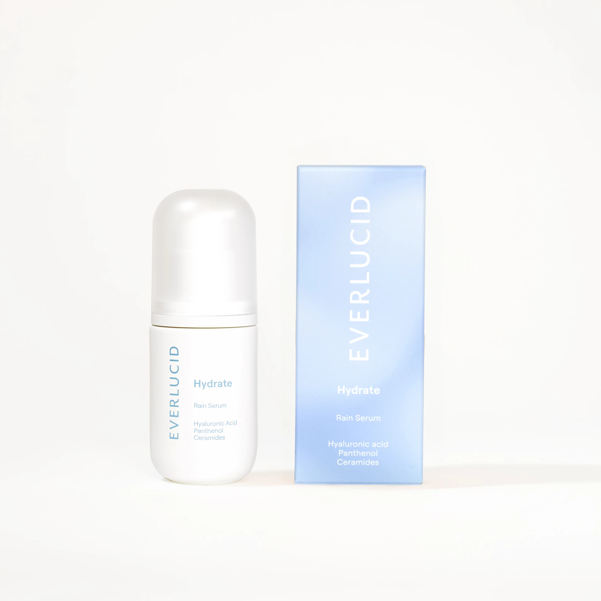
I photographed Everlucid's three-serum launch collection for their e-commerce store. The brand makes barrier-focused skincare with formulas built around ceramides and ingredients. They wanted imagery with an ethereal quality tied to sky-inspired gradients: sunrise tones for their brightening Sunshine Serum, rain-blue atmospheres for their hydrating Rain Serum, and soft cloud-purples for their anti-aging Cloud Serum. The central challenge was creating these color gradients entirely in camera rather than adding them in post-production. I also needed to find texture stand-ins that would convincingly represent each serum's viscosity and feel, since I only had the bottles to photograph and the final formulas weren't available yet.
The Challenge:
Differentiating three clear liquids with atmospheric color worlds
The project required skincare product photography that could differentiate three clear liquids while maintaining a premium, honest visual language. Each serum bottle contained similar-looking transparent liquid, so the atmosphere around each product became the primary tool for distinction. The brand's visual direction leaned toward atmospheric and emotive rather than clinical or lab-focused. My approach centered on building those sky-inspired color worlds practically with lighting and backgrounds instead of relying on digital color overlays that would feel artificial.
The Execution:
In-camera gradients and practical lighting design
Working from my Vancouver studio, I designed lighting setups that could produce seamless gradients matching each serum's intended mood. For Sunshine, I built warm sunrise tones using amber and coral gels positioned to create natural-looking transitions across the background. Rain required cooler, more subdued blue-gray gradients that suggested overcast skies. Cloud needed soft purples with gentle shifts in saturation. Each setup involved layering multiple light sources at specific angles and intensities to achieve smooth color transitions that read as atmospheric rather than flat or graphic. The goal was optical authenticity: gradients that felt like natural light phenomena rather than Photoshop effects.
Managing glass reflections and label legibility
Controlling reflections on small glass bottles presented its own technical demands. Glass surfaces pick up every light source and environmental detail, which can turn into distracting hot spots or muddy reflections that obscure label readability. I used diffusion materials and carefully positioned flags to manage specular highlights while keeping the bottles looking dimensional and premium. The labels needed to stay sharp and legible in every shot since these images would serve product detail pages where customers need to read ingredient callouts and branding details clearly. I kept compositions clean with balanced bottle-and-box pairings that showed packaging context without crowding the frame.
Macro texture photography as trust signal
For texture photography, I sourced stand-in materials that could mimic serum viscosity, sheen, and the way product spreads across skin. Since I didn't have access to the actual formulas, I tested various gels and liquids under macro lighting to find convincing proxies. The texture shots needed to communicate slip and absorption qualities without looking overly retouched or artificial. I used shallow depth of field to isolate texture details and emphasized the way light catches glossy, hydrated surfaces. These macro images were designed to serve as supporting visuals on product pages where customers want proof of product feel and performance.
The Results:
Cohesive launch imagery that balances atmosphere with functionality
The resulting photo collection gave Everlucid a cohesive set of launch imagery that works across their online store and marketing channels. Each serum has a distinct visual world tied to its sky-inspired color gradient, making it easy for customers to distinguish between products at a glance. The in-camera approach preserved the visual honesty the brand wanted to communicate alongside their ingredient transparency and clean formulation standards. The texture photography provided sensorial cues even though the images were created with proxy materials rather than final formulas.
As a Vancouver product photographer, if you're launching a skincare line and need imagery that balances atmospheric branding with e-commerce functionality, I can help you build a visual system that differentiates your products while keeping labels readable and textures believable. Reach out to discuss your next product shoot.
<script type="application/ld+json">
{
"@context": "https://schema.org",
"@type": "Service",
"name": "Clean Skincare Product Photography with In-Camera Gradient Control",
"description": "Color-accurate, glare-free skincare product photography that captures sky-inspired gradients in-camera, preserves label legibility on reflective bottles, and delivers standardized PDP assets without heavy retouching.",
"serviceType": "E-commerce Product Photography",
"provider": {
"@type": "Organization",
"name": "Elina Kustlyvy Photography",
"url": "https://www.elinakustlyvy.com"
},
"areaServed": [
{"@type": "City", "name": "Vancouver", "addressRegion": "BC", "addressCountry": "CA"},
{"@type": "City", "name": "Toronto", "addressRegion": "ON", "addressCountry": "CA"},
{"@type": "City", "name": "Los Angeles", "addressRegion": "CA", "addressCountry": "US"},
{"@type": "City", "name": "Seattle", "addressRegion": "WA", "addressCountry": "US"}
],
"url": "https://www.elinakustlyvy.com/projects/everlucid-com"
}
</script>
<script type="application/ld+json">
{
"@context": "https://schema.org",
"@type": "ImageObject",
"contentUrl": "https://cdn.prod.website-files.com/653c048c7bdcdc4c8f4346aa/688e78aa4eb614848e210430_686d6a0586973c06fa54a416_E-commerce%2520brighten%2520web.webp",
"url": "https://cdn.prod.website-files.com/653c048c7bdcdc4c8f4346aa/688e78aa4eb614848e210430_686d6a0586973c06fa54a416_E-commerce%2520brighten%2520web.webp",
"name": "Everlucid Sunshine Serum Product Photography with Peach-to-Amber Gradient",
"caption": "E-commerce product shot of Everlucid Sunshine Serum bottle showcasing in-camera peach-to-amber sky-inspired gradient, glare-free label legibility, and clean negative space for product page use.",
"creator": {
"@type": "Person",
"name": "Elina Kustlyvy",
"url": "https://www.elinakustlyvy.com"
},
"copyrightHolder": {
"@type": "Organization",
"name": "Elina Kustlyvy Photography"
},
"acquireLicensePage": "https://www.elinakustlyvy.com/contact"
}
</script>
<script type="application/ld+json">
{
"@context": "https://schema.org",
"@type": "Brand",
"name": "Everlucid",
"description": "Singapore-based skincare brand offering gentle, barrier-restoring serums with proprietary Super Ceramides™ inspired by Korean skincare philosophy and sky-gradient aesthetics.",
"url": "https://everlucid.com",
"sameAs": [
"https://trademarks.justia.com/978/51/everlucid-97851650.html"
]
}
</script>
<script type="application/ld+json">
{
"@context": "https://schema.org",
"@type": "Product",
"name": "Everlucid Sunshine Serum",
"description": "Brightening serum with niacinamide, squalane, and Super Ceramides™ to even skin tone and fade dark spots.",
"brand": {
"@type": "Brand",
"name": "Everlucid"
},
"category": "Skincare Serum",
"review": {
"@type": "Review",
"author": {
"@type": "Person",
"name": "Elina Kustlyvy"
},
"reviewRating": {
"@type": "Rating",
"ratingValue": "5",
"bestRating": "5"
},
"reviewBody": "The Sunshine Serum's reflective glass bottle and peach-to-amber gradient required precise diffusion to preserve label legibility and authentic sky-inspired color transitions. The glossy packaging captured light beautifully without hotspots, revealing the product's clean formulation and lightweight texture promise. The cylindrical shape held form under soft directional lighting, allowing every ingredient callout to remain sharp and readable on-camera."
}
}
</script>
<script type="application/ld+json">
{
"@context": "https://schema.org",
"@type": "BreadcrumbList",
"itemListElement": [
{
"@type": "ListItem",
"position": 1,
"name": "Projects",
"item": "https://www.elinakustlyvy.com/projects"
},
{
"@type": "ListItem",
"position": 2,
"name": "E-commerce Photography",
"item": "https://www.elinakustlyvy.com/projects/ecommerce-photography"
},
{
"@type": "ListItem",
"position": 3,
"name": "Everlucid Skincare Product Photography",
"item": "https://www.elinakustlyvy.com/projects/everlucid-com"
}
]
}
</script>
<script type="application/ld+json">
{
"@context": "https://schema.org",
"@type": "WebPage",
"name": "Clean, Color-Accurate Skincare Photography That Converts",
"description": "Case study documenting Everlucid's glare-free, gradient-accurate product photography system: in-camera sky gradients, standardized PDP assets, and texture macros that drive trust and conversion.",
"url": "https://www.elinakustlyvy.com/projects/everlucid-com",
"speakable": {
"@type": "SpeakableSpecification",
"cssSelector": [".article-intro", ".article-conclusion"]
},
"about": [
{"@type": "Thing", "name": "Clean skincare product photography"},
{"@type": "Thing", "name": "In-camera gradient lighting technique"},
{"@type": "Thing", "name": "Glare-free reflective bottle photography"},
{"@type": "Thing", "name": "Standardized e-commerce product page imagery"},
{"@type": "Thing", "name": "Color-accurate skincare campaign photography"}
],
"mentions": [
{
"@type": "Brand",
"name": "Everlucid",
"sameAs": "https://everlucid.com"
},
{
"@type": "Thing",
"name": "Everlucid Sunshine Serum"
},
{
"@type": "Thing",
"name": "Everlucid Rain Serum"
},
{
"@type": "Thing",
"name": "Everlucid Cloud Serum"
},
{
"@type": "Thing",
"name": "Super Ceramides™"
}
]
}
</script>
<script type="application/ld+json">
{
"@context": "https://schema.org",
"@type": "HowTo",
"name": "How to Photograph Reflective Skincare Bottles with In-Camera Gradients and No Glare",
"description": "Technical workflow for capturing color-accurate sky-inspired gradients and glare-free label legibility on reflective serum bottles without relying on CGI or heavy post-production.",
"step": [
{
"@type": "HowToStep",
"position": 1,
"name": "Build an in-camera gradient lighting system",
"text": "Use large scrims and diffusion panels to create soft, directional light that wraps around cylindrical bottles, separating product from background. Position colored gels precisely to replicate sky-inspired gradients (peach-to-amber, aqua, dove-grey) through careful exposure discipline, capturing full tonal range without banding or digital artifacts. This in-camera technique eliminates post-production lag and preserves color authenticity."
},
{
"@type": "HowToStep",
"position": 2,
"name": "Control glare and preserve label legibility",
"text": "Map set geometry in advance, positioning diffusion panels at angles that soften reflections on glossy packaging without flattening form. Use neutral grey surfaces to prevent color contamination. This approach ensures every line of label copy remains sharp and readable—critical for ingredient storytelling—while maintaining the bottle's sculptural shape and authentic product color."
},
{
"@type": "HowToStep",
"position": 3,
"name": "Capture texture authenticity with minimal retouching",
"text": "Build macro setups with soft, even lighting to reveal hydration cues: micro-droplets, light refraction through translucent gel, and subtle pearlescence signaling barrier-nourishing oils. Keep retouching minimal to preserve texture believability. Over-smoothed shots trigger skepticism; detailed texture photography validates tactile claims and shows shoppers the lightweight slip and visible glow they expect."
},
{
"@type": "HowToStep",
"position": 4,
"name": "Standardize the workflow for repeatable consistency",
"text": "Document every lighting ratio, camera angle, and color target. Deliver a shot-list template and color-managed asset library organized by use case: hero product page shots at consistent crop and resolution, detail macros for ingredient storytelling, styled compositions for social, and flat-lay bundle shots. This standardization ensures every new launch feels cohesive with the existing library and ships fast."
}
]
}
</script>
<script type="application/ld+json">
{
"@context": "https://schema.org",
"@type": "FAQPage",
"mainEntity": [
{
"@type": "Question",
"name": "How do you photograph reflective skincare bottles without glare obscuring the label?",
"acceptedAnswer": {
"@type": "Answer",
"text": "We map set geometry in advance and position large diffusion panels at precise angles that soften reflections without flattening the bottle's sculptural form. Neutral grey surfaces prevent color contamination, and controlled lighting separation keeps every line of label copy sharp and readable. This technique preserves ingredient callouts and brand storytelling on glossy packaging while maintaining authentic product color and shape, critical for building trust on product pages."
}
},
{
"@type": "Question",
"name": "Can you create sky-inspired gradients in-camera without Photoshop overlays?",
"acceptedAnswer": {
"@type": "Answer",
"text": "Yes. We use large scrims, diffusion panels, and precisely positioned colored gels to produce seamless tonal transitions across backgrounds and bottles during capture. Disciplined exposure control captures the full range of subtle gradient steps that mimic natural skies at different times of day—peach-to-amber sunrises, cool aqua rain, dove-grey clouds—without introducing banding or digital artifacts. This in-camera approach preserves authenticity, eliminates post-production delays, and ensures what the camera sees matches what customers will see and receive."
}
},
{
"@type": "Question",
"name": "How do you standardize product photography across multiple SKUs for fast launches?",
"acceptedAnswer": {
"@type": "Answer",
"text": "We document every lighting ratio, camera angle, and color target, then deliver a shot-list template and color-managed asset library organized by use case: hero product page shots at consistent crops and resolutions, detail macros for ingredient storytelling, styled social compositions, and bundle flat-lays. Each image is color-managed to match brand palettes within tight tolerances, so every new launch feels cohesive with the existing library. This repeatable system cuts future shoot times, reduces review rounds, and ships PDP-ready assets immediately."
}
},
{
"@type": "Question",
"name": "Why is minimal retouching important for skincare texture photography?",
"acceptedAnswer": {
"@type": "Answer",
"text": "Over-smoothed or CGI-perfect product shots trigger shopper skepticism, especially in the skincare category where trust depends on seeing authentic texture, hydration, and finish. We capture macro details—micro-droplets, light refraction through gel, subtle pearlescence—using soft, even lighting and keep retouching minimal to preserve believability. Shoppers need enough visual detail to almost feel the lightweight slip of the serum, validating claims like 'gentle yet high-performance' at a glance and reducing return rates by aligning expectations with reality."
}
}
]
}
</script>

- other recent projects
SKWEEN foundation balm product photography showing accurate shade range and skincare texture
INKAARA water bottle photography capturing hand-drawn illustrations and affirmations for premium kids product marketing
Superjelly supplement shaker bottle and snapback hat detail photography for e-commerce conversion
Superjelly supplement photography using levitation technique and flavor-matched backgrounds for e-commerce
Quo Beauty Tangle Teezer photographed with precision colour blocking and macro bristle detail
Kristin Ess haircare product photography with controlled highlights and label clarity