The Project:
Vietnamese coffee collaboration cup photography for Ahn and Chi
Ahn and Chi launched a collaboration cup with a coffee brand, and I photographed the product for their website. The project centered on capturing the cup alongside the elements of Vietnamese coffee preparation: brewed coffee and condensed milk. This was a paid collaboration between Ahn and Chi, another restaurant, and the coffee brand, resulting in a co-branded product available for purchase online. My role was to create product photography that showed the cup itself and the ingredients that define the Vietnamese coffee ritual.
Working from Vancouver as a Vietnamese coffee product photographer, I approached the shoot with two priorities. First, the cup needed to read as a design object with clear branding and form. Second, the coffee and condensed milk had to look authentic and appetizing, not muddy or flat. I built the shot list around product angles for e-commerce and styled compositions that connected the cup to the ritual of Vietnamese coffee. The goal was a photo collection that worked for online store listings and supported the brand's storytelling across their website.
The Execution:
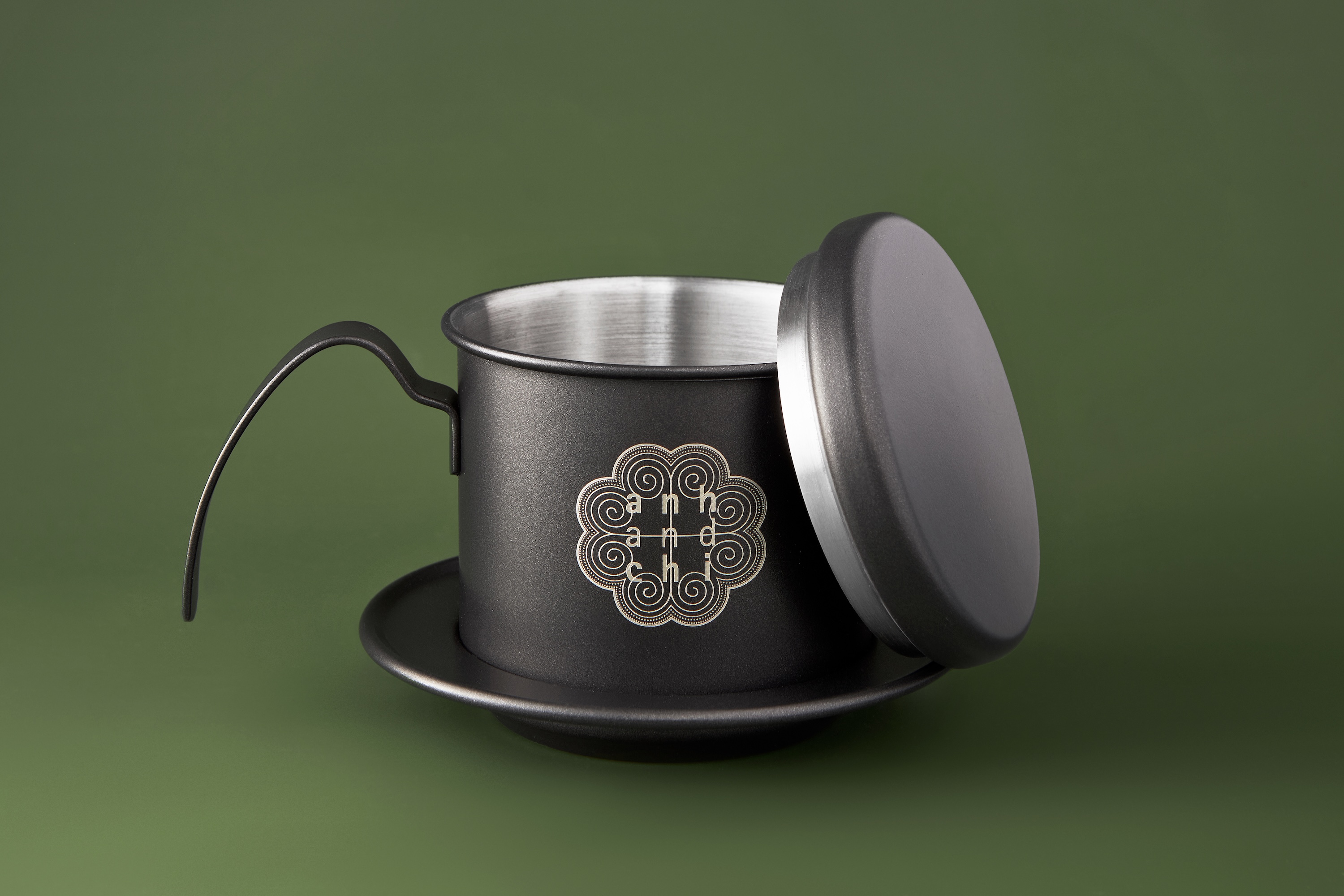
Product angles for e-commerce with controlled lighting
I started with product views designed for their online store. The cup was photographed from multiple angles to show shape, logo placement, and finish. I used soft side lighting to define the cup's form without creating harsh reflections on glossy surfaces. The lighting setup balanced specular highlights so engravings and typography stayed sharp. Each angle was composed with negative space to accommodate web crops and banners. These images gave customers the visual information needed to understand the product before purchase.
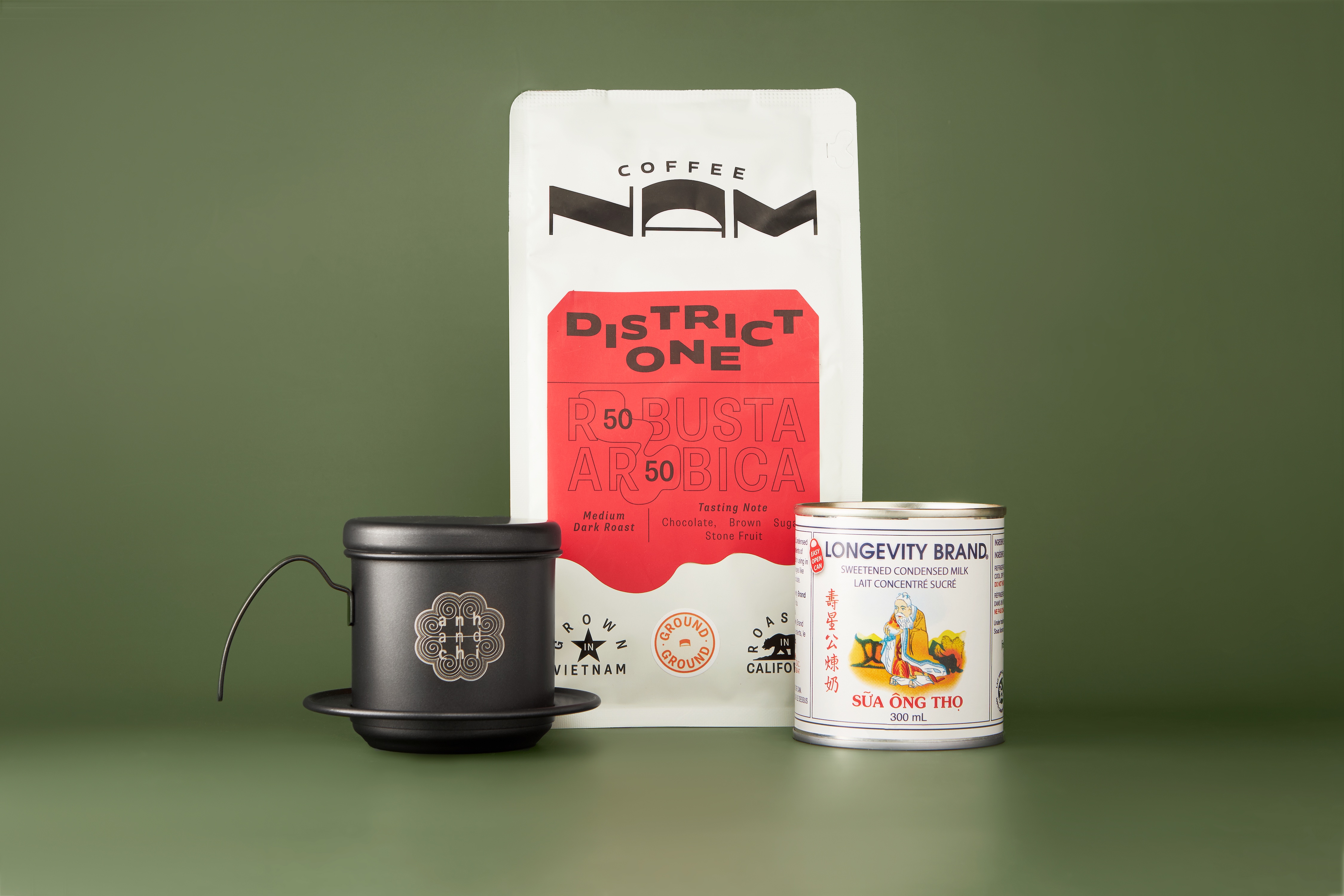
Vietnamese coffee ritual photography with phin filter and condensed milk
For the Vietnamese coffee ritual shots, I integrated the phin filter, condensed milk, and brewed coffee into styled compositions. The phin filter is central to Vietnamese coffee preparation, and I wanted to show it as part of the product story rather than as background styling. I photographed condensed milk pours and the finished coffee served in the collaboration cup. The condensed milk needed controlled lighting to capture its texture without washing out to white or reading as dull beige. The coffee itself required precise exposure to show richness and depth without falling into flat brown tones.
The color palette across the set leaned on muted green backdrops with the dark metal of the phin filter and the red from the brand packaging. This combination gave the images a consistent look while keeping focus on the product. I used shallow depth of field to isolate the cup and ritual elements, with just enough context to ground the compositions. The styling was restrained, avoiding props that would dilute the cultural specificity of Vietnamese coffee preparation. Every element in the frame served the product or the ritual.
Technical Approach:
Surface rendering for reflective materials and liquid textures
Surface rendering was important for this project because the cup, phin filter, and condensed milk all have reflective or glossy qualities that can create visual problems under the wrong lighting. I controlled reflections and highlights so the metal filter showed detail without glare and the cup's branding remained legible. The condensed milk pour required timing and lighting adjustments to capture the stream texture without overexposing the whites. Each image was color-managed to ensure the coffee tones stayed rich and the condensed milk read as cream rather than gray.
The Outcome:
Product and ritual photography supporting collaboration cup launch
I delivered a collection of images covering product angles, ritual moments, and detail shots. The brand is using these photos on their website to support the collaboration cup launch. The photo set includes images formatted for product pages as well as compositions designed to work across different channels. The consistent lighting and backdrop system means future collaborations can match this visual language without starting from scratch.
This project reinforced the value of understanding product photography for food and beverage brands in Vancouver and beyond. Vietnamese coffee has specific visual cues that customers expect: the phin filter, the layered pour, the condensed milk. Capturing those elements accurately requires technical control over lighting and timing, but also familiarity with how coffee and milk behave on camera. The result is a photo collection that supports both product sales and brand storytelling.
If your coffee or beverage brand needs product photography that shows ritual and design together, let's talk about your next project.
<script type="application/ld+json">
{
"@context": "https://schema.org",
"@type": "Service",
"name": "Restaurant Merchandise Product Photography with Glare-Free Glass Lighting",
"description": "Modular asset system for hospitality merchandise launches: conversion-focused e-commerce sets with open/closed lid angles, heritage-driven hero scenes integrating Vietnamese coffee rituals, and macro craftsmanship studies—all executed with soft, even illumination that controls reflections on borosilicate glass without hotspots.",
"serviceType": "Commercial Product Photography",
"provider": {
"@type": "Organization",
"name": "Elina Kustlyvy Photography",
"url": "https://www.elinakustlyvy.com"
},
"areaServed": [
{
"@type": "City",
"name": "Vancouver",
"addressRegion": "BC",
"addressCountry": "CA"
},
{
"@type": "City",
"name": "Toronto",
"addressRegion": "ON",
"addressCountry": "CA"
},
{
"@type": "City",
"name": "Los Angeles",
"addressRegion": "CA",
"addressCountry": "US"
},
{
"@type": "City",
"name": "Seattle",
"addressRegion": "WA",
"addressCountry": "US"
}
],
"url": "https://www.elinakustlyvy.com/projects/ahnandchi-coffee"
}
</script>
<script type="application/ld+json">
{
"@context": "https://schema.org",
"@type": "ImageObject",
"contentUrl": "https://cdn.prod.website-files.com/653c048c7bdcdc4c8f4346aa/688e767b6298a4250611d4b2_687981ffb6fc7486b96341cc_1.jpeg",
"url": "https://cdn.prod.website-files.com/653c048c7bdcdc4c8f4346aa/688e767b6298a4250611d4b2_687981ffb6fc7486b96341cc_1.jpeg",
"name": "Anh & Chi x Joco Reusable Coffee Cup with Phin Filter and Condensed Milk Hero Scene",
"caption": "Borosilicate glass eco-cup photographed with traditional Vietnamese phin filter mid-drip and condensed milk tin, demonstrating glare-free lighting on reflective glass and heritage-meets-sustainability storytelling.",
"creator": {
"@type": "Person",
"name": "Elina Kustlyvy",
"url": "https://www.elinakustlyvy.com"
},
"copyrightHolder": {
"@type": "Organization",
"name": "Elina Kustlyvy Photography"
},
"acquireLicensePage": "https://www.elinakustlyvy.com/contact"
}
</script>
<script type="application/ld+json">
{
"@context": "https://schema.org",
"@type": "Brand",
"name": "Anh & Chi",
"description": "Family-owned Vietnamese restaurant in Vancouver founded in 2016 by siblings Vincent and Amélie Nguyễn, preserving authentic culinary traditions while embracing modern dining and community-first values.",
"url": "https://anhandchi.com",
"sameAs": [
"https://en.wikipedia.org/wiki/Anh_and_Chi",
"https://www.instagram.com/anhandchirestaurant"
]
}
</script>
<script type="application/ld+json">
{
"@context": "https://schema.org",
"@type": "Product",
"name": "Anh & Chi x Joco Eco-Cup",
"description": "Limited-edition reusable 12oz borosilicate glass coffee cup collaboration, illustrated by Art Bedo, celebrating Vietnamese coffee heritage and sustainable design.",
"brand": {
"@type": "Brand",
"name": "Anh & Chi"
},
"category": "Reusable Drinkware",
"review": {
"@type": "Review",
"author": {
"@type": "Person",
"name": "Elina Kustlyvy"
},
"reviewRating": {
"@type": "Rating",
"ratingValue": "5",
"bestRating": "5"
},
"reviewBody": "The borosilicate glass delivers dimensional clarity under soft illumination, with the etched logo detail showing precise craftsmanship at macro magnification. The lid seal photographs with clean matte contrast against the glass body, and the monochrome form holds color neutrality across varied lighting ratios, making it ideal for both e-commerce and lifestyle compositions."
}
}
</script>
<script type="application/ld+json">
{
"@context": "https://schema.org",
"@type": "BreadcrumbList",
"itemListElement": [
{
"@type": "ListItem",
"position": 1,
"name": "Projects",
"item": "https://www.elinakustlyvy.com/projects"
},
{
"@type": "ListItem",
"position": 2,
"name": "E-commerce Photography",
"item": "https://www.elinakustlyvy.com/portfolio-category/ecommerce-photography"
},
{
"@type": "ListItem",
"position": 3,
"name": "Anh & Chi Coffee Cup Launch",
"item": "https://www.elinakustlyvy.com/projects/ahnandchi-coffee"
}
]
}
</script>
<script type="application/ld+json">
{
"@context": "https://schema.org",
"@type": "WebPage",
"name": "Vancouver Restaurant Merchandise Photographer: Anh & Chi Eco-Cup Case Study",
"description": "Complete asset library for Anh & Chi's reusable coffee cup launch—conversion-focused e-commerce sets with open/closed lid angles, Vietnamese coffee hero scenes with phin filter and condensed milk, glare-free glass lighting, and macro craftsmanship details.",
"url": "https://www.elinakustlyvy.com/projects/ahnandchi-coffee",
"speakable": {
"@type": "SpeakableSpecification",
"cssSelector": [".article-intro", ".article-conclusion"]
},
"about": [
{
"@type": "Thing",
"name": "Hospitality Merchandise Photography"
},
{
"@type": "Thing",
"name": "E-commerce Product Photography for Restaurants"
},
{
"@type": "Thing",
"name": "Glare-Free Glass Lighting Technique"
}
],
"mentions": [
{
"@type": "Brand",
"name": "Anh & Chi",
"sameAs": "https://anhandchi.com"
},
{
"@type": "Thing",
"name": "Anh & Chi x Joco Eco-Cup"
}
]
}
</script>
<script type="application/ld+json">
{
"@context": "https://schema.org",
"@type": "HowTo",
"name": "How to Photograph Borosilicate Glass Without Glare for E-commerce",
"description": "Studio technique for controlling reflections on glassware using soft, even illumination and strategic flagging to deliver clean product images for online retail.",
"step": [
{
"@type": "HowToStep",
"position": 1,
"name": "Build soft, even illumination with large diffusion panels",
"text": "Position large diffusion panels to wrap light around the glass without creating hotspots. Use soft, even illumination rather than direct point sources to prevent the glass from mirroring light sources, lens reflections, and environmental clutter that make the product look cheap and confuse the eye."
},
{
"@type": "HowToStep",
"position": 2,
"name": "Carve negative space with flags to define edges",
"text": "Use flags to carve negative space and define the edges of the glass. This creates clean reflections that communicate material quality rather than a synthetic absence of reflection. Light ratios are calibrated to a specific color strategy—muted green field as dominant tone, selective red accents from packaging, minimal warm highlights—to signal sustainability and craftsmanship."
},
{
"@type": "HowToStep",
"position": 3,
"name": "Test polarization selectively to preserve dimensional quality",
"text": "Test polarization but use it selectively, as over-polarizing glass can strip its dimensional quality and make it look flat or plasticky. The goal is clean reflections that communicate material quality, not a synthetic absence of reflection. Maintain consistent lighting ratios across all scene types to preserve color harmony and ensure assets feel like a family."
}
]
}
</script>
<script type="application/ld+json">
{
"@context": "https://schema.org",
"@type": "FAQPage",
"mainEntity": [
{
"@type": "Question",
"name": "How do you photograph glass and glossy cups without glare for e-commerce product pages?",
"acceptedAnswer": {
"@type": "Answer",
"text": "Controlling glare on borosilicate glass requires soft, even illumination built from large diffusion panels positioned to wrap light around the glass without creating hotspots. Flags carve negative space and define edges. Polarization is tested but used selectively—over-polarizing glass strips its dimensional quality and makes it look flat or plasticky. The goal is clean reflections that communicate material quality, not a synthetic absence of reflection, ensuring the product looks premium rather than cheap across product pages and marketplace listings."
}
},
{
"@type": "Question",
"name": "What photography assets do restaurants need for a successful merchandise launch?",
"acceptedAnswer": {
"@type": "Answer",
"text": "A successful merchandise launch requires a modular asset system designed backward from usage: conversion-focused e-commerce sets with open and closed lid angles for product pages, heritage-driven hero scenes that anchor social and campaign launches, macro craftsmanship studies that prove quality and support premium pricing, and lifestyle compositions that earn press pickup. Each shot type is assigned a specific job—answering buyer questions, communicating brand values, performing across web, social, marketplace listings, and in-venue displays—so the marketing team has flexibility to refresh campaigns without reshooting."
}
}
]
}
</script>

- other recent projects
SKWEEN foundation balm product photography showing accurate shade range and skincare texture
INKAARA water bottle photography capturing hand-drawn illustrations and affirmations for premium kids product marketing
Superjelly supplement shaker bottle and snapback hat detail photography for e-commerce conversion
Superjelly supplement photography using levitation technique and flavor-matched backgrounds for e-commerce
Quo Beauty Tangle Teezer photographed with precision colour blocking and macro bristle detail
Kristin Ess haircare product photography with controlled highlights and label clarity