Abra
Abra Paris footwear photography exploring high contrast hard shadow techniques
The Subject:
Why Abra footwear works as a case study for technical clarity
I chose Abra as a creative subject because they've solved a problem most fashion brands still struggle with: how to look premium and avant-garde while making footwear genuinely readable. Their sculptural heels and satin ballerina boots demand a visual approach that protects material quality and silhouette without sacrificing the playful, gender-fluid edge that defines the label. Working from Vancouver, I wanted to explore how high-contrast lighting and saturated color interplay could serve both brand recognition and product clarity, two goals that typically pull in opposite directions.
The Brief:
Hard shadows as sculptural modeling, not editorial flattening
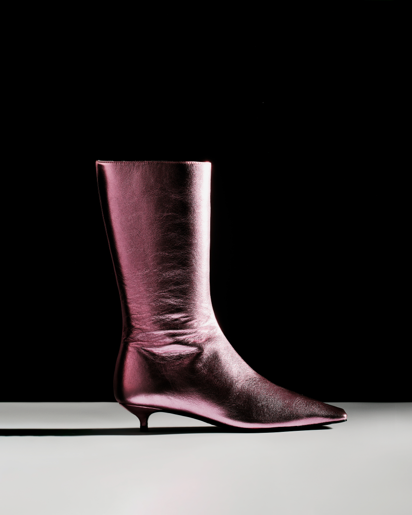
The brief I set for myself centered on a trend I've been tracking: hard shadows and decisive contrast used to model form rather than flatten it. Abra's silhouettes (exaggerated toe shapes, glossy leather, and reflective satin) are notoriously difficult to photograph because flat e-commerce lighting makes them look cheap, while overly artsy editorial setups crush detail in blacks and introduce glare on metallics. If a brand like Abra needed images that worked across campaign storytelling, social media, and product pages, the lighting would need to energize surfaces without generating noise, and the composition would need to lock attention on structure while preserving texture fidelity.
The Execution:
Black void, reflective plane, and saturated complements
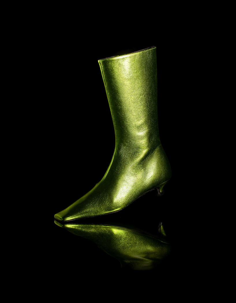
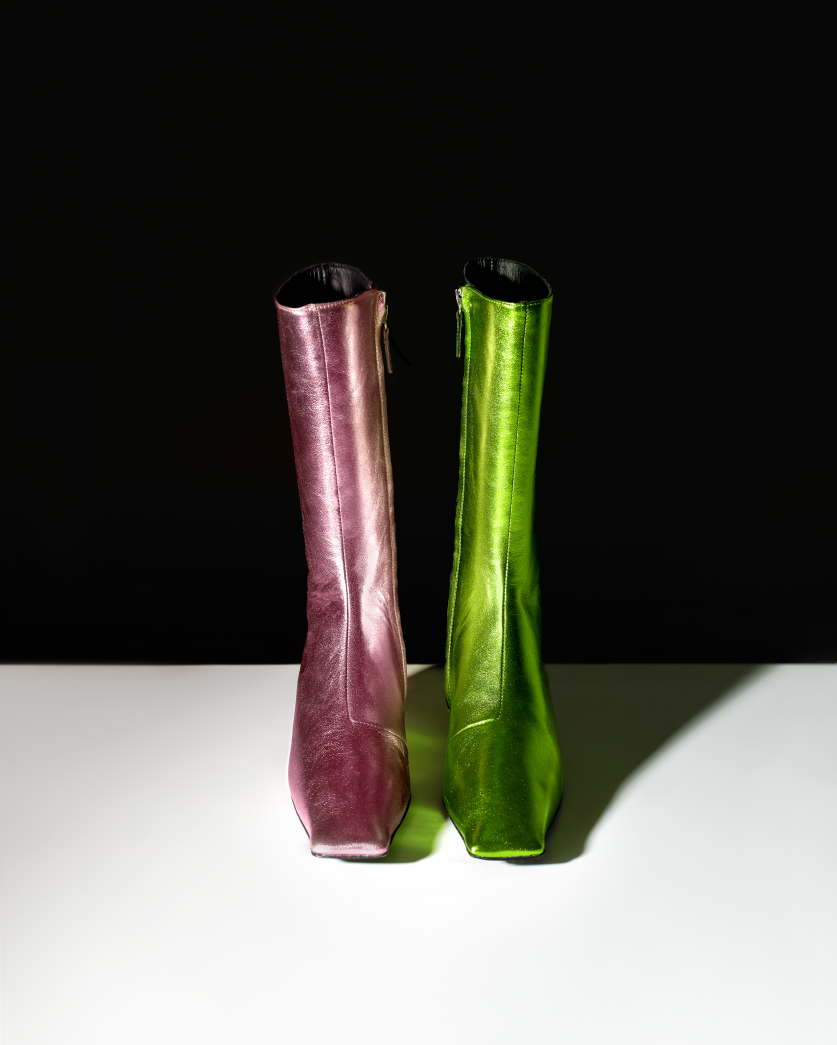
I built the approach around a black void paired with a controlled reflective plane. The black background isolates the shoe and creates a premium, gallery-like frame, while the reflective surface underneath adds dimensionality and sheen without competing for attention. This setup lets glossy materials read as rich rather than plastic and gives satin its characteristic weave and depth. For the pink and green pairing, I used saturated complements to signal Abra's bold, playful ethos (gender-fluid without tipping into abstraction or relying on clichéd identity marketing). The color contrast also functions strategically: it differentiates product variations at a glance and creates attention-grabbing tension on social media without sacrificing the legibility an e-commerce team needs.
Lighting precision for material fidelity
Lighting was precise and product-sensitive. I used hard light to sculpt contours and generate the strong shadows that give footwear its three-dimensional form, but I managed hotspots carefully to suppress glare on metallic hardware and satin toe boxes. Specular highlights were placed deliberately (along edges, hardware details, and heel curves) so they define structure rather than distract. The goal was to show every design decision: the spike detailing, the arch shape, the closure type, and the way light catches the material's finish. This approach finds a middle lane where editorial attitude and e-commerce discipline coexist.
Compositions built for modular deployment
Compositions ranged from singular, sculptural angles to balanced side-by-side arrangements. The duo shots leverage color contrast and negative space to keep both shoes legible while creating a cohesive visual rhythm that could carry across a full lookbook or campaign series. I framed tightly enough to emphasize form but left enough breathing room to preserve the shoes' sculptural presence. Each image was designed to function independently (on a product page, in a press kit, or as a standalone social post) while contributing to a larger visual language that's instantly recognizable as Abra.
The Application:
Multi-channel deployment without visual compromise
The resulting collection works well for multiple uses. The singular shots serve as launch-ready campaign images, the duo compositions function as lookbook or social content, and the tight crops on material details provide texture proof that supports premium positioning at an accessible price point. These are images designed to reduce hesitation about fit and finish while preserving desirability (important for a brand selling sculptural footwear online where customers can't physically assess heel height, arch support, or material quality). The pink-green pairing and hard-shadow aesthetic create a repeatable motif that could scale across seasonal drops without feeling templated, giving Abra a coherent visual identity that translates from web to press to retail partner portals.
Independent labels navigating editorial and commercial tension
This approach would work particularly well for independent fashion labels navigating the tension between editorial credibility and commercial clarity. Brands like Abra need photos that perform in search results and on social media while satisfying the taste standards of fashion insiders and retail buyers. The reflective black setup delivers premium sheen and material fidelity, the high-contrast lighting provides the sculptural punch that catches attention, and the controlled highlight placement ensures every design detail reads clearly across devices and platforms. It's a system built for speed and consistency (deliver once, deploy everywhere) which matters when you're managing frequent releases and tight press deadlines.
The Takeaway:
Creative vision paired with commercial discipline
As a personal project, this demonstrates my capability to balance creative vision with commercial discipline. I can make footwear look expensive and editorial without sacrificing the clarity required for conversion, and I understand how to build a visual language that scales across campaign, e-commerce, and social media without losing coherence. If your brand is launching sculptural silhouettes, working with challenging materials like satin or metallics, or trying to communicate inclusive sizing and gender-fluid design with taste rather than tokenism, let's talk about how we can build a photography system that protects your premium positioning while driving performance across every channel.
Does your brand need images that work as hard as your product design?


