The Client:
Pattern photography for a premium supplement brand with cafe culture positioning
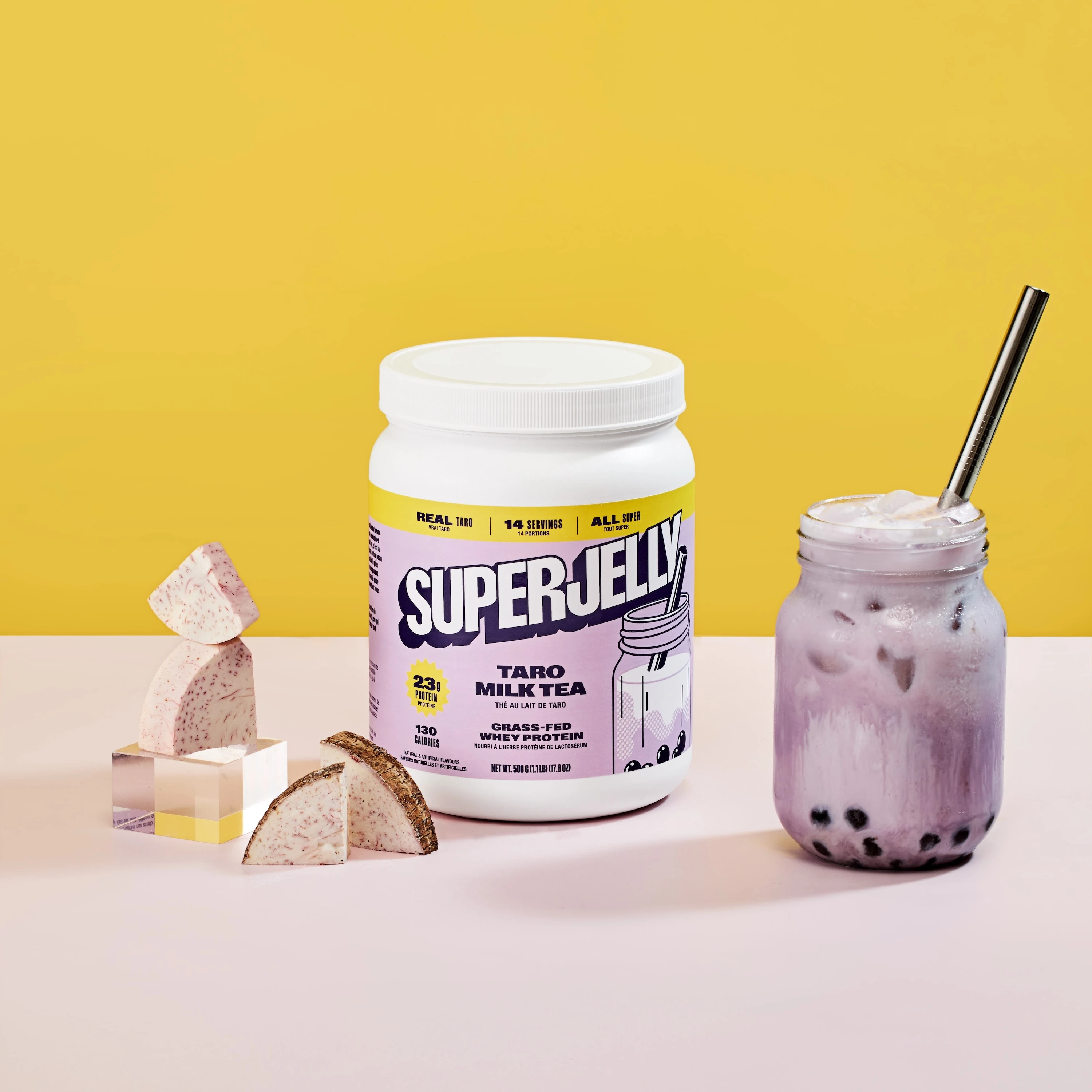
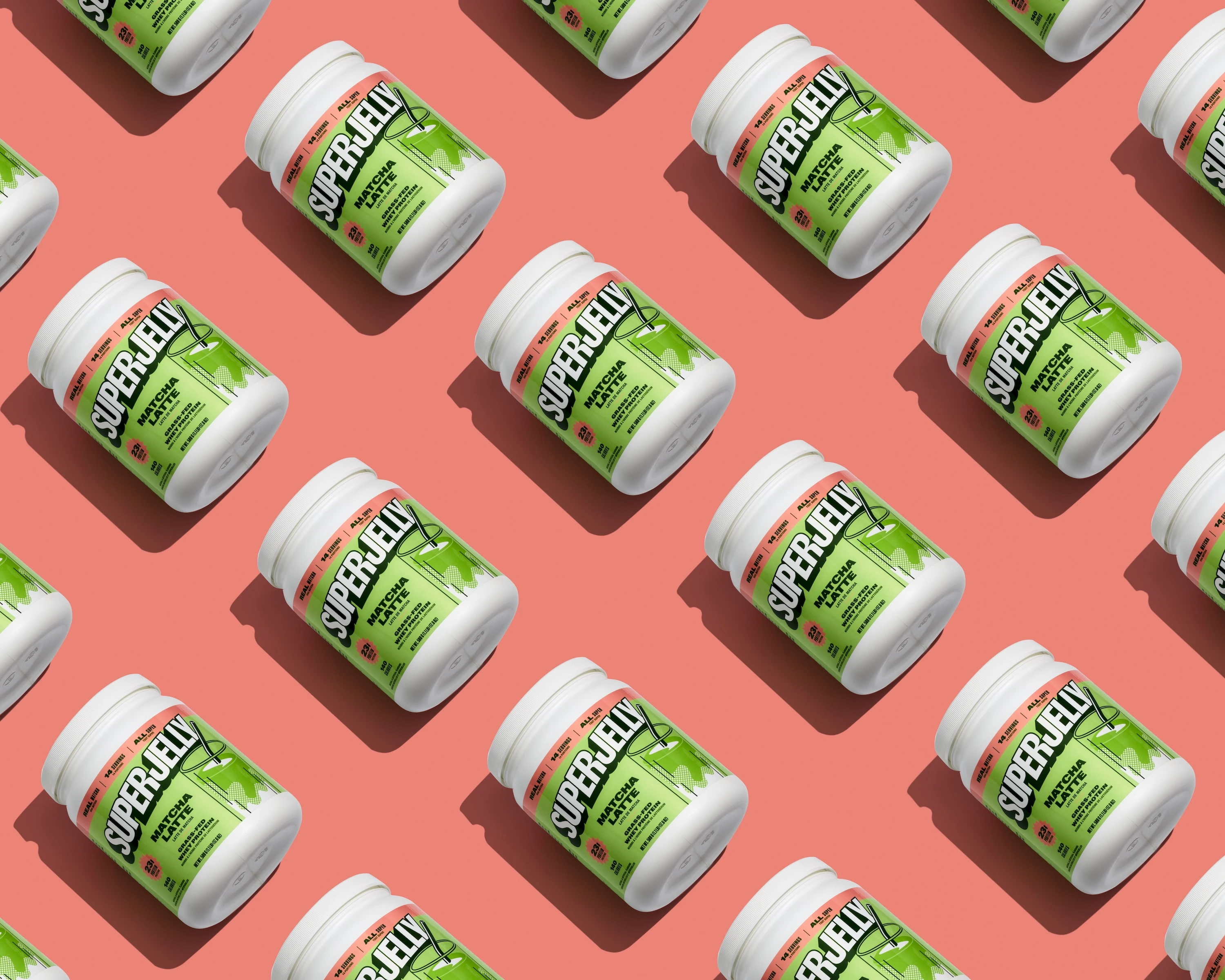
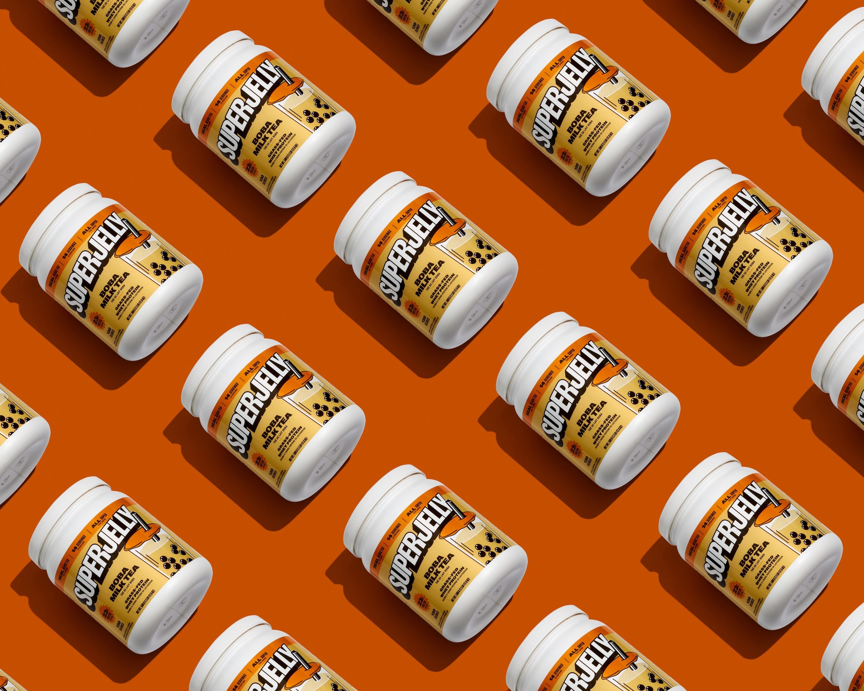
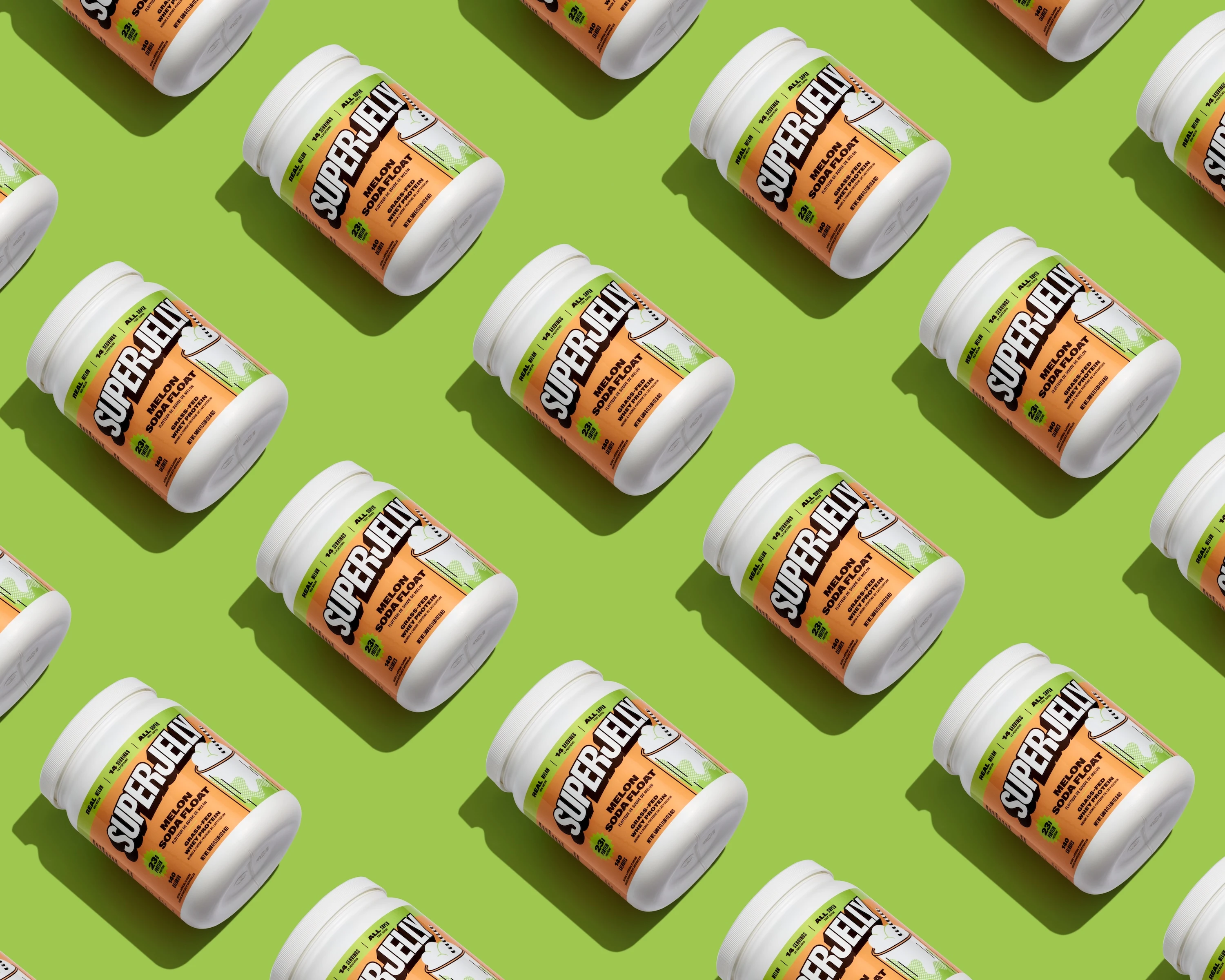
I photographed a pattern-driven image collection for SUPERJELLY, a British Columbia-based supplement brand known for dessert-inspired flavors like London Fog, Taro Milk Tea, and Matcha Latte. The project focused on creating on-brand pattern images designed for visual interest across brand channels. These images were not intended for traditional e-commerce use, but rather to establish a recognizable visual identity that could carry across social media, email campaigns, and brand storytelling moments where the product photography needed to feel more expansive than standard product shots.
SUPERJELLY's packaging features vibrant purple tubs with glossy finishes, and their flavor profiles lean heavily into café culture rather than typical sports nutrition aesthetics. The brand positions itself at a premium price point, so the photography needed to support that positioning while making unconventional flavor names feel credible and appetizing. Working from Vancouver, I approached this as an exercise in building a repeatable visual system where each flavor could have its own color world while maintaining cohesive brand recognition.
The Execution:
Bold color fields and diagonal grid compositions for scroll-stopping recognition
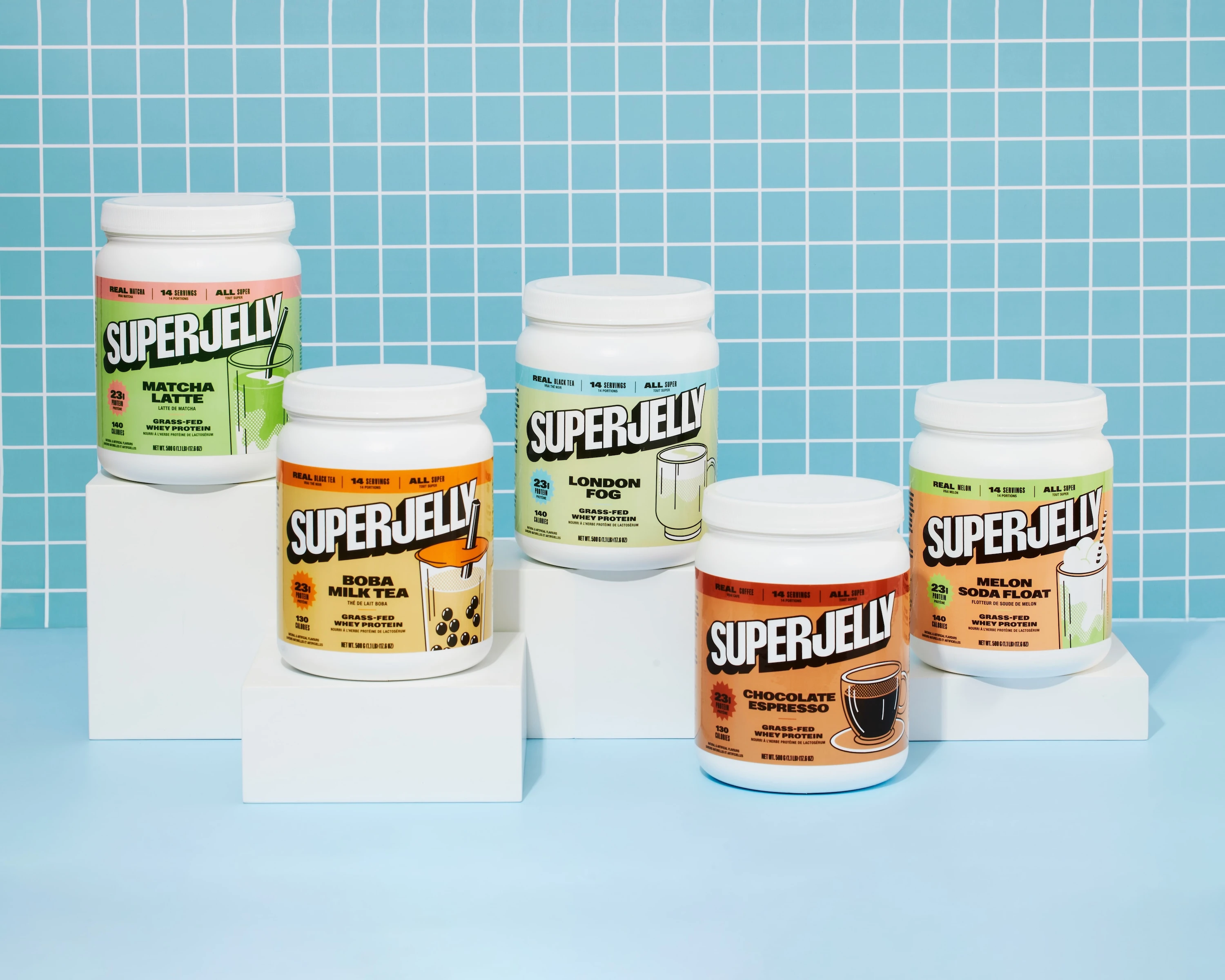
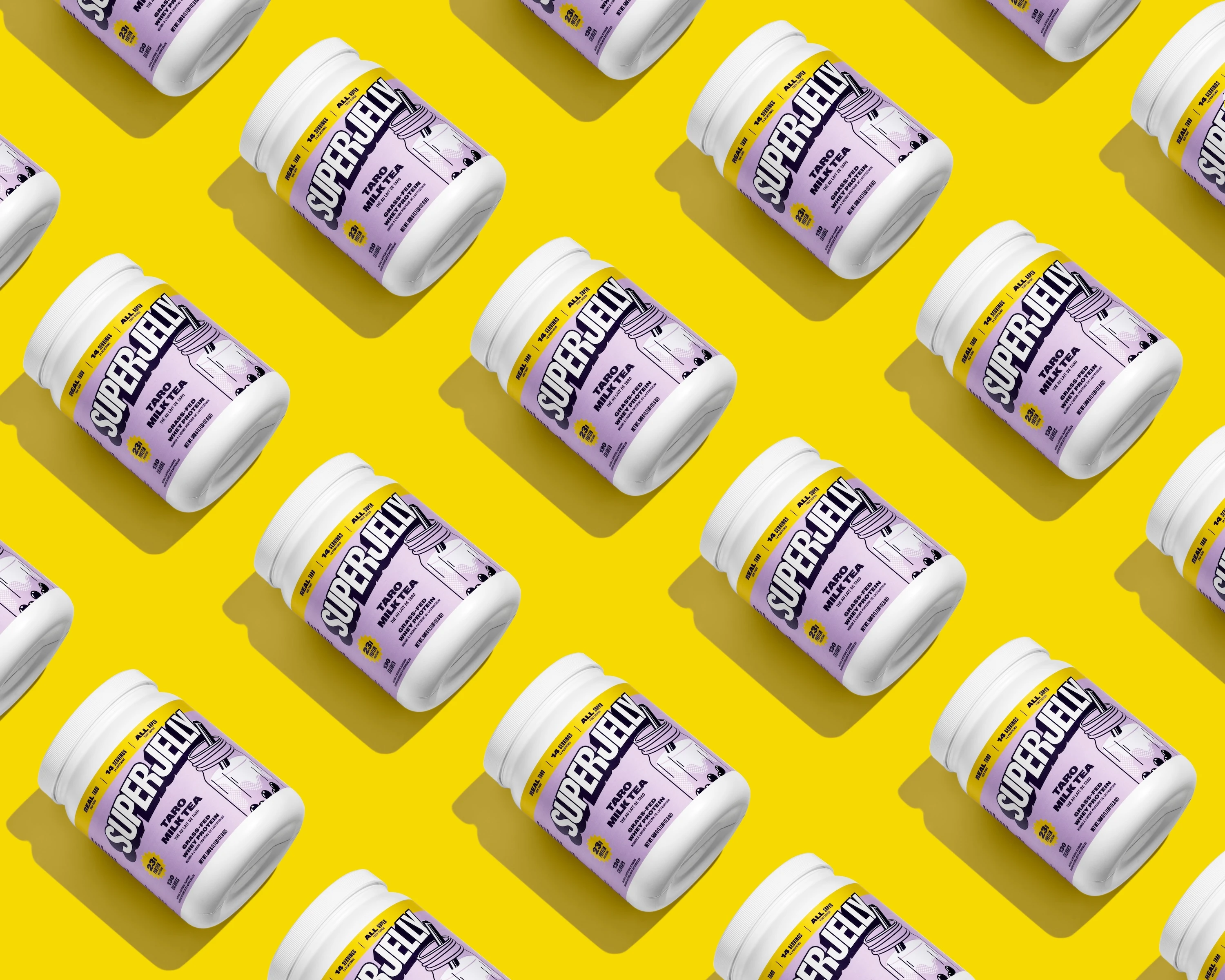
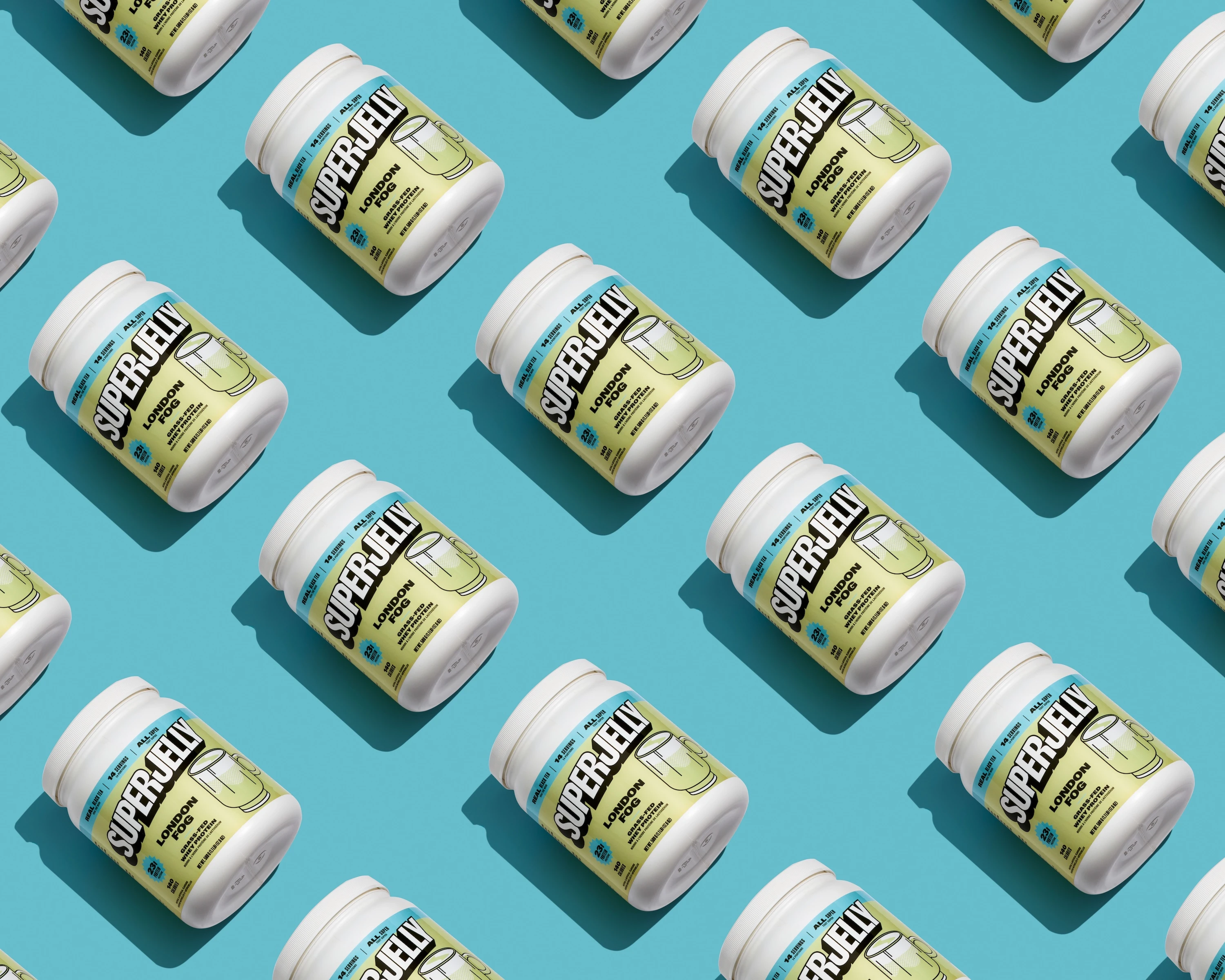
I structured the shoot around bold, flavor-keyed background fields that would make each SKU instantly identifiable. The purple protein tubs were placed on electric yellow, bright blue, orange, and green sets, creating strong color contrast that reads clearly in fast-scroll environments. I used top-down diagonal grid compositions with precise spacing between tubs, arranging them in repeating patterns that create visual rhythm. Some compositions included varied-height white platforms to add depth and break up the flatness that can happen with pure pattern work.
The lighting strategy centered on high-key, soft setups that preserved label legibility on the glossy tubs while managing reflections. Product photography for premium supplement brands requires balancing visual interest with technical clarity, especially when the packaging has reflective surfaces that can obscure important label information. I used controlled, even illumination to maintain true color across the vibrant backgrounds while adding subtle directional shadowing to give the tubs dimensionality without introducing clutter or harsh contrast.
Cafe culture props as flavor credibility signals
For the flavor-specific images, I incorporated props that anchored each SKU in café culture. The London Fog shots included tea, dried lavender, and vanilla beans. Matcha Latte compositions featured a bamboo whisk and fine matcha powder. Taro Milk Tea images showed actual taro pieces alongside a styled drink. These elements were not decorative. They served to make the flavor names feel real and premium rather than artificial or novelty-focused. Each prop was photographed with the same high-key lighting and clean surfaces to maintain consistency across the collection.
I paid close attention to how the background hues interacted with each SKU's identity. The brand uses green and red accent colors in some flavors, so I tuned the background palettes to complement rather than compete with those elements. The goal was to ensure the product remained the visual anchor on any backdrop, with the colored fields enhancing rather than overwhelming the tub. This approach creates images that work across multiple contexts, whether they are used as standalone social posts, layered into campaign graphics, or arranged in grid layouts.
The Result:
A modular visual system that scales with product line growth
The pattern images I delivered were designed to be modular and repeatable. SUPERJELLY launches seasonal flavors frequently, so the photography system needed to accommodate new SKUs without requiring a complete creative overhaul each time. The consistent angles, lighting setup, and compositional structure mean the brand can extend the visual language as their product line grows. The clean, high-contrast approach also ensures the images scale well from large format down to mobile thumbnails, maintaining clarity and brand recognition at any size.
This collection establishes a visual signature that differentiates SUPERJELLY from typical sports nutrition product photos. The café-inspired styling, bold color blocking, and pattern-driven compositions position the brand closer to lifestyle and food photography aesthetics than traditional supplement imagery. The result is a body of work that communicates both the indulgent flavor experience and the premium positioning the brand requires to justify its price point.
If your supplement brand needs photography that balances premium aesthetics with practical clarity across multiple marketing channels, I can help you build a visual system that scales with your product line and supports your brand story. As a Vancouver product photographer, I work with brands that need imagery to make their flavors feel credible, their packaging look premium, and their brand stand out in a crowded category. Reach out to discuss your next project.
<script type="application/ld+json">
{
"@context": "https://schema.org",
"@type": "Service",
"name": "Flavor-First Lifestyle Photography for Supplement Brands with Multi-Flavor Pattern Grid Systems",
"description": "Strategic visual systems combining color-complementary backgrounds, modular pattern grids, and macro texture photography to position premium supplement brands through repeatable, platform-optimized asset libraries that maintain label legibility and scale across flavor SKUs.",
"serviceType": "Lifestyle Photography for Supplement Brands",
"provider": {
"@type": "Organization",
"name": "Elina Kustlyvy Photography",
"url": "https://www.elinakustlyvy.com"
},
"areaServed": [
{"@type": "City", "name": "Vancouver", "addressRegion": "BC", "addressCountry": "CA"},
{"@type": "City", "name": "Toronto", "addressRegion": "ON", "addressCountry": "CA"},
{"@type": "City", "name": "Los Angeles", "addressRegion": "CA", "addressCountry": "US"},
{"@type": "City", "name": "Seattle", "addressRegion": "WA", "addressCountry": "US"}
],
"url": "https://www.elinakustlyvy.com/projects/superjellyco"
}
</script>
<script type="application/ld+json">
{
"@context": "https://schema.org",
"@type": "ImageObject",
"contentUrl": "https://cdn.prod.website-files.com/653c048c7bdcdc4c8f4346aa/688e76e8f9fd90a2a838881a_68787feb9f03ec4301f8ac8e_L-Taro-Milk-Tea-pattern.webp",
"url": "https://cdn.prod.website-files.com/653c048c7bdcdc4c8f4346aa/688e76e8f9fd90a2a838881a_68787feb9f03ec4301f8ac8e_L-Taro-Milk-Tea-pattern.webp",
"name": "Superjelly Taro Milk Tea Multi-Flavor Pattern Grid with Color-Complementary Purple Background",
"caption": "Overhead modular pattern grid showcasing Superjelly Taro Milk Tea protein powder with complementary purple background, repeating bottle placement, and ingredient props creating visual hierarchy for DTC supplement brand marketing.",
"creator": {
"@type": "Person",
"name": "Elina Kustlyvy",
"url": "https://www.elinakustlyvy.com"
},
"copyrightHolder": {
"@type": "Organization",
"name": "Elina Kustlyvy Photography"
},
"acquireLicensePage": "https://www.elinakustlyvy.com/contact"
}
</script>
<script type="application/ld+json">
{
"@context": "https://schema.org",
"@type": "Brand",
"name": "Superjelly",
"description": "Canadian-based sports nutrition brand offering low-sugar, flavor-driven whey isolate and vegan protein supplements in inventive flavors like Melon Soda Float, Matcha Latte, and Taro Milk Tea, emphasizing clean formulations and Canadian manufacturing.",
"url": "https://www.superjellyco.com",
"sameAs": []
}
</script>
<script type="application/ld+json">
{
"@context": "https://schema.org",
"@type": "Product",
"name": "Superjelly Taro Milk Tea Protein Powder",
"description": "Flavor-first whey isolate protein powder in Taro Milk Tea flavor with low sugar, clean ingredient list, and third-party testing from British Columbia-based Superjelly Nutrition.",
"brand": {
"@type": "Brand",
"name": "Superjelly"
},
"category": "Sports Nutrition Protein Powder",
"review": {
"@type": "Review",
"author": {
"@type": "Person",
"name": "Elina Kustlyvy"
},
"reviewRating": {
"@type": "Rating",
"ratingValue": "5",
"bestRating": "5"
},
"reviewBody": "The powder exhibits fine, consistent granulation with no visible clumping, photographing with excellent texture separation under macro lenses. Packaging features high-contrast label typography that maintains crisp legibility even at mobile crop dimensions, with glossy finish responding well to controlled soft shadowing techniques."
}
}
</script>
<script type="application/ld+json">
{
"@context": "https://schema.org",
"@type": "BreadcrumbList",
"itemListElement": [
{
"@type": "ListItem",
"position": 1,
"name": "Projects",
"item": "https://www.elinakustlyvy.com/projects"
},
{
"@type": "ListItem",
"position": 2,
"name": "Food Photography",
"item": "https://www.elinakustlyvy.com/projects/food-photography"
},
{
"@type": "ListItem",
"position": 3,
"name": "Lifestyle Photography for Supplement Brands: Superjelly Case Study",
"item": "https://www.elinakustlyvy.com/projects/superjellyco"
}
]
}
</script>
<script type="application/ld+json">
{
"@context": "https://schema.org",
"@type": "WebPage",
"name": "Lifestyle Photography for Supplement Brands: Superjelly Case Study",
"description": "How flavor-keyed color strategy, multi-flavor pattern grids, and macro texture photography built a scalable visual system for Superjelly's premium DTC supplement brand, delivering platform-optimized assets with mobile-legible labels and measurable engagement improvements.",
"url": "https://www.elinakustlyvy.com/projects/superjellyco",
"speakable": {
"@type": "SpeakableSpecification",
"cssSelector": [".article-intro", ".article-conclusion"]
},
"about": [
{"@type": "Thing", "name": "Lifestyle Photography for Supplement Brands"},
{"@type": "Thing", "name": "Multi-Flavor Pattern Grid Photography"},
{"@type": "Thing", "name": "Color-Complementary Product Photography"},
{"@type": "Thing", "name": "Macro Texture Supplement Photography"}
],
"mentions": [
{
"@type": "Brand",
"name": "Superjelly",
"sameAs": "https://www.superjellyco.com"
},
{
"@type": "Thing",
"name": "Superjelly Taro Milk Tea Protein Powder"
},
{
"@type": "Thing",
"name": "Superjelly Matcha Latte Protein Powder"
},
{
"@type": "Thing",
"name": "Superjelly London Fog Protein Powder"
},
{
"@type": "Thing",
"name": "Superjelly Melon Soda Float Protein Powder"
}
]
}
</script>
<script type="application/ld+json">
{
"@context": "https://schema.org",
"@type": "HowTo",
"name": "How to Build a Scalable Multi-Flavor Visual System for Supplement Brands Using Pattern Grid Photography",
"description": "A structured approach combining color-complementary backgrounds, modular pattern grids, and macro texture techniques to create a repeatable asset library that maintains brand consistency across flavor SKUs while optimizing for mobile label legibility and platform-specific deliverables.",
"step": [
{
"@type": "HowToStep",
"position": 1,
"name": "Establish Color-Complementary Framework for Each Flavor SKU",
"text": "Map each flavor to a specific complementary color pairing designed for maximum color separation—yellow against purple for energy flavors, green against pink for plant-based freshness, saturated blues for cooling profiles. Lock in consistent lighting ratios across sessions so assets from different shoots sit seamlessly together, building visual equity where every new image reinforces the system rather than fragmenting it."
},
{
"@type": "HowToStep",
"position": 2,
"name": "Create Modular Pattern Grids with Overhead and Angled Compositions",
"text": "Use overhead and slightly angled modular layouts where bottles, scoops, and ingredient props repeat in clean grids, employing risers and tiled set design to create clear hierarchy. This technique delivers both a hero image communicating variety and premium quality in a single frame, plus the ability to crop individual sections for single-SKU ads or carousel posts without losing coherence, building an asset library that scales without commissioning separate shoots."
},
{
"@type": "HowToStep",
"position": 3,
"name": "Optimize Label Legibility Through High-Key Even Illumination and Mobile Crop Testing",
"text": "Set up high-key, even illumination with controlled soft shadowing, spacing light sources to eliminate hotspots on glossy packaging while keeping typography sharp. Run mobile crop tests at 320 to 390 pixel widths before finalizing, ensuring dosage information, flavor callouts, and ingredient highlights remain crisp when consumers encounter product pages and Instagram ads on small phone screens, reducing ad disapprovals and conversion friction."
},
{
"@type": "HowToStep",
"position": 4,
"name": "Capture Macro Texture Details to Make Clean Formulations Tangible",
"text": "Use macro lenses and shallow depth of field to capture powder granules, mix-in details, and foam textures, pairing them with culinary props like matcha powder spills or tapioca pearls to reinforce flavor stories. These texture shots serve as secondary assets—cutaway details for social posts, close-up insets for product pages, and proof points for email campaigns emphasizing ingredient transparency—elevating perceived quality and giving marketing teams visual shorthand for real ingredients with no fillers."
}
]
}
</script>
<script type="application/ld+json">
{
"@context": "https://schema.org",
"@type": "FAQPage",
"mainEntity": [
{
"@type": "Question",
"name": "How do you make supplement packaging labels legible in product photos for mobile ads and product pages?",
"acceptedAnswer": {
"@type": "Answer",
"text": "Label legibility requires high-key, even illumination with controlled soft shadowing, spacing light sources to eliminate hotspots on glossy packaging while keeping typography sharp. Before finalizing lighting setups, run mobile crop tests at 320 to 390 pixel widths—the dimensions where most users first encounter product pages and Instagram ads—to ensure dosage information, flavor callouts, and ingredient highlights remain crisp. Any label element that blurs or loses contrast at that size triggers adjustments to lighting or camera angle, delivering images where claims stay clear even when consumers zoom in on small phone screens."
}
},
{
"@type": "Question",
"name": "What is multi-flavor pattern grid photography and how does it help supplement brands scale campaigns?",
"acceptedAnswer": {
"@type": "Answer",
"text": "Multi-flavor pattern grid photography uses overhead and slightly angled modular compositions where bottles, scoops, and ingredient props repeat in clean grids with risers and tiled set design creating clear hierarchy. This technique delivers a hero image that communicates variety and premium quality in a single frame for homepage banners and print collateral, while the modular structure allows marketing teams to crop individual sections for single-SKU ads or carousel posts without losing coherence. Instead of commissioning separate hero shots for every flavor launch, brands can extract assets from a master pattern and maintain consistency, building an asset library that scales campaigns without starting from scratch."
}
},
{
"@type": "Question",
"name": "How does color-complementary product photography boost brand recall for supplement brands?",
"acceptedAnswer": {
"@type": "Answer",
"text": "Color-complementary product photography maps each flavor to a specific background palette designed for maximum color separation—yellow against purple for energy, green against pink for plant-based freshness, saturated blues for cooling flavors. Complementary pairings boost brand recall by creating high-contrast memory anchors, making it easier for consumers scrolling through feeds to recognize the brand in a fraction of a second. By locking in consistent lighting ratios across sessions, each flavor maintains a distinct color identity while reinforcing a unified visual system, ensuring that new images strengthen recognition rather than fragmenting it."
}
}
]
}
</script>

- other recent projects
(001)
Hibiscus Rose Rooibos
Swan Dive hard tea photography balancing holiday warmth with botanical craft identity
(001)
Pierre Hermé's Paris - Macarons
Pierre Herme macaron photography using gradient backgrounds and product stacking
(001)
Ahn & Chi + Kasama Chocolate
Kasama Chocolate collaboration bar photographed with Vietnamese coffee details for Anh & Chi restaurant launch
Photographing Anh & Chi's Vietnamese sauces with ingredient flat lays and bottle clarity for retail launch
29972.webp)
29785.webp)
