The Project:
Color-shifting iridescent mask photographed across skin tones
I photographed Comme Deux's Discoskin iridescent mask as a personal project exploring how to capture color-shifting textures honestly. The Danish beauty brand makes skincare that breaks from minimal Scandinavian aesthetics with bold textures and vibrant finishes. This project focused on showing the mask's iridescent quality across different skin tones and creating images that communicate texture and finish truthfully.
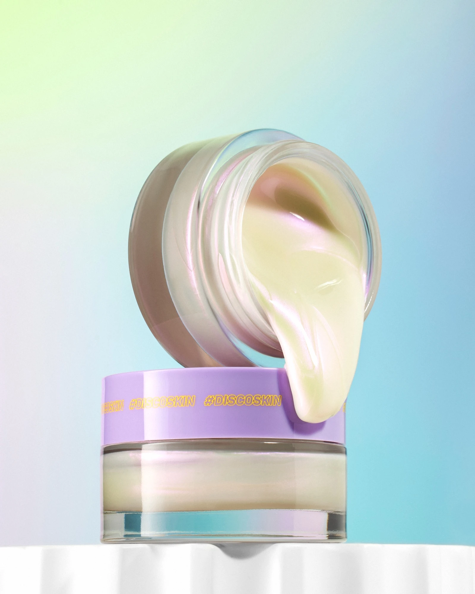
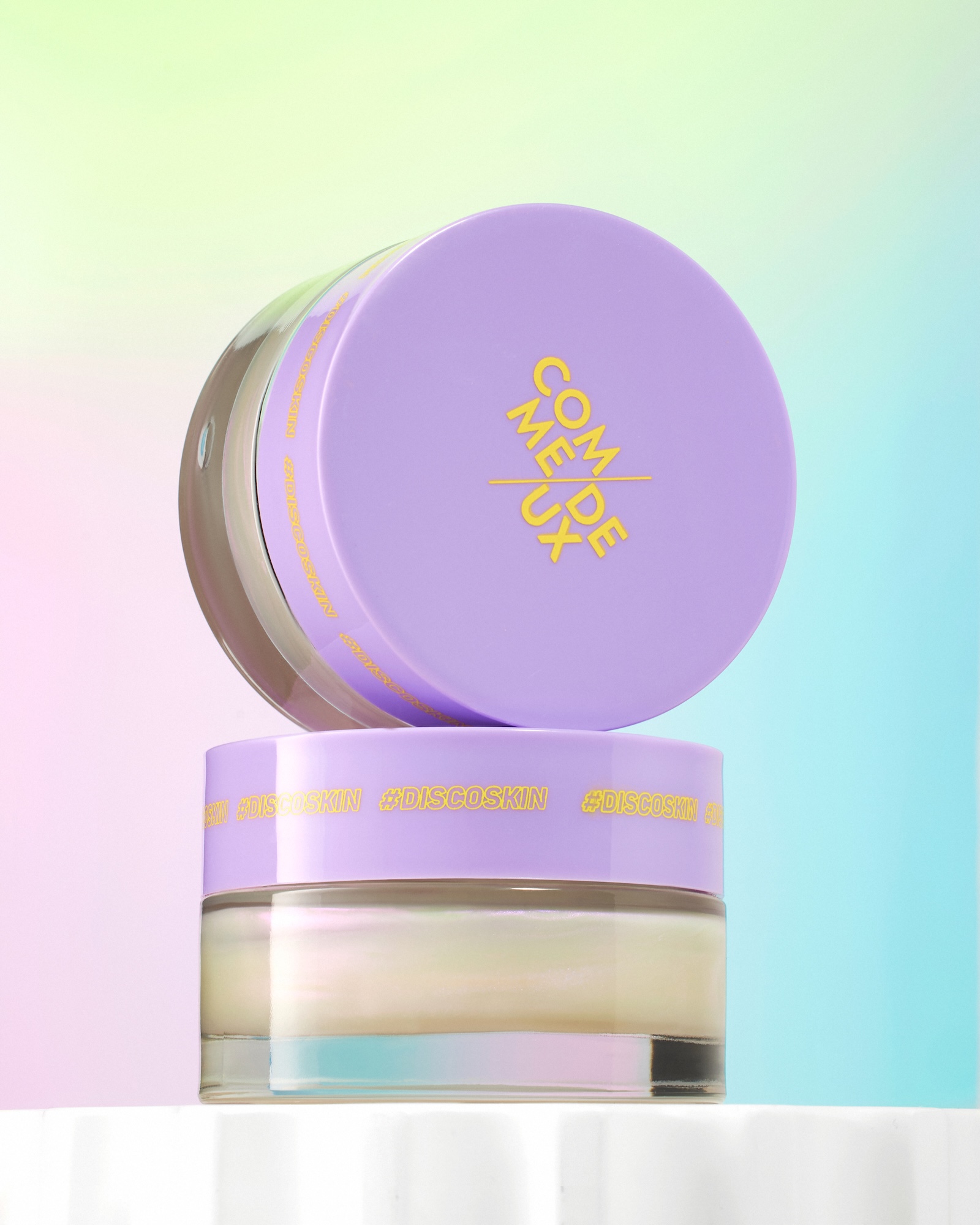
The project centered on two creative challenges I wanted to solve. First, I built in-camera gradients using colored gels and lighting angles rather than post-production effects. I wanted the backdrop to harmonize with the product's color shift while keeping everything authentic. Second, I designed a still-life composition where stacked jars reveal the product texture. The closed jar sits on top while the open jar below shows the mask pouring out in a controlled way that looks tactile and premium.
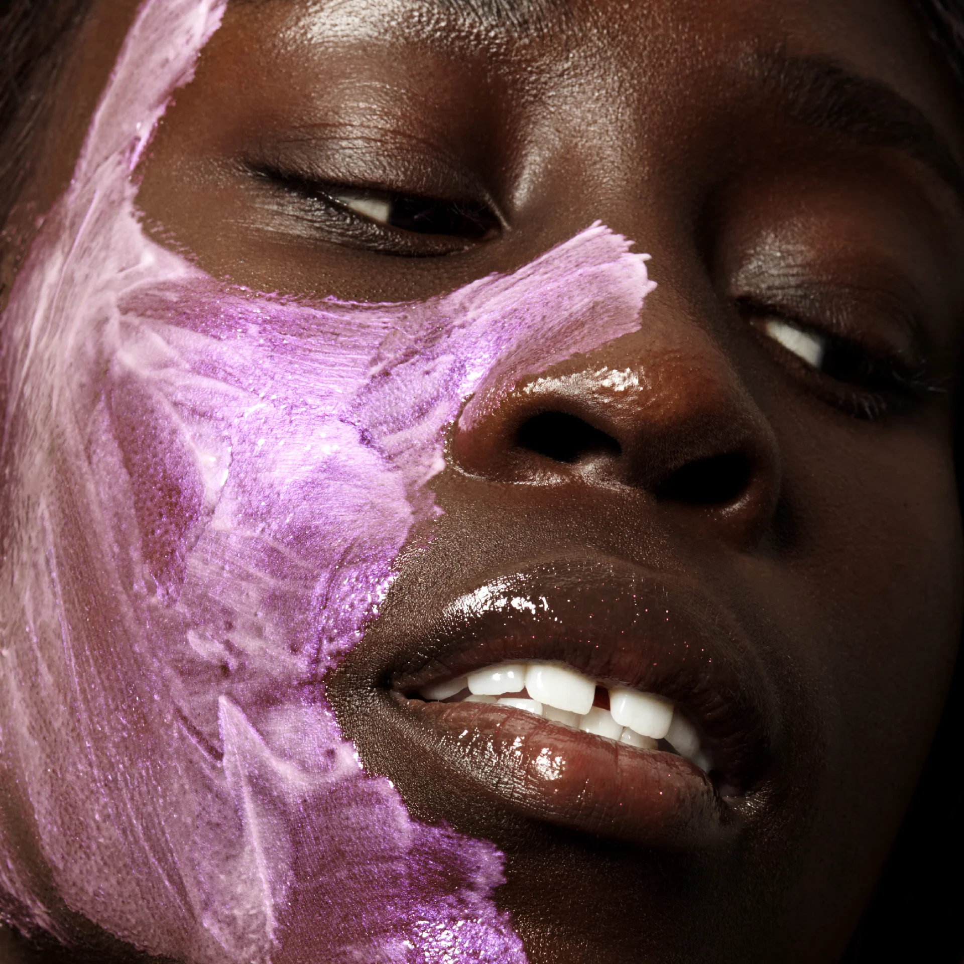
The iridescent texture itself presented the biggest photographic puzzle. The mask has a greenish base with visible purple particles that shift depending on light angle and skin tone. I photographed it on a model with deep skin where the purple tones become more prominent and the green recedes. That color behavior needed to register clearly in the final images because it's how the product actually performs on darker complexions.
The Execution:
Specular lighting for shimmer and reflective finishes
As a Vancouver product photographer working on this Copenhagen-inspired project, I approached the skincare photography with specular lighting that reveals shimmer and reflective qualities without blowing out highlights or oversaturating the iridescence. I positioned light sources to catch the product's sheen while maintaining detail in both the particles and the cream base. For the still-life setup, I angled the jars to introduce dimension and captured the pour at a moment where viscosity reads clearly. The texture looks luxurious and intentional rather than messy or cheap.
The on-skin application required tight framing to show how the mask sits on the surface. I lit the model's face to capture the creamy, hydrated finish and to make the purple shift visible without exaggeration. The goal was to document what someone would actually see when they apply the product, not to create an idealized version. I kept retouching minimal to preserve skin texture and the mask's true appearance.
In-camera gradient backdrop using colored gels
The gradient backdrop emerged entirely in-camera through layered lighting. I used a green-to-blue transition that echoes the mask's color profile without competing with it. The gradient adds visual interest and ties the still-life and on-skin images into a cohesive set, but it doesn't distract from the product itself. The technique proved more time-intensive than adding color in post, but the result feels more authentic and crafted.
The Delivery:
Campaign images, product photos, and e-commerce variants
I delivered a photo collection designed for multiple uses. The on-skin application works as a primary campaign image. The stacked jar composition with the controlled pour serves as a main product photo that shows packaging and texture together. I also provided clean-background variants where the iridescence and color shift remain legible even at small sizes for e-commerce galleries. The gradient-backdrop versions support social content where bold color and texture stand out.
The Outcome:
Accurate documentation of optical properties and texture variation
This project demonstrated how to photograph products with unusual optical properties while maintaining accuracy. Iridescent textures require lighting precision to show their color shift without making them look filtered or inconsistent. Showing that shift on deeper skin tones adds another layer of complexity because the finish genuinely changes. The photography needed to document that variation rather than force a single idealized look.
The pour shot solved a common product photography challenge for gel and cream textures. Viscosity is hard to communicate in a still image, and texture can easily look unappealing if the styling isn't controlled. By stacking the jars and capturing the pour at a specific moment, I created an image that shows how the product moves and feels without crossing into messy or unappetizing territory.
Working from Vancouver, I bring this same approach to beauty product photography that handles complex textures and color-shifting finishes with technical precision. Reach out to discuss your next project.
<script type="application/ld+json">
{
"@context": "https://schema.org",
"@type": "Service",
"name": "Iridescent Skincare Product Photography with Gradient Lighting",
"description": "Commercial beauty photography engineered to capture metameric color shifts, product-in-motion textures, and on-skin iridescence using gradient lighting setups and true-color workflows for skincare brands.",
"serviceType": "Skincare Photography",
"provider": {
"@type": "Organization",
"name": "Elina Kustlyvy Photography",
"url": "https://www.elinakustlyvy.com"
},
"areaServed": [
{"@type": "City", "name": "Vancouver", "addressRegion": "BC", "addressCountry": "CA"},
{"@type": "City", "name": "Toronto", "addressRegion": "ON", "addressCountry": "CA"},
{"@type": "City", "name": "Los Angeles", "addressRegion": "CA", "addressCountry": "US"},
{"@type": "City", "name": "Seattle", "addressRegion": "WA", "addressCountry": "US"}
],
"url": "https://www.elinakustlyvy.com/projects/comme-deux"
}
</script>
<script type="application/ld+json">
{
"@context": "https://schema.org",
"@type": "ImageObject",
"contentUrl": "https://cdn.prod.website-files.com/653c048c7bdcdc4c8f4346aa/688e79e383e2b21625e666c4_68788d8cae240282cf546cb9_March211x1_2.webp",
"url": "https://cdn.prod.website-files.com/653c048c7bdcdc4c8f4346aa/688e79e383e2b21625e666c4_68788d8cae240282cf546cb9_March211x1_2.webp",
"name": "Comme Deux Discoskin Iridescent Face Mask Product Photography",
"caption": "On-skin close-up capturing the purple-green iridescent color shift of Comme Deux's Discoskin mask using gradient lighting engineered to reveal metameric particles at optimal angle of incidence.",
"creator": {
"@type": "Person",
"name": "Elina Kustlyvy",
"url": "https://www.elinakustlyvy.com"
},
"copyrightHolder": {
"@type": "Organization",
"name": "Elina Kustlyvy Photography"
},
"acquireLicensePage": "https://www.elinakustlyvy.com/contact"
}
</script>
<script type="application/ld+json">
{
"@context": "https://schema.org",
"@type": "Brand",
"name": "Comme Deux",
"description": "Danish beauty brand launched in 2018 offering community-driven, vegan, perfume-free skincare and makeup with unconventional textures and iridescent formulations co-created with consumers.",
"url": "https://commedeux.com",
"sameAs": [
"https://www.instagram.com/commedeuxbeauty/",
"https://www.facebook.com/commedeuxbeauty/"
]
}
</script>
<script type="application/ld+json">
{
"@context": "https://schema.org",
"@type": "Product",
"name": "Discoskin Iridescent Exfoliating Face Mask",
"description": "Iridescent face mask with mandelic acid (AHA) and glycerin that delivers warming sensation, micro-circulation stimulation, and purple-green color shift depending on skin tone and light angle.",
"brand": {
"@type": "Brand",
"name": "Comme Deux"
},
"category": "Skincare",
"review": {
"@type": "Review",
"author": {
"@type": "Person",
"name": "Elina Kustlyvy"
},
"reviewRating": {
"@type": "Rating",
"ratingValue": "5",
"bestRating": "5"
},
"reviewBody": "The mask's thick, creamy consistency photographs with sculptural viscosity in pour shots. The iridescent particles refract at engineered angles to reveal a true purple-green shift—on lighter skin tones the green reads forward with subtle purple highlights, while on darker skin the purple advances and green recedes. The warming sensation and texture remain visible through macro optics that capture individual shimmer particles and surface sheen without flattening."
}
}
</script>
<script type="application/ld+json">
{
"@context": "https://schema.org",
"@type": "BreadcrumbList",
"itemListElement": [
{
"@type": "ListItem",
"position": 1,
"name": "Projects",
"item": "https://www.elinakustlyvy.com/projects"
},
{
"@type": "ListItem",
"position": 2,
"name": "Skincare Photography",
"item": "https://www.elinakustlyvy.com/projects/skincare-photography"
},
{
"@type": "ListItem",
"position": 3,
"name": "Comme Deux Iridescent Skincare",
"item": "https://www.elinakustlyvy.com/projects/comme-deux"
}
]
}
</script>
<script type="application/ld+json">
{
"@context": "https://schema.org",
"@type": "WebPage",
"name": "Comme Deux Iridescent Skincare Photography Case Study",
"description": "Commercial beauty photography case study demonstrating gradient lighting techniques to capture iridescent color shifts, product-in-motion textures, and true-color on-skin transformations for Danish skincare brand Comme Deux.",
"url": "https://www.elinakustlyvy.com/projects/comme-deux",
"speakable": {
"@type": "SpeakableSpecification",
"cssSelector": [".article-intro", ".article-conclusion"]
},
"about": [
{"@type": "Thing", "name": "Iridescent skincare product photography"},
{"@type": "Thing", "name": "Product-in-motion beauty photography"},
{"@type": "Thing", "name": "Gradient lighting for metameric color shifts"}
],
"mentions": [
{
"@type": "Brand",
"name": "Comme Deux",
"sameAs": "https://commedeux.com"
},
{
"@type": "Thing",
"name": "Discoskin Iridescent Exfoliating Face Mask"
}
]
}
</script>
<script type="application/ld+json">
{
"@context": "https://schema.org",
"@type": "HowTo",
"name": "How to Photograph Iridescent Skincare Products with Gradient Lighting",
"description": "Commercial photography technique for capturing metameric color shifts in iridescent skincare products using engineered gradient lighting, controlled specular highlights, and true-color workflows.",
"step": [
{
"@type": "HowToStep",
"position": 1,
"name": "Engineer gradient lighting to reveal iridescence",
"text": "Position gelled fill lights to create a smooth, banding-free color transition across the frame. Place light and camera at the exact angle of incidence where iridescent particles refract most visibly—the purple-green shift must be built into the light itself, not added in post-production, to maintain authenticity and trust with transparency-focused audiences."
},
{
"@type": "HowToStep",
"position": 2,
"name": "Capture on-skin transformation across multiple skin tones",
"text": "Maintain a consistent lighting recipe (single key light with gradient fill) across every skin tone while documenting how the iridescent mask adapts—lighter skin shows more green with subtle purple highlights, darker skin brings purple forward and green recedes. Use disciplined depth-of-field to keep pores and shimmer in focus, and implement a color-managed workflow to ensure undertones on screen match real-life appearance."
},
{
"@type": "HowToStep",
"position": 3,
"name": "Freeze product-in-motion texture with high-speed strobe",
"text": "Stage controlled pours using acrylic rigging to position jars without visible supports. Deploy high-speed strobe to freeze motion without ambient blur—run a black-frame test before the pour to confirm no ambient light contaminates the exposure. The resulting frame communicates viscosity, volume, and tactility by showing the mask flowing in a sculptural ribbon that makes viewers want to reach through the screen."
},
{
"@type": "HowToStep",
"position": 4,
"name": "Shoot macro texture studies with cross-polarized lighting passes",
"text": "Use macro optics to isolate texture at a depth-of-field that carves detail without flattening the surface. Capture separate cross-polarized passes (to eliminate surface glare and reveal true color) and unpolarized passes (to preserve specular highlights that make iridescence visible). Place color charts in every setup to ensure the purple-green shift stays consistent across all devices and reduces customer service inquiries about shade accuracy."
}
]
}
</script>
<script type="application/ld+json">
{
"@context": "https://schema.org",
"@type": "FAQPage",
"mainEntity": [
{
"@type": "Question",
"name": "How do you photograph iridescent face masks so the color shift reads on skin?",
"acceptedAnswer": {
"@type": "Answer",
"text": "Iridescence is a light phenomenon that shifts based on angle of incidence, viewer position, and light quality—not a pigment you can simply light with a softbox. I engineer gradient lighting setups using gelled fill lights that create smooth color transitions across the frame, positioning the light and camera at the precise angle where iridescent particles refract most visibly. The purple-green shift is built into the light itself, not added in post, so what the camera captures matches what the product actually looks like under controlled conditions. For on-skin shots, I maintain consistent lighting across different skin tones while documenting how the mask naturally adapts—lighter skin shows more green with purple highlights, darker skin brings purple forward. This approach proves the product's claim while maintaining authenticity that transparency-focused audiences can trust."
}
},
{
"@type": "Question",
"name": "How do you show serum viscosity and texture in still photos for ecommerce?",
"acceptedAnswer": {
"@type": "Answer",
"text": "Product-in-motion shots require high-speed strobe to freeze flow without ambient blur, acrylic rigging to hold containers in position without visible supports, and a black-frame test before the pour to confirm no ambient light contaminates the exposure. For skincare textures like masks or serums, I stage controlled pours—stacking jars so the product flows in a sculptural ribbon that communicates viscosity, volume, and tactility in a single frame. This answers the unasked question every ecommerce customer has: what does this feel like in my hand? For macro texture studies, I shoot cross-polarized and unpolarized lighting passes separately—one eliminates surface glare to reveal true color, the other preserves specular highlights that make shimmer and iridescence visible. Color charts in every setup ensure consistency across devices and reduce return rates from shade mismatches."
}
},
{
"@type": "Question",
"name": "What makes iridescent skincare photography different from standard product photography?",
"acceptedAnswer": {
"@type": "Answer",
"text": "Standard product photography uses generic softbox setups that flatten metameric materials like iridescent masks—the color shift disappears and the product looks indistinguishable from competitors. Iridescent skincare photography requires understanding how to engineer light to reveal the shift: gradient lighting with gelled fills, precise angle-of-incidence control, and separate polarized passes to balance true color against specular highlights. The photography must prove visual claims (the purple-green transition, the warming sensation, the texture) in camera rather than faking them in post, because Gen Z and millennial audiences who value ingredient transparency can immediately spot artificial effects. The result is a modular asset system—hero on-skin portraits, product-in-motion pours, macro texture studies—that works across paid ads, social proof, and ecommerce PDPs while maintaining authentic color accuracy that reduces customer service inquiries and return rates."
}
}
]
}
</script>

- other recent projects
Byoma hydrating serum photography showing dropper mechanics and micro-bubble texture clarity
Rhode skincare photography highlighting texture and gloss with directional lighting
OUAI detox shampoo photography with water splash and product detail
Kibon Beauty sheet mask photography for e-commerce and social media campaigns
Everlucid serum photography using practical gradient lighting techniques
Dfinite foundation swatch photography comparing lighter and deeper shade formulas side by side