Rhode
Rhode skincare photography highlighting texture and gloss with directional lighting
The Opportunity:
Why Rhode works as a case study in beauty photography
I chose Rhode as a creative subject because they've cracked something most beauty brands miss: making science feel sensual without feeling clinical. I watch the accessible prestige space closely, and Rhode's approach to texture and glow is distinctive. The brief I set for myself was to capture that "glazed" promise in a way that feels premium, minimal, and truthful. No greasy highlights or over-retouched blur.
This is a personal project, not commissioned work, but it reflects the kind of visual thinking clean beauty brands need when they're scaling across e-commerce, social, and retail. Rhode's narrow SKU strategy and founder-led aesthetic gave me a focused playground to explore how texture photography can translate efficacy into something visibly appetizing.
The Challenge:
Saturated feeds and product pages that fail to show what formulas feel like
If a brand like Rhode needed to communicate barrier support and peptide performance without reverting to derm-office sterility or celebrity-glam clichés, I'd start by treating the product as the protagonist. The business challenge in this space is real: saturated feeds, patchy undertones across drops, and product page images that fail to show what the formula actually feels like. Brands lose credibility when a customer's jar doesn't match the glow they saw on screen.
I wanted to build a system that could repeat across launches. Clean lighting standards, consistent undertones, and macro moments that show viscosity and sheen accurately mean the brand doesn't need constant reshoots or lengthy retouch rounds. Working from Vancouver, I focused on how to make hydration and slip visually legible in a way that performs commercially but still reads as Rhode.
The Execution:
Soft directional lighting and controlled macro moments
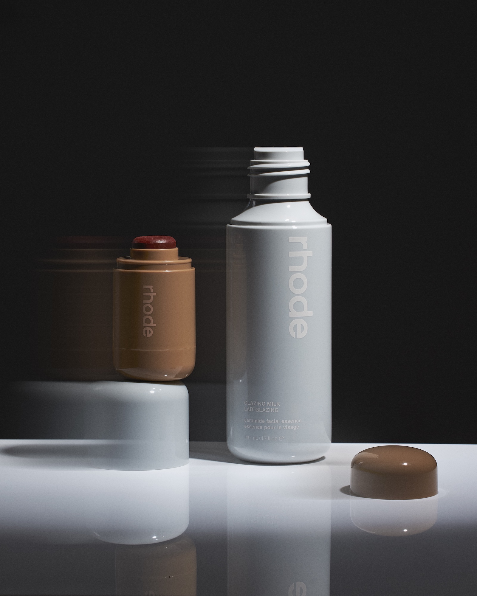
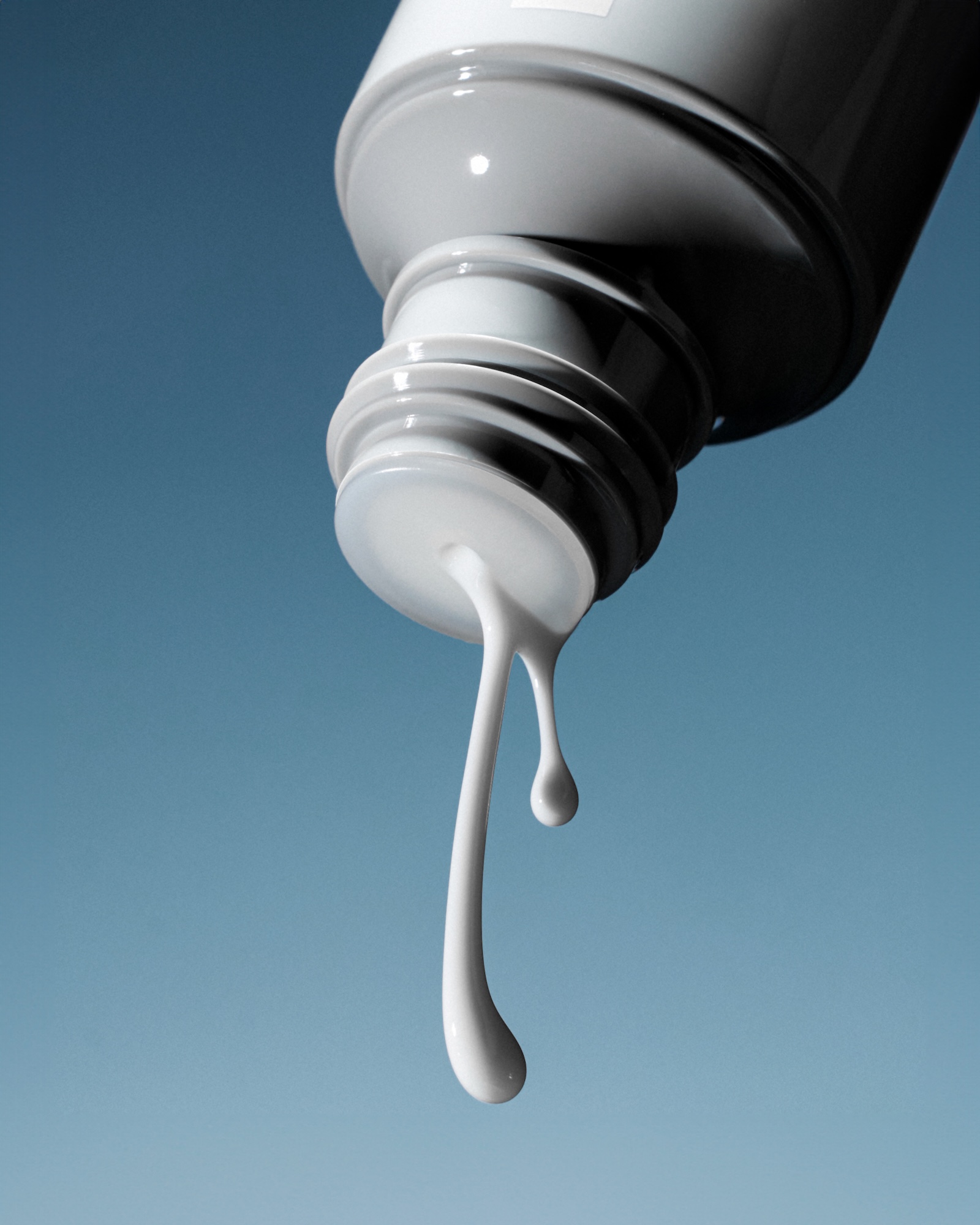
I built the lighting around soft, directional setups that sculpt gloss without crossing into oily territory. High-key base exposure kept the frame clean and minimal, while controlled highlights revealed surface tension and micro-texture in the product itself. For the dripping milk texture shot, I used long exposure to capture the exact moment of fluidity: sensual, but precise. The timing had to be tight. Too slow and it reads as messy, too fast and you lose the tactile promise.
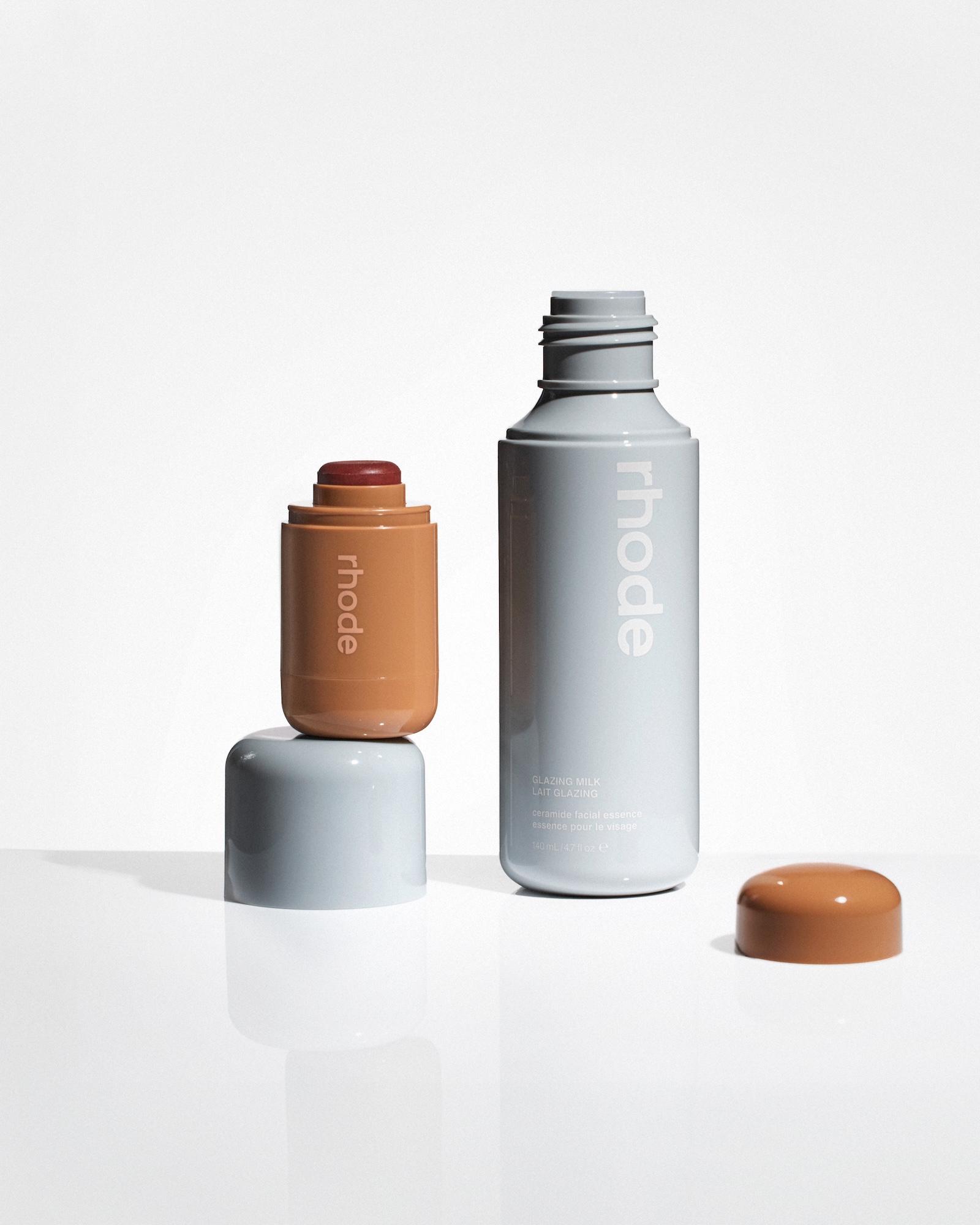
Glass vessels and strategic negative space gave the compositions breathing room and a premium feel without cluttering the frame with props. I kept color calibration strict. Warm packaging tones against cooler product hues meant the "glazed skin" aesthetic stayed legible. Every angle was shot with deliverable formats in mind: main frames with space for copy, vertical crops for social, and clean product photos that could drop straight into product page templates.
Launch ready toolkit with controlled motion and macro texture
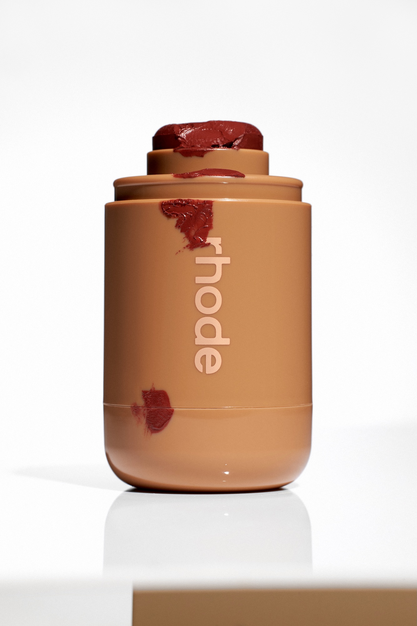
These images are designed to function as a launch-ready toolkit. The collection includes dynamic shots with controlled motion that work well for campaign moments or paid ads where you need to catch attention. Clean product photos on neutral backgrounds translate directly to e-commerce pages and meet retailer specs without additional rounds. Macro texture frames, drips, smears, surface pulls, could serve as social content that externalizes performance, showing customers what "glazing fluid" or "milky hydration" actually means.
The approach maintains visual consistency across all these uses, which matters when a brand is trying to scale without looking patchy or generic. This project demonstrates how skincare product photography can hold up under commercial pressure: accurate color, repeatable lighting, and compositions that stay minimal without feeling sterile.
The Outcome:
Visual systems that translate science backed claims into something people want to touch
What this shows about my capability is straightforward: I can build visual systems that translate science-backed claims into something people want to touch. Beauty photography at this level isn't about one pretty shot. It's about creating a collection that works across different channels and holds the brand's identity intact from product detail page to paid ads to social media.
Working from Vancouver as a product photographer, I focus on texture honesty combined with premium minimalism. If you're a beauty or skincare brand looking for product photography that delivers both, let's talk about your next drop.


