Bloink
Bloink board game photography featuring levitating wooden blocks and player interaction
The Project:
Board game product photography for Bloink
I photographed Bloink, a block-stacking strategy game created by a Vancouver-based team, to capture the emotion, drama, and excitement of gameplay. The brand needed board game product photography that would work across their website and marketing materials. The project centered on showing what makes Bloink distinct: wooden components that invite tactile play, strategic tension between opponents, and the visual drama of towers on the edge of collapse.
We structured the shoot over two days. Day one focused on hands interacting with the game to capture decision-making moments and placement tension. Day two concentrated on pure product photography: clean e-commerce shots, grouped component images showing the full contents, and levitation sequences with blocks and coins suspended in motion. Working from Vancouver, we built a photo collection designed to communicate both the premium quality of the wooden pieces and the strategic chaos that unfolds during play.
The Execution:
Showing strategy and tactile quality without explanation
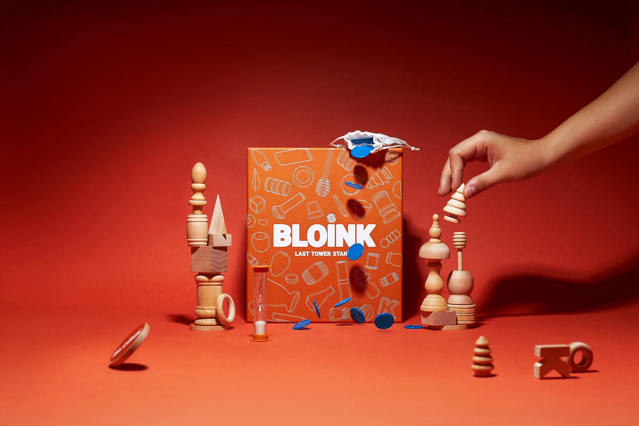
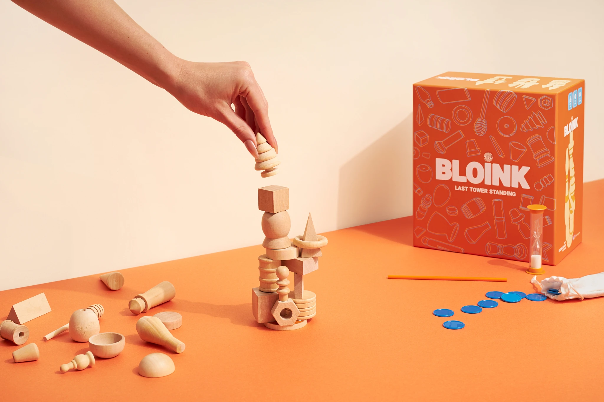
The approach for board game product photography started with understanding what the images needed to communicate. Bloink is not just about stacking blocks. Players choose which pieces their opponents must use, creating a layer of strategy and sabotage. We needed shots that showed this interaction without requiring explanation. The hands-in-play images focused on the moment of selection and placement: fingers hovering over pieces, careful positioning, the tension before a move. We kept hand positions intentional so they enhanced the story without obscuring the components.
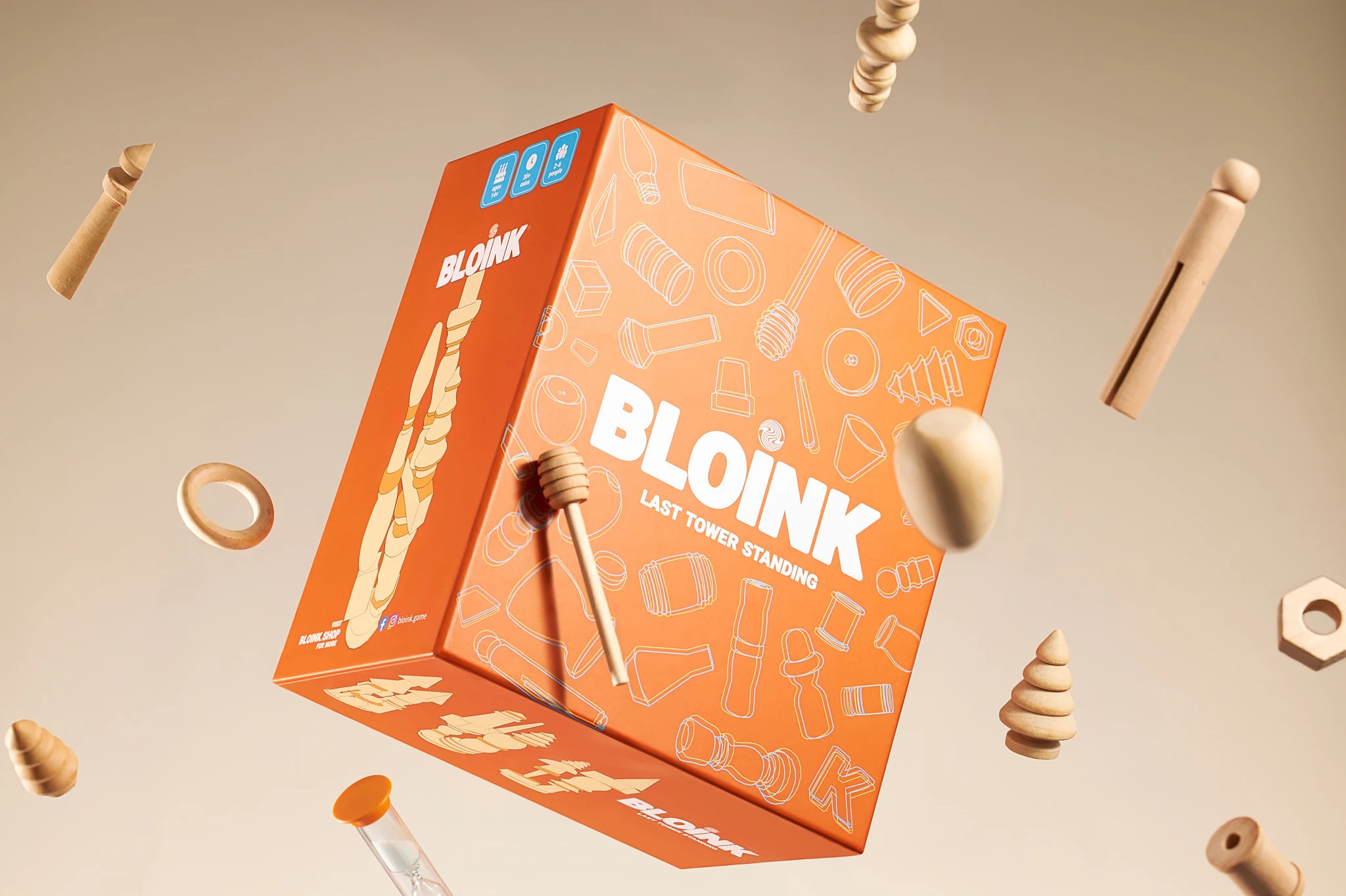
For the levitation sequences, we planned compositions that would show blocks and blue coins orbiting the game box in mid-air. The goal was to visualize motion, risk, and the cascading consequences of each decision. We shot the elements separately with consistent lighting, then composited them to create believable suspension. The technique required precise planning to maintain lighting continuity across all pieces and ensure shadows matched the intended final composition. The result looks dynamic without feeling artificial.
Lighting for drama and clarity
Lighting strategy split between two needs: drama and clarity. For the levitation shots and hands-in-action images, we used bright, focused illumination against saturated red-orange backgrounds that echo the brand's packaging color. This approach heightens urgency and isolates the product. The intense background draws attention while keeping the wooden components and blue coins legible. We controlled gradients and shadows to build dimensionality so the floating elements feel like they occupy real space rather than sitting flat against a backdrop.
For the grouped component shots and e-commerce images, we shifted to soft, diffused lighting that reveals wood grain and surface finish. The wooden pieces needed to look premium and tactile, not cheap or mass-produced. We exposed to capture the natural timber tones accurately while maintaining the brand's orange packaging color without shift. Detail passes focused on texture: edge finishing, grain patterns, the matte surface of the wooden blocks. These shots support the game's price point by proving quality at a glance.
Composition that demonstrates contents and gameplay
Composition choices centered the packaging in many frames to establish brand recognition, then used angled layouts for the levitation sequences to create movement through the frame. We scattered components in ways that suggest live gameplay without creating clutter. Each piece placement was deliberate: showing scale relationships between the rod, bases, blocks, and coins; demonstrating how components interact; giving viewers a clear sense of what comes in the box. The grouped shots inventory the full contents while maintaining visual interest through layering and angle variation.
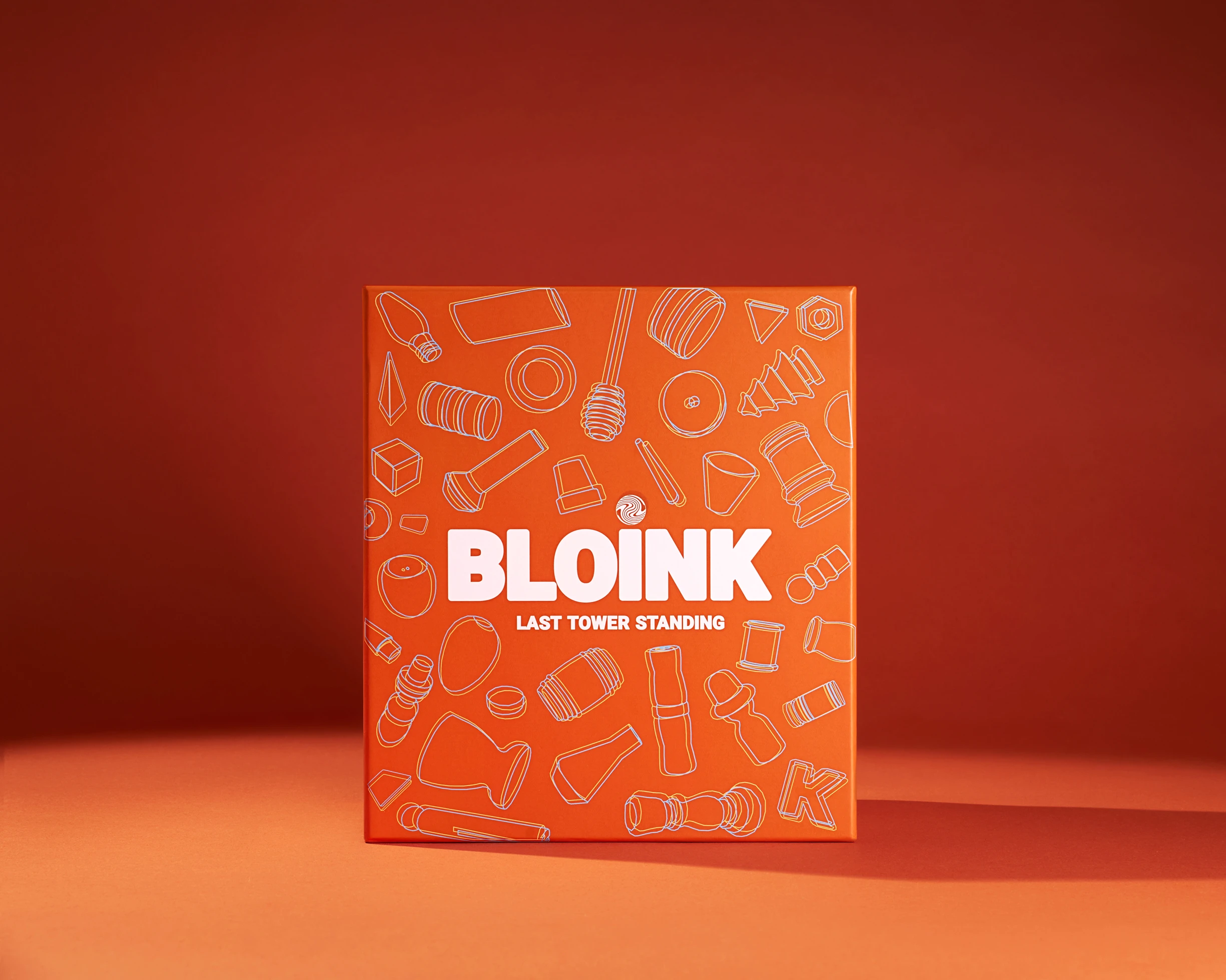
The e-commerce image anchors the collection with a packaging-forward composition. The box sits prominently with illustrated components visible on the cover, telegraphing gameplay complexity. This shot needs to work as a thumbnail and above-the-fold on their product page. We kept the frame clean and centered with even lighting so the brand orange, type, and graphics stay legible at any size. The background reinforces the brand color without competing for attention.
The Result:
A flexible photo system for multiple marketing needs
We delivered a photo collection designed for multiple uses. The levitation images work as attention-grabbing campaign photography. The hands-in-play shots demonstrate gameplay and decision-making tension. The grouped component images remove purchase hesitation by showing exactly what's included. The e-commerce shot provides a reliable, professional product page anchor. The detail passes of wood grain and surface finish support quality claims. All images maintain consistent lighting language and color accuracy so they feel like a cohesive system rather than unrelated shots.
The two-day production structure let us work efficiently. Dedicating day one to model and hands shots meant we could move quickly through interaction sequences without rushing product setups. Day two's focus on pure product photography gave us time for precise styling, lighting adjustments, and the technical work required for clean levitation composites. Splitting the work this way also meant we were not trying to balance lifestyle energy with clinical product accuracy in the same session.
Photography that shows both materials and experience
Photographing tabletop games requires showing components clearly while capturing the experience of play. Bloink's wooden blocks, strategic mechanic, and dramatic tower collapses all needed to read quickly in a single image. The combination of clean product shots, hands-in-action moments, and dynamic levitation sequences gives the brand flexibility to communicate different aspects of the game depending on context: premium materials for retail conversations, gameplay tension for ads, and complete component inventory for e-commerce.
The final collection supports the brand's positioning as a modern, strategic tabletop game with premium components. The photography makes quality and gameplay clear without requiring viewers to read rules or descriptions. Each image type serves a specific purpose while maintaining visual consistency across the set. As a Vancouver product photographer, I designed this work to provide a foundation the brand can use across their website, social channels, retail presentations, and marketing campaigns.
If your tabletop game or physical product needs photography that shows both quality and experience, let's talk about what you're building and how images can support your launch.
```


