The Project:
Translating scent into sight for premium candle photography
I photographed Aromatica's candle line to help customers understand fragrance through imagery alone. The brand produces premium scented candles inspired by natural landscapes, and they needed images for their website that could communicate each scent's character without relying on in-person experience. Working from Vancouver, I created a collection of candle photos that translates olfactory qualities into visual language while maintaining the refined look their positioning requires.
The Challenge:
Making invisible fragrance profiles visually legible
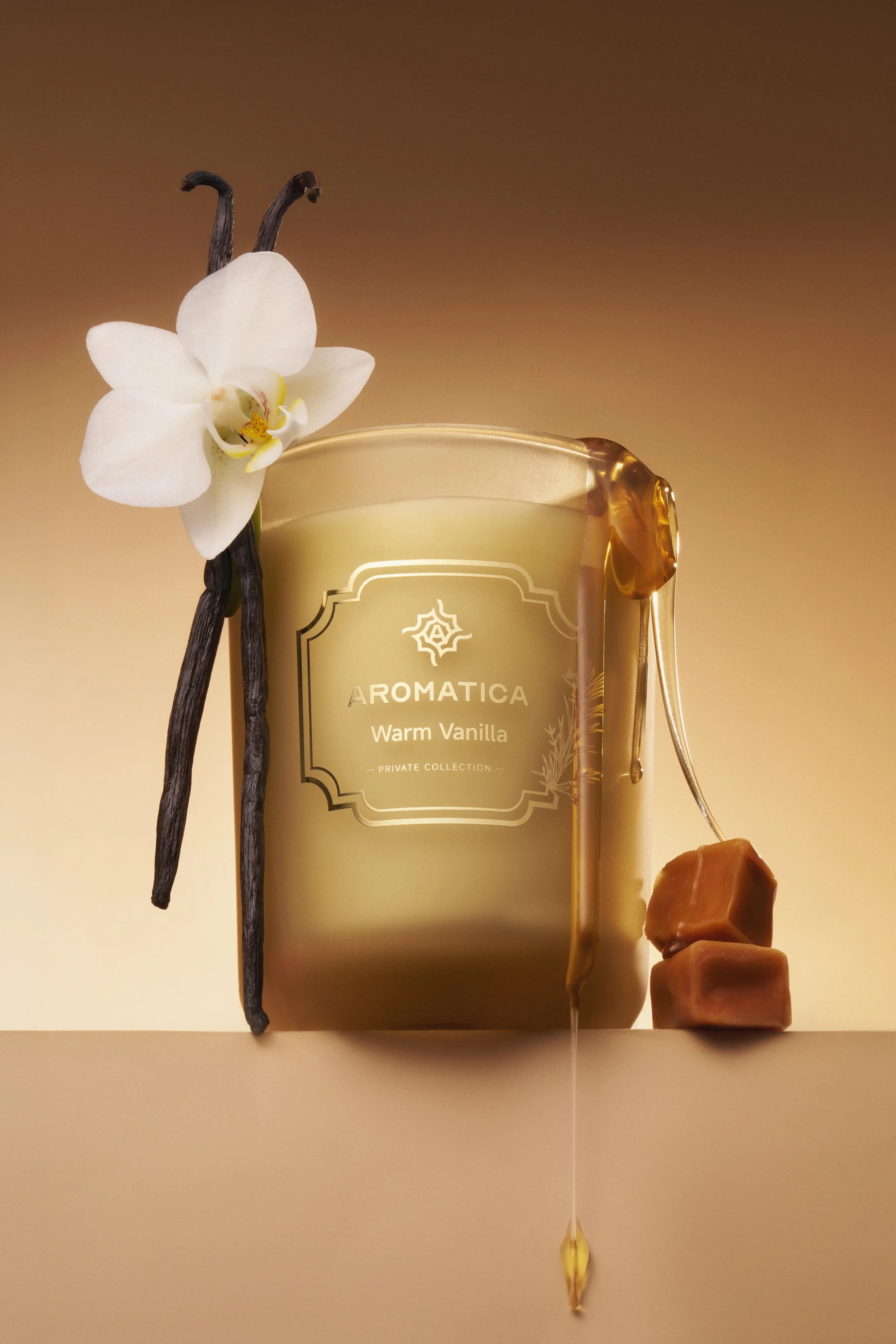
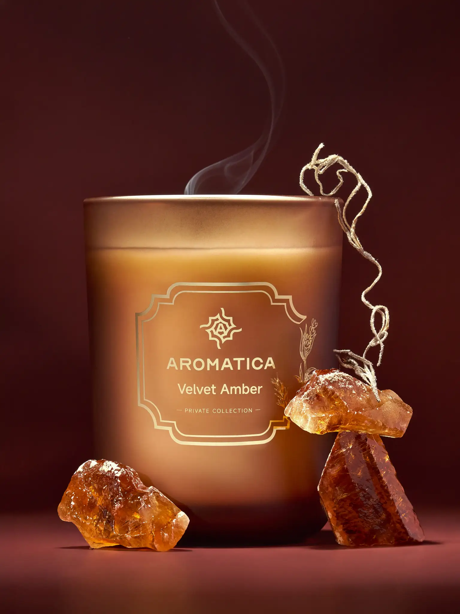
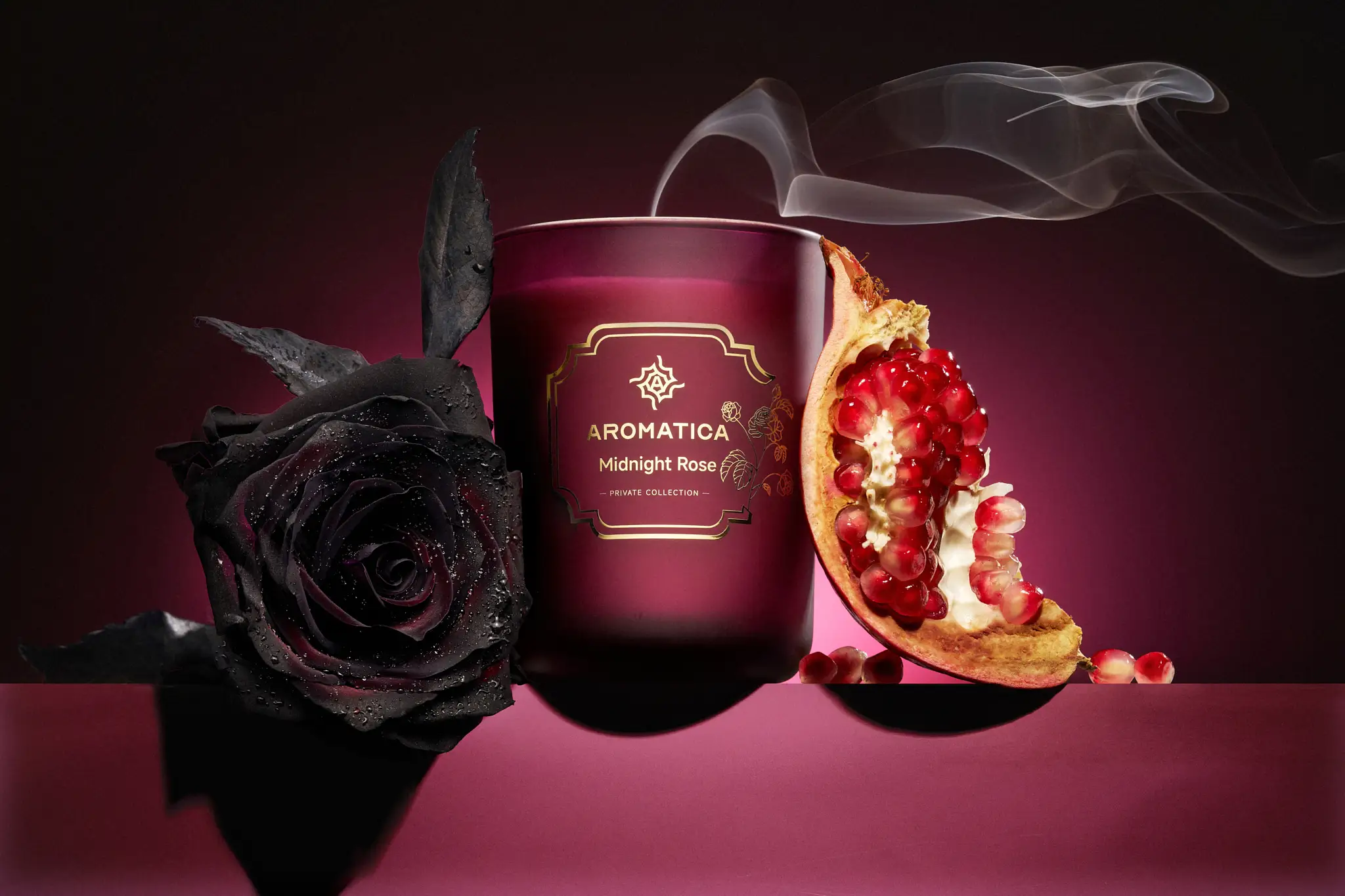
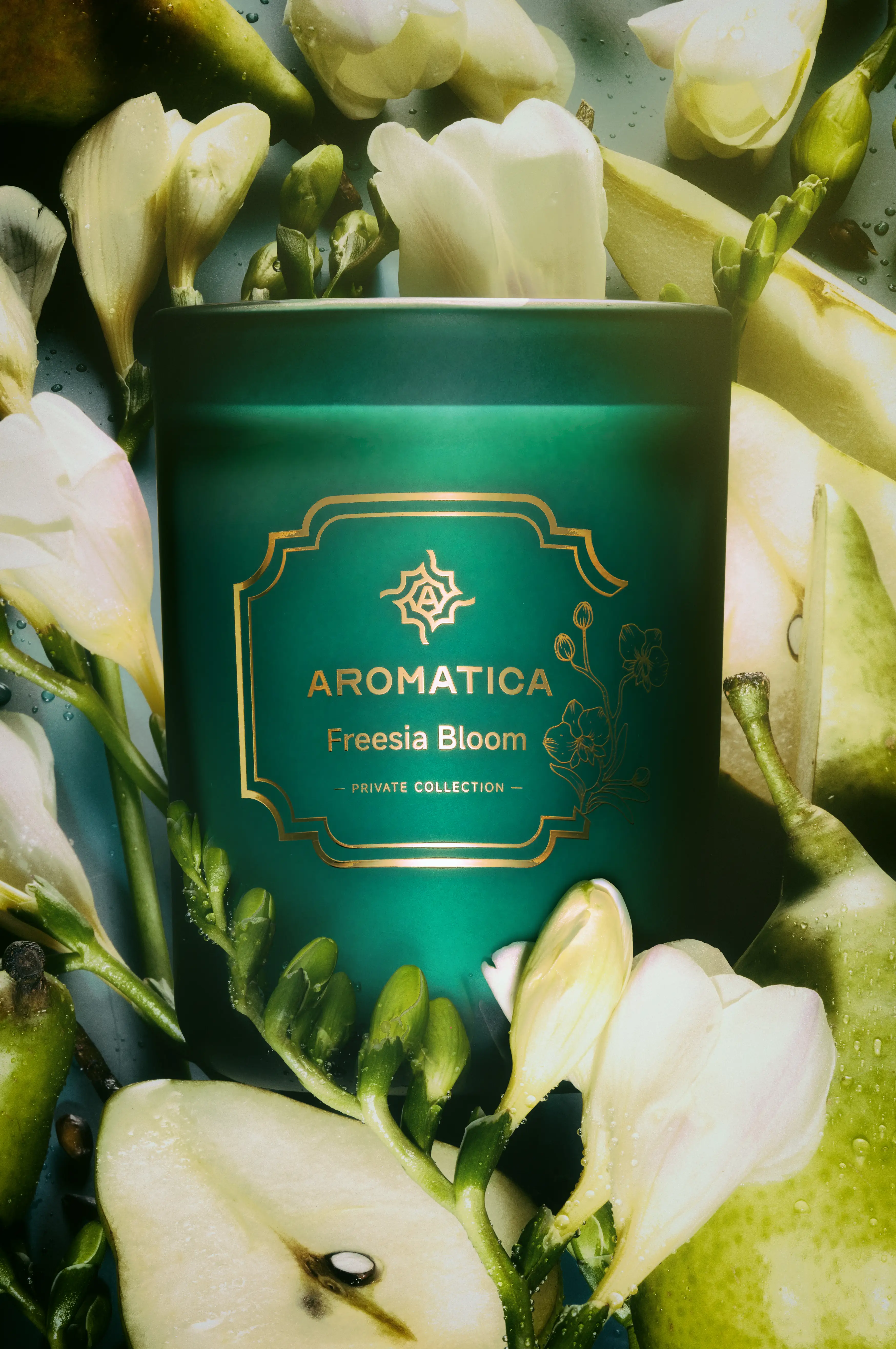
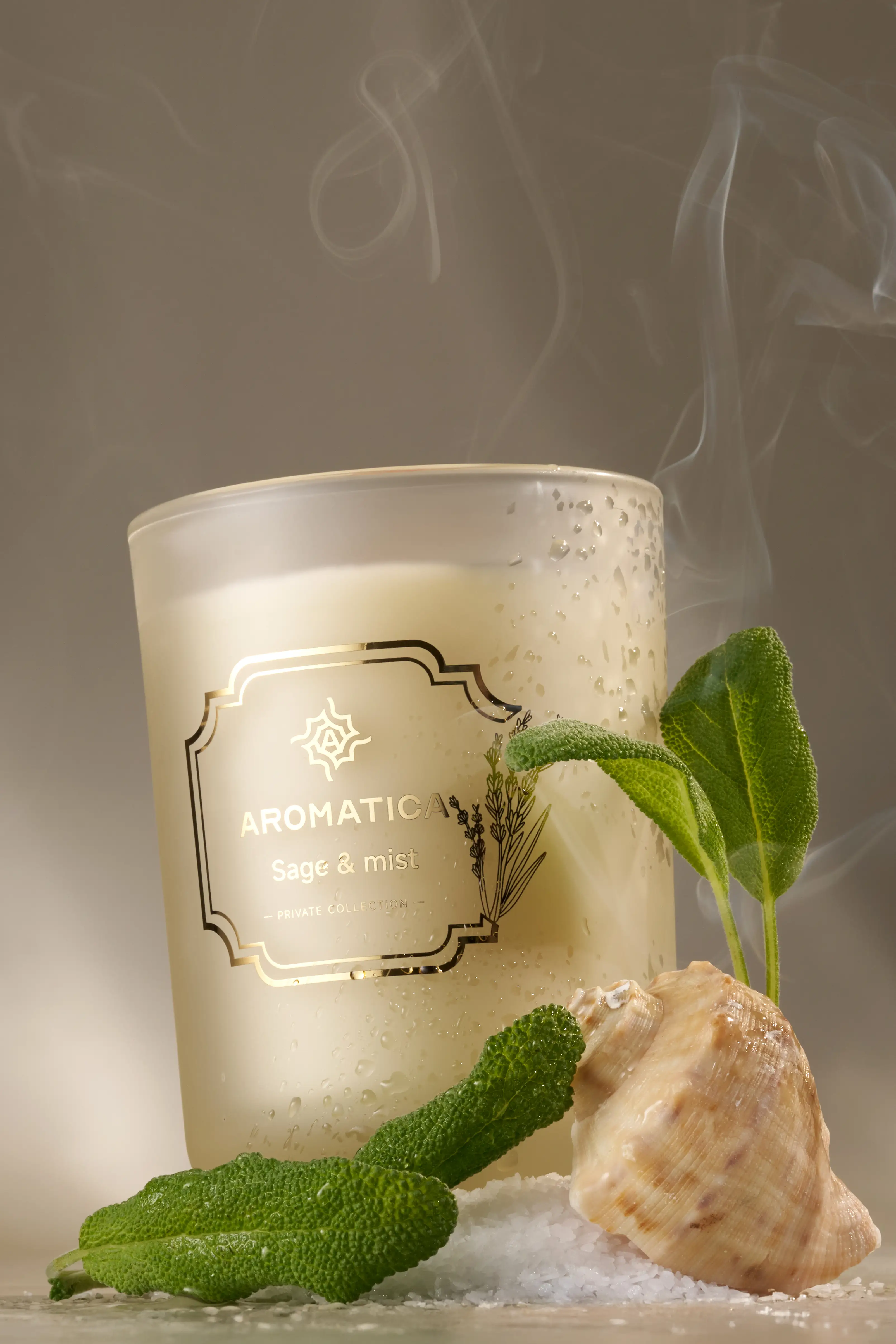
Fragrance exists in the nose, not on the screen. A standard product photo can show a container and a label, but it cannot convey whether a candle smells fresh, warm, earthy, or floral. I styled each candle with ingredients tied to its fragrance profile. Vanilla pods, caramel, amber resin, sage bundles, sea salt crystals, pomegranate seeds, black roses, freesia stems, and sliced pear became reference points that gave viewers an immediate sense of what they might smell. These were not decorative additions. They functioned as scent cues, helping customers form expectations before they made a purchase.
The Execution:
Building micro-environments that match fragrance moods
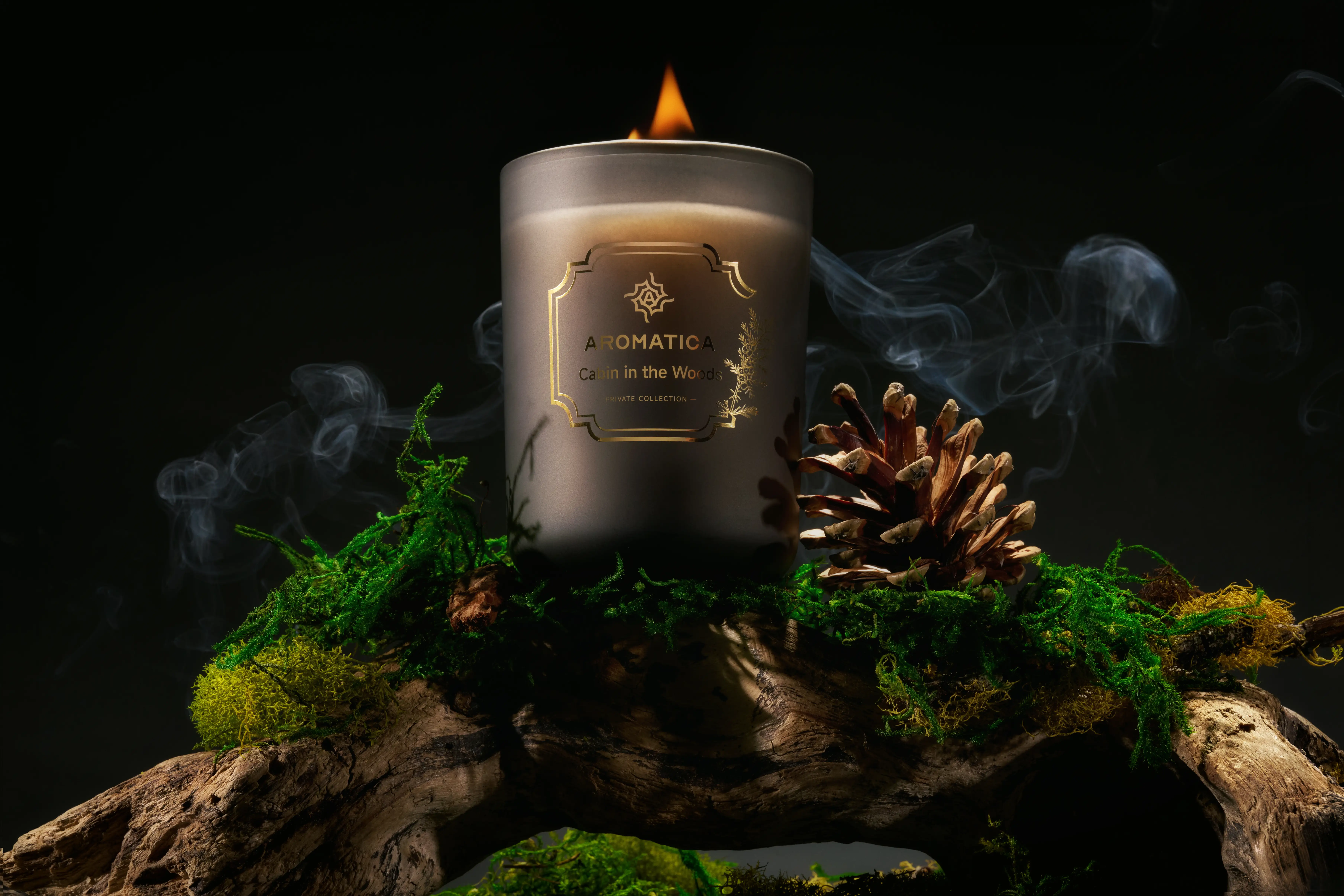
The ingredients explained the notes, but they could not convey the feeling of burning the candle. For each composition, I built an environment around the product using background materials, color palette, and lighting that matched the fragrance's mood. One image placed a woodland-scented candle on real wood with moss and a pine cone, creating a scene that felt like a cabin interior. Another used frosted glass and cool tones to suggest coastal freshness. A floral candle was set against soft, airy backgrounds with delicate botanical textures. Each scene was designed to feel like the place or moment the scent was meant to evoke, turning the product into the center of a small, tangible world.
Lighting that reveals material quality without distraction
Lighting determined whether the candles looked premium or generic. I used controlled setups that revealed the details of the packaging without creating blown highlights on the glass vessels or making the wax appear muddy. Frosted glass required soft diffusion to avoid harsh glare while still defining the form. Gold foil on labels needed contrast to stay legible without becoming a bright spot that pulled attention away from the composition. I lit the candles to show their materiality (the texture of the wax, the crispness of the label, the weight of the vessel) without introducing distractions like fingerprints, dust, or reflections that would undermine the sense of quality.
Color consistency across a diverse scent collection
Color consistency across the collection was important. Aromatica's scents range from forest greens and umbers to midnight reds, soft florals, sea-glass neutrals, and warm ambers. I managed color relationships so that each fragrance had its own palette, but the series maintained a unified visual language. The images needed to feel like they belonged to the same brand while still expressing distinct moods. This balance allowed the collection to work as a catalog on the website, where customers could browse multiple scents and immediately recognize the line's cohesive identity.
Product-first composition with atmospheric layering
Composition followed a product-first approach. The candle remained the subject in every frame, with controlled depth of field keeping the vessel sharp while the surrounding environment added atmosphere without competing for focus. Foreground elements like botanicals or textured surfaces created layering, but they framed the product rather than obscuring it. This structure ensured the images could function in multiple marketing contexts. Campaign photos needed to feel immersive and story-driven. Product page images needed clarity and accuracy. The same approach supported both uses.
Multisensory visual details that suggest intangible qualities
Multisensory details reinforced the idea of fragrance as an experience. Sculpted smoke rising from a wick suggested diffusion and warmth. Dewy droplets on glass hinted at freshness. Tactile wood grain and crystalline salt gave the images physical weight. These elements turned intangible qualities (scent throw, atmosphere, mood) into visual forms that customers could perceive. The photography did not just show a container. It showed what burning the candle might feel like.
The Result:
A scalable visual system for candle e-commerce and campaigns
As a Vancouver product photographer, I delivered a collection of images designed for e-commerce use and marketing campaigns. The photos included ingredient-driven compositions that made scent profiles legible at a glance, product-focused shots with clean backgrounds for clarity and consistency, and lifestyle images that placed the candles in atmospheric environments. The series created a scalable visual system that could accommodate new scents while maintaining the brand's established look. Each image was lit, composed, and edited to support Aromatica's positioning as a premium, nature-rooted candle line without veering into overly rustic or ultra-luxury territory.
The Takeaway:
Photography must translate product function, not just form
For candle brands, photography needs to bridge the gap between what a product is and what it does. Customers cannot smell through a screen, so the images need to do more than document packaging. They need to communicate fragrance, mood, and quality in a way that builds confidence and reduces uncertainty. Ingredient cues, environment-based styling, and careful lighting can make scent feel visible and turn a product page into a sensorial preview of the experience itself.
If your candle or fragrance brand needs product photography that helps customers understand your scents before they open the jar, let's talk about how ingredient-led styling and atmosphere-focused composition can make your line more intuitive and compelling online.
<script type="application/ld+json">
{
"@context": "https://schema.org",
"@type": "Service",
"name": "Candle Product Photography with Ingredient-Led Styling",
"description": "Photography service that translates fragrance into visual language through ingredient cues, atmosphere-focused composition, and controlled lighting that reveals packaging details without glare on glass vessels.",
"serviceType": "Product Photography",
"provider": {
"@type": "Organization",
"name": "Elina Kustlyvy Photography",
"url": "https://www.elinakustlyvy.com"
},
"areaServed": [
{"@type": "City", "name": "Vancouver", "addressRegion": "BC", "addressCountry": "CA"},
{"@type": "City", "name": "Toronto", "addressRegion": "ON", "addressCountry": "CA"},
{"@type": "City", "name": "Los Angeles", "addressRegion": "CA", "addressCountry": "US"},
{"@type": "City", "name": "Seattle", "addressRegion": "WA", "addressCountry": "US"}
],
"url": "https://www.elinakustlyvy.com/projects/aromatica-candles"
}
</script>
<script type="application/ld+json">
{
"@context": "https://schema.org",
"@type": "ImageObject",
"contentUrl": "https://www.elinakustlyvy.com/projects/aromatica-candles",
"url": "https://www.elinakustlyvy.com/projects/aromatica-candles",
"name": "Aromatica Candles Product Photography Collection",
"caption": "Candle product photography using ingredient styling and controlled lighting to communicate fragrance profiles and premium quality through visual language for e-commerce and marketing use.",
"creator": {
"@type": "Person",
"name": "Elina Kustlyvy",
"url": "https://www.elinakustlyvy.com"
},
"copyrightHolder": {
"@type": "Organization",
"name": "Elina Kustlyvy Photography"
},
"acquireLicensePage": "https://www.elinakustlyvy.com/contact"
}
</script>
<script type="application/ld+json">
{
"@context": "https://schema.org",
"@type": "Brand",
"name": "Aromática Candles by Bluecorn Candles",
"description": "Premium scented candle line using coconut wax blend, phthalate-free fragrance oils, and recycled glass vessels, with scents inspired by Colorado's natural landscapes.",
"url": "https://bluecorncandles.com",
"sameAs": [
"https://en.wikipedia.org/wiki/Bluecorn_Candles"
]
}
</script>
<script type="application/ld+json">
{
"@context": "https://schema.org",
"@type": "Product",
"name": "Aromática Scented Candle Line",
"description": "Hand-poured scented candles made with coconut wax, cotton wicks, and clean fragrance oils in recycled glass vessels, inspired by natural Colorado landscapes.",
"brand": {
"@type": "Brand",
"name": "Aromática Candles by Bluecorn Candles"
},
"category": "Scented Candles",
"review": {
"@type": "Review",
"author": {
"@type": "Person",
"name": "Elina Kustlyvy"
},
"reviewRating": {
"@type": "Rating",
"ratingValue": "5",
"bestRating": "5"
},
"reviewBody": "The frosted glass vessels required soft diffusion techniques to avoid harsh glare while maintaining form definition. Gold foil labels demonstrated excellent contrast without creating blown highlights. The coconut wax showed clean texture and the recycled glass had substantial weight that photographed as premium."
}
}
</script>
<script type="application/ld+json">
{
"@context": "https://schema.org",
"@type": "BreadcrumbList",
"itemListElement": [
{
"@type": "ListItem",
"position": 1,
"name": "Projects",
"item": "https://www.elinakustlyvy.com/projects"
},
{
"@type": "ListItem",
"position": 2,
"name": "Product Photography",
"item": "https://www.elinakustlyvy.com/projects#product"
},
{
"@type": "ListItem",
"position": 3,
"name": "Aromatica Candles",
"item": "https://www.elinakustlyvy.com/projects/aromatica-candles"
}
]
}
</script>
<script type="application/ld+json">
{
"@context": "https://schema.org",
"@type": "WebPage",
"name": "Aromatica Candles Product Photography Case Study",
"description": "Vancouver product photographer creates ingredient-led candle photography that translates fragrance into visual language for e-commerce and marketing campaigns, using controlled lighting on frosted glass and atmosphere-focused composition.",
"url": "https://www.elinakustlyvy.com/projects/aromatica-candles",
"speakable": {
"@type": "SpeakableSpecification",
"cssSelector": [".article-intro", ".article-conclusion"]
},
"about": [
{"@type": "Thing", "name": "Candle Product Photography"},
{"@type": "Thing", "name": "E-commerce Product Photography"},
{"@type": "Thing", "name": "Ingredient-Led Styling for Fragrance Products"}
],
"mentions": [
{
"@type": "Brand",
"name": "Aromática Candles by Bluecorn Candles",
"sameAs": "https://bluecorncandles.com"
},
{
"@type": "Thing",
"name": "Aromática Scented Candle Line"
}
]
}
</script>
<script type="application/ld+json">
{
"@context": "https://schema.org",
"@type": "HowTo",
"name": "How to Photograph Scented Candles to Communicate Fragrance Visually",
"description": "A three-step approach to candle product photography that translates olfactory qualities into visual language through ingredient styling, environment-based composition, and controlled lighting.",
"step": [
{
"@type": "HowToStep",
"position": 1,
"name": "Style candles with fragrance-specific ingredients as scent cues",
"text": "Each candle was styled with ingredients tied to its fragrance profile. Vanilla pods, caramel, amber resin, sage bundles, sea salt crystals, pomegranate seeds, black roses, freesia stems, and sliced pear became reference points that gave viewers an immediate sense of what they might smell. These functioned as scent cues helping customers form expectations before purchase."
},
{
"@type": "HowToStep",
"position": 2,
"name": "Build environments using background materials and color palettes that match fragrance mood",
"text": "For each composition, an environment was built around the product using background materials, color palette, and lighting that matched the fragrance's mood. A woodland-scented candle was placed on real wood with moss and pine cone creating a cabin interior feel. Another used frosted glass and cool tones to suggest coastal freshness. Each scene was designed to feel like the place or moment the scent was meant to evoke."
},
{
"@type": "HowToStep",
"position": 3,
"name": "Use controlled lighting to reveal packaging details without glare on glass vessels",
"text": "Controlled lighting setups revealed packaging details without creating blown highlights on glass vessels or making wax appear muddy. Frosted glass required soft diffusion to avoid harsh glare while still defining form. Gold foil on labels needed contrast to stay legible without becoming bright spots. Lighting showed the materiality of wax texture, label crispness, and vessel weight without introducing distractions like fingerprints, dust, or reflections."
}
]
}
</script>
<script type="application/ld+json">
{
"@context": "https://schema.org",
"@type": "FAQPage",
"mainEntity": [
{
"@type": "Question",
"name": "How do you photograph glass candles without glare on frosted surfaces?",
"acceptedAnswer": {
"@type": "Answer",
"text": "Frosted glass candles require soft diffusion to avoid harsh glare while still defining the form. I use controlled lighting setups that reveal the details of the packaging without creating blown highlights on the glass vessels. This approach maintains the premium look by showing the vessel's materiality and weight without introducing distracting reflections that would undermine the sense of quality."
}
},
{
"@type": "Question",
"name": "What is ingredient-led styling for candle photography?",
"acceptedAnswer": {
"@type": "Answer",
"text": "Ingredient-led styling means placing visual cues around the candle that correspond to its fragrance profile. For a candle line, this might include vanilla pods, amber resin, sage bundles, sea salt crystals, pomegranate seeds, or floral stems that match the scent notes. These ingredients function as reference points that help customers understand what the candle smells like before purchase, translating olfactory qualities into visual language that works on a screen."
}
},
{
"@type": "Question",
"name": "How do you maintain color consistency across a candle product line?",
"acceptedAnswer": {
"@type": "Answer",
"text": "Color consistency is managed by giving each fragrance its own palette while maintaining a unified visual language across the series. For a line ranging from forest greens and umbers to midnight reds, soft florals, sea-glass neutrals, and warm ambers, the images need to feel like they belong to the same brand while expressing distinct moods. This balance allows the collection to work as a cohesive catalog on a website where customers browse multiple scents and immediately recognize the brand's identity."
}
}
]
}
</script>

- other recent projects
Editorial jewelry photographer Vancouver: Sital Jansson sculptural wedding bands and fine jewelry
Seattle apparel photography: Streetwear product photography for Singh Stables e-commerce
(001)
Revive Organic Superfoods
Toronto food product photographer: Revive Organic Superfoods smoothie and bundle campaign
SKWEEN foundation balm product photography showing accurate shade range and skincare texture
INKAARA water bottle photography capturing hand-drawn illustrations and affirmations for premium kids product marketing
Superjelly supplement shaker bottle and snapback hat detail photography for e-commerce conversion