Mallorie
Mallorie beauty brand photography with red and black editorial styling

The Subject:
Why SmartGlamour works as a creative brief
I chose SmartGlamour as a creative subject because they've solved a problem most brands ignore: making inclusive sizing feel authentic instead of performative. As an inclusive fashion photographer in Vancouver, I'm drawn to brands that treat representation as a design requirement, not a marketing add-on. For this personal project, I wanted to explore what a values-led fashion brand needs when its entire positioning depends on being visually honest.
The brief I set for myself was to create campaign imagery that could function as both brand storytelling and credible visual proof. SmartGlamour operates in a space where customers are hyperaware of retouching tricks and token casting. If a brand like this needed launch photography, the images would have to say "we see you" without tipping into the flattery language that implies certain bodies need correction. That tension (premium polish without erasure) is where the creative challenge lives.
The Execution:
High contrast lighting and portrait-led framing
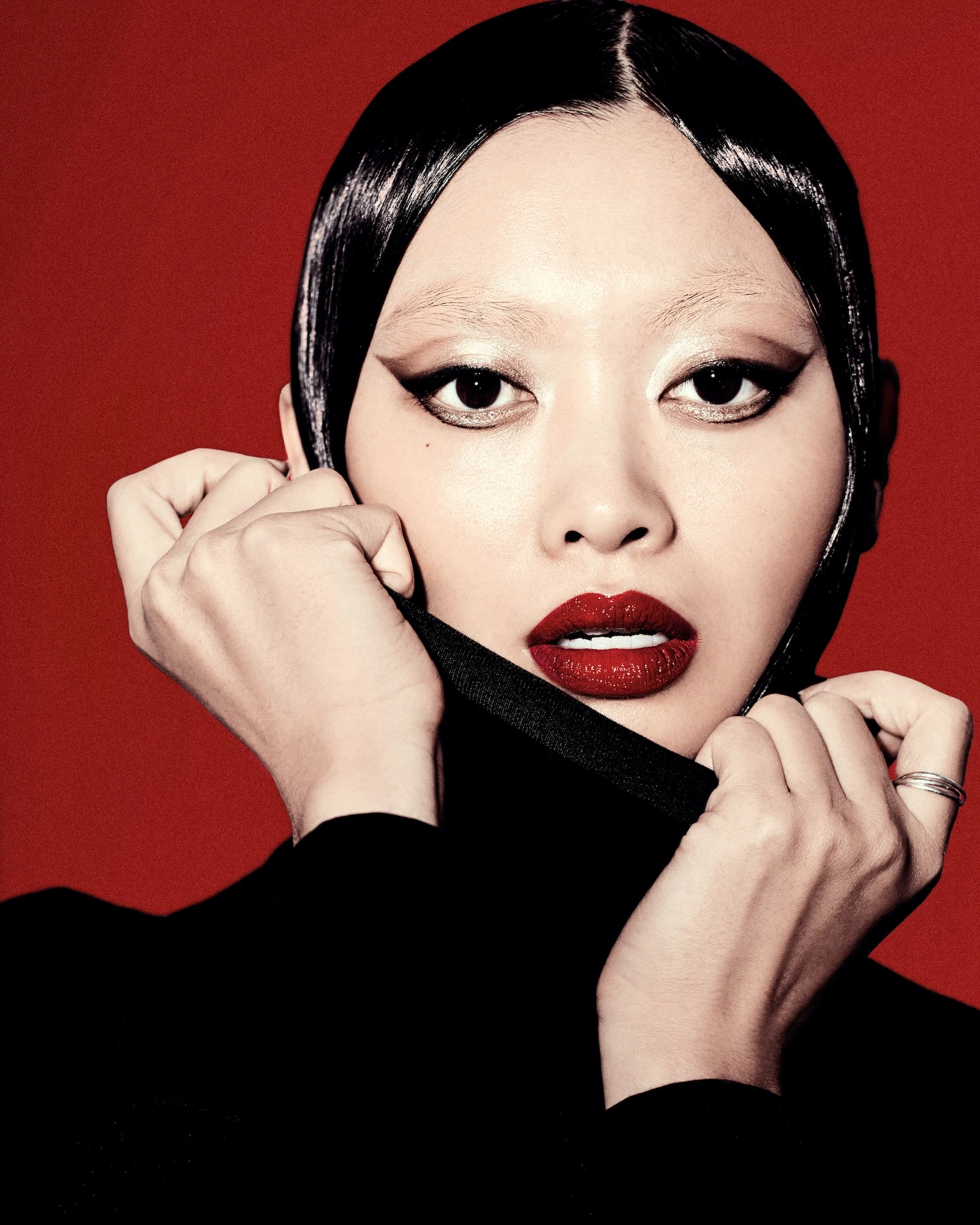
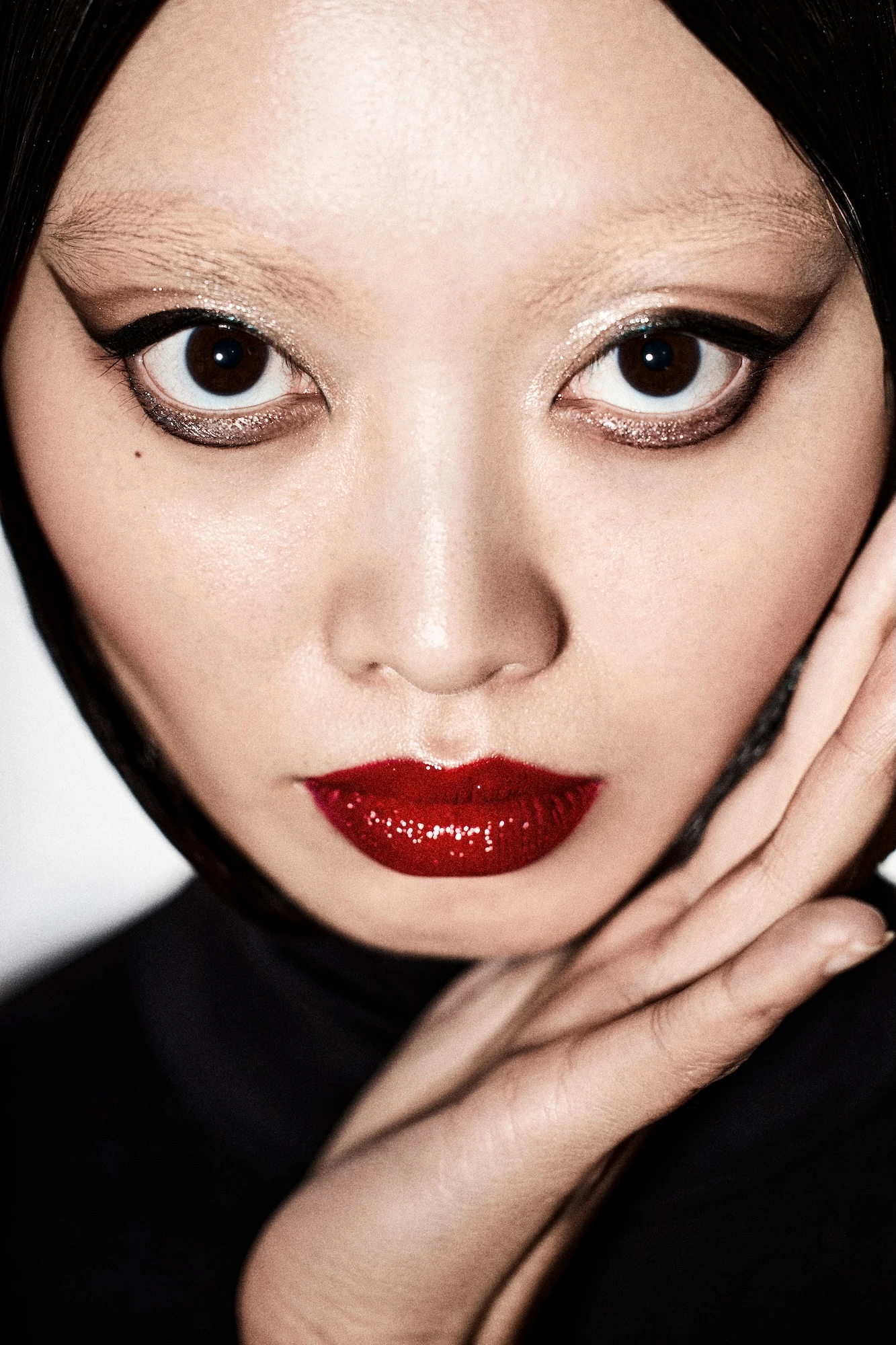
I built the lighting around high-contrast setups to create definition across varied facial structures. Close framing became the primary composition choice because it prioritizes individual presence over garment detail. The goal was to make each portrait feel like direct eye contact, not a catalog pose. I worked with a saturated red-anchored color palette to add energy and memorability. Red registers as confident and assertive, which aligns with a brand centered on body liberation.
The palette also helps visuals hold up across cropping (main banners, social media squares, email headers) without losing impact. Styling focused on sharp lines and intentional makeup to telegraph quality. One risk with values-driven brands is the assumption that ethical positioning means lower production value. These images reject that equation. Slick styling paired with precise light creates a premium visual vernacular.
What the collection includes
- Tight portraits with sculpted light: hero images engineered for tonal control
- Color-forward social cutdowns: framings optimized for square and story formats
- Press-ready key visuals: campaign anchors that establish emotional tone
Each frame is built so the set feels cohesive even when images are used separately. This approach is portrait-led by design. I prioritized capturing ethos over demonstrating fit because top-of-funnel brand work needs to establish emotional connection before the product close-up. For a brand operating in the body positive photography space, the first job is to make viewers feel included.
The Strategy:
Building a reusable visual system
The portraits function as identity images (photos that could anchor a campaign or lead a press kit). They would pair well with future fit-diversity content or on-model product photography to complete the narrative. The lighting and color workflow were standardized so the collection reads as intentional, not patchworked. Consistent art direction across the set means the brand can use these images over time without the visuals feeling dated or disconnected.
I focused on creating a reusable photo collection (main placements, social crops, press visuals) so the investment extends beyond a single launch. This is especially useful for size inclusive lookbook work, where brands need images that support multiple campaigns without requiring luxury-scale production every quarter.
The Capability:
Translating values into visual credibility
What this project demonstrates is my ability to translate a brand's core values into a visual system that works across platforms. The images aren't trying to do everything at once. They establish presence, credibility, and emotional tone. They could serve as the foundation for a larger collection that includes garment detail, fit diversity, and product clarity.
For brands whose differentiation depends on being seen as authentic, the photography has to earn trust before it asks for a purchase. That's the capability this work showcases: turning inclusion into a premium visual language that resonates with values-driven audiences.
Working from Vancouver, if you're building a fashion brand that prioritizes representation and needs photography that reflects that mission without sacrificing polish, let's talk about what your launch needs.


