
Hara
Hara beauty product photography with natural enhancement styling

The Brand:
Why HARAKH needed both emotion and forensic product truth
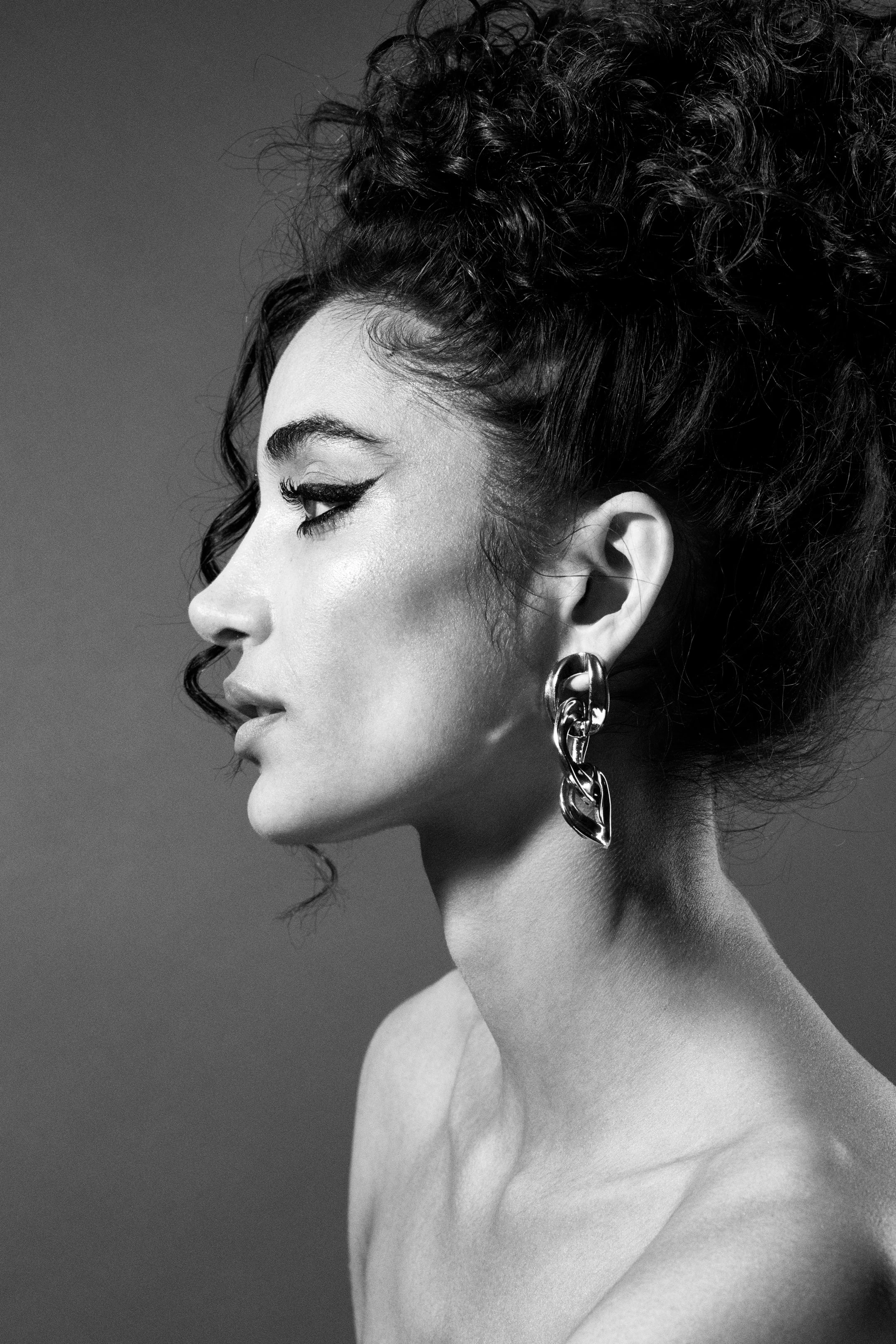
I chose HARAKH because they've built an identity most luxury jewelry brands only claim: every piece carries a traceable provenance story, fourth-generation diamantaire expertise, and craft techniques (granulation, rose-cuts, mixed-stone compositions) that need macro-level clarity to justify $40,000 price tags. That tension between editorial emotion and forensic product truth is where most beauty-plus-jewelry shoots collapse. Diamonds go flat under soft portrait lighting, or the skin gets so retouched the metal edges blur and the brand starts to feel regional instead of international. Working from Vancouver, I wanted to test whether I could hold both: a monochrome beauty portrait that expresses "JOY" while keeping every prong, engraving line, and gemstone facet undeniably sharp.
The Brief:
Profile-driven earring portraits where jewelry dominates the frame
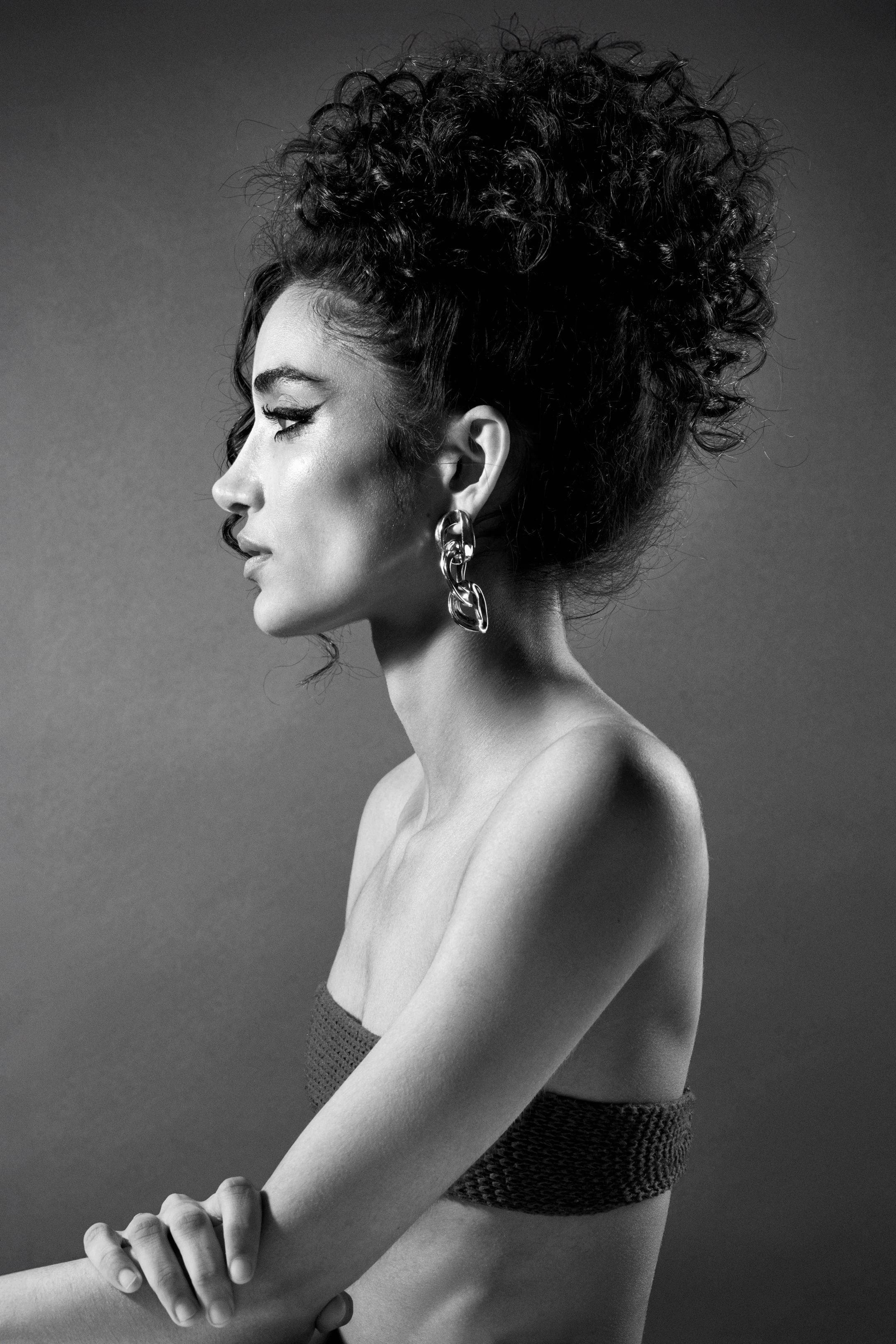
The brief I set for myself was simple on paper and brutal in execution. Shoot profile-driven earring portraits where the jewelry dominates the frame, not the face. Use directional side lighting to sculpt metal contours and control specular highlights so diamonds show fire without blowing out. Keep the model's expression restrained (poised, not performative) so the emotional note stays aspirational but never competes with the product.
And deliver the kind of set a brand like HARAKH would need: main campaign frames, macro detail studies, and adaptable crops that work across press kits, product pages, and paid social without looking like three different shoots stitched together. If a high jewelry brand needed imagery that protects perceived value while telling a heritage story, this approach would solve the hardest problem: making craftsmanship credible at feed size and at full resolution.
The Execution:
Hard side light that sculpts metal and separates every element
I built the lighting around a single hard light source positioned to rake across the earring from the side, creating dimensional shadows that separate every sculptural element (bezel edges, engraved textures, stone settings) while the same light carved structure into the model's cheekbone and jawline. A large diffused fill opposite kept skin falloff even and prevented the shadow side from going dead, but I kept the ratio tight enough that the jewelry stayed the brightest, sharpest thing in the frame.
I shot tethered at f/5.6 so the focus plane locked on the earring with surgical precision while the model's far cheek and the background both softened into tonal separation. The monochrome treatment was deliberate: it removes the distraction of gold-tone drift or gemstone color shifts and puts all the visual weight on form, light behavior, and surface quality. That's the same language high jewelry editorial uses to signal timeless value instead of trend-driven product.
Styling stayed minimal because luxury reads in what you leave out
No competing jewelry, no textured fabrics near the face, no hair intrusions across the earring. I used a subtly textured backdrop (enough tooth to feel intentional, not enough pattern to register as "designed") so the negative space stayed sophisticated instead of clinical. Between frames I checked reflections in the metal with a loupe to catch dust, fingerprints, or specular hotspots that would need cloning later.
The goal was retouch-light capture: sharp where metal meets air, smooth where skin needs to stay premium, and no fake sparkle or halo glow added in post to rescue underlit stones. These images work as they are: campaign portraits that also crop clean for product detail pages, press selects that hold up in print, and social cutdowns that look cohesive because the lighting language and tonal contrast stay consistent across the set.
The Results:
A repeatable system for hybrid luxury shoots where product cannot be secondary
What this project demonstrates is a repeatable system for hybrid luxury shoots where the product can't be secondary. I can deliver the editorial mood a creative director needs for a brand story while maintaining the product clarity an e-commerce team requires to justify a high ticket price. The images function as a complete photo collection: close beauty portraits that express emotional positioning, macro-ready detail frames that make craftsmanship tangible, and background-variant crops optimized for different channels. All captured in a single disciplined setup.
This is spec work, not a client deliverable, but the approach reflects how I'd solve HARAKH's core visual challenge: looking like an international maison without sacrificing the product truth that protects perceived value at $40,000 and up.
As a Vancouver product photographer specializing in luxury jewelry, I know how to hold both beauty and product to the same standard: sharp, consistent, and built for multiple uses from one shoot. If that's what your next campaign needs, let's talk.


