The Subject:
Why I photographed Judith Williams mascara as a creative challenge
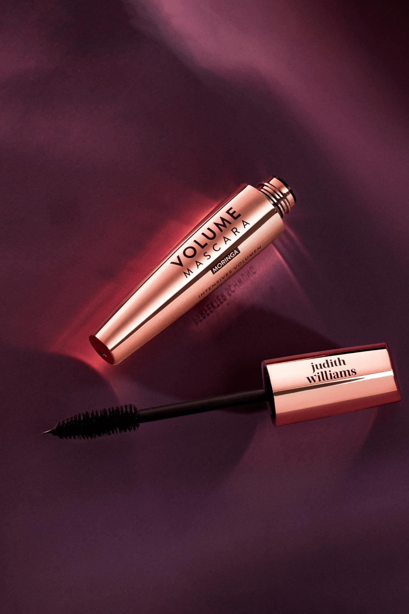
I chose Judith Williams as a creative subject because metallics are everywhere in prestige beauty, and most photographers get them wrong. Brands trying to communicate luxury end up with harsh glare, distracting hotspots, and surfaces that look stamped from aluminum foil. Working from Vancouver, I wanted to prove a different approach was possible. The mascara's satin tube and coordinated purple cap offered the perfect challenge: how do you preserve that reflective sheen without crossing into cheap, and how do you make the brush a functional focus without losing elegance? I set this up as a personal project to explore what brands positioned between clinical performance and sensorial luxury need when they shoot reflective packaging.
The Strategy:
Matching photography to market position
If a brand like this needed launch imagery that balances innovation and refinement, I'd start with their market position. Judith Williams sells a nature plus science story (anti-aging ingredients from Edelweiss, tubing technology mascara formulas), but they're priced for accessible premium, not ultra luxury. That means the photography needs to read credible and elegant at the same time. Too cold and it feels pharmaceutical. Too glossy and it feels like hype without proof. The brief I set for myself was to create images that could anchor a product detail page, support a campaign launch, and feed paid social without feeling like three separate shoots.
The Execution:
How I controlled metallic surfaces without losing refinement
The biggest technical decision was how to light the metallic tube. I used controlled highlights to shape the reflection across the barrel, creating clean gradients that preserve the satin finish instead of a single blown out hotspot. The purple background was chosen specifically to flatter the metal's natural tones and unify the reflections, so the tube and cap feel harmonious instead of lit independently. For the brush detail, I shot tight enough to show individual bristle fidelity, which becomes important when you're selling tubing technology or Ultra Black formulas. People want proof the wand delivers. I kept the angle consistent across the set so the tube reads premium in volume without distortion.
Building flexibility into the composition
Composition was built for cropping flexibility from the start. The angled placement and negative space mean these images work as product page photos, banner crops, and vertical social cuts without rework. I shot the brush both in context and as a standalone macro because mascara briefs almost always need both: the full product for recognition and the detail for performance storytelling. The lighting setup was repeatable so a brand shooting a full range could maintain consistency across SKUs, which matters when you're launching multiple shades or finishes and need the collection to feel unified on a product page.
The Deliverable:
A flexible photo collection for launch, commerce, and social
What these images are is a flexible photo collection: shots that pair the tube and brush for launch storytelling, clean e-commerce angles of the packaging for product pages, and macro texture studies for education driven content or paid social. They work well for brands that need to communicate innovation without sacrificing warmth (metallic packaging that looks engineered but still inviting, macro details that prove performance without feeling clinical). This approach could serve beauty brands selling premium formulas where the packaging and functional components both need to shine, literally and figuratively.
The Result:
Metallics that elevate instead of undermine price perception
The set demonstrates how a Vancouver product photographer can control metallics so they elevate price perception instead of undermining it. Most teams I talk to mention the same frustration: they get beautiful tubes back from production, shoot them, and the photos look flat or cheap because the lighting wasn't sculpted for that surface. These images show what's possible when you treat reflective cosmetics packaging as a lighting design problem, not just a product on a sweep. For brands in the accessible luxury lane, that control becomes a competitive advantage. Your product pages don't just inform, they convince.
Ready to build a visual system that makes your packaging look as premium as it feels? Let's talk about what your next launch needs.
<script type="application/ld+json">
{
"@context": "https://schema.org",
"@type": "Service",
"name": "Reflective Cosmetic Packaging Photography with Color-Accurate Workflow",
"description": "Controlled multi-source lighting on reflective metal packaging with ICC color-managed workflow to preserve deep violet brand tones and deliver glare-free specular highlights across paid social, e-commerce, and retail channels.",
"serviceType": "Luxury Skincare Product Photography",
"provider": {
"@type": "Organization",
"name": "Elina Kustlyvy Photography",
"url": "https://www.elinakustlyvy.com"
},
"areaServed": [
{"@type": "City", "name": "Vancouver", "addressRegion": "BC", "addressCountry": "CA"},
{"@type": "City", "name": "Toronto", "addressRegion": "ON", "addressCountry": "CA"},
{"@type": "City", "name": "Los Angeles", "addressRegion": "CA", "addressCountry": "US"},
{"@type": "City", "name": "Seattle", "addressRegion": "WA", "addressCountry": "US"}
],
"url": "https://www.elinakustlyvy.com/projects/judith-williams"
}
</script>
<script type="application/ld+json">
{
"@context": "https://schema.org",
"@type": "ImageObject",
"contentUrl": "https://cdn.prod.website-files.com/653c048c7bdcdc4c8f4346aa/688e79e3e6a458f9c7a12ef7_68788ed0974abdac19e67d68_Judith-Williams.png",
"url": "https://cdn.prod.website-files.com/653c048c7bdcdc4c8f4346aa/688e79e3e6a458f9c7a12ef7_68788ed0974abdac19e67d68_Judith-Williams.png",
"name": "Judith Williams Retinol Science Mascara with Reflective Packaging on Royal Violet Background",
"caption": "Hero product shot demonstrating controlled specular highlights on metallic tube and color-accurate deep violet packaging for premium skincare campaign assets.",
"creator": {
"@type": "Person",
"name": "Elina Kustlyvy",
"url": "https://www.elinakustlyvy.com"
},
"copyrightHolder": {
"@type": "Organization",
"name": "Elina Kustlyvy Photography"
},
"acquireLicensePage": "https://www.elinakustlyvy.com/contact"
}
</script>
<script type="application/ld+json">
{
"@context": "https://schema.org",
"@type": "Brand",
"name": "Judith Williams Cosmetics",
"description": "European prestige skincare brand combining encapsulated retinols with plant-based alternatives, rigorous testing, and specialized anti-aging formulations for sensitive skin.",
"url": "https://www.judithwilliams.com",
"sameAs": [
"https://www.instagram.com/judithwilliamscosmetics",
"https://www.facebook.com/JudithWilliamsCosmetics"
]
}
</script>
<script type="application/ld+json">
{
"@context": "https://schema.org",
"@type": "Product",
"name": "Judith Williams Retinol Science Mascara",
"description": "Premium anti-aging mascara from the Retinol Science line featuring precision applicator and royal violet metallic packaging with encapsulated retinol complex.",
"brand": {
"@type": "Brand",
"name": "Judith Williams Cosmetics"
},
"category": "Luxury Anti-Aging Cosmetics",
"review": {
"@type": "Review",
"author": {
"@type": "Person",
"name": "Elina Kustlyvy"
},
"reviewRating": {
"@type": "Rating",
"ratingValue": "5",
"bestRating": "5"
},
"reviewBody": "The metallic tube exhibits mirror-like surfaces that require precise reflection control, while the deep royal violet background maintains color integrity across digital channels. The precision applicator features individual bristle geometry that resolves clearly under macro optics, demonstrating engineered precision without crossing into clinical territory."
}
}
</script>
<script type="application/ld+json">
{
"@context": "https://schema.org",
"@type": "BreadcrumbList",
"itemListElement": [
{
"@type": "ListItem",
"position": 1,
"name": "Projects",
"item": "https://www.elinakustlyvy.com/projects"
},
{
"@type": "ListItem",
"position": 2,
"name": "Cosmetics Photography",
"item": "https://www.elinakustlyvy.com/projects/cosmetics-photography"
},
{
"@type": "ListItem",
"position": 3,
"name": "Judith Williams Cosmetics",
"item": "https://www.elinakustlyvy.com/projects/judith-williams"
}
]
}
</script>
<script type="application/ld+json">
{
"@context": "https://schema.org",
"@type": "WebPage",
"name": "Luxury Skincare Product Photography Services for Judith Williams Cosmetics",
"description": "Case study demonstrating controlled lighting on reflective metal packaging, color-accurate deep violet workflow, and macro applicator photography for premium anti-aging retinol line launch assets.",
"url": "https://www.elinakustlyvy.com/projects/judith-williams",
"speakable": {
"@type": "SpeakableSpecification",
"cssSelector": [".article-intro", ".article-conclusion"]
},
"about": [
{"@type": "Thing", "name": "Luxury Skincare Product Photography"},
{"@type": "Thing", "name": "Reflective Cosmetic Packaging Photography"},
{"@type": "Thing", "name": "Color-Accurate Product Photography for Premium Brands"}
],
"mentions": [
{
"@type": "Brand",
"name": "Judith Williams Cosmetics",
"sameAs": "https://www.judithwilliams.com"
},
{
"@type": "Thing",
"name": "Judith Williams Retinol Science Mascara"
}
]
}
</script>
<script type="application/ld+json">
{
"@context": "https://schema.org",
"@type": "HowTo",
"name": "How to photograph reflective cosmetic packaging with controlled specular highlights",
"description": "Multi-source lighting workflow to create clean directional reflections on metallic tubes while maintaining glare control and color accuracy for premium skincare campaigns.",
"step": [
{
"@type": "HowToStep",
"position": 1,
"name": "Build controlled reflection environment with large diffusion panels",
"text": "Position large diffusion panels to create clean, directional reflections on the metallic tube, creating mirror-like shine that signals quality. Use negative fill cards to carve definition into metallic curves and prevent flare from overwhelming the composition."
},
{
"@type": "HowToStep",
"position": 2,
"name": "Apply polarization and establish color management workflow",
"text": "Use polarization to tame secondary reflections without killing the material's inherent sheen, preserving balance between premium polish and readable form. Implement profiled studio lighting with controlled spectrum, gray-balanced capture, and careful color profile application during raw conversion to lock in exact royal violet tone while keeping metallic neutrals accurate."
},
{
"@type": "HowToStep",
"position": 3,
"name": "Execute macro passes with dedicated optics and diffused cross-lighting",
"text": "Switch to dedicated macro optics with shallow depth of field calculated to hold detail across applicator brush geometry while letting background fall into soft blur. Use diffused cross-lighting at low intensity to reveal texture and dimension without creating distracting shadows, maintaining balance where bristles read as precision engineering without appearing harsh or industrial."
}
]
}
</script>
<script type="application/ld+json">
{
"@context": "https://schema.org",
"@type": "FAQPage",
"mainEntity": [
{
"@type": "Question",
"name": "How do you photograph reflective cosmetic packaging without glare for ecommerce and advertising campaigns?",
"acceptedAnswer": {
"@type": "Answer",
"text": "Controlled lighting from multiple sources sculpts specular highlights on metallic surfaces while maintaining absolute glare control. Large diffusion panels positioned at calculated angles create clean, directional reflections that signal premium quality. Negative fill cards carve definition into metallic curves and prevent flare from overwhelming the composition. Polarization tames secondary reflections without eliminating the material's inherent sheen, preserving the balance between premium polish and readable product form."
}
},
{
"@type": "Question",
"name": "What is the best way to maintain color accuracy for deep purple skincare packaging across digital channels?",
"acceptedAnswer": {
"@type": "Answer",
"text": "Deep violet packaging requires disciplined color management workflow to prevent shifting toward magenta or murk across consumer displays, social feeds, and print. This involves profiled studio lighting with controlled spectrum, gray-balanced capture, and careful color profile application during raw conversion to lock in the brand's exact royal tone while keeping metallic neutrals accurate. The goal is delivering files that hold visual identity whether consumers encounter them on Instagram stories, product pages, or retail brochures, eliminating costly rework cycles from color drift."
}
},
{
"@type": "Question",
"name": "How do you capture macro texture detail for luxury skincare applicators without looking clinical?",
"acceptedAnswer": {
"@type": "Answer",
"text": "Macro photography of precision applicators requires dedicated macro optics with shallow depth of field calculated to hold detail across brush geometry while letting the background fall into soft, undistracting blur. Lighting for detail passes demands restraint—diffused cross-lighting at low intensity reveals texture and dimension without creating distracting shadows. Too much contrast makes bristles read as harsh and industrial; too little and the precision engineering disappears. The technique maintains balance where applicators demonstrate scientific credibility without alienating luxury consumers who expect both proof and beauty."
}
}
]
}
</script>

- other recent projects
SKWEEN foundation balm swatch photography showing six shade tones and skincare texture for ecommerce launch
Clé de Peau Beauté lipstick stacking with controlled metallic reflections on black
(001)
Makeup by Mario Cosmetics
Makeup by Mario eyeshadow palette photography with white-on-white product styling and macro texture detail
Chanel Le Vernis nail lacquer photographed with underlighting technique
Tom Ford eyeshadow palette photography with gradient backgrounds and floral styling
Byredo lipstick on serving tray with gradient backdrop and metallic pins