The Brief:
Foundation balm launch photography for shade-inclusive skincare brand
I photographed Skween's foundation body balm collection as they prepared to launch online. Skween creates hybrid skincare-makeup balms with a focus on shade accuracy for melanin-rich skin, and they needed product photography that represented their six-shade range truthfully. The project centered on building a foundational photo collection for their website. Working from Vancouver as a beauty product photographer, I approached the shoot with one priority: accurate shade representation. Complexion products live or die on color trust, so the lighting and workflow had to eliminate any shift in undertone or finish.
The deliverables included straightforward product images, swatches to show texture and tone, and five creative images designed for both their website and social media. Each component served a practical purpose. Product images needed to show label clarity, packaging details, and applicator function. Swatches had to communicate the balm's texture and actual color payoff. Creative images gave Skween flexible content for launch without introducing variables that could distort shade accuracy.
The Execution:
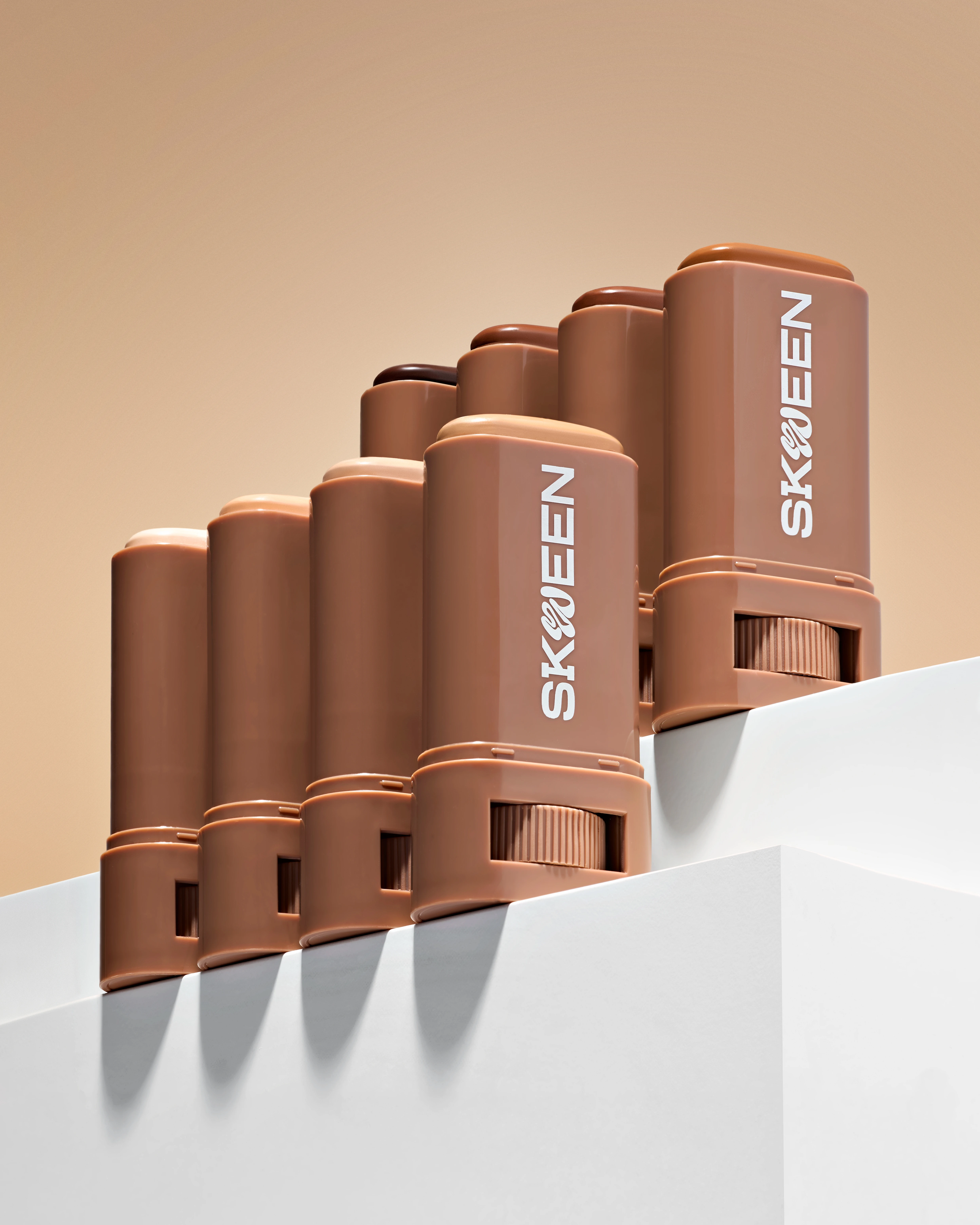
Calibrated lighting for true shade representation across six tones
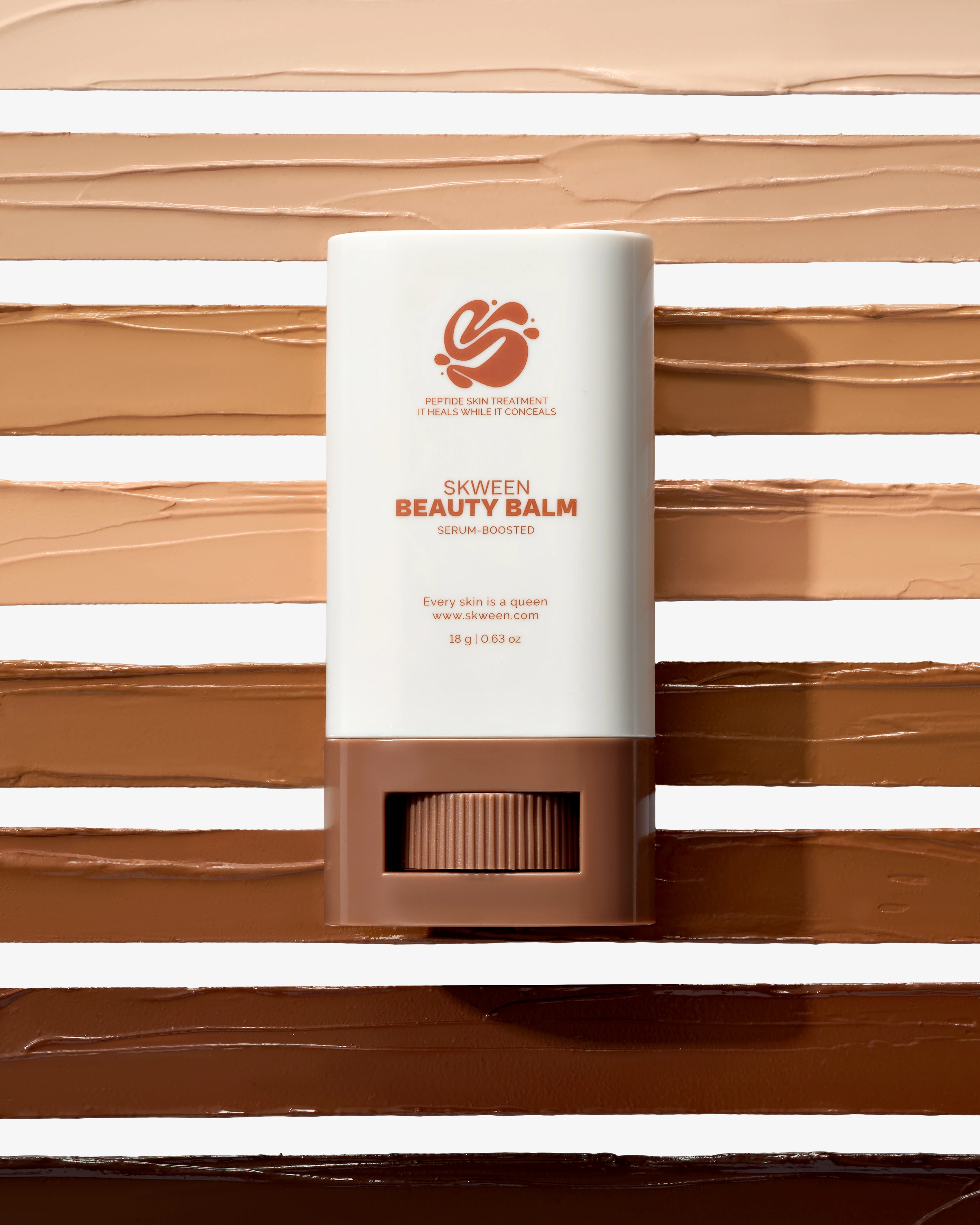
I used calibrated diffuse lighting to eliminate color casts and shadows across the entire shade range. Balm foundations present specific challenges under studio lights. They can look greasy instead of dewy, pick up glare, or read inconsistently across tones. Diffuse lighting kept the serum-like finish visible without introducing specular highlights that would misrepresent the product. I shot against neutral, harmonized backgrounds to avoid color contamination. When photographing complexion products, background choice matters. A warm backdrop shifts undertones warm, a cool one pulls them cool. Neutral gray kept the focus on the balm's true color.
Swatch arrays showing coverage, undertone, and finish progression
For the swatch arrays, I composed parallel and staggered layouts that showed the intentional spacing across the six-shade spectrum. Foundation swatch photography needs to communicate both individual shade characteristics and the logic of the range. I arranged balm swatches to show coverage level, undertone, and finish in a single frame. The staggered layout let each tone remain distinct while demonstrating the progression from lighter to deeper shades. This approach gave customers visual clarity for shade selection without relying on verbal descriptions.
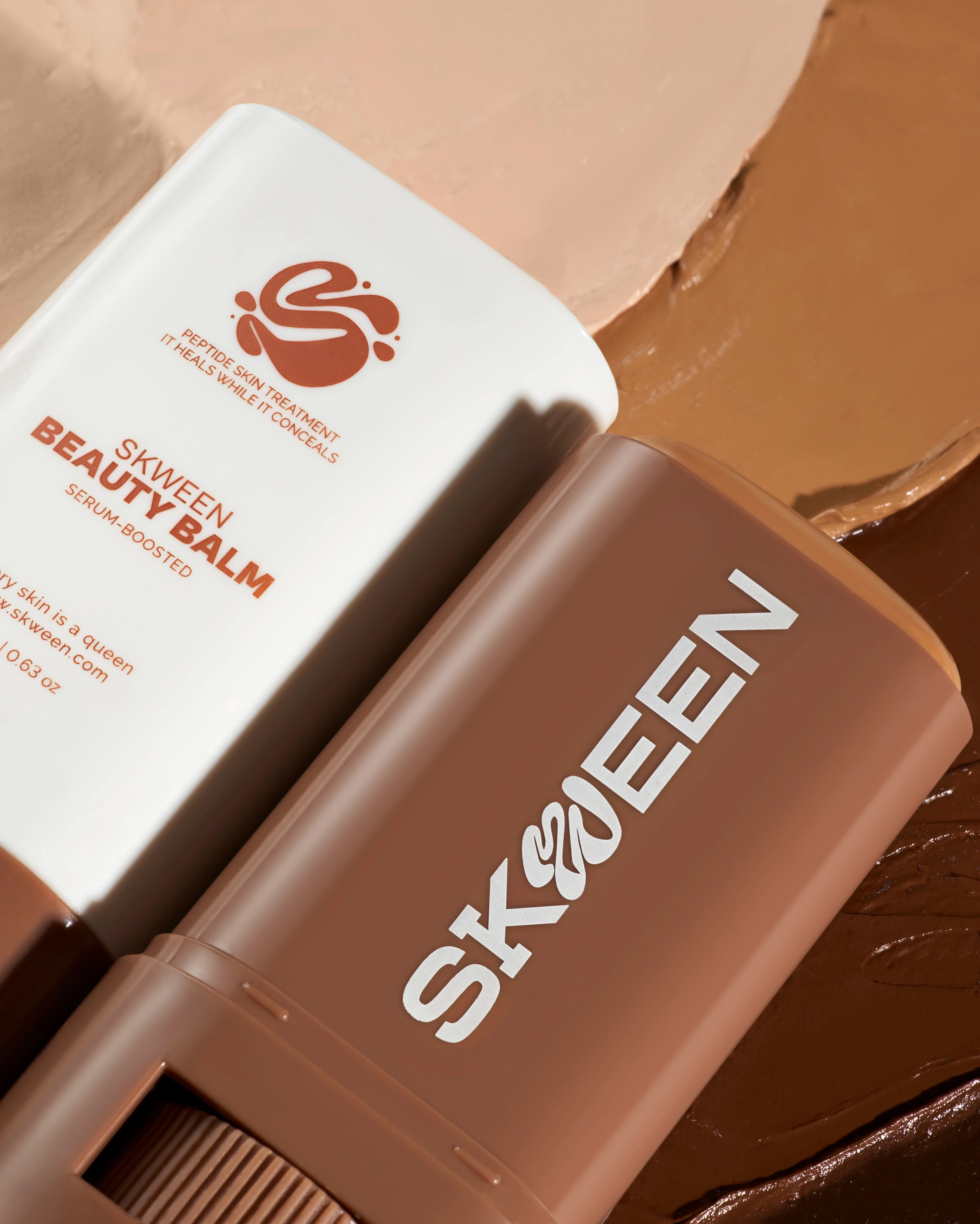
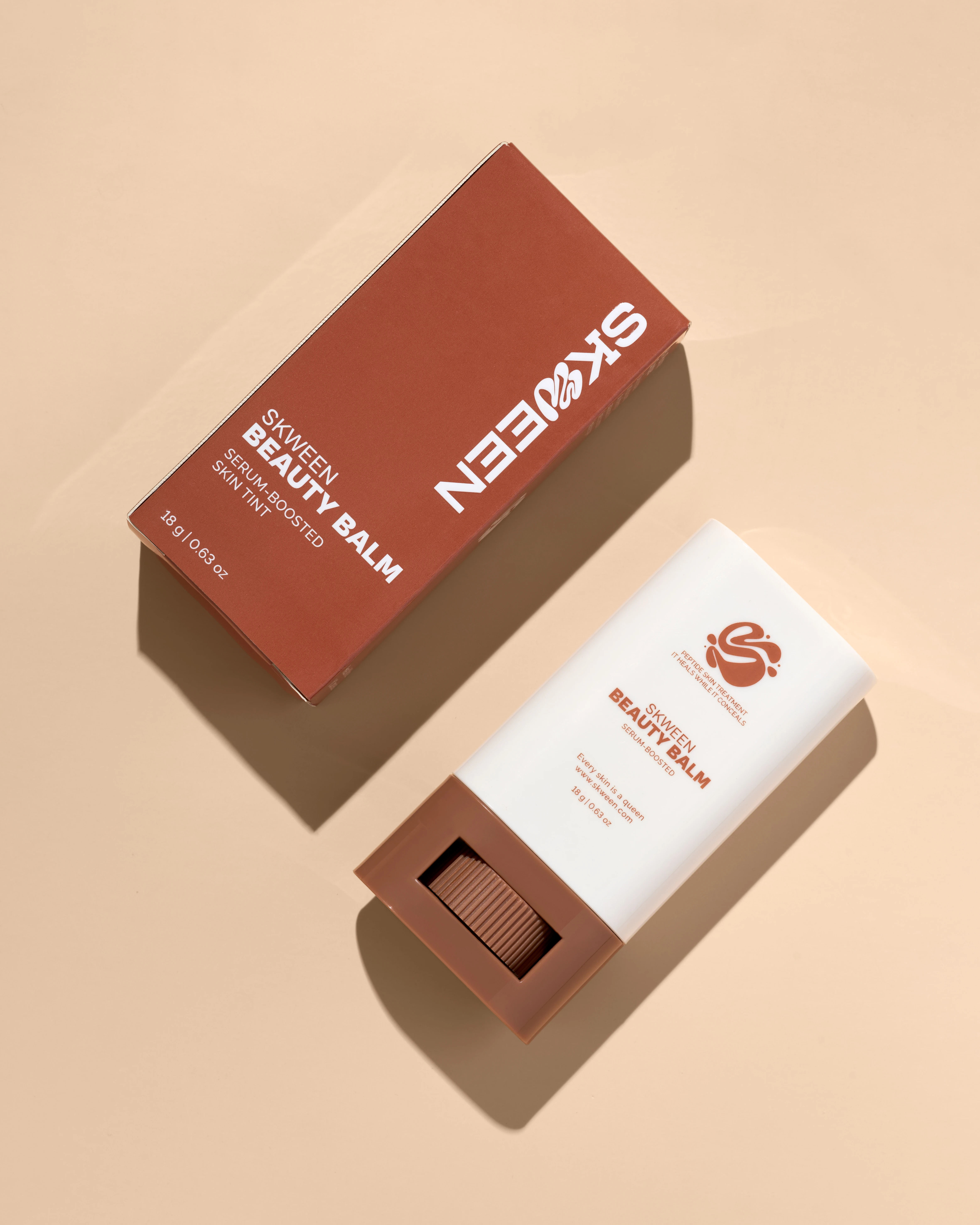
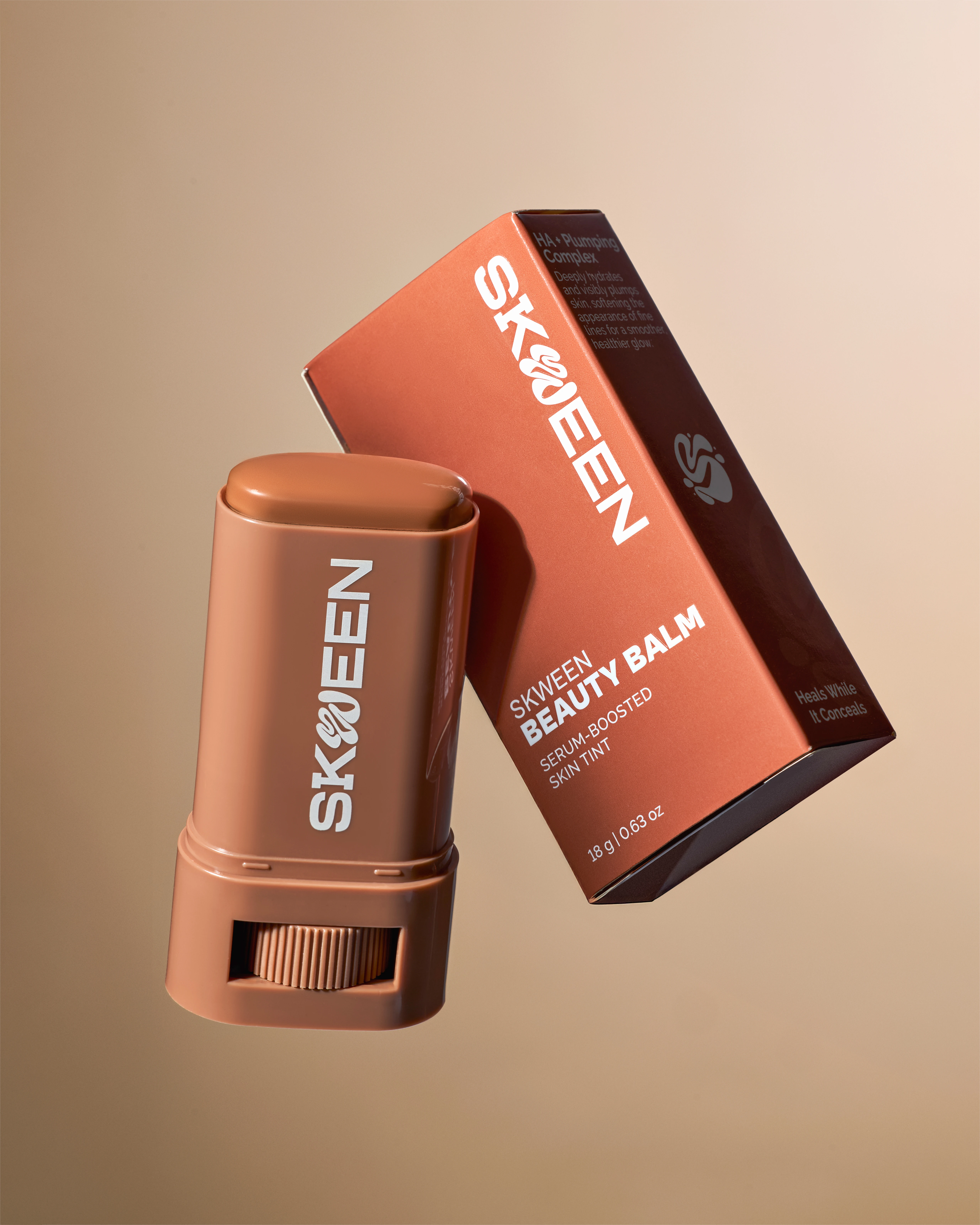
Product detail photography for e-commerce clarity
Product images used top-down and angled setups to maximize label legibility while revealing applicator design and texture. I focused on making the packaging readable and the balm itself visible. Angled shots showed the twist-up mechanism and applicator tip. Overhead compositions kept labels square to the frame and emphasized the clean, minimal design. Each angle served an informational purpose while maintaining a premium, precise look.
Minimal creative images for flexible web and social use
The five creative images stayed product-forward and minimal. I kept lighting consistent with the product shots to avoid introducing new color or finish information that could contradict the swatch and packaging images. Creative images for makeup e-commerce need to feel distinct without becoming decorative. These gave Skween flexible content for different placements while protecting shade truth.
The Outcome:
Launch-ready photo collection building trust through shade accuracy
The collection I delivered includes shade-range visuals, e-commerce product photos, and texture-focused macro content. Skween is using these images on their website. The swatch grids show the balm's coverage and undertone at a glance. Product photos provide the label and packaging detail needed for online product pages. Creative images give them content designed to work across web and social without requiring platform-specific reshoots.
Photographing complexion products for a new beauty brand means building visual equity from scratch. The images need to work immediately because customers don't yet have brand familiarity to fall back on. Shade accuracy, finish fidelity, and consistent lighting across the collection establish trust before the first sale. For Skween, that meant creating a photo collection where every shade reads true, every texture shows clearly, and every frame reinforces their clean, inclusive positioning.
As a Vancouver product photographer, I work with cosmetics brands to create images that handle shade nuance and finish accuracy. If your beauty brand needs product photography that translates online, reach out.
<script type="application/ld+json">
{
"@context": "https://schema.org",
"@type": "Service",
"name": "Inclusive Beauty Swatch Photography for Melanin-Rich Skin",
"description": "Color-managed swatch photography with calibrated shade gradients, high-key diffused lighting, and controlled warmth to preserve undertone fidelity and prevent ashy cast on deeper complexions for beauty brands launching shade-inclusive product lines.",
"serviceType": "Beauty Product Photography",
"provider": {
"@type": "Organization",
"name": "Elina Kustlyvy Photography",
"url": "https://www.elinakustlyvy.com"
},
"areaServed": [
{
"@type": "City",
"name": "Vancouver",
"addressRegion": "BC",
"addressCountry": "CA"
},
{
"@type": "City",
"name": "Toronto",
"addressRegion": "ON",
"addressCountry": "CA"
},
{
"@type": "City",
"name": "Los Angeles",
"addressRegion": "CA",
"addressCountry": "US"
},
{
"@type": "City",
"name": "Seattle",
"addressRegion": "WA",
"addressCountry": "US"
}
],
"url": "https://www.elinakustlyvy.com/projects/skween-beauty"
}
</script>
<script type="application/ld+json">
{
"@context": "https://schema.org",
"@type": "ImageObject",
"contentUrl": "https://cdn.prod.website-files.com/653c048c7bdcdc4c8f4346aa/69432c6c5528de44ed4ccfe9_c5.webp",
"url": "https://cdn.prod.website-files.com/653c048c7bdcdc4c8f4346aa/69432c6c5528de44ed4ccfe9_c5.webp",
"name": "SKWEEN Beauty Balm shade range swatch photography on melanin-rich skin",
"caption": "Calibrated swatch gradients of SKWEEN's six-shade Serum Boosted Skin Tint Beauty Balm photographed under high-key diffused lighting with controlled warmth to preserve undertone accuracy across deeper complexions.",
"creator": {
"@type": "Person",
"name": "Elina Kustlyvy",
"url": "https://www.elinakustlyvy.com"
},
"copyrightHolder": {
"@type": "Organization",
"name": "Elina Kustlyvy Photography"
},
"acquireLicensePage": "https://www.elinakustlyvy.com/contact"
}
</script>
<script type="application/ld+json">
{
"@context": "https://schema.org",
"@type": "Brand",
"name": "SKWEEN",
"description": "Clean, vegan beauty brand founded by sisters Leona and Brianna offering hybrid skincare-makeup products with inclusive shade ranges built for melanin-rich skin.",
"url": "https://skween.com"
}
</script>
<script type="application/ld+json">
{
"@context": "https://schema.org",
"@type": "Product",
"name": "Serum Boosted Skin Tint Beauty Balm",
"description": "Hybrid tint-balm with peptides, niacinamide, and hyaluronic acid providing sheer to light breathable coverage in six shades designed for melanin-rich skin.",
"brand": {
"@type": "Brand",
"name": "SKWEEN"
},
"category": "Beauty Balm",
"review": {
"@type": "Review",
"author": {
"@type": "Person",
"name": "Elina Kustlyvy"
},
"reviewRating": {
"@type": "Rating",
"ratingValue": "5",
"bestRating": "5"
},
"reviewBody": "The balm demonstrates excellent slip and blendability under camera, with a hydrating satin finish that photographs as breathable and weightless rather than masklike. The formulation's controlled warmth prevents the desaturation and gray cast common in products for deeper skin tones, while the texture reveals visible skincare benefits including niacinamide glow and peptide-driven smoothness in macro shots."
}
}
</script>
<script type="application/ld+json">
{
"@context": "https://schema.org",
"@type": "BreadcrumbList",
"itemListElement": [
{
"@type": "ListItem",
"position": 1,
"name": "Projects",
"item": "https://www.elinakustlyvy.com/projects"
},
{
"@type": "ListItem",
"position": 2,
"name": "Paid",
"item": "https://www.elinakustlyvy.com/projects/paid"
},
{
"@type": "ListItem",
"position": 3,
"name": "SKWEEN Beauty",
"item": "https://www.elinakustlyvy.com/projects/skween-beauty"
}
]
}
</script>
<script type="application/ld+json">
{
"@context": "https://schema.org",
"@type": "WebPage",
"name": "Inclusive Beauty Swatch Photography for Melanin-Rich Skin: SKWEEN Case Study",
"description": "How calibrated swatch photography, high-key diffused lighting, and macro texture imaging translated SKWEEN's Perfect Shade Promise into purchase-confidence visuals that reduced shade-related returns and drove conversion for melanin-rich skin customers.",
"url": "https://www.elinakustlyvy.com/projects/skween-beauty",
"speakable": {
"@type": "SpeakableSpecification",
"cssSelector": [".article-intro", ".article-conclusion"]
},
"about": [
{
"@type": "Thing",
"name": "Inclusive beauty swatch photography"
},
{
"@type": "Thing",
"name": "Melanin-rich skin product photography"
},
{
"@type": "Thing",
"name": "Color-managed beauty imaging workflow"
}
],
"mentions": [
{
"@type": "Brand",
"name": "SKWEEN",
"sameAs": "https://skween.com"
},
{
"@type": "Thing",
"name": "Serum Boosted Skin Tint Beauty Balm"
}
]
}
</script>
<script type="application/ld+json">
{
"@context": "https://schema.org",
"@type": "HowTo",
"name": "How to photograph makeup swatches on melanin-rich skin without ashy cast",
"description": "A color-managed workflow using calibrated shade gradients, high-key diffused lighting with controlled warmth, and precise white balance to preserve undertone fidelity across deeper complexions.",
"step": [
{
"@type": "HowToStep",
"position": 1,
"name": "Configure color-managed lighting with controlled warmth",
"text": "Set up high-key, diffused lighting that eliminates shadows without flattening dimension. Use controlled warmth in the lighting configuration to prevent the desaturation that causes ashy cast on deeper skin tones, while maintaining precise white balance to ensure each shade reads accurately across mobile product pages, Instagram stories, and paid Facebook carousels."
},
{
"@type": "HowToStep",
"position": 2,
"name": "Apply swatches with uniform pressure and consistent blending",
"text": "Photograph calibrated shade gradients and apply swatches with uniform pressure, blending to a consistent edge to demonstrate both initial payoff and buildable coverage. This meticulous application mimics real-world use and creates visual anchors for shade-matching experiences that allow customers to compare undertones side by side without color-correction distortion."
},
{
"@type": "HowToStep",
"position": 3,
"name": "Capture macro texture studies showing finish and formulation benefits",
"text": "Shoot close-up texture work that captures satin finish on skin, revealing hydration and breathable glow that separates hybrid skincare-makeup products from heavier foundations. These macro shots demonstrate slip, blendability, and weightless feel as tactile proof points that the formula delivers on ingredient claims before purchase, reducing cognitive load required to trust the brand."
},
{
"@type": "HowToStep",
"position": 4,
"name": "Build structured shade-comparison lineups with harmonized backgrounds",
"text": "Create clean, eye-level compositions placing all shades against harmonized earth-toned backdrops that enhance rather than compete with warm and cool undertones. Structure tiered arrangements and banded swatch landscapes as modular components that function across product pages, shade quizzes, paid social, and editorial partnerships while maintaining color consistency when compressed for mobile or thumbnail views."
}
]
}
</script>
<script type="application/ld+json">
{
"@context": "https://schema.org",
"@type": "FAQPage",
"mainEntity": [
{
"@type": "Question",
"name": "How do you prevent ashy cast when photographing makeup on deep skin tones?",
"acceptedAnswer": {
"@type": "Answer",
"text": "Preventing ashy cast requires high-key, diffused lighting with controlled warmth that eliminates shadows without flattening dimension, combined with precise white balance calibration. This configuration prevents the desaturation common in generic softbox setups that flatten darker complexions, while preserving undertone fidelity and depth retention. The lighting setup prioritizes hue preservation over high contrast, ensuring each shade reads accurately whether viewed on mobile product pages or in paid social carousels."
}
},
{
"@type": "Question",
"name": "What makes swatch photography effective for shade-matching tools and product pages?",
"acceptedAnswer": {
"@type": "Answer",
"text": "Effective swatch photography combines uniform application pressure with consistent edge blending to demonstrate both initial payoff and buildable coverage, creating visual anchors that allow side-by-side undertone comparison without color-correction distortion. Structured shade lineups against harmonized earth-toned backdrops enable intuitive scroll-and-select experiences in shade quizzes, while color-managed workflows ensure swatches maintain accuracy across product pages, paid ads, and influencer content, reducing decision friction and cutting customer service inquiries about undertone matching."
}
},
{
"@type": "Question",
"name": "How does macro texture photography communicate skincare-makeup hybrid benefits?",
"acceptedAnswer": {
"@type": "Answer",
"text": "Macro texture studies capture the satin finish, hydration, and breathable glow of hybrid formulas on skin, translating ingredient claims like niacinamide, peptides, and hyaluronic acid into visually verifiable proof points before purchase. These close-up shots reveal slip and blendability that demonstrate weightless feel and buildable coverage, addressing skepticism from customers burned by heavy or masklike products. For paid social, the same macro work crops into thumb-stopping content that communicates formulation benefits in under two seconds, delivering conversion advantages over generic product photography."
}
}
]
}
</script>

- other recent projects
Clé de Peau Beauté lipstick stacking with controlled metallic reflections on black
(001)
Makeup by Mario Cosmetics
Makeup by Mario eyeshadow palette photography with white-on-white product styling and macro texture detail
Chanel Le Vernis nail lacquer photographed with underlighting technique
Tom Ford eyeshadow palette photography with gradient backgrounds and floral styling
Byredo lipstick on serving tray with gradient backdrop and metallic pins
Chanel Rouge Allure pattern photography with open bullet showing gold gradients and lipstick texture