The Subject:
Makeup by Mario as creative subject
I chose Makeup by Mario as a creative subject because the brand solves a problem most prestige cosmetics ignore: proving formula performance without sacrificing luxury aesthetics. Founded by Mario Dedivanovic, the line translates decades of pro artistry into products engineered around technique. Gel-powder metallics, self-setting concealers, luminous bases with MoistureGrip Technology. The visual challenge interested me because these claims demand proof.
Shoppers scrolling Sephora or the brand's direct site need to see payoff, texture, and finish behavior before they commit to a $42 foundation or $68 eyeshadow palette. This is a personal project exploring how images could function as both conversion tools and creative storytelling for a brand rooted in artistry and education.
The Strategy:
Building a repeatable system for technique-led performance
If a brand like Makeup by Mario needed campaign and e-commerce photography, the brief would center on showing technique-led performance within a restrained, premium visual language. Mario's differentiators require imagery that makes formula behavior legible without losing the elevated minimalism buyers associate with prestige beauty. Slurry formulas, texture separation, inclusive shade ranges. All of it must read instantly.
Working from Vancouver, I'd approach this by building a repeatable system: white-on-white product styling for brand consistency, macro texture studies to prove pigment and reflect, and model-led application frames to demonstrate blendability and shade fidelity across skin tones. The goal would be a modular photo collection serving product page requirements, paid social crops, retail toolkits, and launch campaigns. All anchored by a unified lighting and composition discipline.
The Execution:
Precision diffused lighting and reflective control
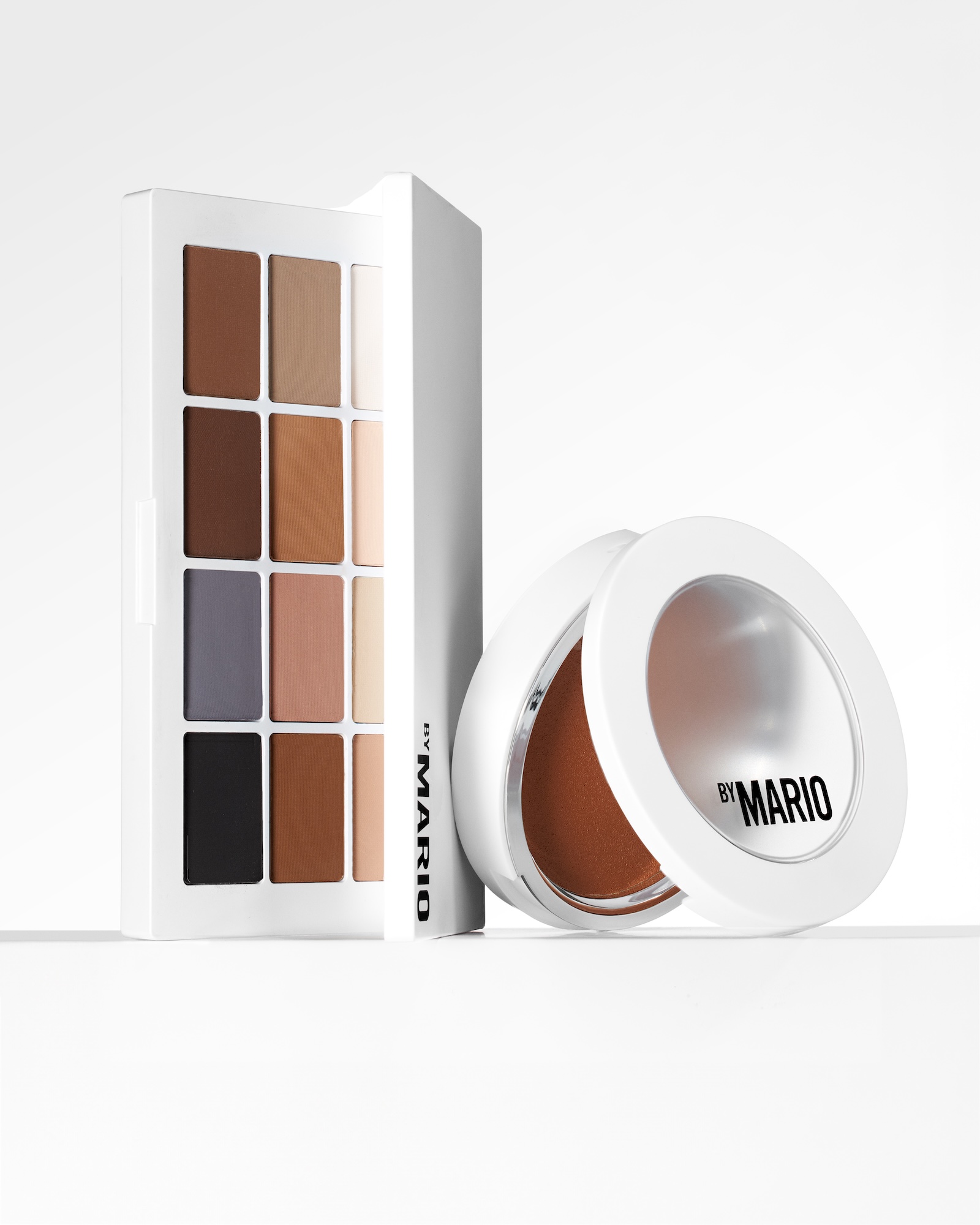
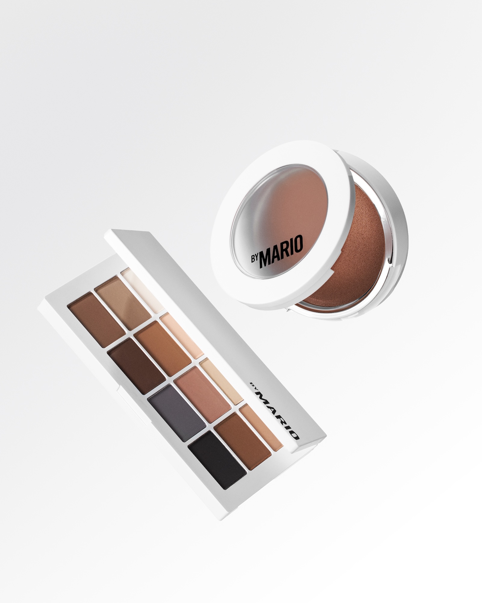
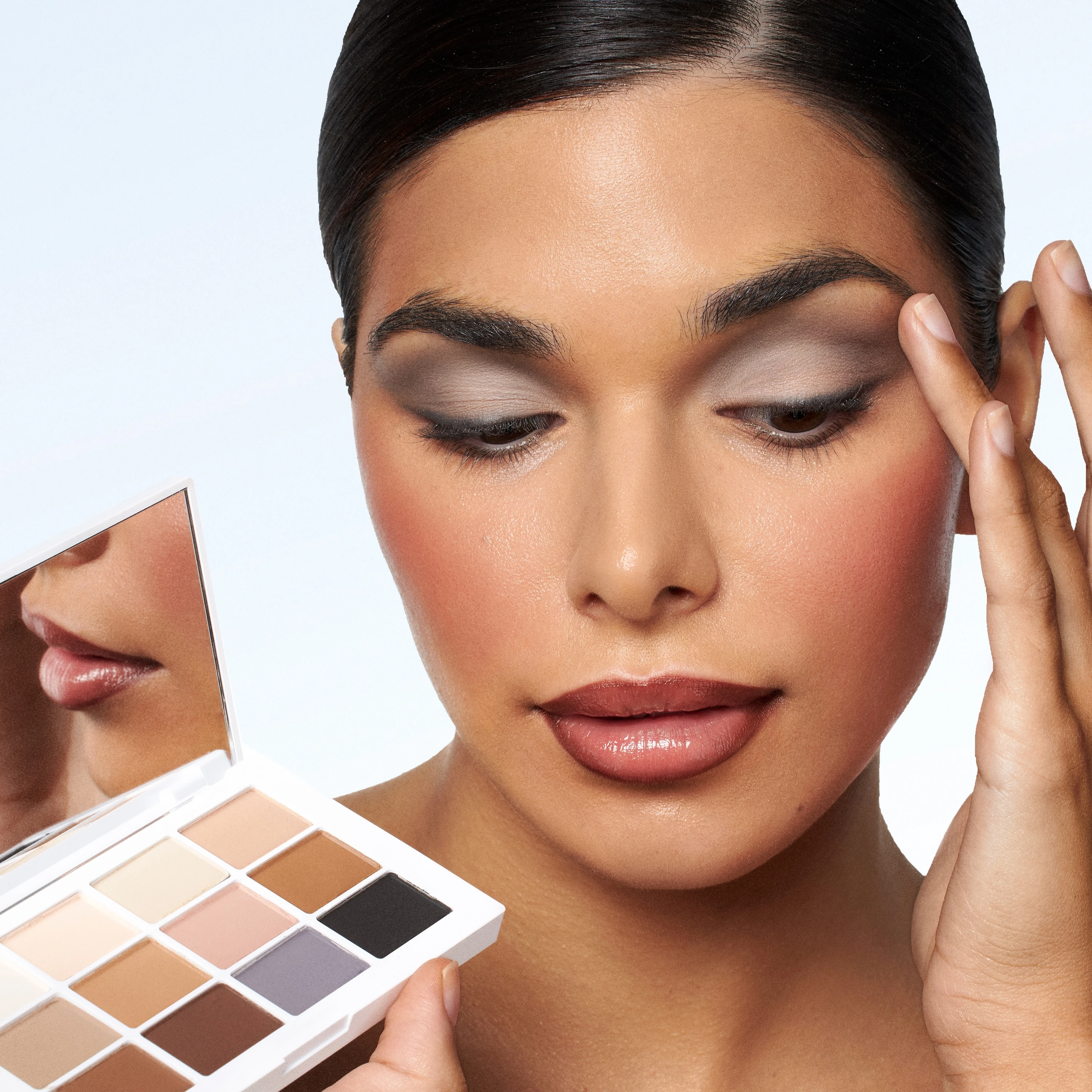
I focused on clean lines and white-on-white styling to create a neutral stage that foregrounds product performance. Precision diffused lighting became the foundation. I used high-key setups to suppress glare and preserve highlight detail in metallic pans and luminous complexion finishes. Reflective control was important: no blown highlights, but enough specularity to show the gel-powder reflect and dewy skin without crossing into greasy territory.
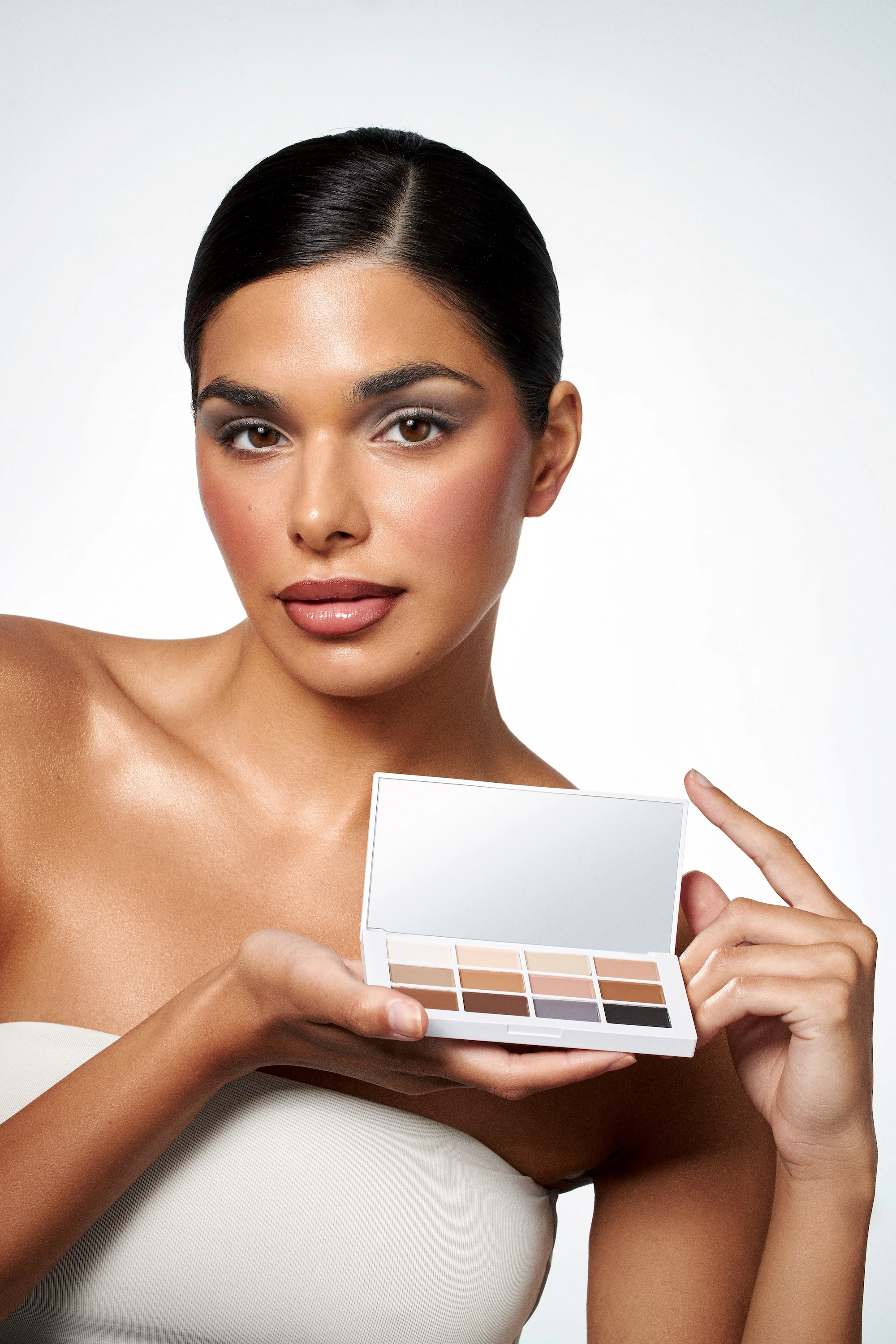
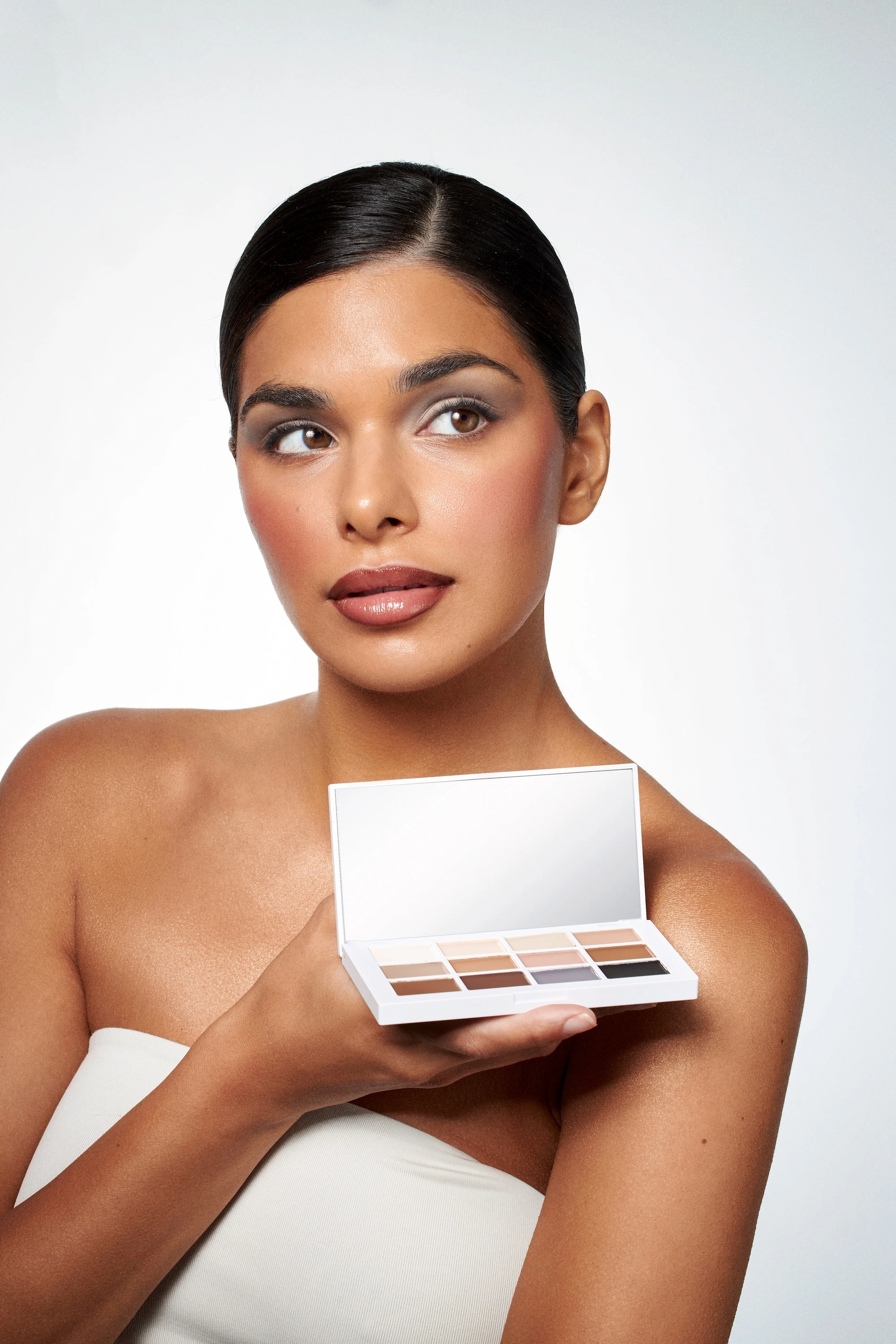
For product-only frames, I angled palettes deliberately to surface pan structure and tonal depth, giving shade-integrity proof at a glance. Model-led portraits used orthogonal compositions and gaze-directing geometries to maintain focus hierarchy, turning application into visual instruction. Every technical choice served a conversion function.
Technical choices as conversion functions
- Macro swatch studies: reveal pigment density and edge behavior
- Neutral white backgrounds: standardize tonality across the set
- Deliberate cropping safety: ensures images work across different formats without reshoots
The Application:
Images designed for multiple uses
The collection includes images designed for multiple uses. Campaign portraits show product-in-hand application with real blendability across skin tones. Proof that inclusivity isn't just a shade count but visible on real complexions. Pristine white-on-white product stills work well for e-commerce pages where clarity drives add-to-cart decisions.
Macro texture tiles function as performance evidence: close-ups of crushed powder, swipe density, and metallic reflect that translate artistry claims into observable detail. Shade-range layouts demonstrate consistent color rendering under controlled lighting, reducing the risk of mismatch complaints that drive returns.
These images could serve brands competing in the prestige tier at Sephora, where buyers expect luxury polish and conversion-ready proof in equal measure. This approach would work particularly well for launches, where marketing and creative teams need a cohesive photo collection deployable across web, social, retail, and PR without visual inconsistency.
The Takeaway:
Engineering cosmetics photography for e-commerce and campaign use
This project demonstrates my capability to engineer cosmetics photography for e-commerce and campaign use within a disciplined visual system. I understand that makeup texture photography demands technical precision. Highlight retention on pressed powders, specularity gradients on metallics, microtexture legibility without grittiness. Those details translate directly to trust and conversion.
As a Vancouver product photographer, I've built a workflow around repeatable lighting setups, calibrated color management, and platform-specific planning so brands get modular deliverables, not one-off shots. If you're looking for photography that shows formula performance with premium restraint and scales across channels, let's talk about your next launch.
<script type="application/ld+json">
{
"@context": "https://schema.org",
"@type": "Service",
"name": "Inclusive True Color Cosmetics Photography with On-Face Application and Macro Texture Detail",
"description": "High-key calibrated beauty product photography that demonstrates accurate shade representation across diverse skin tones, combining white-on-white product stills, macro finish detail, and editorial on-face application to drive conversion and reduce returns.",
"serviceType": "Commercial Beauty Photography",
"provider": {
"@type": "Organization",
"name": "Elina Kustlyvy Photography",
"url": "https://www.elinakustlyvy.com"
},
"areaServed": [
{"@type": "City", "name": "Vancouver", "addressRegion": "BC", "addressCountry": "CA"},
{"@type": "City", "name": "Toronto", "addressRegion": "ON", "addressCountry": "CA"},
{"@type": "City", "name": "Los Angeles", "addressRegion": "CA", "addressCountry": "US"},
{"@type": "City", "name": "Seattle", "addressRegion": "WA", "addressCountry": "US"}
],
"url": "https://www.elinakustlyvy.com/projects/makeupbymario"
}
</script>
<script type="application/ld+json">
{
"@context": "https://schema.org",
"@type": "ImageObject",
"contentUrl": "https://cdn.prod.website-files.com/653c048c7bdcdc4c8f4346aa/688e7773564930e6a84e562a_68733373c991ac394e81abb8_1%2520copy.jpeg",
"url": "https://cdn.prod.website-files.com/653c048c7bdcdc4c8f4346aa/688e7773564930e6a84e562a_68733373c991ac394e81abb8_1%2520copy.jpeg",
"name": "Makeup by Mario Master Mattes Eyeshadow Palette White Background Product Photography",
"caption": "Clean white-on-white product still of matte eyeshadow palette demonstrating high-key lighting technique that preserves micro-texture and enables accurate shade comparison across inclusive color range.",
"creator": {
"@type": "Person",
"name": "Elina Kustlyvy",
"url": "https://www.elinakustlyvy.com"
},
"copyrightHolder": {
"@type": "Organization",
"name": "Elina Kustlyvy Photography"
},
"acquireLicensePage": "https://www.elinakustlyvy.com/contact"
}
</script>
<script type="application/ld+json">
{
"@context": "https://schema.org",
"@type": "Brand",
"name": "Makeup by Mario",
"description": "Artist-driven cosmetics brand founded by master makeup artist Mario Dedivanovic in October 2020, offering professional-grade formulas with inclusive shade ranges and technique-focused education.",
"url": "https://www.makeupbymario.com",
"sameAs": [
"https://www.instagram.com/makeupbymario",
"https://www.sephora.com/brand/makeup-by-mario"
]
}
</script>
<script type="application/ld+json">
{
"@context": "https://schema.org",
"@type": "Product",
"name": "Master Mattes Eyeshadow Palette",
"description": "12-pan matte eyeshadow palette designed with shades based on degrees of human skin tones, engineered for blendability and pigment payoff.",
"brand": {
"@type": "Brand",
"name": "Makeup by Mario"
},
"category": "Eyeshadow Palette",
"review": {
"@type": "Review",
"author": {
"@type": "Person",
"name": "Elina Kustlyvy"
},
"reviewRating": {
"@type": "Rating",
"ratingValue": "5",
"bestRating": "5"
},
"reviewBody": "The pressed powder texture reveals exceptional pigment density under macro photography, with a micro-matte finish that photographs without glare while maintaining visible depth. The pan surface shows tight, even particle distribution and minimal fallout texture, qualities that translate to superior blendability and buildable payoff on skin across diverse tones."
}
}
</script>
<script type="application/ld+json">
{
"@context": "https://schema.org",
"@type": "BreadcrumbList",
"itemListElement": [
{
"@type": "ListItem",
"position": 1,
"name": "Projects",
"item": "https://www.elinakustlyvy.com/projects"
},
{
"@type": "ListItem",
"position": 2,
"name": "Cosmetics Photography",
"item": "https://www.elinakustlyvy.com/projects/cosmetics-photography"
},
{
"@type": "ListItem",
"position": 3,
"name": "Makeup by Mario Case Study",
"item": "https://www.elinakustlyvy.com/projects/makeupbymario"
}
]
}
</script>
<script type="application/ld+json">
{
"@context": "https://schema.org",
"@type": "WebPage",
"name": "Inclusive True Color Cosmetics Photography — Makeup by Mario Case Study",
"description": "Portfolio case study demonstrating how white-on-white product photography, macro texture detail, and editorial on-face application solved shade representation and conversion challenges for artist-driven cosmetics brand.",
"url": "https://www.elinakustlyvy.com/projects/makeupbymario",
"speakable": {
"@type": "SpeakableSpecification",
"cssSelector": [".article-intro", ".article-conclusion"]
},
"about": [
{"@type": "Thing", "name": "Inclusive true color cosmetics photography"},
{"@type": "Thing", "name": "White-on-white beauty product photography"},
{"@type": "Thing", "name": "Editorial beauty photography on-face"},
{"@type": "Thing", "name": "Macro makeup texture photography"},
{"@type": "Thing", "name": "Matte vs metallic eyeshadow photography"}
],
"mentions": [
{
"@type": "Brand",
"name": "Makeup by Mario",
"sameAs": "https://www.makeupbymario.com"
},
{
"@type": "Thing",
"name": "Master Mattes Eyeshadow Palette"
},
{
"@type": "Thing",
"name": "Master Metallics Eyeshadow Palette"
},
{
"@type": "Thing",
"name": "SurrealSkin Foundation"
}
]
}
</script>
<script type="application/ld+json">
{
"@context": "https://schema.org",
"@type": "HowTo",
"name": "How to Photograph True-to-Life Makeup Color Across Diverse Skin Tones for E-Commerce",
"description": "Three-part commercial beauty photography approach combining calibrated white-on-white product stills, macro texture detail, and editorial on-face application to demonstrate inclusive shade range and drive conversion.",
"step": [
{
"@type": "HowToStep",
"position": 1,
"name": "Capture pristine white-on-white product stills with calibrated high-key lighting",
"text": "Use a soft, high-key setup with large diffused key light, fill, and subtle rim to eliminate harsh shadows while preserving micro-detail. Calibrate white balance to neutral, shoot RAW for maximum color latitude, and apply polarizing filters selectively to control specular reflection on metallic shades without killing sparkle. This creates modular product grids that enable accurate shade comparison and speed decision-making on product detail pages."
},
{
"@type": "HowToStep",
"position": 2,
"name": "Shoot macro detail frames to reveal texture, finish, and pigment payoff",
"text": "Shift to longer focal length with extension tubes and position light at shallow raking angle to reveal imprint pattern, particle density, and sheen gradient in pressed pans. Use black flags to shape light for matte shades that read without glare, and introduce controlled specularity for metallics—small, precise highlights that communicate dimensional sparkle without washing out base tone. These macro cuts reduce pre-purchase uncertainty about texture and performance."
},
{
"@type": "HowToStep",
"position": 3,
"name": "Pair product with editorial on-face application across diverse skin tones",
"text": "Create clean portraiture with precise product placement—palette edge entering frame, shade names visible, gaze path guiding viewer from product to result. Shoot each finish both in swatch and on-lid to demonstrate real-world pigmentation, blendability, and how the product interacts with skin tone. This bridges the gap between artist techniques and consumer self-application, driving engagement and assisted conversions from tutorial content back to product pages."
}
]
}
</script>
<script type="application/ld+json">
{
"@context": "https://schema.org",
"@type": "FAQPage",
"mainEntity": [
{
"@type": "Question",
"name": "How do you capture true-to-life makeup color across diverse skin tones for product pages?",
"acceptedAnswer": {
"@type": "Answer",
"text": "I use a three-part approach: calibrated high-key lighting on white-on-white product stills to establish clean color fidelity, macro detail frames to show texture and finish behavior, and editorial on-face application shots across diverse skin tones that demonstrate real pigmentation and blendability. The workflow includes shooting RAW with neutral white balance, using polarizing filters to control reflection without killing metallic sparkle, and pairing product grids with on-skin swatches to validate shade range and reduce the 'will this work for me?' hesitation that lowers conversion."
}
},
{
"@type": "Question",
"name": "What is the best way to show metallic vs matte eyeshadow textures in product photography?",
"acceptedAnswer": {
"@type": "Answer",
"text": "Matte shades require broad, even light that reveals pigment depth without glare, while metallics need controlled specularity—small, precise highlights shaped by black flags and reflective cards that communicate dimensional sparkle without washing out the base tone. I shoot each finish at different light angles: diffuse illumination for mattes to show true color, and raking angle with selective reflection for metallics to capture sheen gradient and particle behavior. The resulting images demonstrate not just color, but how the product blends, builds, and interacts with skin, directly addressing finish uncertainty that kills add-to-cart."
}
},
{
"@type": "Question",
"name": "Why does white-on-white beauty product photography improve e-commerce conversion?",
"acceptedAnswer": {
"@type": "Answer",
"text": "White-on-white minimalism eliminates visual noise, speeds shade comparison, and meets retailer specs for fast-loading product detail pages. The challenge is maintaining separation and dimension without introducing color casts or crushing highlights. By using soft high-key light, calibrated neutral white balance, and RAW capture for maximum color latitude, this approach creates modular, consistent assets that improve time-on-page and add-to-cart rates while supporting inclusive shade range grids and shade-matching tools across every channel."
}
}
]
}
</script>

- other recent projects
SKWEEN foundation balm swatch photography showing six shade tones and skincare texture for ecommerce launch
Clé de Peau Beauté lipstick stacking with controlled metallic reflections on black
Chanel Le Vernis nail lacquer photographed with underlighting technique
Tom Ford eyeshadow palette photography with gradient backgrounds and floral styling
Byredo lipstick on serving tray with gradient backdrop and metallic pins
Chanel Rouge Allure pattern photography with open bullet showing gold gradients and lipstick texture
