The Project:
Why Quo Beauty and why this approach
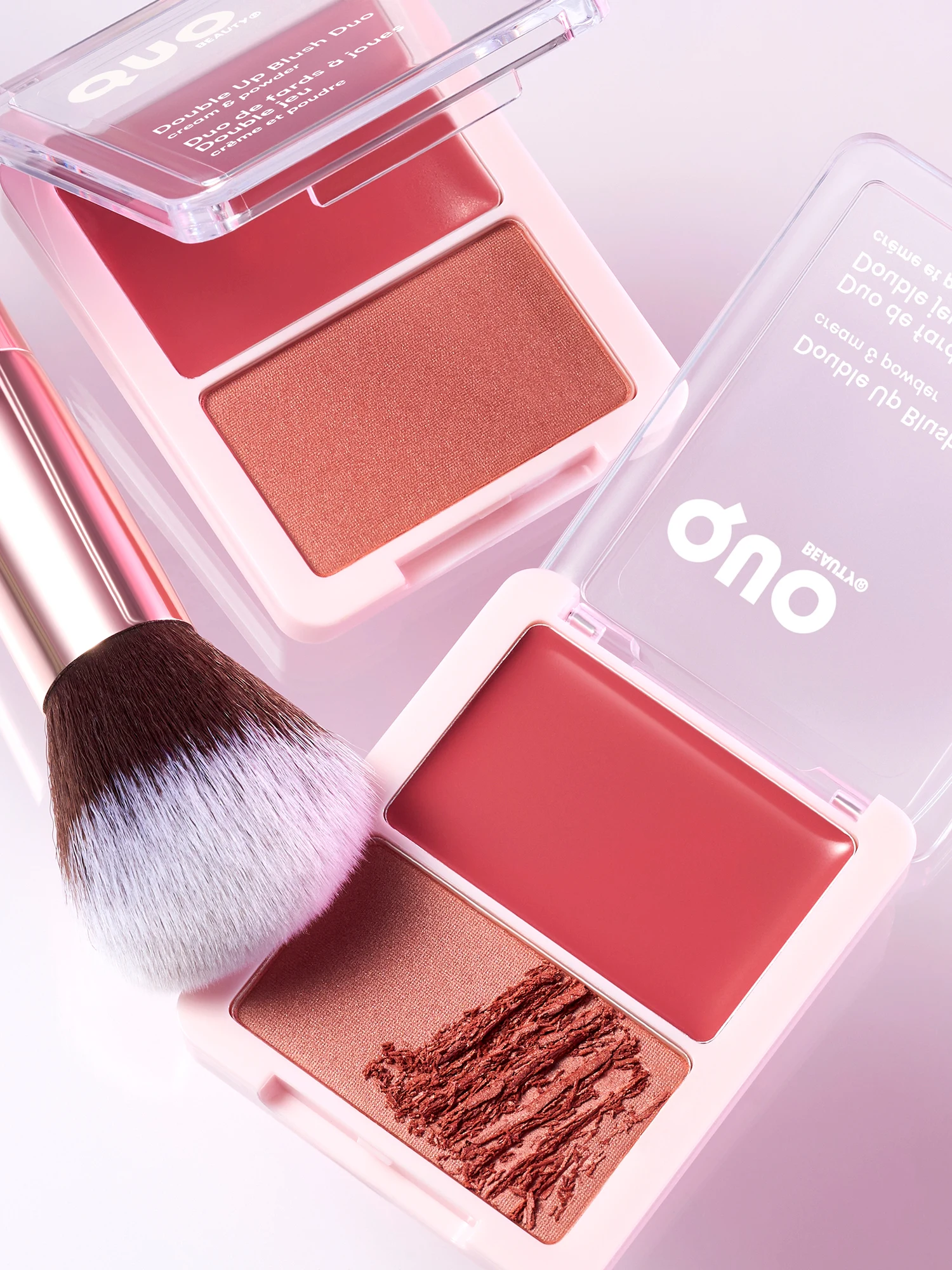
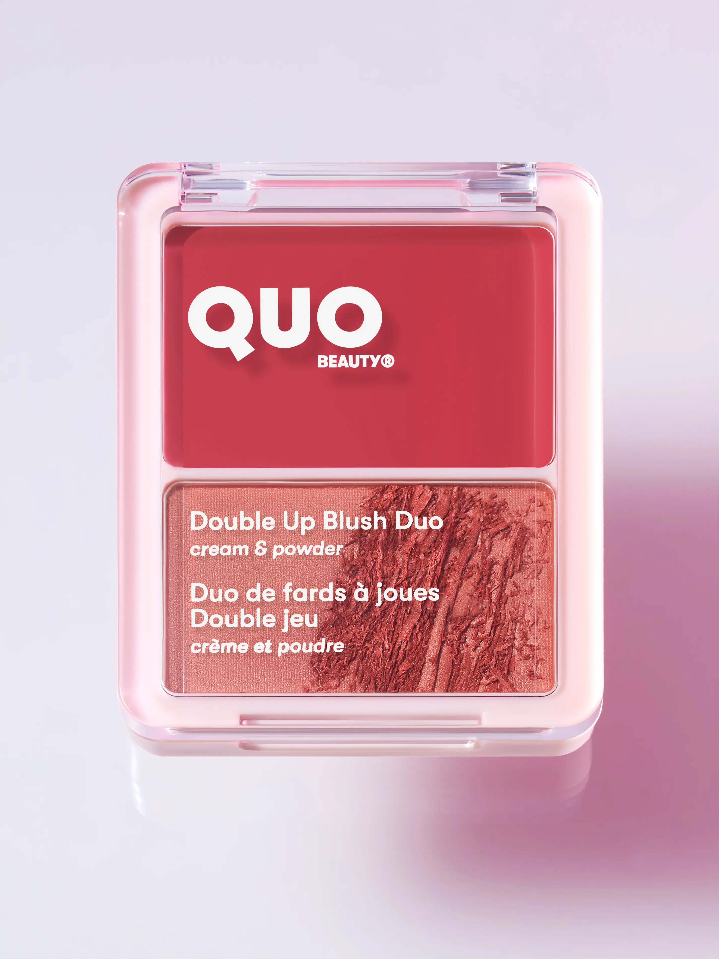
I chose Quo Beauty as a creative subject because they've solved a problem most drugstore beauty brands ignore: making ethics and trend relevance work at mass-market price points. As a Toronto makeup product photographer, I wanted to explore how visual storytelling could bridge the gap between pristine product discovery and believable everyday use without relying on heavy retouching or misleading finishes. The brief I set for myself was simple: create a two-image series that moved from untouched appeal to tactile proof, showing what these blushes actually look like when someone opens them, uses them, and integrates them into a real routine. This is a personal project, not client work, but it reflects the kind of thinking I bring to beauty brands navigating similar challenges.
The Challenge:
Competing with prestige while proving approachability
If a brand like Quo needed to communicate both premium desirability and approachable authenticity, here's how I'd approach it. The core tension for affordable beauty is visual: you need polish to compete with prestige packaging in a feed, but you also need credibility to earn trust and reduce returns. Most product photography leans hard into one or the other: either clinical e-commerce shots that feel sterile, or lifestyle setups so loose they obscure shade and finish. I wanted to test whether a minimal series could deliver both, using a progression from discovery to experience as the organizing principle.
The first image shows the blushes untouched, fresh, and ready to perform. The second introduces texture, sweep marks, and a brush resting in the frame, signaling use without staging a full beauty routine. Together, they tell a compact story: this is what you'll want, and this is what you'll actually get.
The Execution:
Lighting and composition for color truth
I built the lighting around soft, controlled setups that preserved color accuracy and finish across all three shades. Blush is notoriously difficult to photograph accurately because undertones shift under inconsistent light, and shimmer or sheen can blow out if the key is too hard or the shadows too aggressive. I used diffused lighting with carefully managed falloff to keep the pans readable and the logo clear, ensuring the packaging stayed recognizable even at thumbnail scale.
For the second image, I kept the same lighting structure but loosened the composition, allowing diagonal lines from the open compacts and the brush to create movement and guide the eye. The brush itself became a narrative device, grounding the scene in real application and reinforcing the idea that these products are meant to be touched, not just admired.
Macro texture photography as trust signal
The close-up work was deliberate. I wanted to capture the grain of the powder, the way shimmer particles catch light, and the tactile quality of a finger swipe through a pan. These details matter because they communicate finish and payoff in ways a clean shot can't. A customer scrolling through a product page or a social feed needs to see what "buildable" or "luminous" actually looks like, not just read it in copy.
The sweep marks and visible texture in the second image function as proof: this blush behaves the way you'd expect, and the color you see is the color you'll get. I framed tightly to prioritize product and branding, keeping the backdrop neutral and modern so the focus stayed on the blushes themselves. The result is a set of images that work well for e-commerce detail shots, social carousels, or campaign content where color accuracy and tactile storytelling drive performance.
Balancing trend relevance with product clarity
I also wanted to experiment with a visual technique I'd been seeing across beauty content on social platforms. The approach felt fresh and culturally current, but I adapted it to keep the product central rather than letting the trend dominate. Styling, composition, and color stayed rooted in product photography principles (clean, intentional, and brand-forward) while the technique added a contemporary edge.
This kind of balance is critical for brands that need to participate in trending visual language without losing their identity or confusing their audience. The images feel timely, but they're not interchangeable with everything else in a feed. They're still unmistakably about the blushes: their shades, their finishes, and the experience of using them.
The System:
A repeatable framework for high volume launches
This approach would work well for brands managing high product counts and fast launch cycles. A repeatable framework (pristine setup, used setup, close-up texture detail) creates a scalable content engine. You could apply the same structure to foundations, concealers, lip products, or tools, adjusting styling and composition to fit the category while maintaining visual consistency across the line.
For a brand like Quo, where volume and speed matter as much as quality, that kind of system reduces production friction and ensures every launch has channel-ready images that slot into e-commerce, paid social, organic content, and retail modules without starting from scratch every time. The two-state progression also maps neatly onto customer journey stages: awareness imagery that catches attention, and consideration imagery that builds confidence and reduces hesitation.
The Application:
Cross channel assets from a single shoot
These images are designed to function across multiple uses. The pristine blush shot could serve as a primary product image, a campaign anchor, or a grid post on social. The texture-led, brush-in-frame composition works as a secondary e-commerce image, a story post, or a paid social variation that emphasizes tactile appeal and finish. Together, they create a narrative set that tells a complete story even with minimal photos.
That efficiency matters when timelines are tight and budgets need to stretch across dozens of products. I've kept the lighting, framing, and retouching standards tight enough to protect color accuracy and finish honesty (the two things that directly impact return rates and customer complaints) while still delivering the polish and contemporary feel that beauty audiences expect.
The Takeaway:
Strategic systems meet technical precision
What this project demonstrates is my ability to translate strategic thinking into practical, repeatable visual systems. I understand the business pressures beauty brands face: trend pace, channel requirements, volume demands, and the constant need to look premium without premium spend. I also understand the technical precision required to photograph cosmetics credibly: color management, texture control, finish clarity, and retouching that enhances without misleading.
If your brand needs a Toronto makeup product photographer who can deliver blush swatch photography with cosmetic-grade detail, clean backdrop setups that scale, and beauty product texture photography that builds trust across different channels, let's talk about how I can help you build a content engine that keeps pace with your launch calendar.
<script type="application/ld+json">
{
"@context": "https://schema.org",
"@type": "Service",
"name": "Blush Swatch Photography with Texture Detail",
"description": "Two-state product photography progression for cosmetics: pristine discovery imagery and tactile in-use shots with brush integration, designed to show accurate color, finish, and buildability for beauty e-commerce and social channels.",
"serviceType": "Makeup Product Photography",
"provider": {
"@type": "Organization",
"name": "Elina Kustlyvy Photography",
"url": "https://www.elinakustlyvy.com"
},
"areaServed": [
{
"@type": "City",
"name": "Vancouver",
"addressRegion": "BC",
"addressCountry": "CA"
},
{
"@type": "City",
"name": "Toronto",
"addressRegion": "ON",
"addressCountry": "CA"
},
{
"@type": "City",
"name": "Los Angeles",
"addressRegion": "CA",
"addressCountry": "US"
},
{
"@type": "City",
"name": "Seattle",
"addressRegion": "WA",
"addressCountry": "US"
}
],
"url": "https://www.elinakustlyvy.com/projects/quo-beauty"
}
</script>
<script type="application/ld+json">
{
"@context": "https://schema.org",
"@type": "ImageObject",
"contentUrl": "https://www.elinakustlyvy.com/projects/quo-beauty",
"url": "https://www.elinakustlyvy.com/projects/quo-beauty",
"name": "Quo Beauty Blush Product Photography",
"caption": "Two-state blush photography showing pristine compacts and in-use texture with brush integration for e-commerce and social media.",
"creator": {
"@type": "Person",
"name": "Elina Kustlyvy",
"url": "https://www.elinakustlyvy.com"
},
"copyrightHolder": {
"@type": "Organization",
"name": "Elina Kustlyvy Photography"
},
"acquireLicensePage": "https://www.elinakustlyvy.com/contact"
}
</script>
<script type="application/ld+json">
{
"@context": "https://schema.org",
"@type": "Brand",
"name": "Quo Beauty",
"description": "Canadian drugstore beauty brand offering vegan, cruelty-free, PETA-certified cosmetics and accessories at accessible price points with trend-driven innovation and sustainable packaging.",
"url": "https://www.quobeauty.com",
"sameAs": [
"https://www.shoppersdugmart.ca/Shop/Categories/Beauty/Brands/Quo-Beauty/c/FS-1220212",
"https://www.instagram.com/quobeauty"
]
}
</script>
<script type="application/ld+json">
{
"@context": "https://schema.org",
"@type": "Product",
"name": "Quo Beauty Blush Collection",
"description": "Drugstore blush range available in powder, cream, and balm formulations with buildable, luminous finishes.",
"brand": {
"@type": "Brand",
"name": "Quo Beauty"
},
"category": "Color Cosmetics - Blush",
"review": {
"@type": "Review",
"author": {
"@type": "Person",
"name": "Elina Kustlyvy"
},
"reviewRating": {
"@type": "Rating",
"ratingValue": "5",
"bestRating": "5"
},
"reviewBody": "The powder texture shows fine grain with visible shimmer particles that catch light predictably. Pans demonstrate buildable payoff with clean color deposit, and the compact packaging maintains logo clarity at thumbnail scale while surviving tactile use."
}
}
</script>
<script type="application/ld+json">
{
"@context": "https://schema.org",
"@type": "BreadcrumbList",
"itemListElement": [
{
"@type": "ListItem",
"position": 1,
"name": "Projects",
"item": "https://www.elinakustlyvy.com/projects"
},
{
"@type": "ListItem",
"position": 2,
"name": "Creative",
"item": "https://www.elinakustlyvy.com/projects/creative"
},
{
"@type": "ListItem",
"position": 3,
"name": "Quo Beauty Blush Photography",
"item": "https://www.elinakustlyvy.com/projects/quo-beauty"
}
]
}
</script>
<script type="application/ld+json">
{
"@context": "https://schema.org",
"@type": "WebPage",
"name": "Quo Beauty Blush Product Photography - Makeup Product Photographer Toronto",
"description": "Two-state beauty product photography case study demonstrating pristine and in-use cosmetic imaging for drugstore makeup brands, with color-accurate blush swatches, texture detail, and brush integration for e-commerce and social.",
"url": "https://www.elinakustlyvy.com/projects/quo-beauty",
"speakable": {
"@type": "SpeakableSpecification",
"cssSelector": [".article-intro", ".article-conclusion"]
},
"about": [
{
"@type": "Thing",
"name": "Blush Swatch Photography"
},
{
"@type": "Thing",
"name": "Beauty Product Texture Photography"
},
{
"@type": "Thing",
"name": "Makeup Brush Product Photography"
}
],
"mentions": [
{
"@type": "Brand",
"name": "Quo Beauty",
"sameAs": "https://www.quobeauty.com"
},
{
"@type": "Thing",
"name": "Quo Beauty Blush Collection"
}
]
}
</script>
<script type="application/ld+json">
{
"@context": "https://schema.org",
"@type": "HowTo",
"name": "How to Photograph Blush with Accurate Color and Texture for E-Commerce",
"description": "A repeatable two-state product photography framework for cosmetics that moves from pristine discovery imagery to tactile in-use proof, preserving color accuracy and finish clarity.",
"step": [
{
"@type": "HowToStep",
"position": 1,
"name": "Build Soft, Controlled Lighting for Color Accuracy",
"text": "Use diffused lighting with carefully managed falloff to keep powder pans readable, logos clear, and undertones stable. Avoid hard key lights that blow out shimmer or aggressive shadows that distort finish. This setup preserves color accuracy across all shades and ensures packaging remains recognizable at thumbnail scale."
},
{
"@type": "HowToStep",
"position": 2,
"name": "Capture Pristine Discovery Shot with Clean Framing",
"text": "Photograph untouched blush compacts with tight framing, neutral backdrop, and diagonal composition lines that create visual interest without obscuring product or branding. This first-state image serves as primary e-commerce imagery, campaign anchors, or social grid posts that communicate premium desirability."
},
{
"@type": "HowToStep",
"position": 3,
"name": "Introduce Texture and Brush for In-Use Proof",
"text": "Keep the same lighting structure but loosen composition to show sweep marks, powder grain, and a brush resting in frame. Capture shimmer particles catching light, finger swipes through pans, and tactile details that communicate buildability and finish. This second-state image functions as secondary e-commerce detail shots or social story posts that build confidence and reduce return rates."
}
]
}
</script>
<script type="application/ld+json">
{
"@context": "https://schema.org",
"@type": "FAQPage",
"mainEntity": [
{
"@type": "Question",
"name": "How do you photograph cream blush without losing color accuracy?",
"acceptedAnswer": {
"@type": "Answer",
"text": "Use diffused lighting with controlled falloff to prevent undertones from shifting and shimmer from blowing out. Maintain consistent key placement across all shades, and capture the powder grain, sweep patterns, and texture details that show how the finish behaves under real use. This approach preserves color fidelity while demonstrating buildability and payoff."
}
},
{
"@type": "Question",
"name": "What makes a good blush swatch photo for e-commerce?",
"acceptedAnswer": {
"@type": "Answer",
"text": "Effective blush swatch photography shows both pristine product appeal and tactile proof of use. The first image captures untouched pans with clear branding and accurate color, while the second introduces sweep marks, visible texture, and a brush in frame to demonstrate finish and application. Together, they communicate what the customer will want and what they'll actually receive, reducing hesitation and returns."
}
},
{
"@type": "Question",
"name": "Why include makeup brushes in beauty product photos?",
"acceptedAnswer": {
"@type": "Answer",
"text": "A brush resting in the frame functions as a narrative device that grounds the image in real application. It signals tactile use, reinforces that the product is meant to be touched, and guides the viewer's eye through diagonal composition lines. For drugstore beauty brands, brush-in-frame setups build credibility by showing the product in context without staging a full routine."
}
}
]
}
</script>

- other recent projects
Sensorial beauty stills with scent-layer atmosphere
Beauty product photography: Bea + Jada mood and texture proof
Clean beauty product photography: Real skin portraits for Beia's sensitive skincare line
tarte mascara and eyeliner photographed on skin at macro scale
Photographing FaceCrime skincare's rebellion-inspired face oil campaign with model portraits and product shots for Vancouver clean beauty brand
(001)
Makeup by Mario Beauty
Makeup by Mario foundation photography with natural skin texture